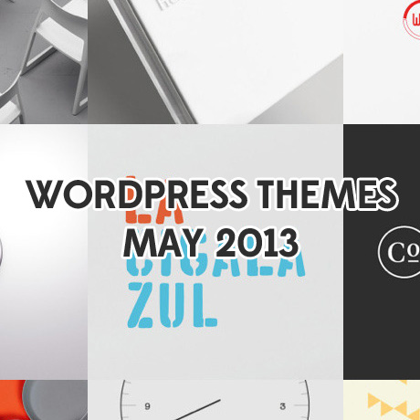
Creative WordPress Themes – May 2013

Portfolio, photography, and artistic WordPress themes are always popular. The ability to showcase images, videos, and text in one theme make it ideal for different web applications that can serve both artistic and corporate specifications. Here are some of the latest creative WordPress themes available in the market today:

Bloq

Create a lasting first impression with Bloq Premium WordPress Theme – a highly customizable theme with a fully responsive layout. The modern flat graphics and block layout format gives you that high-end graphic designer look perfect for creative agencies and freelance design professionals. This theme’s dedicated control panel allows users to configure the majority of the theme’s aesthetics and functionalities like color choices, page templates, and features such as post-formats, page templates, custom widgets, shortcodes, other theme elements that can help you create the look and branding you need.

PurePress

PurePress is a responsive and retina-ready theme that is packed with customization tools to help you create a multi purpose portfolio site. It is fully responsive and optimized for mobile devices. Features include slider choices, 6 skins, boxed and wide layout options, 8 layout options (with or without sidebar), tons of page templates. This theme is also capable of “password-protected” posts – a useful feature especially for professional photographers.

Awsm

AWSM is clean and simple, fully featured WordPress theme, perfect for creative people, freelancers or agencies. This unique theme reminds you of popular networking sites such as Facebook and Pinterest with a twist using familiar features such as the Facebook timeline and Pinterest’s masonry style grid layout. This theme is ideal for the creative freelancer who wants to display his work, projects, skills, services, and other interesting information (professional or personal). AWSM uses responsive design, stylish CSS3 and jQuery animations.

It is highly customizable with powerful theme options panel and many custom features. Another feature highlight is the option to use either a one-page layout which means your pages will scroll to its content, or the standard menu navigation which means that every page will open as a separate page on your website. You can even combine both without affecting any of your website content. AWSM is a unique and fresh take on the traditional portfolio styled theme.

Ideanosse

Create an impressive repository of your personal work using Ideanosse. Personal or creative websites need not be boring or look cookie cutter-ish with the usual predictable layout. If you are a little bit bored with what’s out there, check out this minimalist , responsive, single Page HTML5 WordPress Theme designed on Bootstrap Front End Framework. It is designed for specially small agencies to show their business online in more modern way with maximum coverage of clients. This theme can also be used for modern designers, developers & freelancers to show their works in a creative way.

The Barbershop

The Barbershop is a One Page Responsive WordPress Theme with a clean, unique retro/vintage design. The theme is packed with great Custom Post Types and Theme Options to display any kind of work on your website. Taking its playful design cue from the iconic Marx mustache, The Barbershop is a solidly designed theme that (although primarily designed for Barbershops) can be used for other website applications including your personal portfolio. This theme’s responsive development displays perfect on any tablet and mobile device and is easy to edit and maintain.


Photography WordPress Themes Roundup for April 2013

Here are a few of our current picks for awesome photography themes for 2013:

Modelish

Modelish is a unique modern HTML5+LESS fully responsive WordPress theme for presenting artwork or photography. This full-width photography/portfolio styled theme is also versatile enough to be used for any type of business as well. The stylish, yet clean and professional design is optimized with mobile first techniques and retina display support. Add some style and modern flair to your website with its customizable system that makes it easy to adapt to your favorite colors, fonts and style preferences.

Keres Full Screen Photography Theme

Keres is a cool fullscreen responsive WordPress theme built for a photography or portfolio website. It comes with many cool features like multiple slideshows (fullscreen Slideshow, Ken Burns Slideshow), a unique Image Flow Gallery, Skin manager, fullscreen Contact Map, fullscreen Youtube and Vimeo Video. This theme includes customizable elements (color, font, background image) with 50+ advanced shortcodes and a Shortcode Generator support to create the portfolio style you really want.

Photojax Minimalist Ajax Photography Portfolio

Photojax is a clean and minimal, grid styled WordPress photography theme. This sleek and modern theme features two color skins, beautiful galleries using the premium Royal Slider plugin ($20 value), an audio player, and a minimal blog (all you’ll need for a great photography portfolio). Although designed for photographers it can be a great theme for graphic designers, architects, and anyone else with an image based portfolio.

Sniper Premium Photography

Sniper is a sleek and powerful premium responsive + liquid WordPress theme built for photographers, creative agencies or portfolio website. All elements of this theme are liquid which makes it ideal for smartphone and mobile devices. This modern WordPress theme’s dynamic navigation system makes it fun and interesting to explore your website – from dropdown menus to toggled pages, everything is full of surprises.

Smarald

Smarald is an incredibly unique, highly interactive, retina ready, responsive WordPress Portfolio theme, suitable for all sorts of creatives, agencies and even blogs. Whether you want to showcase your work in a beautiful way, share your articles with your readers, or just to have a great interactive website for your agency, this premium theme is the perfect solution for you.


Eye-Catching Retina Display WordPress Themes

The shift towards high-definition in gadgets and devices has been around for a little while. Today, software and digital products are often described as“retina” display read which simply means that these products are graphically ready, in terms of clarity, contrast, and sharpness, to be displayed in high definition devices without diminishing in quality.

Here are some of the newest retina-ready WordPress themes you can try on your HD devices:

Novelty (Portfolio)

This portfolio and blog theme’s clean minimalist look is a perfect complement to outstanding artwork and projects normally displayed in a creative professional’s website. Photographers, design agencies, freelance creatives, and corporate sites will love to show off their pieces in high definition and this theme is ready to do that. It is also 100% responsive replicating that HD experience even on mobile devices.

!LesPaul (Multipurpose)

A multipurpose user friendly theme equipped with Sharp Retina (high DPI) graphics that will look beautiful on modern high resolution displays. The crisp and sharp design elements incorporated in this theme will look great on handheld devices such as smartphones and tablets.

Supreme Magazine (Magazine)

Subscribers will enjoy browsing through your online publication built using this theme. Supreme Premium WordPress Theme is a revolutionary Retina Responsive Magazine/Blog theme integrated with clean, modern, and crystal clear graphics that can be effectively displayed in retina ready modern devices.

Eagle Logistics (Logistics/Forwarding/Shipping)

This premium theme was designed with the logistics industry in mind. It was conceptualized to turn websites into an effective solution for logistic transactions. The retina-ready capability of this theme is most effective in the use of images and text used in promoting products and services related to your logistics business. These crystal clear elements add that attention to detail factor and communicates professionalism necessary in any business especially in this type of industry.

Slurp (Modern Creative Grid Portfolio)

Creative professionals will fall in love with the edgy and modern style of this theme. Images and graphics take center stage on the homepage with the unique organic and asymmetrical manner that they are displayed creating that cool and edgy look. This retina ready and responsive theme will surely wow your users, clients, and potential clients no matter what device they use to view you site.


WordPress Themes 2014? What Does the Future Hold?

Did you know that there are approximately 8 months and 2 weeks till January 2014? What?! 2014 already? You might think that’s still too far away but in reality, big businesses usually have 2-year, 3-year, and 5-year plans already pencilled in place. It’s not unusual for them to think beyond today and they probably already have activities and processes scheduled even beyond that time frame.

So what’s our fearless forecast for 2014? Is it too early to tell? Let’s take a few “wild” but calculated guesses on what we think is to come.

Mobile – The Handheld and Portable Desktop

This forecast is not new and developments in the past 2 years or so have all been pointing to this direction. Smartphones, tablets, androids, iOs devices are more and more in stiff competition with each other as people rely more and more on their devices to get everything done. As this trend continues, WordPress theme authors and developers need to think of ways, as early as now, not just adapt to the move but perhaps innovate something revolutionary that will inspire a fresh way of doing things. The move towards drag, drop, click one button, one size fits all types of themes is great but could always be better – more personalized, easier to customize and brand, and perhaps an easy to maneuver app-like admin panel – especially on a tiny 3.5” inch display using a tiny unwieldy touch keyboard.

Retina Display

Manufacturers of LCD, LED, HD and all the other display devices are probably well into production already filled with orders for the Christmas season and early next year and we bet that retina display is high up in one of their specs somewhere. What to do? WordPress authors and developers need to update, create, and optimize themes in anticipation of that. Apple is already set to require retina display in their iOS apps which means all current apps need to be updated and all future apps need to be designed with this in mind. Android phones are probably not too far behind. Mobile versions of WordPress themes need to anticipate this as well.

User Friendly Analytics

As Google continues to purge the SERPS from “spammy” and over “optimized” websites, perhaps more simple and built-in tools to help provide the average WordPress user the statistics needed to analyze and improve key aspects of his or her website. There are numerous plugins that add functionalities like performance and analytics to determine site speed, word frequencies, user interactivity, analytics and all those wonderful tools but it would be nice to have all these capabilities, in simple user friendly format, already built into the theme to reduce risks of compatibility issues.

Design

Simple and minimalistic designs will continue on till the next year with designs becoming more and more intuitive eliminating a lot of code fear and analysis on the part of the user. Features will still be consumer driven but will eventually be trimmed down to the essentials as more and more WordPress users become more educated and less “awed” by multiple sliders and 1000+ ways to change colors and backgrounds.

More Social

Social networking through Facebook, Twitter, Pinterest, Instagram and other similar websites have made it so simple for people to connect with each other. WordPress themes need features like these that make it as simple and as easy for the website owner to encourage more user interactivity within his website and his other social media networks. The flow from website to social networks needs to be seamless and streamlined to encourage more interconnectivity, engagement, and exchange. It’s part of the high quality ranking site Google equation.

Of course, nothing is carved in stone and anything can happen between now and then. These are fearless or fearful forecasts, you might say. It does help to understand how businesses move – whether they are aggressive or conservative in their strategies, and to keep abreast of what is going on in the whole web design industry in general. That way, your efforts as a WordPress professional will be more strategic and more deliberate.


ThemeGrade Gets A Facelift

ThemeGrade loyal subscribers will be delighted to hear the great news about their favorite review site. This great WordPress resource that started in 2009 just went through a design overhaul and what was already a great website has now become even better. In our previous article about ThemeGrade, we touched on the unique services this website offers the WordPress community. The information and reviews of different WordPress themes and WordPress providers have helped guide hundreds if not thousands of WordPress buyers and users in making informed WordPress purchase decisions saving them time and money in the process.

What’s great about the upgraded and updated ThemeGrade?

Overall Design

ThemeGrade has switched from a dark theme design and opted for a more minimalist, white spaced design making it easier for users to find reviews of different WordPress Providers and WordPress Themes. Below are some of the design improvements implemented in ThemeGrade’s new look:

  • Clean and Minimalist Design
  • Simple, Easy, and User-Friendly Navigation
  • Streamlined, Organized, and Easy to Access Information
  • Easy to See Ratings
  • Improved Readability

Grading System

ThemeGrade provides an easy to understand grading system for both WordPress Themes and WordPress providers. WordPress themes are graded in 2 categories and are awarded a Bronze, Silver, or Gold award based on the combined score of both tests:

General Test – these tests focus more on coding and W3C compliance(HTML & CSS), browser compatibility, support from designer, post area tests, nested/threaded comments, sidebar link hierarchy, and other special effects.

SEO Test – these tests give you an idea how well a theme has been optimized for search engines. Tests are done for off-page and on-page optimization. Review scope includes coding and W3C compliance for SEO. SEO testing for home page heading, post and page heading, post and page title tag, and content code position.

WordPress Providers, on the other hand, are graded and are awarded Gold, Silver, or Bronze Awards based on the following:

Functionality and Usability – these tests focus more on the user’s experience regarding features of themes offered by the WordPress provider usually targeting usability, ease of use, and seamless integration to a theme design.

Graphic Design – these tests focus on the overall look and design of themes offered by the WordPress provider. Page design on header image, color, contrast, font and readability, and element placement are all taken into consideration in the review.

Coding – the General Test and SEO Test are also applied to the themes offered by the WordPress Provider. Test results are then added and averaged to arrive at an overall coding score of the theme provider.

Overall Best Score – The overall score of each developer is based on the sum of the providers’ score in each category. Theme providers with the highest overall score will be rated as the TOP WordPress Theme providers.

Search Functionality

ThemeGrade has made searching for WordPress reviews and ratings so much easier. These search filters are simple, easy to use and are categorized as follows:

Efficient Search Filters are grouped according to:

  • Theme Price
  • Theme Structure
  • Theme Category
  • Theme Ranking
  • Tags

ThemeGrade’s current facelift removes all the unnecessary clutter and information overload that distract from the more important information contained in the reviews. Finding the information users need is now more pleasant and user-friendly. With all these improvements implemented both on the design front and the functionality side, we give ThemeGrade an overall score of A+.

Check out the new look of ThemeGrade.


Free Designer Resources for your WordPress Theme: Icon Sets

Sometimes all it takes to add the finishing touch to a drab design is choosing the right design element. There are numerous resources available online but sometimes it gets too overwhelming to search for them. We’ve found a few design resources that you might be able to incorporate into your WordPress theme design:

Free Outline Icons from Vandelay

these minimalist, outline style icons designed by Grandiz for Vandelay Designs will go well with Swiss-style, white spaced WordPress themes.

Free Brands Icons from Smashing Magazine

Smashing Magazine is giving away Simple Icons by Dan Leech. This set contains 100 white icons that have transparent backgrounds and can be used for popular websites, apps and organisations.

Free WordPress Post Type Icons from Fribly

Add some style to your custom posts with these sticker type icons. Icons are transparent and in png format. They include: status, link, quote, video, audio, image, gallery and aside. May be used for both personal and commercial projects.

Social Media Icons from Harkable

These sharp and sleek social media icons will add polish to any WordPress theme. Add that extra wow to your website using these icons. (PSD and PNG format)

Clean and Colorful Social Media Icons for 2013 from Mascot Agency

These simple yet vibrantly colored icons have that Windows 8 graphic quality about them. More icons are included in the actual download.

Icons are a great way to add a signature look to your website when done the right way. Enjoy these free resources to add that signature look to your site.


P.S. – Don’t Forget Your WordPress Footer

Save the best for last, so they say, and you can very well do so by optimizing your WordPress footer. The footer, more or less, is an indicator of your website’s personal style. Not all people like flooding their footer with links. Those who subscribe to the minimalist approach prefer a couple of links or so as a subtle reminder to users that they are at the bottom of the page. Others prefer to engage and encourage users to explore a little bit more. Whatever your style preference is, the footer is a useful navigational tool you can use to highlight important content that you would like users to know about.

The footer is essentially another sidebar that can be filled with widgets, secondary information, or even a simple copyright notice if that’s all you prefer. It frees up your sidebar to contain the more urgent call to action items or important links your users need to be aware of. Nevertheless, it is still prime real estate on your site as it is the last thing the user sees when he scrolls all the way to the bottom of the page. The WordPress code for the footer can appear like the one below. Use a wp_footer() call, to appear just before closing body tag:

<?php wp_footer(); ?>
</body>
</html>

Below is a list of content that you may or may not add to your footer:

  • Social Network Links
  • Recent Posts | Pages
  • Categories
  • Feeds | Feed Links
  • Newsletter Subscription
  • Designer Credit(s)
  • Random Quotes
  • Advertisements
  • About
  • Links to Recommended Resources
  • Pictures | Flickr feed
  • Credit and Thanks
  • Popular Posts within your blog/site
  • Links to tutorials or “must read first” articles
  • Calendar
  • Tag List or Tag Cloud
  • Copyright

If you choose to optimize your footer with SEO techniques be sure to take into account recent Google Panda and Penguin updates to make sure your website will not be penalized for “over optimizing” and simply stick to links that are really useful.


30 of the Best Shopify Themes (Free & Awesome)

Do you prefer to shop from shabby looking shops? Well, I am sure that all of us will be answering this question with a resounding NO. If that is the case, then why should shopping online be any different. It is imperative these days for a website owner to have an inviting, user-friendly experience lest you go the way of obscurity.

Application of a useful and at the same time beautiful theme in the website therefore becomes extremely important. Readily downloadable themes or templates compatible with different kinds of websites are available on the internet which can be used by designers as a starting point of their projects. Or it can be useful for novice designers who want to draw valuable inspiration from these examples thereafter start developing their own unique template. If you download a free shopify theme, then the work of the designer will be simplified and become much faster as well. These templates come with many useful features like ability to connect with the social networking sites, full customization features whereby the developer can amend it according to his own needs and all the latest technologies. With the use of these templates your website is surely going to stand out from the rest. It doesn’t end with having a unique template and features, its all depends on how well and different you do business. You can find experiences of popular ecommerce experts and help articles on blogs like Shopify ecommerce blog.

In addition to our article on some of the best ecommerce WordPress Themes of 2013, we have also created this detailed list of the 30 best and most diverse shopify websites for you designers out there. They can build up a unique, attractive and at the same extremely interactive platform with the help of these themes.

(more…)


15 Sensational Mobile WordPress Themes


According to a survey I came across a few months back, the number of people who use a smartphone is larger than the number of people who use a toothbrush! This means that if your website is not mobile phone friendly then you are missing on on a lot of visitors. Some people feel that if the number of people who surf the Internet on smartphones is A and the number of people who use the Internet from their computer is B then the total number of Internet users is A + B. Wrong!

A lot of people browse the Internet on their smartphones only when they can’t access it via a computer for e.g. while travelling in a car, train or bus etc. This means that there is a big overlap between A and B. A major portion of smartphone browsers is a subset of computer browsers. So what does this has to do with your website? A lot. If you ensure that your site is easily accessible to smartphones then the number of page impressions your site gets can dramatically increase as the same people who were visiting your site via their computers can visit it even when they are…say…travelling.

Below we have collected 15 beautiful WordPress themes designed specifically for mobile phones. Some are free and some cost a nominal amount. Check them out and see which ones work best for you! NOTE: A post on great Responsive WordPress Themes for 2013 is coming soon!
(more…)