Web Design Trends WordPress Users Need To Know

WordPress is the most popular content management system existing today fetching 21.8% of the world’s total internet usage and capturing 60.3% of the market share as per W3tech’s latest market report. It comes as no surprise that the majority of the general web design trends predicted for 2014 are already common features available and/or integrated in most if not all WordPress themes being sold in the marketplace today. It makes you wonder whether WordPress is only a trend follower or it is actually THE trend setter to watch.

WordPress core developers, theme and plugin developers and authors, and the WordPress community in general are some of the most passionate people on the planet. With only ten years tucked into its belt, WordPress has emerged as one the most dynamic and cutting edge platforms today primarily because of the commitment of its community.

In a recent business article on eCommerce design trends for 2014, it lists trends that WordPress users already consider as familiar features. The trend list includes:
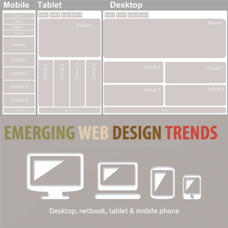
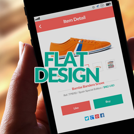
  • flat design
  • responsive design
  • less sliders
  • more user friendly navigation
  • more creative use of web fonts

These trends have actually appeared in most WordPress themes as common features in the last year or so. Even Forbes magazine, lists similar web design trends in an article that came out early this year. Although Forbes also adds “storytelling design” characterized by concise, compelling copy coupled with strong imagery as one of the significant web trends that will emerge in 2014. Guess what? A wonderful new WordPress plugin – Aesop Story Engine – in relation to the “storytelling” trend has already been generating a lot of interest lately.

For those who have been following the development path of the latest WordPress version that is to be released (April 16), there are several new features in WordPress 3.9 that could set off new “trends” in the web design world. WordPress 3.9 emphasizes more user friendly features and improved multimedia handling capabilities. A few of these significant features that are worth noting are listed below:

  • New features like live widget previews
  • a new theme installer
  • UI refinements when editing images and when working with media in the editor including the return of some of the advanced display settings for images.
  • audio and video playlists
  • new gallery support
  • The formatting function that turns straight quotes into smart quotes (among other things) underwent some changes to drastically speed it up.

More detailed features can be viewed on the WordPress core development website.

Having said all that, it is interesting to note that the thrust towards being more multimedia savvy while at the same time being more and more user friendly could be a significant WordPress feature that could set off a general web design trend. With WordPress gaining more and more influence over the whole internet population, it is possible that whatever developers, coders, designers, authors, etc. come up with to improve WordPress products and services could eventually be the standard that the web design community will use.

Who knows what WordPress will be like in the next 10 years. The innovations succeeding WordPress iterations will bring and the vast influence it will have in relation to the entire Internet population, mobile, tablet or what not together with the hardcore commitment of its core community will definitely create an impact on the way the world wide web looks and functions. Whatever it is, anything that goes on in WordPress is definitely going to be exciting and worth watching.


WordPress Design For A Global Market

Design is subjective. There are generally accepted design principles that govern the design community and serve as guides to evaluating “correct” design. However, not all of them are totally applicable to specific clients especially when Western taste buds meet Eastern culture. But when and where shall the ‘twain ever meet if beauty and design aesthetics are wrapped deeply in mores and culture?

This is the cross cultural challenge that web designers need to face in order to remain competitive in today’s global market place.

West, Meet East

Before the West was, the East was. Two of the world’s oldest civilizations, China and India, are also two of the fastest and most robust economies today. According to Census.gov, as of 2014, China and India ranked as the top two countries with the highest population in the world. China ranked first with 1.3B (population) with an approximate 42.3% Internet penetration, followed by India with 1.2B (population) with an approximate 81% Internet penetration. Approximately 1 billion internet users from these 2 (right to left, top-to-bottom reading) countries alone. And if theme developers do the math, even if at 1% of a billion internet users, that’s still a lot of WordPress themes right there. Too many to ignore.

Global Market Local User Design

We’ve talked about defining your target market and directing your business to reaching your specific demographic. Once you have that down pat, it’s probably time to think of expansion and consider widening your net a little further. To go a little more granular and target the local user.

With WordPress powering over 21% of the Internet and being one of the most user friendly and reliable CMS systems existing today, aside from the fact that it is free, more and more Internet users are looking to it as their platform of choice.

With that, the popularity of WordPress has crossed over into multi language markets despite having been around for only a decade and catering mainly to users of modern languages which are generally left to right in direction. Hence, the increase in demand for WordPress themes with RTL or WPML features or WP plugins that provide this functionality.

The diversity of WordPress users from all across the globe is becoming an important factor in developing themes that are relevant culturally and technically suited to these users local needs. As responsive once was a premium feature that has now become a standard feature in all WordPress themes, so shall the multi language and RTL feature become.

The Design Approach

The WordPress theme development marketplace has grown considerably with designers coming up with better and more user friendly designs that match the general needs of WordPress users. There is a huge pool of WordPress themes available for, generally, almost every type of website need out there. But there is still room to grow for more cross-cultural friendly options.

Below are some design elements that designers need to consider when creating themes that are responsive to culturally diverse user groups. (Notes culled from W3.org and Sitepoint.com)

  • Language
    – Languages don’t have a direction. Scripts have a writing direction, and so languages written in a particular script, will be written with the direction of that script. Languages can be written in more than one script.
  • Typography – fonts and characters
    – Typography can look “busier” to Western eyes than to Asian readers because many Asian scripts don’t have separate upper and lower cases. Some languages have scripts that are not alphabetic at all, but which express an idea rather than a sound. Occasionally, it’s necessary for an author to provide readers with pronunciation help for especially rare or awkward characters, usually with an alternative script in small writing above the ambiguous character.
  • Content presentation
  • Styling
  • Usability
  • Navigation
  • Mirror layout
  • Scripts (Left to Right, Right to Left, Top to Bottom)
    – Text direction is another thing that should not be confused with language. In some scripts, such as Arabic and Hebrew, displayed text is read predominantly from right to left, although within that flow, numbers and text from other scripts are displayed from left to right. Knowing the directionality of text, based on the script(s) to be used, is important to web designers and authors, because right-to-left text can be more complicated (for beginners) to work with and the organization and directionality of the page layout are affected. Therefore, knowing the writing direction can be relevant to estimating the work involved to create web pages in a new language.
  • Images and animations
  • Forms
    – Designing forms for an Asian market can have pitfalls for Western developers. For example, it’s common to require both given name and family name and give an error if both are not completed. Many Asian languages write names with family names first and given names afterwards while some have only one name. Also, do not limit the amount of characters in Address fields.
  • Mobile
  • Propriety
  • Color palettes
    – While choosing your colors for your design, keep in mind that certain colors have different connotations across cultures. For example, red is lucky for Chinese people. On the other hand, Thai people will be offended if you print their name in red — it’s the color that monks employ to write names on coffins, so to write someone’s name in red is to “wish them dead”.
  • Symbols and metaphors

For web designers, W3.org International’s tagline sums it up quite well: “Making the World Wide Web Worldwide.” Let’s!


WordPress Design and Development Trends 2014

What do you think WordPress has in store for the coming year?

Here are some of the ideas shared by key people in the WordPress community:

From Tomas Puig, WordCamp Chicago 2013:

  • Device fragmentation is driving the adoption of CMS technologies.
  • WordPress is going to be used as the backend to drive core business for small and large audiences
  • WordPress is the best system of record that is used by lots of people and is a pleasure to work with compared to other systems.
  • 30% of the Internet are familiar with WordPress. In the world of CMS’s, WordPress user acceptance is easy.
  • WordPress is democratizing the serving of content to native applications across all platforms. Not only is it a blogging platform alone but it is already being used and optimized as an application framework.

From Collis Ta’eed, CEO (Envato)

  • Flat has a long way to go yet, and so the main changes I think we’ll see in the next year are more fun, but faddish, trends like long shadows and the like. In similar fashion I think we’ll see some more depth, layering, graduations, and other visual distinctions making their way back in, but in a more refined and subtle way than the old days.
  • Incorporating motion in its various forms is another logical build on flat design. Everything is pointing to this becoming a major piece of interface design going forward.
  • WordPress will continue to dominate the open source CMS market. Its position feels unassailable thanks to a heady combination of usable software, massive community, and constantly improving product.
  • 2014 will see even more diversity in the tooling landscape from indie software development houses, SaaS companies, and the big A.

Currently powering over 21% of all websites – with 46 million downloads and thousands of WordPress themes built, bought and sold each day, the future of one of the most popular open source CMS’s existing today burns brighter than ever.


WordPress and Web Design Events 2013 – 2014

Keep yourself up to date with the latest trends and technology on WordPress and web design with these upcoming events and conferences. Plan your schedules and book early.

Event: Industry 2014 – An Event for Web Professionals
Date: 22 – 23 April 2014
Venue: Newcastle Upon Tyne, UK
Topic(s): Managing design in organisations, Metrics, Assumptions and Design, User Experience, CSS, Business, ‘Big Projects’, HTML/JS and Mobile Web and Web Performance

Event: Port80 Handheld Mashup
Date: 27 – 28 Nov 2013
Venue: Wales Millennium Centre, Cardiff, Wales
Topic(s): Big Ideas for Small Devices

Event: Port80 2014
Date: 16 May 2014
Venue: TBA
Topic(s): TBA

Event: 2014 SXS Interactive Festival Week
Date: 6 – 16 March 2013
Venue: Austin Convention Center, Austin, Texas
Topic(s): Health, privacy, hacking and design, nonprofits, fashion, space exploration and gaming — and everything in between

Event: The Business of Web Design
Date: 18 July 2014
Venue: Cardiff, Wales
Topic(s): Art of web design freelancing and running your own web design show

Event: Le Web’13 Paris
Date: 9 -12 December 2013
Venue: 50 Avenue du President Wilson 93200 La Plaine Saint Denis
Topic(s): Mobile, hardware, social, etc. and their potential trajectories, Technology

Event: International Conference on Intelligent User Interfaces
Date: 24 -27 February 2014
Venue: Haifa, Israel
Topic(s): Annual meeting of the intelligent interfaces community and serves as the principal international forum for reporting outstanding research and development on intelligent user interfaces

Event: The Next Web Europe 2014
Date: 24 – 25 April 2014
Venue: Amsterdam, Netherlands
Topic(s): Internet and Technology

Event: An Event Apart
Date: 9 – 11 December 2013
Venue: The Palace Hotel, San Francisco CA
Topic(s): Web design, typography, mobile web, CSS

Event: WebVisions NYC
Date: 3 – 4 April 2014
Venue: NYIT Auditorium on Broadway
Topic(s): Explore the Future of the Web

Event: New Media Expo 2014
Date: 4 – 6 January 2014
Venue: Rio All Suite Hotel, Las Vegas, Nevada
Topic(s): Blogging, Podcasting, Web TV & Video


Flat Design WordPress Themes You Can Flaunt

Design trends come & go. Some rise to the top like a shooting star and stay there with the rest of the stars while others burst like comets and fade into the night sky. One so called design “trend” that has actually been around for the longest time has been getting much attention only recently. In fact, even Apple has finally embraced it and has incorporated it in their latest iteration of the iOs. Say hello to the flat design. And it has found its way in many of the newest WordPress themes being released. Here are some examples of WordPress themes that have gone “flat”. Check these out.

Nova Flat & Clean Responsive Theme

If you are looking for a WordPress theme that can be used for multipurpose applications and for diverse types of websites, check out Nova Premium WordPress Theme, a clean, flat design multipurpose premium theme that will surely amaze you. It’s got a sample content importer, 14 homepage options, 9 premium sliders, unlimited header options, a page builder, fluid layout, a skin manager, and a short code editor just to name a few. The flat graphics are integrated nicely and they add to the overall professional look of the theme.

Showy Bold and Flat Portfolio

Impress your clients with this ultra minimalist, boldly simple, flat design WordPress portfolio theme, Showy. Design agencies, creative professionals, and freelance artists will love the simple, uncluttered look of this premium theme that will surely put their creative work in the spotlight. Less is more, indeed. And if it’s a portfolio showcase you want, you have everything you actually really need in this excellent theme.

Flat Responsive Portfolio Theme

If your’re looking for a fresh new way to present your portfolio in step with the latest flat design trend, Flat Premium WordPress Theme is worth a peek. The horizontal scrolling action gives visitors the feeling that they are going through a glossy high end design magazine. You get a choice of 2 homepage options, flat design interactive social media buttons, AJAX pagination for quicker load time, collapsible side menu, tons of other features, plus it is retina ready (great for images) with an optional retina logo upload field feature.

Revusion Flat Corporate Theme

Revusion Premium WordPress Theme is a flat responsive, modern and very professional looking corporate theme packed with features for today’s modern business. Revusion integrates Pixeden flat icons into its design as inspired by the current flat design UI trend. This premium theme gives you several different layout options via its page templates. You can choose to add a testimonial page, a team page, a services page, an FAQ page, a gallery page, aside from the usual blog, portfolio, and contact pages to ensure you can pick exactly what you want to add to your site. This retina display ready theme also comes with the Slider Revolution Responsive WordPress Plugin.

Sistina Flat Multipurpose Shop Theme

Sistina Premium WordPress Theme is a clean and modern WooCommerce theme, designed with a fresh flat style and with a great responsive and retina-ready design. The cool flat graphic elements, modern typography, and streamlined layout give this theme that modern flair that will appeal to today’s modern shopper. This WordPress theme includes several premium features like the Wishlist and the Compare Products features, the Product Enquiry form (for catalog use sans the shopping cart), the Ajax layered filter, and also a Popup plugin to show offers and news.


35 Different Educational Website Designs for Inspiration

Educational Institutions and Universities need attractive websites to attract new students and serve exceeding students. Educational websites have lot of information to show, they need to provide details of admissions, syllabus, results, information of a student. So these types of websites need good designers to be worked on as UI is very important to make it reader friendly.

(more…)


M-Commerce – The Mobile Market, Web Design and Conversion

The unstoppable invasion of mobile computing and how it has woven itself into our daily routines is undeniable. A life without the Internet, free WiFi, and our handheld devices is almost unimaginable and web designers have heard and heeded this lifestyle change, hence, the birth of responsive, fluid, and liquid design trends. Mashable has even named 2013 “The Year of Responsive Design”. However, we are still in the early stages of understanding this mobile demographic to yet see tangible and consistent conversion results from the marriage of Mobile Commerce (M-Commerce) and Web Design for handheld and mobile devices. Responsive design does not necessarily equate to actual conversion, whether in sales, subscriptions, or networking.

According to a report by Litmus.com,

“More email is read Mobile than on a desktop email client or via webmail. Stats say 36% of email is now opened on a mobile device, with 33% for desktop and 31% for webmail.” – Litmus –”Has your audience gone Mobile” (June 2012)

As of September 2012:

We’ve seen some major changes in mobile email opens in the past year and a half. As of September 2012, 38% of all opens were on a mobile device, compared to only 17% eighteen months ago—that’s a 123% increase in mobile opens!

Diving deeper into specific mobile operating systems, the majority of these opens are being made on iOS (iPhone and iPad – 80.34%) and Android (18. 93%) devices:

The next question is, Does Mobile Traffic Convert into Leads?

Not necessarily so. There are several factors that lead to actual traffic conversion and there is no hard and fast rule on it but website owners can make educated guesses based on actual data and stat results gathered from their own website traffic trends.

Three ways to reach your target mobile traffic:

Run a native mobile app

  • Needs to be downloaded by the user
  • Restricted amount of content and functionality

A mobile website or M-Dot (a dedicated scaled down mobile version of the main website)

  • Advantage – faster loading time and optimization
  • Disadvantage – two bodies of content to manage

Responsive web design

  • Uses responsive, fluid, liquid layouts, media queries, and flexible images to adapt to various devices and resolutions
  • More future friendly
  • One body of content to manage
  • Consistent brand experience
  • Social media friendly

Among all three, responsive web design appears to be the most feasible way of reaching your target market. But is responsive web design enough to address the problem of conversion?

Here are some strategies to consider to maximize your web design and marketing optimization efforts to improve your conversion rates on your website:

Create a mobile optimized landing page

  • Make sure that your landing page is displayed properly on all screen sizes (portrait and landscape)
  • The need for speed – achieve fast loading time (5 seconds or less) by using optimized media content (images, video, and audio) and scripts.
  • User friendly – Prospects don’t have to type anything just click a button. If possible, must be clickable by the thumb.
  • Content must be simple, readable and easily navigable. Call to action buttons must be prominently but strategically located.

Create a mobile optimized order form

  • Redirect users from the landing page to your mobile optimized order form.
  • Form fields should be easy to read and fill out on any mobile device. Longer forms lead to boredom and lower conversion rates.
  • Remove all sidebar content so the form fits perfectly on the viewable window of the mobile device

Create several versions of your landing pages and order forms and test which ones convert the most. Improving User Experience and establishing a User Friendly Interface all contribute to an enjoyable browsing experience for your mobile visitors which will eventually boost your conversion results.


Web Design Tools for WordPress 2013

Learning is a never-ending journey. There’s always room to grow, things to improve, and ways to make things better, more efficient, and more effective. Here are some (premium and free) web design tools that can help WordPress authors and developers reduce work time, increase productivity and improve work quality:

Sail.js (Free)

Sails.js makes it easy to build custom, enterprise-grade Node.js apps. It is designed to resemble the MVC architecture from frameworks like Ruby on Rails, but with support for the more modern, data-oriented style of web app development. It’s especially good for building real time features like chat, it automatically builds a RESTful JSON API, and it supports HTTP and WebSockets. The Sails framework was developed by Mike McNeil with the support of Balderdash.

Backbone.js (Free)

Backbone.js gives structure to web applications by providing models with key-value binding and custom events, collections with a rich API of enumerable functions,views with declarative event handling, and connects it all to your existing API over a RESTful JSON interface.

Extra Strength Responsive Grids (Free)

Extra Strength Responsive Grids are percentage-based, for smooth, non-snappy width adjustments that enable you to take total control of your layout. ESRG deploys meaningful class names such as grid-half and grid-quarter to make life easier. ESRG is also SASS-enabled.

Easel Design without a Designer (From Free – $99 Subscription)

Easel is an in-browser, high-fidelity web design tool that lets you mockup, share and implement your ideas with ease. This WYSIWYG web design tool aims to make web design and development easier for teams who want to quickly get their ideas online without having to hire a designer. The app is a great resource for people who don’t have any coding experience but know what they want visually.

Responsive Nav (Free)

Responsive Nav is a tiny JavaScript plugin which weighs only 1.7 KB minified and Gzip’ed, and helps you to create a toggled navigation for small screens. It uses touch events and CSS3 transitions for the best possible performance. It also contains a “clever” workaround that makes it possible to transition from height: 0 to height: auto, which isn’t normally possible with CSS3 transitions.


Free Designer Resources for your WordPress Theme: Icon Sets

Sometimes all it takes to add the finishing touch to a drab design is choosing the right design element. There are numerous resources available online but sometimes it gets too overwhelming to search for them. We’ve found a few design resources that you might be able to incorporate into your WordPress theme design:

Free Outline Icons from Vandelay

these minimalist, outline style icons designed by Grandiz for Vandelay Designs will go well with Swiss-style, white spaced WordPress themes.

Free Brands Icons from Smashing Magazine

Smashing Magazine is giving away Simple Icons by Dan Leech. This set contains 100 white icons that have transparent backgrounds and can be used for popular websites, apps and organisations.

Free WordPress Post Type Icons from Fribly

Add some style to your custom posts with these sticker type icons. Icons are transparent and in png format. They include: status, link, quote, video, audio, image, gallery and aside. May be used for both personal and commercial projects.

Social Media Icons from Harkable

These sharp and sleek social media icons will add polish to any WordPress theme. Add that extra wow to your website using these icons. (PSD and PNG format)

Clean and Colorful Social Media Icons for 2013 from Mascot Agency

These simple yet vibrantly colored icons have that Windows 8 graphic quality about them. More icons are included in the actual download.

Icons are a great way to add a signature look to your website when done the right way. Enjoy these free resources to add that signature look to your site.