Effective WordPress End User Documentation
WordPress theme developers and authors who sell their WordPress themes to non-WordPress professionals will always run the risk of customers coming back to them seeking support for theme installation, setup or some other bug or issue. Attending to one or two or maybe even four customers requiring support poses no problem and is actually still quite manageable. However, the downside of a popularly selling WordPress theme is how to provide support to, let’s say, more than a hundred or even thousands of buyers who have very little WordPress knowhow. The only thing that can bridge the gap between the buyer and the WordPress author’s brains is the documentation or the instruction manual included in the theme package. The lack of or a poorly written end user documentation can spell disaster for the author in terms of after sales support.

There are many challenges that should be anticipated while developing a theme’s documentation. The most common reason why problems crop up is, to put it bluntly, people don’t actually bother to read the documentation. How many times have you bought a gadget, took it out of the box, fiddled with it first, and only bothered to look at the instruction manual when you couldn’t get it to work? Guilty? Don’t worry, your theme buyers probably did the same thing too.

The problem if this happens all the time is that authors and developers will be spending more time attending to support issues instead of creating more new themes. That is why there is a need to be able to provide buyers and theme users sufficient information to be able to handle simple troubleshooting on their own. Even if they are WordPress beginners.

What is efficient and sufficient theme documentation?

People receive and absorb information in different ways. Some people comprehend easily when there are lots of pictures, screenshots, or visual aids. They are what we call visual learners. On the other hand, there are people who can comprehend easily by simply listening to audio instructions. They are auditory learners. On the other hand, some people work better if instructions are in bullet format or checklists instead of long paragraphs, while other people who find lists and text heavy instructions boring need manipulatives or something tactile to make the concepts become real to them.

Knowing that theme buyers can fall into any of those types of learners should help authors in developing the appropriate documentation format that will satisfy the needs of.

The purpose of providing customers, especially WordPress beginners, with detailed documentation is to assist them and guide them as if you, the author, were actually there holding them by the hand through each step. This might sound too laborious on the part of the author but can you imagine all the time you would save from answering basic installation or setup questions if these challenges have already been addressed and comprehended in the documentation right from the beginning?

Documentation and Tutorial Formats for Every Type of Learner

Perhaps providing WordPress theme buyers with documentation and tutorial options that matches their learning style will encourage them to dig more into the documentation instead of seeking theme support straight away. Providing audio or podcast instructions for the auditory learner; screenshots, images or video for the visual learner; written or text format instructions for the list learner; and perhaps activity-based instructions for the kinesthetic or tactile learner; all in simple and easy to understand, and easy to follow instructions. This will free the author or developer to focus his efforts on improving the theme rather than spending time answering basic support questions.


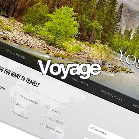
Voyage: Travel WordPress Theme 2013

We all love an adventure. Who doesn’t dream of traveling or going on that dream vacation? According to the Global Online Travel Report for 2012, some of the key findings and statistics featured in their report listed below are:

  • The trend of booking trips online is expected to grow further in 2012, especially in emerging markets such as China, India and Brazil.
  • In 2012, the “Online Travel Segment” is forecast to represent almost a third of the total global travel market value.
  • Online travel sales in the US are forecasted to increase by more than +10% in 2012 compared to 2011.
  • The UK is projected to remain the largest share of Europe’s online travel market in 2013, followed by Germany and France.
  • Gross bookings on the Asia Pacific online leisure/ unmanaged business travel market are expected to increase by more than +30% in 2012 compared to 2010.

Meanwhile, according to US Travel.org,

Activities with the greatest level of interest among U.S. adults are, in order, visiting friends and relatives, sightseeing, beaches/waterfronts, visiting zoos/aquariums/science museums, national parks, visiting a state park, going on a cruise, theme parks, visiting a city and visiting a mountain area. Interest in the engaging in the activities varies by generation, household income, gender and most other demographic characteristics of leisure travelers.”

Based on these statistics and findings, barring local and international security issues and safety, people WILL travel. Perhaps it is also safe to say that the travel industry, at present, is definitely a viable industry. It may be also safe to say that the internet has contributed a great part to making travel reachable and accessible to a lot of people all around the globe. Access to online airline e-ticketing, booking and reservations, destination packages, hotel reviews and ratings have made people bolder in making travel decisions. Even if only a fraction of the 7 billion world population have the means to travel, travel agencies have not fully saturated this market. So, if you are considering putting up your own online travel agency, this is great news. The next step is to setup your own website and what better way to do it than through WordPress and with a theme that’s specifically tailored for travel agencies.

Voyage Travel WordPress Theme is a gorgeous feature packed premium WordPress theme built for this specific niche. The responsive theme’s highlights include an extremely powerful search and filter option that clients can use to find the travel package of their choice. The theme also includes lots of pages for showcasing a variety of holidays, special prices and latest promos, packages according to destinations, and a whole lot more. It also comes bundled with a Blog and Contact Page and tons of shortcodes you can use to customize or tweak the theme according to your needs. A lot of these powerful functionalities are based on one of Themefuse’s best and most complex theme, Homequest. Another great thing about Voyage is that you can actually play with it for 14 days, using Themefuse’s test labs feature, before you decide to purchase.

Features:

  • Responsive
  • One click auto install
  • Best for a travel agency website
  • Powerful search and filter options
  • Dynamic Sidebar Widget Creation
  • jQuery Image / Video Light box

Voyage Premium WordPress Theme includes video tutorials, theme documentation, and access to an AfterCare Forum for theme issues, questions, and support.

Voyage: $49 | Demo & Download

Secure Your Interwebs With Sucuri

Malware infestations, blacklistings, Google warnings, malicious software, infected domain, suspicious activity, phishing – not exactly the landing page you want to welcome your visitors with, right? But if you have experienced the dreaded Google warning splash page (just like the dreaded blue screen), it is a cause for concern.

Hackings and other website attacks are becoming more prevalent nowadays. Not that they weren’t before but these malicious activities never went away either. They’ve just become a little bit more sophisticated than before. Government websites, large hosting websites and the more popular and well-known websites seem to be a favorite target but the truth is – no website is immune from these attacks. It is projected that the total number of websites in 2013 will reach 1 Billion and 2 Billion in 2015. (source: toni.org) That’s a lot of www candidates right there. Of course, you can reason away that your website is totally insignificant compared to the 999 million other websites that can be targeted by a malicious attack. On the other hand, yours might just be THE one. Hopefully not.

The impact of a website attack can be devastating especially if it is an eCommerce or a highly monetized site. Not only do you lose a lot in terms of time, lost data, missed sales opportunities and potential business income due to messed up systems and lost traffic, these attacks also affect your site’s credibility and reliability which are the most important currencies any business can have online. Once the public becomes aware of the attack, caution sets in and transactions become paralyzed. The possibility of being blocked or blacklisted becomes a total nightmare. The website owner is now faced with an unnecessary battle of perceptions that could have been prevented in the first place. How can this battle be prevented and how can you, the website owner, protect your peace of mind from potential attacks?

Sucuri Security is a company that offers a security service that detects unauthorized changes to network (cloud) assets, including web sites, DNS, Whois records, SSL certificates and others. It is also heavily used as an early warning system to detect Malware, Spam and other security issues on web sites and DNS hijacking. Sucuri shot into the limelight when GoDaddy hosted sites were attacked and exploited. They were the company that conducted the cleanup operations for them. Sucuri is not a malware protection software to be installed on your site. The company provides a monitoring service to protect your website from any malware, threats of intrusion, infections, and the like. This extra layer of protection is an assurance for both you and your clients or customers that any information exchanged on your website will not be compromised.

You can get a free analysis for your website from Sucuri. Just visit their website and have your website checked anytime. They also have a free plugin that can be downloaded from the WordPress plugins page. This plugin is free but works best in tandem with their security service packages. To learn more about these service packages, check out their website to see which one matches your requirements. The investment you make today to secure your website can save you so much headache in the future.

Visit Sucuri.net to get your free analysis. Download the free plugin from WordPress.

Get Sucuri Now!

25 Basic Adobe Lightroom Tutorials for Learners

The phrase “photo editing” has become synonymous with “Adobe Photoshop”. Photoshop is the industry leader when it comes to editing images. But one drawback of Photoshop is that a designer needs a good amount of coaching before he can use Photoshop properly. A coaching center near my house promises to teach Photoshop in 2 months to the layman. Not everybody will be willing to invest two months to learn a photo editing software, especially when one does not intend to choose photo designing as a career.

Understanding this problem, Adobe has designed another software named Adobe Lightroom to help even the general public to easily edit images. To quote Adobe’s website – “Lightroom includes all the tools you need for most digital photography tasks in one intuitive solution. Lightroom helps photographers work faster and more efficiently with one image, a set of images, or a large image library.”

When I stated that Lightroom can be used for the general public I don’t mean that one can begin using it merely after installing it. Obviously you need to have some guidance to use the software properly. Therefore, in this blog post, I have collected a list of 25 excellent tutorials on how to use Lightroom properly and get desired results.

(more…)


Responsive Web Design (RWD) vs Adaptive Web Design (AWD)

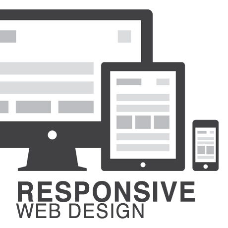
We’ve heard the terms Fluid, Adaptive, and Responsive used interchangeably when describing a theme’s ability to resize according to browser specs or device (mobile or not) size. Are they really different from one another or are they referring to the same characteristics found in themes described as such?

What is Responsive Web Design (RWD)? Responsive Layout?

Let’s take a closer look.

Responsive web design (often abbreviated to RWD) is an approach to web design in which a site is crafted to provide an optimal viewing experience—easy reading and navigation with a minimum of resizing, panning, and scrolling—across a wide range of devices (from desktop computer monitors to mobile phones) – Wikipedia

Responsive design is the methodology behind making a website respond to whatever platform you are viewing it on regardless of resolution and orientation. It may change how certain elements display but it will not remove elements or change the core functionality of their behaviours. Responsive design uses a fluid grid and it is usually possible entirely through HTML and CSS, without the need for DOM (Document Object Model) manipulation. – Matthew Freeman

According to Ethan Marcotte, The 3 Elements of Responsive Web Design are:

A flexible, grid-based layout – A layout based on proportions rather than absolutes; uses a flexible grid, which in turn ensures that a website can scale to a browser’s full width.

Flexible images and media – Layouts based on percentages resize gracefully according to the size of the browser window rendering them. However, it is problematic to ensure that the content within a site resizes.
Images and media should scale with the flexible grid; images that work in a flexible context, whether fluid themselves or perhaps controlled through overflow mechanisms. CSS addresses this problem with its max-width property

Media queries – Content based breakpoints; optimize the design for different viewing contexts and spot-fix bugs that occur at different resolution ranges. CSS3’s media queries directly address these usability problems by allowing browsers to serve different styles for different viewing contexts. CSS3 greatly expands support for media queries, adding the ability to target media features such as screen and device width and orientation.

These 3 elements of Responsive Web Design find their way into 3 different types of Responsive (RWD) Layouts:

The Basic Fluid Lay­out
Con­tent con­tin­u­ally flows or adjusts in a word-wrap fash­ion as screen width is increased or reduced. There are no “dis­tinct” dif­fer­ences in con­tent pre­sen­ta­tion. Fluid layouts are dynamic and user sensitive – adapting to the available real estate on the user interface and providing increased content accessibility.

The Adap­tive Lay­out
There are pre­de­fined sizes were dif­fer­ent lay­outs are trig­gered. These are called breakpoints. Typ­i­cally there are three or four break­points to accom­mo­date desk­top, tablet and mobile screen sizes.

The Respon­sive Lay­out
This is a hybrid of Basic Fluid Lay­out and Adap­tive Lay­out. There are pre­de­fined break points, how­ever in between these breakpoints con­tent will flow to expand or con­tract.

According to his article for the Adobe Blog, Carl Sandquist states that:

“Cur­rently, most RWD web sites use Respon­sive Lay­out since it offers a best-of-both-world expe­ri­ence. Con­tent snaps into the appro­pri­ate approx­i­mate posi­tion for a device type (e.g. Tablet) and then fine-tuned adjust­ments are made for the exact screen size on a par­tic­u­lar device.”

What is Adaptive Design (AWD)? Adaptive Layout?

“Adaptive design is the manipulation of layouts to best perform on certain screen resolutions inclusive of elemental removal or behaviour changing techniques. Adaptive design usually requires Javascript to efficiently manipulate the DOM. Javascript can be avoided if you plan on having duplicate on-page elements and then show or hide them based on screen sizes, this might be appropriate for smaller elements but not whole columns or navigation elements.” – Matthew Freeman

“This technique adapts what is displayed depending on the capabilities of the device being used, as well as the screen size. It centres on the context of the user, so even when the same content is used, it is adapted (with some or even all of the design elements changing), depending on whether the user is using a mouse and keyboard or touch screen. AWD also uses different layouts for tablets and mobiles with certain. ‘Responsive’ elements built in to reduce the number of different templates required. AWD can be taken to further extremes with content being completely repackaged and reworded, while images and video are either reworked or completely removed.” – Danny Bluestone

According to Aaron Gustafson, author of Adaptive Web Design, Crafting Rich Experiences with Progressive Enhancement:

“Progressive enhancement isn’t about browsers. It’s about crafting experiences that serve your users by giving them access to content without technological restrictions. Progressive enhancement doesn’t require that you provide the same experience in different browsers, nor does it preclude you from using the latest and greatest technologies; it simply asks that you honor your content (and your users) by applying technologies in an intelligent way, layer-upon-layer, to craft an amazing experience.

He encourages designers to: Think of the user, not the browser.”

Which one is better?

A better understanding of the differences between Responsive Web Design and Adaptive Web Design is a starting point to deciding which solution will work well for you, or your clients, if you are a WordPress professional. Knowing what solutions are available and having the ability to distinguish and implement whichever design approach best meets the specifications of the end user is an important element. Of course, nothing is carved in stone. Future designs may be a combination or a hybrid of both – employing the best features of each one. The goal is to ensure that the user experience at the point of searching and eventually finding your website is the best experience they get at that particular moment – fully hoping that it will be the first of many more visits and not their last.


Black Friday & Cyber Monday WordPress Deals 2012

WordPress: Black Friday & Cyber Monday deals 2012

We like to keep our pulse on the latest and greatest in the world of WordPress, and we wanted to bring you a list of some of the biggest and best WordPress deals for Black Friday and Cyber Monday 2012.

Bluehost: You can join Bluehost hosting at the bargain basement price of $3.95/month starting Friday November 23, 2012 – Monday November 26, 2012. Get the Bluehost Promo here.

HostGator: Get 50% off your hosting order on Black Friday and Cyber Monday. This includes shared, VPS, and even dedicated accounts. Get domains for $1.95 (this is the lowest price HostGator has ever had on domains). Get the HostGator Promo here.

Themify: Starting now until November 26th, 2012, you can use the coupon code BLACKFRIDAY to get 40% off on all of our Themify WordPress Themes including the Club membership! This is a great opportunity to join their developer club at a fantastic price. You can get all 33 themes (Photoshop mockup files included) for just $53.40 (normally $89). That is $1.62 per theme! If you are an existing member, this is a good time to buy more themes or upgrade to the Club membership. Get the Themify Promo here.

ManageWP: Subscribe to a premium subscription and you’ll receive a 30% life-time discount for any ManageWP package or configuration, which will remain active for as long as you remain a customer, even if you upgrade or downgrade in the future! Get the ManageWP Promo here.

Theme Junkie: This year, Theme Junkie is offering a promo code that allows you to get 40% off with the promo code BLACK. This brings the lifetime membership to $119.40, the 1-year membership to $41.40, the 6-month membership to $29.40, and the single purchase (which lets you get 3 Themes for the price of 1) to $23.40. Get the Theme Junkie Promo here.

Obox-Design: Obox has put together two bundles for the Black Friday/Cyber Monday promotion this year. The Classic Bundle gives you 4 overhauled classic Themes + 1 Plugin for just $25. The Super Premium Bundle gives you 6 amazing Premium Themes + 2 Plugins for $50 (an incredible savings of $610). Get the Obox Design Promo here.

Solostream: Get 20% off your Solostream purchase with promo code: 5084BE. The promotion is valid through Monday November 26, 2012. Get the Solostream Promo here.


WooThemes: The Reboot

Just this month, WooThemes introduced a club revamp and implemented new tiered licensing and support packages. Previously you could purchase one theme for $70. With it you get 2 bonus themes plus lifetime support. Now, with the new tiered licensing scheme, WooThemes introduces 3 more packages in addition to its Standard Package offering: the Developer Theme Package, the Standard Club Package, and the Developer Club Package.

Standard Package – $70

WooThemes retains this package everyone has gotten used to. You still get the theme you want with unlimited domain usage plus two other themes of your choice. Previously, however, you got lifetime support for your purchased theme while in the new scheme only 1 year of support is included. WooThemes has explained that revenues gotten from the initial purchase 3 years ago will not sustain the support services obtained during the lifetime of the product. Users have the option to purchase lifetime support service for an additional $30. This package does not include PSD files.

Developer Package – $150

This package is similar to the Standard package. You get unlimited domain usage for the theme you purchased plus 3 other themes. The Developer package includes PSD files for additional customization capabilities. Service is likewise for 1 year with the option for lifetime support for an additional $30.

Standard Club Package – $20 per month + $125 start-up fee

This package gives you access to all 82 themes in the WooThemes inventory with unlimited domain uses as well as an additional of at least 1 theme a month. It gives you access to support services as long as membership is current. This package does not include access to PSD files.

Developer Club Package – $25 per month + $200 start-up fee

This package also gives you access to all 82 themes in the WooThemes inventory with unlimited domain uses as well as an additional of at least 1 theme a month. PSD files are included with this package. Support access available as long as membership is current.

Similarly extensions of the popular WooCommerce plugin are now under a tiered licensing scheme. You can purchase single site use, usage for up to 5 sites or unlimited site usage.

While a lot of folks have accepted the changes in WooThemes some have expressed dissatisfaction with the new setup. One user stated that from his point of view WooThemes jacked the prices up and lowered the support quality. Another user lamented the shutting down of support forums as support is not email based in response to the new system. The majority of users, however, still think WooThemes needs to do what is necessary to sustain its business in response to the growth the WordPress industry.

Sometimes, in order for businesses to survive in an ever evolving business environment, changes have to be undertaken to ensure the viability and profitability of such. Otherwise, to remain in business without profitability is a futile endeavor. Any change, especially in businesses, does not happen at a whim. Surely, the people behind WooThemes have put in the thought process before they arrived at their new scheme. The tricky part is in the area of providing support and for how long. Unless there is a guarantee that every theme that comes out of WooThemes is fail-proof (all things remaining constant) up to a certain point, no matter how many updates and plugins come out, – people will still expect to receive support. And if they don’t they will simply switch providers. It’s as simple as that.

See the WooThemes Reboot

When Is The Best Time To Sell WordPress Themes?

Like any other product, the demand for WordPress themes does have seasonality. In our observation, theme sales do well from January to March then slows down from April to May. Summer months are usually slow while sales pick up in the fall with a dip around Christmas time.

Seasonality in any product or service is determined mainly by socio-cultural factors in the marketplace. In most markets around the world, economic activity is dependent on holidays or the absence or presence of school. There is also the aspect of climate, where people tend to stay indoors more during the cold months.

In the case of theme sales, it can be said that this phenomenon is mainly driven by the level of activity a person has during a season. Great sales during the first quarter of the year may be attributed to more free time for buyers to stay online as the kids are still in school and most folks prefer to stay indoors during winter. This means people have more time to tinker with their websites during this time and spotting opportunities for improvement or change could mean upgrading to a newer WordPress theme or buying and installing a new plugin. The spring slowdown correlates to the physical activities associated with this season: spring cleaning, gardening, putting away winter stuff, etc. Sometimes the lure of the outdoors is greater than staying inside the house, what with the weather becoming more pleasant and warmer. When summer kicks in and as the kids are out of school, that’s when all the vacations, trips and out of town activities happen. People tend to relax a bit more and work on websites take a back burner during this time. As kids go back to school in the fall, sales gradually picks up as people find more time to focus on work before the next big holidays, like Thanksgiving and Christmas, roll in. Spending patterns during Thanksgiving and Christmas usually turn towards gifts, gadgets, and other stuff to buy online unless WordPress authors take their cue from the season and create enticing special prices for WordPress theme packages or bundles.

Knowing these patterns, how do you align development and marketing activities for your themes? It would be wise to have your development activities lie heavily during the spring and summer months. That way, your resources do not have to compete with the demands of development and marketing at the same time. The best time to strengthen core technology, respond to emerging design trends, is during these lean months. As fall comes, resources can be shifted to marketing and after sales support as sales starts picking up. This is the right time to introduce new products and manage customer satisfaction as they adapt to your new themes.

Recognizing these consumer patterns may help you plan your annual business cycle as you make those critical decisions to save time, effort and money in your WordPress business.