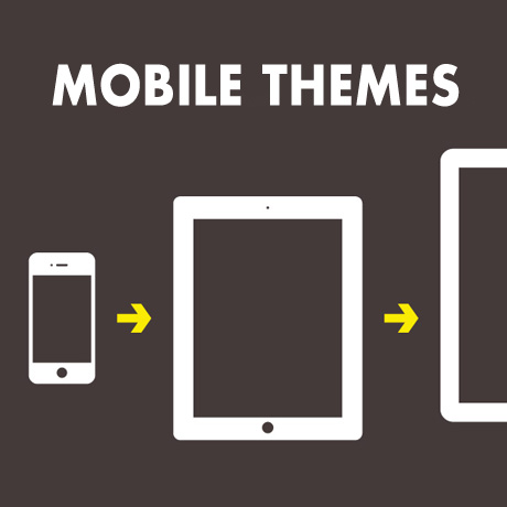
WordPress Themes for Mobile and Tablet

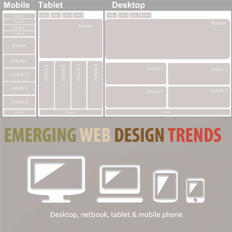
Majority if not all of the recent WordPress theme releases have included responsive design as a staple feature. This ensures that these themes will display well on mobile and handheld devices. Below is a list of WordPress themes that have been created and designed primarily for mobile and handheld devices. These themes are meant to cater to a mobile audience but some of them can also function quite well even on desktop browsers.

Here’s a roundup of the latest WordPress themes for mobile and tablet:

Provocateur°

Provocateur° is a cool and interesting theme built using jQuery Mobile, HTML5 and CSS3, especially for mobile phones and particularly optimized for Apple devices. Main features include a portfolio, a blog, a customizable main page, custom menus and widgets, shortcodes (accordion, portfolio, contact form, tags, YouTube), and even a QR-code sharing option. This theme has a unique slide down menu, email and social networking sharing (twitter & facebook) options, and a changing flip animation.

Touch

Touch is a “lighter than air” WordPress theme that shows power can be packed in a light mobile theme. You get a straightforward blog, an optional static front page, a touch gesture-enabled gallery, a portfolio, a unique comment form along with a validation-enabled contact form, plus sliders, short codes etc. all in one neat, little package. This theme has been thoroughly tested on iOS, Android, Windows Phone, including desktop browsers.

Brave

Brave is an elegant and feature- rich dark theme created for mobile devices. This awesome theme has everything your desktop theme offers and can be used alongside your desktop site. it is ready for localization, can ‘install as web app’ on iOS, contains a beautifully unique menu, comes with comment/contact forms, has a touch/swipe enabled gallery, comes with multiple color schemes, and a variety of extremely customizable short codes to design the mobile website you need.

Resans

Resans is a highly advanced WordPress theme for creatives designed especially for tablets and mobile devices. On larger devices, Resans presents posts on a 4 column grid (Masonry style). As display sizes shrink, the number of columns reduce until a lone column is displayed mobile-style. Resans supports several features such as swipe gestures, responsive layout, 5 page afterload animations, animated loading of new pages, unlimited colors for fonts and backgrounds (header, footer, content, menu), and so much more. Resans can be used alongside with your desktop template and can be set up using Resans AP.

Hero

Hero is a super clean, feature packed WordPress theme built for websites with lot of mobile following. This theme has the power of a regular desktop theme adapted to the smaller devices. Hero gives you impressive blog and portfolio pages similar to a regular desktop version in a more compact form to encourage interaction from your mobile visitors. Theme features include: provisions for two different slider plugins, tons of shortcodes, 9 post formats (Aside, Quote, Image, Video, Audio, Gallery, Status, Link, Chat), translation ready, “install as web app” functionality, and so much more.

Spartan

Spartan is a fully featured WordPress theme for mobile devices created with the goal of being flexible enough to adapt to any and all types of WordPress sites and yet still function as a stand alone theme. One of the many cool features tucked into this theme is the menu that goes beyond just listing a number of links in predetermined styles. This feature allows you to build and color a unique navigation system of your choice. Other cool features include: the comment button that also serves as a visual indicator (grayed out when comments for a given post are disabled, or shaking itself ever so gently to remind the user to read and leave comments when comments are enabled), and also the amount of customization available via shortcodes.


WordPress-Friendly Ghost Themes

Ghost started out as a Kickstarter project by John Nolan with the goal of creating

… a blogging platform with all the open source benefits of WordPress, but simpler in every way, and just focused on publishing. Ghost is unique in its philosophy of focusing entirely on publishing. Everything about the administrative system is designed around making writing simple and pleasurable. Everything about the theme system has been created to facilitate personal blog, magazine, and news themes.

The biggest difference between Ghost and other platforms from a technological point of view is that it’s built entirely in JavaScript. A modern technology stack means that Ghost can push the boundaries of what’s possible with the web. You can install and run a blog on a 16MB USB stick, a Raspberry Pi, or a high powered Virtual Private Server.

Although this new ecosystem is fairly new compared to WordPress and may not appeal to everyone’s liking, there have been several beautiful and interesting themes that have been released with a WordPress version counterpart. Here are a few of these Ghost-inspired WordPress themes that you can check out.

CASPER

Casper WP theme, is essentially a port of the gorgeous default theme from the Ghost blogging platform built using Underscores as a base. It is a clean, minimalist, and lightweight theme that’s designed to highlight content without the unnecessary frills. Author, Lacy Morrow, gives a short demonstration of the theme’s features with a blog post that was written in Markdown (the language used by Ghost)and uses the Jetpack Markdown plugin for parsing. Other WordPress features are also integrated into the theme.

RAIN

RAIN is one of the best selling Ghost themes on ThemeForest and also has a responsive WordPress theme counterpart. This minimalist WordPress “Ghost” theme has a background that is 100% dynamic where you can imply upload your own photo and it also includes audio files in the package free of charge. This theme is designed primarily for writers.

ASTRO

Astro is a content focused responsive theme, originally a Ghost designed theme, built for the WordPress platform. Designed from the bottom up to be high performance, user friendly, and accessible on all devices. Astro adapts to the users viewport, so it looks great on smartphones, tablets, TVs, and even the latest 4K monitors. Astro includes two different post styles. The standard style is designed for update posts and short articles. The featured style includes full title images, suited towards larger articles, tutorials and other documentation.


Best WordPress Themes 2021

UPDATED April 12, 2021: 2021 is sure to be another great year for WordPress Theme development. Like the millions and millions of people using WordPress, we eagerly await the Themes and Plugins to be released this year, and you can …


What Features Do Most Commercial WordPress Themes Have in Common?

WordPress users enjoy many benefits not necessarily available in other content management systems. The plethora of high quality WordPress themes that users can choose from is more than enough to dress up any website. Whatever type of website you plan to put up, most likely, there is a WordPress theme for it. Here are some of the most common features present in some of the most popular WordPress themes in the market today.

A Great Slider

An effective theme must help create a steady following for your site. It must be able to captivate casual visitors and convert theme into followers that eventually become clients and customers. A slideshow is a great tool that can deliver quick, dramatic visual impact combining the use of images with taglines, spiels, or memes to hook visitor interest. This billboard-like effect gives casual visitors something to spark their curiosity and encourage them to examine and explore your site further. The short attention span this generation has, a slider is an indispensable feature for any website. Popular plugins like Slider Revolution, Layer Slider, Nivo Slider, and Flexslider make the job a whole lot easier.

Parallax and Animation

Once you’ve gotten the attention of visitors, the challenge shifts towards keeping their interest. Perhaps you’ve attended lectures were you came in with excitement about what you could learn only to be disappointed by a boring, uncharismatic instructor whose droning voice put you to sleep. This is analogous to going through great content in boring or even hard to read content. This actually narrows your followers to those who are actually already sold to your content. If your goal is to convert more people to your product or service, the presentation of your content has to facilitate easy reading and assimilation of information. Corporate presentations are often more effective when stats are represented as animated charts and bullets. These actually help executives focus on the items that need to be considered. Having animated bullets and content sections also give focus on items you want your visitors to remember.

Flexible Layout with Drag and Drop Capability

Presenting your content is important in developing your following. While animation helps your audience focus on key points of your content, a sound content structure is still required for visitors to make sense of your site as a whole. Being able to piece together key points into a cohesive body of knowledge will drive home a stronger message to your visitors that will keep them coming for more. To do this, your content has to be organized in such a way that visitors go through important sections in a natural, stress free manner. The natural flow of content will vary according to your audience. Recognizing this, themes that have been designed and devised to respond to the needs of various audiences will bring a higher conversion in terms of subscribers and followers. A lot of themes now include drag and drop page builder features allowing you to assemble your own pages from scratch. Some themes come with ready made layouts for almost any type of site which can be tweaked to meet specific audience needs. Most, if not all, of these themes have powerful options panels and shortcode generators for maximum customization flexibility.

Mobile Friendly

Mobile is a platform that cannot be ignored. Mobile gadgets are part of today’s lifestyle because of the convenience it provides its users. As such, theme designers and developers are forced to confront the peculiarities one encounters when using a mobile device. A theme has to be responsive. This means it has to be able to adjust to give the best possible display regardless of what device you use to browse your site. Theme pages need to have the capability to reorder and resize according to tablet and smartphone displays without sacrificing the beauty of the theme on desktop. In addition to this, special navigation menus for mobile devices must be able to facilitate the interface differences on these devices from desktop. Usually, the Bootstrap framework is a theme author’s go to option to ensure optimal performance on mobile platforms.

Good SEO

No matter how great your site is in terms of content or aesthetics, it must be found by your target audience. Great themes are coded in such away that is friendly to search engines to help land your site on the first few pages of search results. This is accomplished in a number of ways: meta and links, XML sitemaps, RSS Optimization, and Breadcrumb among others. There are numerous options to ensure your site is covered by good SEO measures. Clean code, SEO optimized images and videos, and installing reliable and tested SEO plugins like SEO by Yoast, etc. are some of the many SEO practices you can integrate on your site.


A Word from the Founder – Matt Mullenweg

Here are some of the interesting points that came up in a recent extended interview J.J. Colao of Forbes.com did with WordPress Founder and CEO Matt Mullenweg. Talking points were shared on WordPress releases, market share, funding, revenue sources, mobile, and other interesting insights about the future of WordPress and Automattic.

  • On Web Presence: WordPress now powers 22% of the Web, including Forbes.com
  • Mullenweg became CEO of Automattic in January 2014 after being chairman for 8 years.
  • On WordPress releases: The next WordPress release isn’t expected this year but Mullenweg hopes maybe in a year or two.
  • Automattic is basically a big experiment hoping to create something that’s fully open source to the core, that becomes a big Internet-scale business.
  • Revenue composition is 80% from WordPress.com subscriptions, 10% each from WordAds and VIP
  • People who are hosted on Amazon or GoDaddy or those places also have a set of products for them under Jetpack.
  • On Mobile: A new interface that works fluently whether you’re on the desktop, a tablet or notebook is currently being built targeting half or a plurality of active users by the end of the year.
  • On the future of Automattic and WordPress: 10 years from now, Mullenweg wants it to be an organization that has thousands of people – to build, in a completely distributed, open source fashion, a 10 or 20 thousand-person company.
  • On Mullenweg’s management style and hiring policies: “Don’t worry about whether your team hired someone that put you over budget for the year. Something like that has nothing to do with creating great products.”
  • On Touch Technology: “We’re not going to launch anything anymore ever again, that’s not responsive. I want to be more of a mobile company but as we do that I don’t want to lose the things that make us the engine of the independent Web.”

Mullenweg’s aggressive and visionary approach to delivering a product that is open, diverse, and which can be widely adopted by tens or thousands or millions of users is not an easy task. But then again, to quote his own words, “I didn’t sign up for easy.” Here’s to an exciting WordPress future for the world wide web.

Check out the complete transcript of the interview on Forbes.com


5 Most Popular Page Builder Plugins Roundup

Drag and drop customizations via Page Builder plugins are quite popular because of the ease it provides in creating multiple layout configurations without messing with code. There are several page builders available in the WordPress market today. Here are some of the most popular ones:

Visual Composer

Visual Composer is #1 Best Selling drag and drop frontend and backend page builder with 70k+ websites already powered. This plugin offers drag and drop page building with an intuitive user interface. What makes Visual Composer convenient is its front end page building capabilities. Visual Composer allows you to choose from 40+ different page elements or use custom shortcodes. The plugin also allows you to design your pages in a responsive way. The developers offer lifetime updates free of charge and has lots of tutorials available to help you use the plugin. The capabilities of Visual Composer may also be extended with premium add ons like Templatera or Easy Tables. You will be able to take full control over your WordPress site, build any layout you can imagine with no programming knowledge required.

Live Composer

Live Composer is a front-end WordPress page builder plugin with 28+ modules packed with functionality and styling options that allow countless variations to be made easily and without any coding. Live Composer offers front end drag and drop page building capabilities to your themes. It is designed to turn any theme into a feature packed beast. Live Composer comes with 28+ modules with easy customize options for each. Each module can be adjusted for device specific options making sure your pages look great on tablets, smartphones and desktops/laptops. You also have the option to create your own modules for specific functionality. Live Composer comes with special post types like Projects, Galleries, Downloads, Testimonials, Staff and Partners and transferring what you do on one page to another is easy with Live Composer’s Templates system.

Awesome Builder

Awesome Builder is a WordPress Drag & Drop Page Builder and shortcodes generator that offers the best solution you need to build a modern web page in the easiest way ever. This plugin widgetizes your pages allowing you to drag and drop your widgets into any section of the page. No need to create new modules. You can use existing widgets on your website. You can also use 25+ widgets included with the plugin but it will work with any widget you have. The plugin also enables a responsive layout for your pages. Awesome builder supports animation for each widget you add. Awesome Builder supports full width, background color image and video support.

Parallax One Page Builder

Parallax One Page Builder enables you to create your own one page website in just a few minutes. With this plugin you can create unlimited landing page with more features options and unlimited sections each with parallax effects as you enable. The plugin also comes with gallery and portfolio capabilities included. The first section gives you 7 slide gallery you can use with images, color or YouTube video. Each section there after can have an image, color or YouTube video as background. Plugin employs custom SEO for improving your sites web search results.

Drag and Drop Shortcodes

Drag and Drop Shortcodes is a great WP plugin with intuitive drag&drop interface and lot of elements to choose from, like: Accordions, Stats Counter, Knobs, Alert Boxes, Animation Box, Price Boxes, Progress Bar, QR Code, Service Boxes, Tabs, Team Member, Map, PayPal Buttons, Member Only Content, Tooltip, YouTube, Vimeo and self hosted HTML5 video. Drag and Drop shortcodes offer convenient page building capabilities using a highly intuitive backend interface. The plugin comes with a lot of page elements including Video, Stats Counters, Progress Charts, etc. Draggable sections and column allows you to present content as you see fit. Animation options, parallax and video backgrounds help you enliven your content even on the most boring default themes. What makes this plugin even more special is that it allows you to create your own modules with shortcodes.


Web Design Trends WordPress Users Need To Know

WordPress is the most popular content management system existing today fetching 21.8% of the world’s total internet usage and capturing 60.3% of the market share as per W3tech’s latest market report. It comes as no surprise that the majority of the general web design trends predicted for 2014 are already common features available and/or integrated in most if not all WordPress themes being sold in the marketplace today. It makes you wonder whether WordPress is only a trend follower or it is actually THE trend setter to watch.

WordPress core developers, theme and plugin developers and authors, and the WordPress community in general are some of the most passionate people on the planet. With only ten years tucked into its belt, WordPress has emerged as one the most dynamic and cutting edge platforms today primarily because of the commitment of its community.

In a recent business article on eCommerce design trends for 2014, it lists trends that WordPress users already consider as familiar features. The trend list includes:

  • flat design
  • responsive design
  • less sliders
  • more user friendly navigation
  • more creative use of web fonts

These trends have actually appeared in most WordPress themes as common features in the last year or so. Even Forbes magazine, lists similar web design trends in an article that came out early this year. Although Forbes also adds “storytelling design” characterized by concise, compelling copy coupled with strong imagery as one of the significant web trends that will emerge in 2014. Guess what? A wonderful new WordPress plugin – Aesop Story Engine – in relation to the “storytelling” trend has already been generating a lot of interest lately.

For those who have been following the development path of the latest WordPress version that is to be released (April 16), there are several new features in WordPress 3.9 that could set off new “trends” in the web design world. WordPress 3.9 emphasizes more user friendly features and improved multimedia handling capabilities. A few of these significant features that are worth noting are listed below:

  • New features like live widget previews
  • a new theme installer
  • UI refinements when editing images and when working with media in the editor including the return of some of the advanced display settings for images.
  • audio and video playlists
  • new gallery support
  • The formatting function that turns straight quotes into smart quotes (among other things) underwent some changes to drastically speed it up.

More detailed features can be viewed on the WordPress core development website.

Having said all that, it is interesting to note that the thrust towards being more multimedia savvy while at the same time being more and more user friendly could be a significant WordPress feature that could set off a general web design trend. With WordPress gaining more and more influence over the whole internet population, it is possible that whatever developers, coders, designers, authors, etc. come up with to improve WordPress products and services could eventually be the standard that the web design community will use.

Who knows what WordPress will be like in the next 10 years. The innovations succeeding WordPress iterations will bring and the vast influence it will have in relation to the entire Internet population, mobile, tablet or what not together with the hardcore commitment of its core community will definitely create an impact on the way the world wide web looks and functions. Whatever it is, anything that goes on in WordPress is definitely going to be exciting and worth watching.


Must Have Features in Choosing a WordPress Theme for your Website

WordPress theme trends come and go. Some popular features a while back have faded away while others went mainstream and have become basic and essential features integral to a WordPress theme. A lot of the WordPress themes in the marketplace today are feature-packed and sometimes it gets overwhelming to choose the perfect one. Website owners need to be able to sort through long menu of features, pull out those that are relevant to their own specific website needs and goals, just to make sure they don’t get an over bloated and slow-loading website. Here are some basic features to look for in selecting a WordPress theme to fit your website needs.

Flexibility and Ease of Use

User experience is a key factor in web design. WordPress themes must be flexible enough to adapt to the user’s needs and provide way for customization to be simple and easy. A popular feature nowadays is the drag and drop feature where layouts can be configured and reconfigured by simply dragging and dropping elements into specific areas. WordPress themes that include this feature already have a fan base as it makes customization convenient and friendly even for WordPress beginners.

Responsive (On or Off feature)

The emergence of mobile platforms in internet usage makes its users a population that shouldn’t be ignored. A lot of people think that mobile might eventually displace desktop as the dominant platform for internet access. In light of this, website owners need to consider WordPress themes that are 100% responsive enabling content to be presented efficiently on smartphones, tablets, and other mobile or handheld devices. Themes that include features such as menus especially designed for mobile devices, responsive sliders, and responsive images are also a plus factor. Some also prefer that they have control over whether they want the responsive feature turned on or off which means that WordPress themes that have this option will appeal to this type of web user.

Search Engine Optimization

It would be a pity for a site with amazing content to be left to obscurity because search engines can’t find it. According to Joost de Valk, creator of the popular SEO plugin Yoast,

“Out of the box, WordPress is a pretty well optimized system, and does a far better job at allowing every single page to be indexed than every other CMS I have used. But there are a few things you should do to make it a lot easier still to work with.”

WordPress themes that are built according to best code practices and are integrated with sound SEO measures will do well as far as search engine visibility and ranking are concerned.

Multi Media Handling Capabilities

Gone are the days where people are merely content reading stuff on the web. Today’s generation of internet users seek more interactive and media heavy content. Website users tend to lean towards WordPress themes that are flexible enough to handle all types of media formats (audio, video, images, etc). Support for self-hosted videos, Youtube, Vimeo and SoundCloud, and other third party multi media content hosts is always a plus as internet users today.

Animations, Parallax, Sliders, etc.

Some people detest sliders and other visual eye candy. Some don’t even think that it helps a site at all while some consider these visual effects necessary features in a website. When people get to your site, you want to ensure that they get enough interest to go through your content. The use of all these visual effects can go from cheesy to spectacular depending on how it is presented. Today’s media bombarded user can benefit from well-thought of and creative visual presentations that feed both the eyes and the mind.

Translation or Multi Lingual Ready

WordPress already powers more than 21% of the Internet and will continue to increase even as of this writing. This means that more non-English speaking users will be thrown in the mix of users and will need themes that can be translated into their own languages and with RTL (right to left provision). This segment of WordPress users will be more attracted to themes that are easier to adapt to their local audiences.

These features listed here may or may not be on the top of your list. If you do have some suggestions, feel free to leave us a comment and tell us why you think so. We’d love to hear from you.


WordPress Themes for Photographers – March 2014

Creating an online portfolio is no longer a challenge nowadays. There are hundreds of options for displaying photographs available to photographers today that give you that expensive professional look. Here are some of the latest WordPress photography themes you can use to show off your prized images:

PhotoReactive – Fullscreen Studio for WordPress

PhotoReactive Premium WordPress Theme is a full screen studio theme for WordPress that photographers will love. This premium theme gives photographers tons of creative options for them to showcase images and other multimedia content both on the homepage and also in the portfolio pages. Full screen slideshows options include touch swipe capability, captions (with or without), photo wall, YouTube and Vimeo videos, static image, and the popular Kenburns slideshow (with or without audio). This theme is also equipped with Ajax & normal portfolio showcases, WooCommerce functionality to help you set up your own photography shop and it is also WPML ready (includes .po .mo language files.)

Devendo Photography WordPress Theme

Devendo Premium WordPress Theme is a flat and modern portfolio theme suitable for photographers. This premium theme is built with Bootstrap 3, is 100% responsive and is also available in four color schemes that can be changed in the theme’s options panel. Key features include: smart overlay search function, integrated social sharing, responsive mega menus with Bootstrap grid inside dropdowns, full screen portfolio with direction aware hover effects, smooth scrolling AJAX-powered horizontal blog, among others.

Fidelity – Premium Photography WordPress Theme

Fidelity Premium WordPress Theme is a modern photography theme with a future-oriented design targeted primarily for photographers but can also be used by design agencies, architecture bureaus, etc. This premium theme takes a full advantage of the latest CSS3 hardware-accelerated transitions (with a fallback to jQuery animations) giving users incredible performance on diverse platforms like desktops, tablet PCs and smartphones. Some of the unique features include: the ability to set up narrow or full width page in a few clicks, the ability to show EXIF data in the portfolio posts, and the horizontal masonry style blog layout that gives you that high end magazine feel. You can also display unlimited slideshows and videos for your background.

The Gentleman – Photography & Portfolio Theme

The Gentleman WordPress Theme is a fully responsive multipurpose theme perfect for any photographer, designer, agency, or any business looking to show off their work. There are multiple homepage layouts, tons of portfolio styles to choose from, and a lot of other features allowing you to build your perfect photography/portfolio website. This theme includes features like: Price tables, team members, multiple blog layouts, preset flat and pattern styles, a powerful theme options panel, multiple sliders including the popular Revolution Slider, multiple portfolio options including the Magnific Responsive Lightbox, and so much more.

Camilla – Horizontal Fullscreen Photography Theme

Camilla Premium WordPress Theme is a modern, minimal, full screen horizontal canvas ideal for displaying your photographs the way you intended them to be seen. This theme’s minimalistic design shifts the focus to your work with the use of distraction-free full screen video-ready galleries . Some of this theme’s modern features include: one-page layout, horizontal scroll, vertical scroll sections in horizontal layout, and it is optimized for mobile devices with its swipe navigation feature for smartphones and tablets, etc.