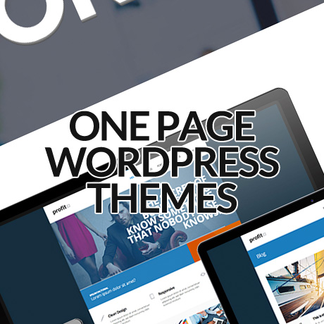
WordPress Slider Mania

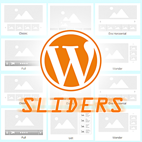
Sliders are staples in websites nowadays. A homepage without a slideshow seems an oddity considering the media intensive content this generation craves for. For all the benefits sliders give website owners, there are indeed some sliders that really standout from the rest. Below is a listing of 5 of the most popular sliders available in the market today:

Slider Revolution

Considered the most popular plugin in the Envato marketplace, Slider Revolution is a slider definitely worth considering. This plugin features tons of unique transition effects, an image preloader, video embedding, autoplay that stops on user interaction and lots of easy to set options to create your own effects. This plugin is one of the few that offers full screen slideshows, it is also noted for enabling almost any type of content that can be put in a slideshow, and, it is quite popular for its responsive feature as well. The plugin also enables easy slider creation using Visual Builder. Using its animation builder, you can conveniently drag and drop captions, and, create your own custom animation easily. Slider Revolution also allows you to integrate SEO optimization measures on your slides thus further improving your page’s performance on search engines.

Royal Slider

This slider plugin was created especially for mobile devices. What makes Royal Slider standout is its affinity toward touch screen interfaces. Create your own custom slideshows and css3 banner rotators with images, videos or HTML content in slides, allow dynamic population of data from Flickr, Instagram, Featured posts and even WooCommerce products, display vertical or horizontal thumbnails with the plugin’s photo gallery. While it doesn’t have much of fancy transition effects, Royal does guarantee a stable, accessible, high performance slider experience on any device. RoyalSlider is tested on Mac, PC, iPad 2, iPhone 4, HTC Desire, Lumia 920, Surface, Blackberry PlayBook and even on Kindle Keyboard

Layer Slider

Layer slider is most noted for its use of cutting edge technology to give you more than 200 preset 2D and 3D slide transitions to give you the smoothest slideshow experience available. At the very heart of this slider is its layered design that enables you to have 3D like slideshows. Easy to use interfaces enable you to create your slideshows in a WYSIWYG manner which include live previews, drag and drop slider builder, etc. The plugin supports responsive layouts, multiple layouts and touch screen gestures to ensure that your slideshow experience is the same regardless of device. Layer slider is SEO friendly allowing you to build semantic markup with custom attributes that search engines can index easily.

Slider PRO

This fully responsive and mobile ready slider plugin in comes with 150+ options to help you set-up your very own slideshow. The plugin allows you to dynamically load content from your content. Slider PRO also enables you to add animated or static layers into your slideshows to create 3D like slides. The plugin uses a user friendly media loader to enable easy population of content into your slideshows. Slider PRO offers 100+ transition effects which can be optimized into hundreds of possible variations.

Touch Carousel

This slider plugin was created with mobile devices in mind. Touch carousel enables touch navigation on iOS, Android and Blackberry devices. Over 20 settings are available to control speed, layout and slideshow. Touch carousel allows you to slide any post type including WooCommerce and Jigoshop content. You can select content based on taxonomy, popularity or date.


Is Your WordPress Site A Target For Hackers?

Online security is a priority website owners should take seriously. How many of us use the same password not only for multiple sites but for other personal information like bank accounts, billings, credit cards, etc.? General website information is available via Whois.com and displays information such as your email address. To the determined hacker, this single piece of information could lead to a chain of personal information tracking and could lead to more devastating consequences aside from identity theft. The epic hacking of Wired’s Senior Writer, Mat Honan, that dissolved his digital life is a reality check that whatever goes online (and even offline) can disappear in a matter of seconds.

Another security challenge is having multiple authors and contributors to your WordPress website. Granting access to users should be managed with a built-in authentication system to filter out unauthorized or unregistered users from accessing not only your resources but also premium information not open to the public. Installing necessary precautions and different levels of security checks can be helpful in creating deterrents to possible security hacks.

Here are some useful tools you can use to protect your site from being compromised.

LastPass – PassWord Manager

LastPass is an award-winning password manager that saves your passwords and gives you secure access from every computer and mobile device. Download and setup is easy and can be done in minutes. Once you’ve created your account, LastPass prompts you to save new sites as you browse – so you’ll never lose another password. After saving a website’s username and password, LastPass will autofill the login when you return to that site. No thought, no typing, no work required – LastPass does it for you. LastPass allows you to share access to multiple users securely. This security tool also helps you address other password management concerns and security threats like keylogging, etc.

UpDraftPlus – WordPress Backup

UpdraftPlus simplifies backups and restoration. Backup into the cloud (Amazon S3 (or compatible), Dropbox, Google Drive, Rackspace Cloud, DreamObjects, FTP, SFTP, SCP, WebDAV and email) and restore with a single click. Key features include: Site duplicator/migrator: can copy sites, and (with add-on) move them to new locations; backups of files and database can have separate schedules; large sites can be split into multiple archives; database backups can be encrypted for security; and download backup archives direct from your WordPress dashboard, among many.

Clef – 2 Step Authentication Mobile App

Clef is a free replacement for usernames and passwords that makes logging into your WordPress site easier and more secure. It is a mobile app that replaces usernames and passwords using your smartphone. This security tool lets any site recognize their users based on their phones, instead of anything they have to remember or type. Clef puts secure cryptography in the hands of every user and frees you from having to remember any passwords. Once you sign in to one WordPress site using Clef, you can sign into all of your Clef-enabled sites with a single click. And once you sign out of the app on your phone, you are automatically signed out of all your WordPress sites.

Google Authenticator – WordPress Plugin

The Google Authenticator plugin for WordPress gives you two-factor authentication using the Google Authenticator app for Android/iPhone/Blackberry. You may already have the Google Authenticator app installed on your smartphone, using it for two-factor authentication on Gmail, Dropbox, Lastpass, Amazon etc. The two-factor authentication requirement can be enabled on a per-user basis. You could enable it for your administrator account, but log in as usual with less privileged accounts. It also works on WordPress installations that have several users aseach user has his own Google Authenticator settings.

All In One WP Security & Firewall

The All In One WordPress Security plugin is a comprehensive, user-friendly, all in one WordPress security and firewall plugin for your site. It reduces security risk by checking for vulnerabilities, and by implementing and enforcing the latest recommended WordPress security practices and techniques. This plugin uses an unprecedented security points grading system to measure how well you are protecting your site based on the security features you have activated. Protect against “Brute Force Login Attack” with the Login Lockdown feature. Users with a certain IP address or range will be locked out of the system for a predetermined amount of time based on the configuration settings and you can also choose to be notified via email whenever somebody gets locked out due to too many login attempts. Monitor/View the account activity of all user accounts on your system by keeping track of the username, IP address, login date/time, and logout date/time.

As always, check for compatibility before installing any plugin or tool. And don’t forget to backup your site as well.


Google Hummingbird – The Latest Algorithm Update

In case it slipped by you, Google announced its latest algorithm update last September – the Hummingbird – in celebration of its 15th anniversary. The announcement, held in the garage where Google was born, includes several major improvements on its answering system technology since its last Caffeine update in 2010.

One of the many new types of search activities in Hummingbird is what Google calls “Conversational Search“. This update is more than just typing in keywords to search for results. It encourages you to “have a conversation with Google” where you can post questions as if you were having a normal conversation.
Here are some of the latest changes included in this update:

Knowledge Graph

  • Use the Knowledge Graph to answer questions you never thought to ask and will help you discover more.
  • Knowledge Graph Carousel at the top of the results page gives you a more complete picture of what you’re curious about. Explore collections from the Knowledge Graph and browse lists of items, that help you research a topic faster and more in depth than before.
  • The Knowledge Graph can understand language differences, helping you more precisely express what you mean as you enter your search.
  • Information from the Knowledge Graph is available on desktop, tablet, and your smartphone.

Voice Search

  • Ask your questions out loud and get answers spoken back whether you are out and about or sitting at your desk. Just tap the mic on the Google search bar and speak up. This works on the Google Search App for iOS, Android and Chrome browsers for laptops and desktops.
  • Search without typing. You can ask anything, anywhere. Use it in the kitchen, on the couch or anytime your hands might be full. Plus, searching with your voice makes searching words you’re not sure how to spell quicker and easier.

Google Now

  • Gives you the right information at just the right time using helpful cards with information you need like: boarding passes, appointments, weather, flights, hotels, restaurant reservations, events, reminders, traffic, etc.

According to Amit Singhal, SVP, Google Search

“We’ll keep improving Google Search so it does a little bit more of the hard work for you. This means giving you the best possible answers, making it easy to have a conversation and helping out before you even have to ask. Hopefully, we’ll save you a few minutes of hassle each day. So keep asking Google tougher questions—it keeps us on our toes! After all, we’re just getting started.”


One Page WordPress Themes – October 2013

One Page WordPress themes are becoming quite popular lately. Not only do these ultra simplified and straightforward themes look brilliant but they are also faster loading. Some say they also produce higher conversion rates. Here are some of the latest One Page WordPress themes you need to check out:

GoBlack One Page Parallax WordPress Theme

GoBlack Premium WordPress Theme is a clean and modern single-page portfolio styled theme ideal for the promoting services of creatives, design agencies, or creative freelancers in a professional manner. This 100% fully responsive theme was built in HTML5 and CSS3 using Parallax javascript to create the animated parallax image effects that make it engaging and dynamic. GoBlack features include the revolution slider, unique portfolio scroll animation, smooth tabless design, fentancy black color schemes, and so much more.

Prisma One Page Responsive WordPress Theme

Prisma Premium WordPress Theme was developed with a goal to provide a quick solution to create an impressive modern website with an easily editable layout without sacrificing unique aesthetics. This bold, fully responsive one page theme built with Bootstrap 2.3.2 is easy to customize and includes features such as: filterable portfolio with integrated Fancybox, animated retina-ready splash menu, and also single page layout with stand-alone page setup option among others.

Flavor One Page Parallax WordPress Theme

Flavor Premium WordPress Theme is a warm and classic looking one page premium theme that will surely make your portfolio stand out. The generous space dedicated to presenting images (filterable) is readily accessible and gives visitors a very good idea of the quality of your work. Salient features of this theme include: modular homepage – layout sections + layout shortcodes, smooth tabless design, parallax effect, flexible grid system built with Bootstrap, among many.

Webmakers One Page WordPress Theme

Webmakers Premium WordPress Theme is a single page, clean and minimalist style WordPress theme recommended for creatives, freelancers and agencies. This theme comes with 5 pre-made theme skins, powerful theme options with ability to change typography, unlimited style settings for colors, fonts, and other design elements, a custom plugin based shortcode generator to build theme element easily, a built in ajax contact form, to name a few.

Cingle Responsive One Page WordPress Theme

Cingle Premium WordPress Theme is a clean, responsive multi purpose One Page WordPress theme ideal for a range of web uses. This premium theme will work well for business or corporate portfolios, creative agencies, design professionals, or even freelance professionals who want a more flexible theme to meet their various needs. Cingle features an ultra responsive design (enable/disable), sticky navigation, light and dark styles, parallax, Google Analytics tracking code, unlimited theme customization options, etc. to get your website to where you want it to be.

Simple Easy Parallax Retina WordPress Theme

Simple Premium WordPress Theme is an impressive, modern and yet very easy to use flat design WordPress theme with both single page and multiple page layout options. This fully responsive theme inspired by cool metro colors and built with Bootstrap includes features such as: mobile optimized parallax feature, animated contents, retina display optimization, touch optimized responsive layout, filterable expanding portfolio, and fully tested it on iPhone 5, iPad 4, S3 android and Windows Phone.

Visia Responsive One Page Retina WordPress Theme

Visia Premium WordPress Theme is a beautiful, minimalist, fully responsive retina ready single page WordPress theme that will surely impress your visitors. This premium theme includes a separate blog section and is suitable for any kind of creative or business use. Visia is highly optimized for both mobile and desktop platforms and uses a lazy-loading support for images, assets and compression of all required scripts for lightning fast loading time. It also features a built in custom thumbnail cropping tool to help you control images you need to highlight for your posts.

Omni One Page/Multi Page Parallax Flat WordPress Theme

Omni Premium WordPress Theme is a high quality, flat and full responsive WordPress theme for creative businesses or photographers. This Bootstrap built modern theme gives you 5 amazing header options to choose from (portfolio, revolution slider, video, parallax, layer slider).You can add unlimited pages and separators to each page and customize them according to your own preferences.You also have a choice between the One Page and the MultiPage version which can be easily switched in the Admin panel.


WordPress Plugins To Try This September 2013

Enhance your WordPress site with these useful plugins that will help beef up features and functions you already have:

Ajax Portfolio Grid for WordPress

Ajax Portfolio Grid plugin allows for smooth loading and reloading of pages because of its Ajax feature. Features include: flexible columns, Youtube and Vimeo support, Drag and drop support, and hardware accelerated touch swipe support among a few. This robust plugin is built around the MVC core and makes full use of HTML5, CSS3, PHP 5.2+, and jQuery 1.7 – latest technologies that allow it to render fast and lightweight results including effects that are responsive and adapt to most if not all handheld and mobile devices.

Paper Grid

Paper Grid is a lightweight and powerful content grid plugin for WordPress that allows you to showcase your team, your services and products, or any other type of content in a dynamic and interactive way. You can select images, icons, change colors and you can also easily share your team members or even content on your social networking sites. The Content Grid frontend css file is only 5 KB and the javascript file is only 2KB making it really lightweight which means your website’s loading performance will be fast.

Mobile.nav

Mobile.nav is an easy to install and easy to use mobile and responsive navigation menu plugin for WordPress that creates an awesome mobile menu for your website. It supports top level + nesting up to 3 sub levels (4 levels totally) but can expand to how many you need by copying few lines of css. This plugin uses the native WordPress built-in design language and easily integrates with the WordPress menu system and supports expanding menu tree. Mobile.nav works on iOS, Android and Windows Mobile.

Hashtag for WordPress

The Hashtag WordPress plugin uses the new auto-complete system in the WordPress editor which allows you to set up an integrated hashtag system for your website. You can easily add a hashtag (#word) in your posts based on # character and on other hashtags already existing on your site. This plugin filters all the sentences containing the hashtag and displays them with links and thumbnails to the related posts. The #hashtag word link and the #hashtag page can also be easily customized (font, border, radius, padding, margin, etc.) according to your preferences.

FormCraft WordPress Form Builder

Create your own stylized forms with FormCraft WordPress Form Builder plugin – an AJAX powered form interface that allows you to create responsive forms and add as many as 23 fields (conditional or not), add multi-columns, save form progress, generate form analytics, integrate MailChimp, Campaign Monitor and Aweber and send to auto responders, embed objects, maps and videos, upload multiple images (retina-optimized), add form validation, get all submissions in your inbox, and many other useful features.

Frontend Builder

Frontend Builder WordPress plugin allows you to design your web page using intuitive frontend and backend options and a drag & drop system that allows you to add all the content that you need regardless of the template that you are using. This plugin is an easy-to-use solution for all users regardless of their skill level whether as designers or developers. Developers will find this plugin useful because they can assign this plugin to their templates with their own shortcodes and enable their potential users to design their own web pages using their own template’s elements. Other features include: clone options, WordPress shortcodes, pre-made UI system, live preview, and tons of other options.


30 Different Content Slider Plug-ins for WordPress

When looking at websites, slideshows and carousels are the best way to present images and this is usually achieved using jQuery. To have jQuery slider galleries or other image presentation on your web page you have to code or download a jQuery slider plug-in and integrate it. Those sliders give effective looks and are very attractive to users.

Here you can see 30 Different content slider plug-in for WordPress. Hope these plug-ins help you…Enjoy!!!

(more…)


WordPress Themes for Mobile and Tablet

Majority if not all of the recent WordPress theme releases have included responsive design as a staple feature. This ensures that these themes will display well on mobile and handheld devices. Below is a list of WordPress themes that have been created and designed primarily for mobile and handheld devices. These themes are meant to cater to a mobile audience but some of them can also function quite well even on desktop browsers.

Here’s a roundup of the latest WordPress themes for mobile and tablet:

Provocateur°

Provocateur° is a cool and interesting theme built using jQuery Mobile, HTML5 and CSS3, especially for mobile phones and particularly optimized for Apple devices. Main features include a portfolio, a blog, a customizable main page, custom menus and widgets, shortcodes (accordion, portfolio, contact form, tags, YouTube), and even a QR-code sharing option. This theme has a unique slide down menu, email and social networking sharing (twitter & facebook) options, and a changing flip animation.

Touch

Touch is a “lighter than air” WordPress theme that shows power can be packed in a light mobile theme. You get a straightforward blog, an optional static front page, a touch gesture-enabled gallery, a portfolio, a unique comment form along with a validation-enabled contact form, plus sliders, short codes etc. all in one neat, little package. This theme has been thoroughly tested on iOS, Android, Windows Phone, including desktop browsers.

Brave

Brave is an elegant and feature- rich dark theme created for mobile devices. This awesome theme has everything your desktop theme offers and can be used alongside your desktop site. it is ready for localization, can ‘install as web app’ on iOS, contains a beautifully unique menu, comes with comment/contact forms, has a touch/swipe enabled gallery, comes with multiple color schemes, and a variety of extremely customizable short codes to design the mobile website you need.

Resans

Resans is a highly advanced WordPress theme for creatives designed especially for tablets and mobile devices. On larger devices, Resans presents posts on a 4 column grid (Masonry style). As display sizes shrink, the number of columns reduce until a lone column is displayed mobile-style. Resans supports several features such as swipe gestures, responsive layout, 5 page afterload animations, animated loading of new pages, unlimited colors for fonts and backgrounds (header, footer, content, menu), and so much more. Resans can be used alongside with your desktop template and can be set up using Resans AP.

Hero

Hero is a super clean, feature packed WordPress theme built for websites with lot of mobile following. This theme has the power of a regular desktop theme adapted to the smaller devices. Hero gives you impressive blog and portfolio pages similar to a regular desktop version in a more compact form to encourage interaction from your mobile visitors. Theme features include: provisions for two different slider plugins, tons of shortcodes, 9 post formats (Aside, Quote, Image, Video, Audio, Gallery, Status, Link, Chat), translation ready, “install as web app” functionality, and so much more.

Spartan

Spartan is a fully featured WordPress theme for mobile devices created with the goal of being flexible enough to adapt to any and all types of WordPress sites and yet still function as a stand alone theme. One of the many cool features tucked into this theme is the menu that goes beyond just listing a number of links in predetermined styles. This feature allows you to build and color a unique navigation system of your choice. Other cool features include: the comment button that also serves as a visual indicator (grayed out when comments for a given post are disabled, or shaking itself ever so gently to remind the user to read and leave comments when comments are enabled), and also the amount of customization available via shortcodes.


M-Commerce – The Mobile Market, Web Design and Conversion

The unstoppable invasion of mobile computing and how it has woven itself into our daily routines is undeniable. A life without the Internet, free WiFi, and our handheld devices is almost unimaginable and web designers have heard and heeded this lifestyle change, hence, the birth of responsive, fluid, and liquid design trends. Mashable has even named 2013 “The Year of Responsive Design”. However, we are still in the early stages of understanding this mobile demographic to yet see tangible and consistent conversion results from the marriage of Mobile Commerce (M-Commerce) and Web Design for handheld and mobile devices. Responsive design does not necessarily equate to actual conversion, whether in sales, subscriptions, or networking.

According to a report by Litmus.com,

“More email is read Mobile than on a desktop email client or via webmail. Stats say 36% of email is now opened on a mobile device, with 33% for desktop and 31% for webmail.” – Litmus –”Has your audience gone Mobile” (June 2012)

As of September 2012:

We’ve seen some major changes in mobile email opens in the past year and a half. As of September 2012, 38% of all opens were on a mobile device, compared to only 17% eighteen months ago—that’s a 123% increase in mobile opens!

Diving deeper into specific mobile operating systems, the majority of these opens are being made on iOS (iPhone and iPad – 80.34%) and Android (18. 93%) devices:

The next question is, Does Mobile Traffic Convert into Leads?

Not necessarily so. There are several factors that lead to actual traffic conversion and there is no hard and fast rule on it but website owners can make educated guesses based on actual data and stat results gathered from their own website traffic trends.

Three ways to reach your target mobile traffic:

Run a native mobile app

  • Needs to be downloaded by the user
  • Restricted amount of content and functionality

A mobile website or M-Dot (a dedicated scaled down mobile version of the main website)

  • Advantage – faster loading time and optimization
  • Disadvantage – two bodies of content to manage

Responsive web design

  • Uses responsive, fluid, liquid layouts, media queries, and flexible images to adapt to various devices and resolutions
  • More future friendly
  • One body of content to manage
  • Consistent brand experience
  • Social media friendly

Among all three, responsive web design appears to be the most feasible way of reaching your target market. But is responsive web design enough to address the problem of conversion?

Here are some strategies to consider to maximize your web design and marketing optimization efforts to improve your conversion rates on your website:

Create a mobile optimized landing page

  • Make sure that your landing page is displayed properly on all screen sizes (portrait and landscape)
  • The need for speed – achieve fast loading time (5 seconds or less) by using optimized media content (images, video, and audio) and scripts.
  • User friendly – Prospects don’t have to type anything just click a button. If possible, must be clickable by the thumb.
  • Content must be simple, readable and easily navigable. Call to action buttons must be prominently but strategically located.

Create a mobile optimized order form

  • Redirect users from the landing page to your mobile optimized order form.
  • Form fields should be easy to read and fill out on any mobile device. Longer forms lead to boredom and lower conversion rates.
  • Remove all sidebar content so the form fits perfectly on the viewable window of the mobile device

Create several versions of your landing pages and order forms and test which ones convert the most. Improving User Experience and establishing a User Friendly Interface all contribute to an enjoyable browsing experience for your mobile visitors which will eventually boost your conversion results.


Beautiful WordPress Technology Themes For Inspiration

Imagine a world without technology. Difficult, isn’t it? No Internet, no computers, no cell-phones, no TV. Surely technology makes our lives easier and more technology makes our lives even easier. New inventions are made every now and then and they need the word to spread so that more and more people will know about them and may use them. In today’s world the Internet is one of the best options available to spread the word about anything. Other aspects like TV commercials, print media ads, posters, etc. are somewhat limited in the sense that they do not provide the “complete information” about a product.

(more…)