The Panda Algorithm and Your Website


Kicked, slapped, penalized, pooped on – who would have thought that something as gentle as a panda could be so violent. In truth, Google Panda, the much dreaded update was actually named after one of Google’s engineers, Navneet Panda, the man who developed the technology behind the algorithm that has put everyone – SEO professionals, webmasters, and website owners alike, on their toes.

One Search Engine to Rule Them All

Many SEO people get flustered and panicky and a lot of them shake in their boots whenever a Google update looms on the horizon. That’s how much Google affects SEO professionals and webmasters. But believe it or not, there was a time when Google was just one of the many search engine players out there. How many of you remember Lycos, AltaVista, Ask Jeeves, or MSN Search? Some of the older ones that you may be familiar with have already become inactive but a few others are still very much around like Baidu, Yandex, AOL Search, and the rebranded Yahoo! Search powered by Bing, the product of a deal between Yahoo and Microsoft. Check out this timeline on Wikipedia to see the rest of the search engines.

It was around 2000 when Google’s search engine rose to the top of the heap with its efficient, relevant, and lightning speed search results largely due to its patented algorithm called Pagerank. This iterative algorithm ranks web pages based on the number and PageRank of other web sites and pages that link there, on the premise that good or desirable pages are linked to more than others. Today, Google Search is the most used search engine indexing billions of pages and processing several billion queries each day leading the core search market in January 2013, according to Comscore, with a 67% market share. No wonder SEOs tremble. Of course, you could try other browsers like Bing and join the SEO Wars watercooler discussion between Google and Bing and add your two cents worth.

The Goal of Search

Larry Page, co-founder and Google CEO, once described the “perfect search engine” as something that “understands exactly what you mean and gives you back exactly what you want.” “…our goal is to make it as easy as possible for you to find the information you need and get the things you need to do done.”

The relevance of the search results that a search engine returns dictates how useful it is to its users. Google Web Search, one of the many Google products and not to be mistaken with Google, Inc., a web search engine or a software code designed to search for information on the Internet has proven to be the most relevant search engine out there. By web crawling, indexing, searching, and returning authoritative results as seen in Search Engine Result Pages or SERPs, it has risen to the top of its game. Google crawls through millions of web pages for a particular word or phrase queried to provide the most relevant or popular results first and in what order or ranking the results should be shown in the SERPs. Of course, the most coveted spot is the top result on the first page. It’s the goal of every website owner. That’s also the reason why SEO exists.

The Business of Search

Businesses and even individuals invest heavily in SEO just to improve their rankings hoping to land in the first few pages of Google’s Search Engine Results Page. Black hat, grey hat, white hat – you name it – it’s all been tried in the quest for that number one spot on Google. Why do people want to top Google’s SERP? Studies show that users spend more time on the number one website imputing a level of authority and credibility to it, knowingly or unknowingly. This translates into higher click thru rate which translates into higher traffic, which further translates into higher income potential, especially if you are an eCommerce website. There is money in search thus the need for SEO in business. Enter the SEO professional.

The Race to the Top – Gaming the System

The race to the top of Google’s results page has become critical to many businesses to the extent that many have resorted to tactics and tricks to game Google’s search algorithm. There are many highly reputable SEO firms that follow Google’s best practices for Search Engine Optimization. Unfortunately, there have been a lot and there still are many who abuse the system to try to get ahead of the rest. Whatever color you want to call these techniques used to manipulate the search engine results, redirect users to false links or shortchange users on real content, the results are definitely short term and the risk of being penalized hangs like a guillotine waiting to drop on your head.

Google’s Response

Google Panda rolled out in February 2011 cracking down on: websites with thin, duplicate content, spammy sites, sites with excessive linking, parked pages filled with ads or keywords and no real content, content farms, and sites, generally in violation of Google’s Best Practices guidelines. Consequently, a lot of websites plunged from their top positions and even after two years since the update, several of them have yet to recover. These sites that got hit suffered loss of traffic, loss of income, and a whole lot more. Legitimate sites also suffered a lot of collateral damage much like those who got hit by Hurricane Sandy. The latest Panda update to hit happened in January 2013.
Embracing the Mighty Panda?

Obviously, these changes have shaken what is shakeable in order for the unshakeable to remain. As more and more people are bringing their businesses online, this means more websites will be created and the virtual highway will definitely be clogged with cyber traffic sooner than we think. The mobile web is already bursting at the seams with billions of people accessing the web through their handheld devices.The question is, is your site ready for all that traffic? will they find you or have you been stricken off the radar already? Out of sight and out of mind.

Google’s mission is to organize the world’s information and make it universally accessible and useful.

Although it is not the only search engine out there, Google currently dominates the search engine market. As a company, its goals, objectives, and activities will always be in pursuit and in line with their corporate mission. Knowing this, their updates to improve and innovate their products and services will always be part of the landscape and shouldn’t surprise anyone anymore. A Panda, a Penguin, a Poodle, or any update using any name is to be expected. The algorithms and the parameters may change but the push towards fulfilling their corporate vision remains. Who says you have to live up to Google’s standards? You don’t actually have to. There ARE other search engines out there. If, however, you decide to stay, then the best thing that you can probably do for your website is to “think like Google” to know and anticipate what Google wants.

How to Think Like Google

The answer is not a secret and it is actually quite easy to find. Google lists ten things that they believe in as a company. You may or may not agree with all of them and your methodologies and policies may differ from theirs. But, you can probably focus on three major areas you have in common in which, whether you like or not, Google affects and has a “say” in. These areas include:

  • The content on your website
  • The internal linking structure of your site.
  • The “user experience” on your site.

Creating a high-quality site that complies with the best web practices guidelines will benefit your website and more importantly, your users, in the long-term. As Google integrates more evaluations by real live users into their iterations, actual user experience will bear much weight as your website is evaluated. Users who enjoy your content and the overall experience of interacting with your website are your best weapons to help spread the word about you and help you rise to that most coveted top spot of Google’s search engine results page.


Turbo Charge your Website with WordPress Widgets

WordPress is one of the most popular Content Management Systems around. Not only is it powerful and feature laden, it is also has some of the most beautifully designed themes available out there. Even if you do compare other platforms, you can tell a WordPress site apart. The great part about building your site using WordPress is that you can make a great product even better. One way to do that is by adding widgets to your theme.

Widgets are a quick and easy solution to add a little more “oomph” to your website. These small pieces of content or tools can be placed in any of the widgetized areas of your WordPress theme. Widget areas are the predefined blocks or sections of your theme where you place widgets. These widgets can be added, removed, arranged, reordered any way you want in areas such as your sidebar, header, footer, the homepage, or any other defined area in the WordPress theme’s design.

Widgets can either be static or dynamic. Some of the default WordPress widgets include “meta” data, categories, popular posts, archives, and so many others. You can also add 3rd party widgets like subscriptions forms, advertisements, dynamic content such as RSS feeds and social networking feeds, custom code, Javascript, etc. to boost the functionalities and features of your theme. Some of these widgets may also come built-in with the theme you choose to install. Below is a sample of how the Widgets section appears in the admin panel of your WordPress theme.

The left side of the screen is where you have a listing of your available widgets. It’s as simple as dragging and dropping any widget you like into the sections on the right. These widgets will appear live on your site in as soon as you drop them in place. You can access your widgets from the Appearance ? Widgets screen in your Dashboard. From here you can: add, configure, remove, delete, enable accessibility mode, or troubleshoot your widgets if necessary.

Adding widgets require no coding skills at all. Even a WordPress beginner can do it. You don’t need to be an expert to install a widget. Sometimes, you may need to copy and paste scripts or codes from 3rd parties if you find a widget you really like. Otherwise it’s a very simple and easy way to improve user experience and the overall aesthetics of your WordPress theme.


5 Excellent Resources for Free PSD Web Templates


The Internet is such a great resource for learning almost anything. You can practically start a whole new career based on all the free available information that can be downloaded online. Thanks to very generous people who don’t mind sharing their talent and resources for others to learn from. For those who want to try their hand at designing web templates, one of the best ways to learn is to mimic the good ones that are out there. Thankfully, there are excellent resources out there if you know where to look. Here are some of the best that’s out there today and the great thing about it is that these resources are absolutely free. Check them out:

Blaz Robar

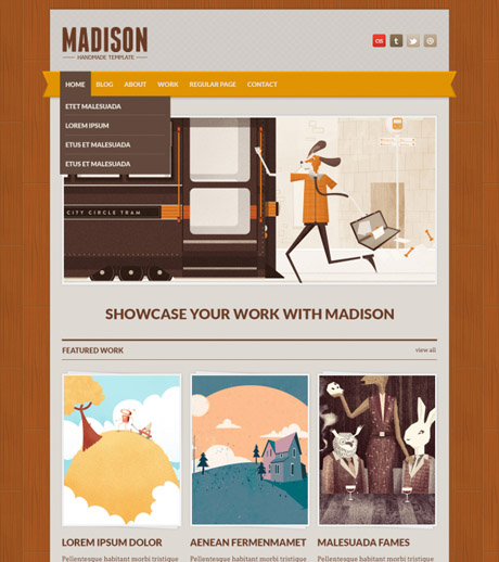
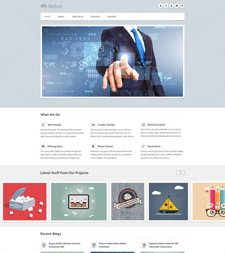
Blaz Robar is a graphic designer from Melbourne, Australia and is part of a web design studio, Eleven Media that specialises in creating unique WordPress themes. Below is one of the many PSD templates available on his site Blazrobar.com and you can also find his work on www.thelayoutlab.com.

Luis Zuno

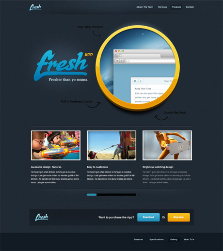
Luis Zuno is a full time web designer & developer spends his time creating themes and templates. Below is a sample of one of the free PSD files on this site were created by him. According to him, you are free to download, and use them in both your commercial and personal projects. Luis Zuno’s work can also be found at ThemeForest.

Martin Fabricius

Martin Fabricius is a young and talented web designer from Vejle Denmark and has won several awards in his homeland. According to him:

My big passion is usability and web and app design. I make web and app design on a freelance basis apart from my job as CTO to Ungarbejde.dk

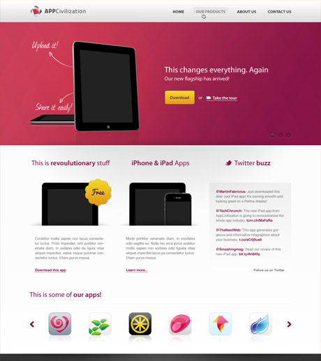
Below is a sample of the kind of work that is available on his website:

Elemis Freebies

Cemile and Volkan are two graduate students at VCD in Istanbul and work as freelance web designer/developers. Currently they are working on creating user-friendly and clean website templates on Themeforest.
Below is a sample of their work which can be downloaded for free on their website:

Premium Coding

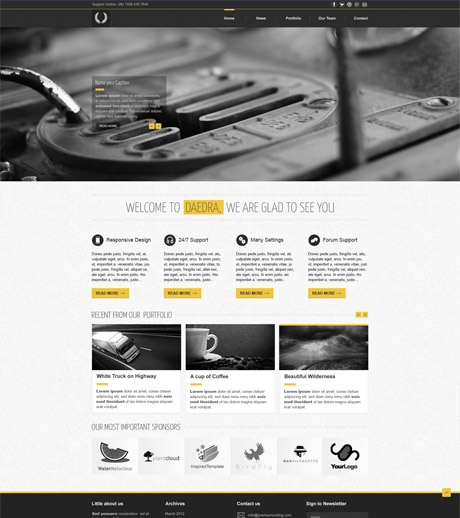
Premium Coding is an interactive multimedia design website that provides tons of resources for web developers, designers, and the web community. Below is a sample of one of the many free resources you can download from their site.

With all the free tutorials, templates, and design resources available out there, you can jump start your web design skills in no time. So bring out your text editor, your editing software and get started. All you need to add to the equation is your time.


17 Awesome Adobe air apps for designers

One fine day I was trying to fill in an important official form online on my Mozilla Firefox’s browser. After spending about half an hour I reached the last few questions of the form. One question there asked me to click a checkbox to answer but I could see no checkbox on the screen. After wasting a lot of time reading the instructions and every possible detail over and over again I asked for advice from my friends. One person told me that I should try to refill the form on Internet Explorer. I tried it and now the checkbox appeared and I successfully completed and submitted the form online.

The problem just described occurred because the form was designed to work especially for Internet Explorer. You see, designing an application for all systems is tedious as one has to tweak the runtime code again and again to make it compatible to work with different systems. Here is where Adobe AIR jumps in. If an internet application is designed using Adobe AIR then it will automatically work for all systems and browsers.

Technically speaking:

“Adobe AIR is a cross-operating system runtime that lets developers combine HTML, JavaScript, Adobe Flash and Flex technologies, and Action Script to deploy rich Internet applications (RIAs) on a broad range of devices including desktop computers, netbooks, tablets, smartphones, and TVs. AIR allows developers to use familiar tools such as Adobe Dreamweaver®, Flash Builder®, Flash Catalyst®, Flash Professional, or any text editor to build their applications and easily deliver a single application installer that works across operating systems.” – Adobe’s website.

Adobe AIR has a wide array of apps that can help designers design better applications. Below I have selected 17 of them.

(more…)


The Basic Web Page Structure – HTML5 List of Tags


You can think of an HTML page as a series of containers. After an opening statement that defines the type of page to follow, there is one large element, the <html> tag, that contains the two primary structural elements, and <body>.

HTML documents consist of a tree of elements and text. Each element is denoted in the source by a start tag, such as “<body>“, and an end tag, such as “</body>“. (Certain start tags and end tags can in certain cases be omitted and are implied by other tags.)

Here’s how the basic essential code for an HTML5 web page looks:

<!DOCTYPE html>
<html>
<head>
<title> Title of document goes here </title>
</head>
<body>
Visible text goes here…
</body>
</html>

Before we can fully appreciate what these containers or placeholders do to our webpage we need to know how they function. Below is a list of HTML5 compliant tags we can use to study and familiarize ourselves with as to the description and function of each tag. Let’s do a little exercise. As you go through the list, pick a web page (any, even this one) and right click on it. Select “view page source” and try to find the tags listed here and look for them in the page source. Try to classify which ones are basic tags, formatting tags, image tags, and so on. While you are at it, challenge yourself to decode the code. Have fun!

<bdi> Isolates a part of text that might be formatted in a different direction from other text outside it
<mark> Defines marked/highlighted text
<meter> Defines a scalar measurement within a known range (a gauge)
<progress> Represents the progress of a task
<rp> Defines what to show in browsers that do not support ruby annotations
<rt> Defines an explanation/pronunciation of characters (for East Asian typography)
<ruby> Defines a ruby annotation (for East Asian typography)
<time> Defines a date/time
<wbr> Defines a possible line-break
<datalist> Specifies a list of pre-defined options for input controls
<keygen> Defines a key-pair generator field (for forms)
<output> Defines the result of a calculation
<figure> Specifies self-contained content
<audio> Defines sound content
<source> Defines multiple media resources for media elements ( and )
<track> Defines text tracks for media elements ( and )
<video> Defines a video or movie
<nav> Defines navigation links
<command> Defines a command button that a user can invoke
<header> Defines a header for a document or section
<footer> Defines a footer for a document or section
<hgroup> Groups heading elements
<section> Defines a section in a document
<article> Defines an article
<aside> Defines content aside from the page content
<details> Defines additional details that the user can view or hide
<summary> Defines a visible heading for a details element
<embed> Defines a container for an external (non-HTML) application

Don’t forget that WordPress uses PHP but PHP is a server-side technology (runs on a server) that dynamically generates the HTML that will be sent to the browser (IE, Safari, Firefox, Chrome). HTML is whatever you view on a website.


Responsive Web Design (RWD) vs Adaptive Web Design (AWD)

We’ve heard the terms Fluid, Adaptive, and Responsive used interchangeably when describing a theme’s ability to resize according to browser specs or device (mobile or not) size. Are they really different from one another or are they referring to the same characteristics found in themes described as such?

What is Responsive Web Design (RWD)? Responsive Layout?

Let’s take a closer look.

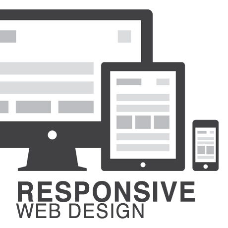
Responsive web design (often abbreviated to RWD) is an approach to web design in which a site is crafted to provide an optimal viewing experience—easy reading and navigation with a minimum of resizing, panning, and scrolling—across a wide range of devices (from desktop computer monitors to mobile phones) – Wikipedia

Responsive design is the methodology behind making a website respond to whatever platform you are viewing it on regardless of resolution and orientation. It may change how certain elements display but it will not remove elements or change the core functionality of their behaviours. Responsive design uses a fluid grid and it is usually possible entirely through HTML and CSS, without the need for DOM (Document Object Model) manipulation. – Matthew Freeman

According to Ethan Marcotte, The 3 Elements of Responsive Web Design are:

A flexible, grid-based layout – A layout based on proportions rather than absolutes; uses a flexible grid, which in turn ensures that a website can scale to a browser’s full width.

Flexible images and media – Layouts based on percentages resize gracefully according to the size of the browser window rendering them. However, it is problematic to ensure that the content within a site resizes.
Images and media should scale with the flexible grid; images that work in a flexible context, whether fluid themselves or perhaps controlled through overflow mechanisms. CSS addresses this problem with its max-width property

Media queries – Content based breakpoints; optimize the design for different viewing contexts and spot-fix bugs that occur at different resolution ranges. CSS3’s media queries directly address these usability problems by allowing browsers to serve different styles for different viewing contexts. CSS3 greatly expands support for media queries, adding the ability to target media features such as screen and device width and orientation.

These 3 elements of Responsive Web Design find their way into 3 different types of Responsive (RWD) Layouts:

The Basic Fluid Lay­out
Con­tent con­tin­u­ally flows or adjusts in a word-wrap fash­ion as screen width is increased or reduced. There are no “dis­tinct” dif­fer­ences in con­tent pre­sen­ta­tion. Fluid layouts are dynamic and user sensitive – adapting to the available real estate on the user interface and providing increased content accessibility.

The Adap­tive Lay­out
There are pre­de­fined sizes were dif­fer­ent lay­outs are trig­gered. These are called breakpoints. Typ­i­cally there are three or four break­points to accom­mo­date desk­top, tablet and mobile screen sizes.

The Respon­sive Lay­out
This is a hybrid of Basic Fluid Lay­out and Adap­tive Lay­out. There are pre­de­fined break points, how­ever in between these breakpoints con­tent will flow to expand or con­tract.

According to his article for the Adobe Blog, Carl Sandquist states that:

“Cur­rently, most RWD web sites use Respon­sive Lay­out since it offers a best-of-both-world expe­ri­ence. Con­tent snaps into the appro­pri­ate approx­i­mate posi­tion for a device type (e.g. Tablet) and then fine-tuned adjust­ments are made for the exact screen size on a par­tic­u­lar device.”

What is Adaptive Design (AWD)? Adaptive Layout?

“Adaptive design is the manipulation of layouts to best perform on certain screen resolutions inclusive of elemental removal or behaviour changing techniques. Adaptive design usually requires Javascript to efficiently manipulate the DOM. Javascript can be avoided if you plan on having duplicate on-page elements and then show or hide them based on screen sizes, this might be appropriate for smaller elements but not whole columns or navigation elements.” – Matthew Freeman

“This technique adapts what is displayed depending on the capabilities of the device being used, as well as the screen size. It centres on the context of the user, so even when the same content is used, it is adapted (with some or even all of the design elements changing), depending on whether the user is using a mouse and keyboard or touch screen. AWD also uses different layouts for tablets and mobiles with certain. ‘Responsive’ elements built in to reduce the number of different templates required. AWD can be taken to further extremes with content being completely repackaged and reworded, while images and video are either reworked or completely removed.” – Danny Bluestone

According to Aaron Gustafson, author of Adaptive Web Design, Crafting Rich Experiences with Progressive Enhancement:

“Progressive enhancement isn’t about browsers. It’s about crafting experiences that serve your users by giving them access to content without technological restrictions. Progressive enhancement doesn’t require that you provide the same experience in different browsers, nor does it preclude you from using the latest and greatest technologies; it simply asks that you honor your content (and your users) by applying technologies in an intelligent way, layer-upon-layer, to craft an amazing experience.

He encourages designers to: Think of the user, not the browser.”

Which one is better?

A better understanding of the differences between Responsive Web Design and Adaptive Web Design is a starting point to deciding which solution will work well for you, or your clients, if you are a WordPress professional. Knowing what solutions are available and having the ability to distinguish and implement whichever design approach best meets the specifications of the end user is an important element. Of course, nothing is carved in stone. Future designs may be a combination or a hybrid of both – employing the best features of each one. The goal is to ensure that the user experience at the point of searching and eventually finding your website is the best experience they get at that particular moment – fully hoping that it will be the first of many more visits and not their last.


30 Stunning Ecommerce Shopping Website Designs

Ecommerce is one such thing which doesn’t need any introduction. Especially in this century we can say it’s on fire with the innovations and new ventures coming in. Gone are those days where Amazon and eBay are the only destinations for online shopping. One such industry that benefitted from this whole scenario is definitely web design and development. They received an immense number of new opportunities. Small groups and freelances also received a good amount of work in to design themes with the evolution of ecommerce software like Shopify, etc. We tried to collect a few of the best shopping website designs for your inspiration.

These 30 Stunning ecommerce website designs can provide a more enjoyable user experience, and they can also be excellent sources of design inspiration. We hope you enjoy (and get some good ideas).

(more…)


HostGator – Best Web Host. Period.

If you are looking for the absolute best deal in WordPress Hosting (and hosting in general), allow us to introduce you to HostGator – the ONE name to know in hosting. Some of the highlights: UNLIMITED Disk Space UNLIMITED Bandwidth …


We Buy Websites

Do you own a website that is making money? Have you considered selling it or like the idea of selling it? If so, we want to hear from you. We work with a network of website investors who are always …