Best WordPress Themes 2021

UPDATED April 12, 2021: 2021 is sure to be another great year for WordPress Theme development. Like the millions and millions of people using WordPress, we eagerly await the Themes and Plugins to be released this year, and you can …


Not Your Usual WordPress Themes Roundup

Multipurpose WordPress Themes are great for creating all types of websites but sometimes it’s more convenient and it saves a lot of time to use a ready-made theme that’s specific to your website requirements. Here are a few WordPress themes that are more than just your usual WordPress theme designs. Check them out:

Joglo – Woocommerce Real Estate Theme

Joglo Premium WordPress Theme is a modern real estate theme especially built for the real estate business. This WooCommerce enabled premium theme makes it easy to run an online realty company that can handle transactions like offering property for sale or home/apartment renting service. It has a sleek and dynamic design packed with features and functions like: Advanced Search where customers can easily browse any property filtered according to price, location, type or some other category or tag; Agents page listing agents names, description, and contact information; Responsive and custom layout; Property page with a contact form; and, Property detail page with map

Advocator: Professional Nonprofit Organizations

Advocator Premium WordPress Theme is primarily designed for non-profit, charity, organization, or advocacy related websites that aim to be interactive with their audience. This theme boasts of professional level accessibility and performance having been built using the Foundation 5 framework by Zurb. Key features include: audience can engage with you on mobile devices with ease, you can accept donations seamlessly, you can add Events for your organization, you can collect emails using Mailchimp, and if you’re a developer, you can customize super fast and efficiently.

Frisieur – WordPress Theme for Hairdressers

Frisieur Premium WordPress Theme is a fully responsive theme designed for hairdressers, hair salons, stylists, makeup artists, and similar professionals you need to set appointments with. This theme includes features and functions like: Working Appointment form, Approximate time with timepicker (compatible with two time types), Opening hours table, Google Map with geolocalization, and Working Contact Form, – elements necessary to booking clients online.

Pump – Responsive Wedding & Multi-purpose Theme

Pump Premium WordPress Theme is a Wedding Event & Multipurpose WordPress Theme all rolled into one. This super simple and yet fully functional responsive theme has endless possibilities not only for Weddings and events but even for business, corporate, or portfolio applications. This theme can grow with its users and convert into something else and adjust as the couple’s needs and interests evolve. It is also WooCommerce, BuddyPress, bbPress, and WPML ready.

WooCommerce Supermarket Theme – GoMarket

Woocommerce GoMarket Premium WordPress is a complete shopping solution for eCommerce owners. This theme includes 6 pre-designed stores making it easy to set up the store of your dreams. It features a
combination of Vertical Menu and Main Mega Menu to help customers navigate through the site easily.


Awesome New Themes for June 2013

Orange Core

If you’re looking for a theme that can do a lot to meet what a host of clients need then you definitely want to check out Orange Core. This multi-purpose theme is great for business and corporate sites although it does have excellent portfolio capabilities too. Awesome presentations may be done using the panoramic full-width homepage slider. Built in pricing tables, service pages, column variations and other page templates included are great tools necessary in building business and corporate sites. Orange core can be a great way for potential customers to get information about your business using these features. Orange Core is optimized for mobile and touch screen devices and is built on twitter bootstrap.

Vernum

Vernum is a clean, modern and powerful One Page Parallax theme that can virtually be what you want it to be. This theme has a drag and drop page builder to help you create the pages you want. Vernum also uses the parallax effect for added drama as you scroll down the page. In addition to these, Vernum uses retina ready graphics, is responsive, has great blog and portfolio capabilities, and uses CSS3 animations. It is flexible enough to meet the demands of websites of different kinds.

WP Education

WP Education is a premium theme designed for schools and educational institutions. Many educational institutions suffer from unimpressive websites. WP Education is a viable solution to add that professional air to any academic institution. Aside from the normal blog and gallery capabilities, schools can use this theme as an administrative and organizational tool to publish available courses, their descriptions and comments, and even process applications from prospective students.

Universfolio

Universfolio is a responsive multipurpose theme you can use for business or for pleasure. Whether it’s a corporate website, a personal blog or a creative portfolio, Universfolio has something for you. The theme uses the popular and powerful Revolution Slider to give you stunning slide transitions and layered 3d effects. This allows you to present eye catching slideshows to make casual visitors stay on your site longer. The theme also has awesome portfolio and blog page templates to showcase your work and keep visitors up to date with what’s going on. Universfolio is WooCommerce ready giving your site extra ecommerce capabilities.

JP Animated vCard Theme

JP is a cool and modern vCard WordPress theme for the creative professional. It’s got everything you need to create a good first impression on visitors, current clients, and potential clients. It’s simple and clean menu system allows you to navigate through the whole site without much fuss. It includes a great portfolio that allows you to showcase images, videos and other media projects on your site for interested parties to look at. You also have a blog page so visitors can get an insight on how you approach projects and tasks. This theme also has a Services Page and a Contact Page for those interested in hiring your services.

Lambo Photography Theme

If you are a photographer wanting to setup your own website or wanting to revitalize your existing one, check out Lambo. Lambo Premium WordPress Theme gives you special ways of showcasing your photos and images. This theme is perfect for the photographer or graphic artist who wants his/her work presented to potential clients artistically. The theme’s homepage slider is designed so that the graphic gives you the semblance that you are looking through a lens. The full screen slider presents your works in a choice of sliders including one with the popular Ken Burns effect.

Realia

Realia Premium WordPress Theme is a real estate and property rental theme ideal for real estate agents, brokers and professionals. This theme allows you to manage properties for sale or for rent so that potential buyers can go to your site and look for the property they desire and easily find it. This google map integrated theme allows visitors to search according to location based on defined filters like: number of baths, price, whether for sale or for rent. This theme has a dedicated page for each property with a description, an image gallery and a google map indicating its location. An inquiry form is conveniently located on the sidebar to facilitate contact with a broker. Property owners can submit their properties for sale. Theme supports IDX infrastructure trusted by professionals in the real estate industry.


ThemeForest Theme Sells Over 800 Copies In One Week

One WordPress theme, 7 days, 800 copies, $36,000 grand. A lot of WordPress authors and developers on Themeforest would love to achieve even a fraction of that and most of them are probably scratching their heads wondering why. This popular theme has even dislodged U-Design from its top spot for the past few weeks and to think it’s the only item in this author’s Themeforest portfolio. If you are wondering what theme achieved such a feat check out AVADA, a responsive multi purpose theme created by ThemeFusion.

Let’s dissect this theme a little bit further and try or simply attempt to figure out why the market is loving this theme.

Overall aesthetic

Avada’s layout can be classified as clean, straightforward, and professional-looking with very neutral colors and lots of white space. If you are familiar with real estate open houses, real estate professionals really spend a lot of time to “stage” a property before “opening” it up to the market. Care is taken to display only enough design elements to highlight the property’s unique and outstanding features, pulling back from adding unnecessary and distracting clutter. This deliberate “staging” is intended to give the potential buyer the room to imagine what he can do with it to meet his own needs. The focus is on its potential and what it can become. Avada is like that, a well-staged theme with lots of potential for all types of buyers. The demo is clear and easy to maneuver, giving customers a taste of all that it can be for whatever need they have.

Features & Functions

This premium theme is not just a pretty face. It has enough built in features and functions to create the website you need for yourself or for your clients. Everyone wants to create a website that is unique and representative of himself or his brand. Avada has a plethora of feature and function choices that, when mixed and matched together, with the client’s own images and content, can create a one of a kind and totally different website every time. Here are some of Avada’s easy to customize features that you can “play” with:

  • Homepage – 10 versions
  • Sliders – 6 styles
  • Headers – 5 versions
  • Page Templates
    • About Us – 2 versions
    • Services – 2 versions
    • Pricing Options
    • Meet the Team
    • Side Navigation
    • Contact Page – 2 versions
    • FAQ – 2 versions
    • Sidebars – Left and Right
    • Full-width page
    • 404 page
  • Portfolio – 6 layouts
  • Blog – 4 layouts
  • Custom Posts, Custom Widgets,
  • Shortcodes for Elements, Icons, Media, Pricing Tables & Typography
  • Responsive
  • Retina-ready

Support

Aside from the extensive, detailed documentation and easy to follow HD narrated video tutorials, Avada generously includes the entire set of PSDs (20+ files) for those who want to customize the theme even further. Buyers get 100% free support via their support forum. Customer feedback has been, overall, favorable so far. Providing WordPress theme support is not an easy task especially if you are servicing thousands of buyers. To receive favorable feedback regarding their theme support indicates that they have a support system that really works. This translates into higher buyer confidence which translates further into higher sales.

Avada has sold almost 15,000 copies to date and has received more than a thousand 5-star ratings which is something worth noting. Receiving a 5-star rating from 2 or more people can be easily dismissed but 1,000 or more satisfied customers can’t be ignored.

Fluke or luck? We think not. A good product with a lot of hard work backing it up sounds more like it. If this is the trend that the market is supporting as far as WordPress themes are concerned, then it is good sign that the market and the industry are headed for better days.

Get Avada Now!

WordPress Themes Should Be More Expensive: HERE’S WHY

If this post has caught your eye, you are probably a current WordPress user, author, developer, designer, or if not, perhaps a potential one. The subject of pricing is a tricky topic that some prefer to ignore or avoid – the proverbial elephant in the room. Why, because this is a hot topic indeed.

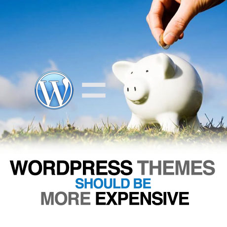
How should WordPress Themes be priced anyway?

For the purpose of this article, let’s start off by saying that a WordPress theme is a downloadable digital product as compared to an actual physical product that can be shipped. When you purchase a WordPress theme you do not receive any physical items at all but instead, you are given permission or license to download an electronic/ digital product (the theme), via email or a provided link, and use it according to the author/developer’s specific TOU (Terms of Use).

Traditionally, the actual cost of producing/manufacturing tangible products can be arrived at by adding the cost of materials used and the labor paid to produce these products to arrive at the total cost of goods. Others may add on overhead costs but strictly speaking it’s simply materials +labor. For services rendered, actual cost can be arrived at based on a rate applied to the number of man hours spent (time) on a project or the professional fee charged by the person (expert) rendering the service.

However,

Digital products require an approach to pricing that differs from that used for physical products. Most digital products have common characteristics which includes:

  • high fixed cost to produce the first unit, but low marginal costs to produce subsequent units
  • quality is difficult to judge without actually experiencing the product

The most common pricing method that can be used for digital products is to use a licensing approach.
(source: Digital Economy: Impacts, Influences, and Challenges by Harbhajan S. Kehal, Varinder P. Singh)

The Digital Products Cost Equation

The cost structure of digital products = high fixed costs that are sunk, and tending towards zero marginal costs.

Fixed costs refer to the costs associated with a product, that are fixed over a number of units. Thus regardless of the number of units produced and sold, the fixed costs remain the same. With digital products, much of the fixed costs are actually sunk costs, and therefore non-recoverable costs. A large portion of the costs associated with digital products are fixed, and sunk, and not variable costs, which are more typical of traditional manufactured goods.

Sunk costs refer to costs that are non-recoverable fixed costs. Digital products usually have significant sunk costs (when compared to other fixed costs) in the form of research & development and intellectual property (copyright, patents etc.) for the product. If the product is not successful in the marketplace, the costs associated with the the product development (intellectual property, labor) cannot be recovered. Thus when making pricing decisions about the product in the future, one should not factor in the sunk costs. If a product’s cost structure is made up of sunk costs (no other fixed costs) and zero marginal costs then any price above zero will contribute to the company’s bottom line. Other fixed costs, that are not sunk (rent, depreciation on equipment etc.) should be factored in when making pricing decisions in the future, since these are ongoing costs to the company. The company will continue to have to pay these costs in the future, this is not the case for sunk costs.

Marginal costs are the costs associated with creating an additional unit of product. This is similar to variable costs, which are the costs that increase directly with the increase in production (unlike fixed costs). Digital products typically have very low marginal costs, when compared with traditional goods (materials, labor etc.) and if the product is distributed via a web site, then the marginal costs can be zero. The consumer is bearing the distribution costs, and there are no packaging costs. This is why companies are able to market their products for free on their web sites, in order to try to entice further purchases at a later time (in the hopes of creating lock-in perhaps).
(source: http://www.udel.edu/alex/dictionary.html#d)

What costs go into the creation of a WordPress theme anyway?

How many of you enjoy BTS (Behind the scenes) footages of upcoming movies? BTS clips give you a sneak peek of how these movies were filmed and the production process these films have gone through. Similarly, if we could do a BTS video of how a WordPress theme is created, can you imagine the amount of work that goes into creating a theme? Can you identify which activities fall under fixed costs, sunk costs, or marginal costs? Can you tell how many working hours have gone into its creation? Can you measure the education, experience, competence and expertise of the author/developer?

When you purchase a WordPress theme from a reputable WordPress author/developer you typically get a long list of features like the one below. But, have you ever associated any cost to these features?

1. Theme Features and Functionalities

  • Fancy Sliders
    • Simple jQuery Slider
    • Slider Pro ($25)
    • jQuery Carousel Evolution ($10)
    • TouchCarousel ($21)
    • LayerSlider (Parallax Slider) ($15)
    • Paradigm Slider ($15)
    • Slider Evolution ($18)
    • Nivo Slider WordPress Plugin ($19)
    • Pinwheel Slider ($9)
    • Responsive Ken Burns Slider WordPress Plugin ($18)
  • Plugins/plugin compatibility ($4-$50)
    • eCommerce/shopping cart plugins
    • Audio/Video/Images/Slideshows/Widgets/Portfolio
    • SEO, Social Media
  • Multiple page templates (more than basic Blog and Archives templates)
  • Graphic Design Elements
    • Icons
    • Fonts
    • Stock Photos
    • Multimedia
  • Mobile device compatibility and display features
  • Styling Short codes (buttons, columns, tables, boxes, dropdowns, drop caps, etc.)
  • Custom admin panel and customization features

2. Admin/Marketing/Support Costs

  • Business license/ applicable taxes (cost = based on your geo location)
  • Developer’s fees
  • Hosting costs
  • Theme preview designs
  • Copywriting
  • Analytics – Marketplace sharing
  • Support staff, Forum maintenance, Live chat support
  • Documentation, PSD/XML/Demo content files
  • Video tutorials, screencasts and video hosting costs
  • Setup, installation of WordPress, theme, plugins (time spent)

3. Labor: Professional fees and software (personal or outsourced)

  • Man hours to create and develop theme
    • (design and coding)
    • design concept | creative process (R&D, selection and decision making: colors, fonts, graphics, icons
    • testing, browser compatibility
  • Software: Photoshop, Dreamweaver, Illustrator, etc – ($1500 up)
  • Training, Seminars, Education

Did you know that creating custom themes for clients range from around $1500 up to $50000 depending on the project. Looking at the list above, and seeing everything that goes into creating a theme, would you say that WordPress themes are underpriced? overpriced? or fair enough?

Let’s ask the next question. What’s important to you? How much do you value your business? your brand? yourself?

The answers to these questions will more or less determine how much you are willing to pay anything actually – whether it’s paying for your website, for your family needs, or even for your own personal growth.

How important are these WordPress designer’s traits to you?

  • Competence – work portfolio
    Web development requires many skills: Proficiency in Photoshop and design skills, CSS and HTML skills, copywriting and SEO skills, programming skills, with subsets of skills across a vast array of programming languages.
    If you’re comparing costs between developers, make sure it’s apples to apples – you should know what you’re getting in terms of feature set and functionality. Then take into consideration the experience and portfolio of the individual or company you’re looking at hiring, the attention you can expect to receive and the general rapport between you and a potential developer. Even if the cost is perfect and everything else seems right on paper, you may want to think twice about hiring someone if you don’t feel that somewhat ethereal sense of connection and comfort.
  • Experience – good working knowledge, coding skills
    A less experienced person may charge less because he doesn’t have the full-blown skill of a seasoned professional. It’s always a risk when you’re working with freelancers who build websites “on the side”, self-taught “learn web design in 21 days” types and people who are just starting out in the industry.
  • Number of years in practice
    Experienced developers can charge you more because they bring the weight of their expertise to bear on your project. An experienced developer may be able to do your site in half the time and charge twice as much, but remember you’re dealing with value and not cost.

Sometimes you have to make your decision, not based on cost, but based on value – which company do you want to work with? Which one has the most experience, the best portfolio, the most responsive people? A higher cost should not disqualify a company if that’s the one you’re confident can get the job done.

Pricing is not a magic, secret recipe. It’s just the cost of doing business, plus the value of expertise, plus the time needed to complete a project in a particular set of circumstances with a particular set of requirements. (reference: Websearchsocial.com)

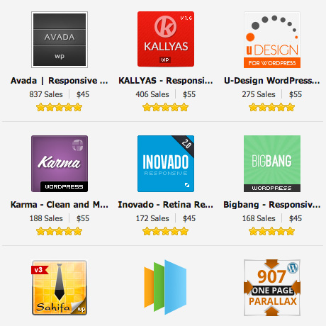
At $39 you can already get 80 premium WordPress themes, no sweat. It’s about the same price, more or less, of a plugin or a slider, isn’t it? Do you agree that these themes should be worth a whole lot more than that?

Tell us what you think. We’d love to hear your thoughts.


Header.php and The WordPress Header


In a previous article, we ‘deconstructed’ and brokedown a basic WordPress theme into 5 sections namely: the header, the menu, the sidebar, the content, and the footer. This time we are going to dive a little deeper into one of the sections and try to dissect it a little bit more.

Here’s how we defined The WordPress Header in that article:

The header is the structure that traditionally sits at the top of a web page. It contains the title of the website. It may also be referred to as the masthead, head, title, and banner. In all WordPress Themes, the header is found within the header.php template file.

Most themes have a header image that displays at the top of the page. This image is generated by a graphic defined either in the CSS value for the property that represents the header area or through the use of a custom header feature in WordPress. In themes that don’t have the custom header image feature, you can easily define a background image for the header image using CSS. (source: CSS for Dummies)

Not to be confused with headings (more on this in the future), the WordPress header is an important and strategic element of any WordPress theme because it is the first thing the visitor sees on your site. A good header communicates and reflects the content, purpose and intention of the site. It establishes your personal brand. Much like the cover of a top selling book or magazine, the header serves as a teaser of what can be expected from the rest of the website. It should be interesting enough to encourage visitors to explore the site even further. Not all headers require pictures or images. Some websites use beautiful typography as headers and they work just as well. Cluttered headers crammed with outdated blinking gifs and ads should be avoided as they are surefire ways for visitors to hit the back button in a jiffy.

The header.php file

header.php should contain everything from the DOCTYPE tag to the end of the page’s navigation. This means that all <head> tag information, meta tags, <title> tag variables, and other information must be included in the site’s header. This template file also must contain the <?php wp_head(); ?> tag, which places valuable WordPress version-sharing information, and other website information, within the head of the document. It must be placed before the closing </head> tag. (source: speckyboy.com)

The coding experiment

The header is set in an h1 HTML tag and features one template tag used with two different options or parameters. Basically, the first one displays the URL of the website in a link, and the second one displays the name of the blog or website as set in the Administration > Settings > General panel. When the user moves the mouse over the header title, the header can be clicked to return back to the main or front page of the site as set in the Administration > Settings > General panel.

Let’s experiment a bit with this basic header code. The code below contains two sections (the head and the body)

<HTML>

<HEAD>
<TITLE>My Home Page</TITLE>
</HEAD>

<BODY>
<H1>Blogging Experiment</H1>
This is an experiment.
</BODY>

</HTML>

and it will produce something like this:

Blogging Experiment

This is an experiment.

Of course, this is just plain simple html without any CSS styling applied yet. Sample CSS code that can be applied:

#header {
background: #90a090;
border-bottom: double 3px #aba;
border-left: solid 1px #9a9;
border-right: solid 1px #565;
border-top: solid 1px #9a9;
font: italic normal 230% ‘Times New Roman’, Times, serif;
letter-spacing: 0.2em;
margin: 0;
padding: 15px 10px 15px 60px;
}

If you want to experiment a little further and test your html coding skills you can check out this nifty tool on the W3Schools website. Simply submit your code and see what happens. You can make it as simple or as complicated as you want. Check it out here: W3Schools.com Try it yourself.


WordPress Theme Deconstructed

Last week we touched on the basic components of a typical WordPress theme. Below is a visual example of how the layout looks like.

The components are as follows:

The Header (header.php)

The header is the structure that traditionally sits at the top of a web page. It contains the title of the website. It may also be referred to as the masthead, head, title, and banner. In all WordPress Themes, the header is found within the header.php template file.

Most themes have a header image that displays at the top of the page. This image is generated by a graphic defined either in the CSS value for the property that represents the header area or through the use of a custom header feature in WordPress. In themes that don’t have the custom header image feature, you can easily define a background image for the header image using CSS. (source: CSS for Dummies)

Menu (navigation) – usually found within or above the header

There are two ways to display a nav menu. One is by calling wp_nav_menu() within a theme template file. The other is by using the Navigation Menu widget. Most themes will call a menu from their header.php template, but menus can be placed anywhere. (source: Justin Tadlock)

The Sidebar (sidebar.php)

In general, the WordPress sidebar features titles of the various sections within a list, with the section items in a nested list below the title.
According to the WordPress Codex and in terms of design,
a sidebar is:
“… a narrow vertical column often jam-packed with lots of information about a website. Found on most WordPress sites, the sidebar is usually placed on the right or left-hand side of the web page, though in some cases, a site will feature two sidebars, one on each side of the main content where your posts are found.”

(You can also check out our previous article “Adding Sidebars to WordPress” to read more about sidebars.)

The Content Column (index.php)

The content container in WordPress plays the most important role. It holds the WordPress Loop which dictates the generation of content on the page depending upon the request by the user.

Content consists of text, images, or other information shared in posts. This is separate from the structural design of a web site, which provides a framework into which the content is inserted, and the presentation of a site, which involves graphic design.

The Footer (footer.php)

The footer is found within the footer.php template file. Footers are more than just a place to put copyright information. The footer in a web design is the bottom of the page. It indicates the end of the page. The footer includes navigational links to move the reader into your blog’s content, but it does so much more. It’s the last thing some visitors see after they finish reading your blog post and comments and should encourage people to stay a little longer on your site. (Source: lorelle.wordpress.com).

More next week!


22 Awesome jQuery Typography Plugins 2013

In today’s fast moving internet world every website owner is using all the tools that he can to make his website look more visually appealing and more attractive in terms of design. This makes sense because if you think that websites should only provide information then you should not consider starting up a website at all.

Now many different types of technological tools are available out there which can help you design better websites. In this article I have chosen to focus on jQuery plugins.

jQuery is a JavaScript library that simplifies HTML, document traversing, event handling, animating and Ajax interactions for rapid web development.

Below I have compiled 22 awesome jQuery typography plug-ins which you can use to enhance your site. To show one example how these plug-ins can help you, let’s take a look at the first plugin J Rumble. I am sure you know sites that change the link color when you move your hover over the link. This effect is known as “hover effect”. J Rumble takes this technology one step further. By using this plugin, as soon as someone chooses an element of your site, the element will rumble, vibrate, shake or rotate.

There are 21 other plugins that will make your life easier. So scroll down and take a look.

(more…)


Responsive Web Design (RWD) vs Adaptive Web Design (AWD)

We’ve heard the terms Fluid, Adaptive, and Responsive used interchangeably when describing a theme’s ability to resize according to browser specs or device (mobile or not) size. Are they really different from one another or are they referring to the same characteristics found in themes described as such?

What is Responsive Web Design (RWD)? Responsive Layout?

Let’s take a closer look.

Responsive web design (often abbreviated to RWD) is an approach to web design in which a site is crafted to provide an optimal viewing experience—easy reading and navigation with a minimum of resizing, panning, and scrolling—across a wide range of devices (from desktop computer monitors to mobile phones) – Wikipedia

Responsive design is the methodology behind making a website respond to whatever platform you are viewing it on regardless of resolution and orientation. It may change how certain elements display but it will not remove elements or change the core functionality of their behaviours. Responsive design uses a fluid grid and it is usually possible entirely through HTML and CSS, without the need for DOM (Document Object Model) manipulation. – Matthew Freeman

According to Ethan Marcotte, The 3 Elements of Responsive Web Design are:

A flexible, grid-based layout – A layout based on proportions rather than absolutes; uses a flexible grid, which in turn ensures that a website can scale to a browser’s full width.

Flexible images and media – Layouts based on percentages resize gracefully according to the size of the browser window rendering them. However, it is problematic to ensure that the content within a site resizes.
Images and media should scale with the flexible grid; images that work in a flexible context, whether fluid themselves or perhaps controlled through overflow mechanisms. CSS addresses this problem with its max-width property

Media queries – Content based breakpoints; optimize the design for different viewing contexts and spot-fix bugs that occur at different resolution ranges. CSS3’s media queries directly address these usability problems by allowing browsers to serve different styles for different viewing contexts. CSS3 greatly expands support for media queries, adding the ability to target media features such as screen and device width and orientation.

These 3 elements of Responsive Web Design find their way into 3 different types of Responsive (RWD) Layouts:

The Basic Fluid Lay­out
Con­tent con­tin­u­ally flows or adjusts in a word-wrap fash­ion as screen width is increased or reduced. There are no “dis­tinct” dif­fer­ences in con­tent pre­sen­ta­tion. Fluid layouts are dynamic and user sensitive – adapting to the available real estate on the user interface and providing increased content accessibility.

The Adap­tive Lay­out
There are pre­de­fined sizes were dif­fer­ent lay­outs are trig­gered. These are called breakpoints. Typ­i­cally there are three or four break­points to accom­mo­date desk­top, tablet and mobile screen sizes.

The Respon­sive Lay­out
This is a hybrid of Basic Fluid Lay­out and Adap­tive Lay­out. There are pre­de­fined break points, how­ever in between these breakpoints con­tent will flow to expand or con­tract.

According to his article for the Adobe Blog, Carl Sandquist states that:

“Cur­rently, most RWD web sites use Respon­sive Lay­out since it offers a best-of-both-world expe­ri­ence. Con­tent snaps into the appro­pri­ate approx­i­mate posi­tion for a device type (e.g. Tablet) and then fine-tuned adjust­ments are made for the exact screen size on a par­tic­u­lar device.”

What is Adaptive Design (AWD)? Adaptive Layout?

“Adaptive design is the manipulation of layouts to best perform on certain screen resolutions inclusive of elemental removal or behaviour changing techniques. Adaptive design usually requires Javascript to efficiently manipulate the DOM. Javascript can be avoided if you plan on having duplicate on-page elements and then show or hide them based on screen sizes, this might be appropriate for smaller elements but not whole columns or navigation elements.” – Matthew Freeman

“This technique adapts what is displayed depending on the capabilities of the device being used, as well as the screen size. It centres on the context of the user, so even when the same content is used, it is adapted (with some or even all of the design elements changing), depending on whether the user is using a mouse and keyboard or touch screen. AWD also uses different layouts for tablets and mobiles with certain. ‘Responsive’ elements built in to reduce the number of different templates required. AWD can be taken to further extremes with content being completely repackaged and reworded, while images and video are either reworked or completely removed.” – Danny Bluestone

According to Aaron Gustafson, author of Adaptive Web Design, Crafting Rich Experiences with Progressive Enhancement:

“Progressive enhancement isn’t about browsers. It’s about crafting experiences that serve your users by giving them access to content without technological restrictions. Progressive enhancement doesn’t require that you provide the same experience in different browsers, nor does it preclude you from using the latest and greatest technologies; it simply asks that you honor your content (and your users) by applying technologies in an intelligent way, layer-upon-layer, to craft an amazing experience.

He encourages designers to: Think of the user, not the browser.”

Which one is better?

A better understanding of the differences between Responsive Web Design and Adaptive Web Design is a starting point to deciding which solution will work well for you, or your clients, if you are a WordPress professional. Knowing what solutions are available and having the ability to distinguish and implement whichever design approach best meets the specifications of the end user is an important element. Of course, nothing is carved in stone. Future designs may be a combination or a hybrid of both – employing the best features of each one. The goal is to ensure that the user experience at the point of searching and eventually finding your website is the best experience they get at that particular moment – fully hoping that it will be the first of many more visits and not their last.