Awesome New Themes for June 2013
Orange Core

If you’re looking for a theme that can do a lot to meet what a host of clients need then you definitely want to check out Orange Core. This multi-purpose theme is great for business and corporate sites although it does have excellent portfolio capabilities too. Awesome presentations may be done using the panoramic full-width homepage slider. Built in pricing tables, service pages, column variations and other page templates included are great tools necessary in building business and corporate sites. Orange core can be a great way for potential customers to get information about your business using these features. Orange Core is optimized for mobile and touch screen devices and is built on twitter bootstrap.

Vernum

Vernum is a clean, modern and powerful One Page Parallax theme that can virtually be what you want it to be. This theme has a drag and drop page builder to help you create the pages you want. Vernum also uses the parallax effect for added drama as you scroll down the page. In addition to these, Vernum uses retina ready graphics, is responsive, has great blog and portfolio capabilities, and uses CSS3 animations. It is flexible enough to meet the demands of websites of different kinds.

WP Education

WP Education is a premium theme designed for schools and educational institutions. Many educational institutions suffer from unimpressive websites. WP Education is a viable solution to add that professional air to any academic institution. Aside from the normal blog and gallery capabilities, schools can use this theme as an administrative and organizational tool to publish available courses, their descriptions and comments, and even process applications from prospective students.

Universfolio

Universfolio is a responsive multipurpose theme you can use for business or for pleasure. Whether it’s a corporate website, a personal blog or a creative portfolio, Universfolio has something for you. The theme uses the popular and powerful Revolution Slider to give you stunning slide transitions and layered 3d effects. This allows you to present eye catching slideshows to make casual visitors stay on your site longer. The theme also has awesome portfolio and blog page templates to showcase your work and keep visitors up to date with what’s going on. Universfolio is WooCommerce ready giving your site extra ecommerce capabilities.

JP Animated vCard Theme

JP is a cool and modern vCard WordPress theme for the creative professional. It’s got everything you need to create a good first impression on visitors, current clients, and potential clients. It’s simple and clean menu system allows you to navigate through the whole site without much fuss. It includes a great portfolio that allows you to showcase images, videos and other media projects on your site for interested parties to look at. You also have a blog page so visitors can get an insight on how you approach projects and tasks. This theme also has a Services Page and a Contact Page for those interested in hiring your services.

Lambo Photography Theme

If you are a photographer wanting to setup your own website or wanting to revitalize your existing one, check out Lambo. Lambo Premium WordPress Theme gives you special ways of showcasing your photos and images. This theme is perfect for the photographer or graphic artist who wants his/her work presented to potential clients artistically. The theme’s homepage slider is designed so that the graphic gives you the semblance that you are looking through a lens. The full screen slider presents your works in a choice of sliders including one with the popular Ken Burns effect.

Realia

Realia Premium WordPress Theme is a real estate and property rental theme ideal for real estate agents, brokers and professionals. This theme allows you to manage properties for sale or for rent so that potential buyers can go to your site and look for the property they desire and easily find it. This google map integrated theme allows visitors to search according to location based on defined filters like: number of baths, price, whether for sale or for rent. This theme has a dedicated page for each property with a description, an image gallery and a google map indicating its location. An inquiry form is conveniently located on the sidebar to facilitate contact with a broker. Property owners can submit their properties for sale. Theme supports IDX infrastructure trusted by professionals in the real estate industry.


Best BuddyPress Themes May 2013

BuddyPress is an open source social networking software package owned by Automattic – essentially, a plugin that can be installed on WordPress to transform it into a social network platform. If you are considering to up the ante on your blog by being more socially connected, here are some of the best BuddyPress themes you can check out:

Flix BuddyPress Ready Team Blogging

Flix is a powerful and flexible community blogging theme for WordPress. you can use to start your own community in no time. This theme includes BuddyPress and bbPress as part of the many superb features of this theme. It also includes a SmartTab system where you can put authors in the spotlight. Easily order the front page by posts from a specific author a specific category without reloading the page. The team blogging feature is perfect for both small and big blogs that have multiple contributors. This responsive theme is also whitelabel enabled which means you can easily customize the theme to suit your business brand.

OneCommunity BuddyPress Theme

OneCommunity theme is a responsive WPMU compatible theme integrated with a BuddyPress plugin. This plugin allows users to register on your site and start creating profiles, posting messages, making connections, creating and interacting in groups and much more. This theme is a social network in a box where you can build a social network for your company, school, sports team or niche community. The theme includes over 40 inner pages to manage profiles, activities, messages, group messages, invitations, subscriptions, and forums of both members and groups.

Razor

Razor is a responsive and clean, professional looking BuddyPress theme for WordPress. Built on a responsive layout structure and supporting Retina (HiDPI) enabled devices, this theme is packed with powerful modern features and the advanced controls such as Drag and Drop Layout Manager, Contact Form Builder, White Label Admin, Sidebar Manager and so much more. Building websites, communities, social networks is a breeze with this amazing looking theme. The possibilities are endless.

Social Buddy

Social Buddy is a responsive, flexible, BuddyPress and BBPress integrated community WordPress theme that is perfect for niche communities and social networks. Its fully fluid responsive design makes it work beautifully on mobile devices. This theme includes extensive documentation and an intuitive options panel making setup and customization a breeze. Theme support is excellent and top notch.


Blazing the Trail in 2013

Greater things are yet to come and they are exciting. There’s always something magical whenever the New Year comes. Technically, if you really strip this day down to what it really is and take away all the fireworks and celebration, it’s actually another normal sunrise and sunset in the calendar. Fortunately, this is not how majority of us see it. Many of us look forward to it with a lot of hope and expectations, a chance to start again, an opportunity to embrace new challenges, a time to let go of the old and wipe the slate clean, a new beginning for many.

For those of us in the WordPress community and the greater Internet population, things have never been more exciting. Imagine a single video garnering more than a billion views and still counting. Why is this significant? This simply gives us the information that there are a billion or more active Internet users out there that we can reach out to. As global interconnection continually increases, social behavior continues to adapt and our world seems closer and more reachable everyday. By force majeure the older generation are being pulled in by the tech savvy younger generation into the digital age as this has now become the common tool for communication. Social networking continues to expand and so has its demographic base.

For those who are in the WordPress marketplace and are serious about it, the hard questions need to be asked. Is it enough to simply ask what the ideal WordPress theme really is or what the perfect theme looks like? Are the current themes in the market today meeting the needs of the consumers, real and perceived? What about creativity and originality? Or innovation? Are we willing to think out of the box and be experimental as far as theme features and designs are concerned or are we just going to play it safe and blend with the crowd? Are we ready to meet the demands of the unstoppable rise of mobile computing and the multilingual global marketplace?

As we look into the future, those in the Internet and web development industry, (WordPress included) need to take a wholistic approach in planning for the next 12 months and beyond. Maybe some are just dabbling in WordPress theme development for fun while others are seriously considering it as a viable business opportunity worth investing in. Perhaps as we plan future steps maybe we can take a step or two back and view the WordPress themes market from a different angle or with a fresh perspective – to work backwards and use the future to strategically determine today’s activities. Somebody once said, “If you always do what you always did, you will always get what you always got.” Who would have ever thought that an Asian guy would teach the world (1 billion+) how to do a horse dance? Mind-blowing but undeniably real and possible. Maybe he did what wasn’t normally done and got the results nobody expected. Guess what? So can all of us.


Fusion Theme from Elegant Themes Coming Soon

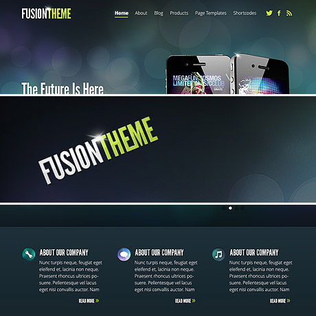
Elegant Themes recently announced their new and upcoming theme: Fusion – a theme designed to “fuse” professionalism and pizzazz to create that perfect solution for technology companies and blogs alike. If you run a tech blog or an app development company and you need a really cool looking theme that’s hip and modern then Fusion is probably the theme for you.

The general design of this theme is similar to Elegant’s recent themes, Nimble and Harmony, taking off from that single page design while adding the modern, graphic flavor to it. One of the many benefits of a “one page” design is that you get a quick and easy, concise at a glance look, quite handy for mobile devices, with options for details in sub pages.

Similar to Nimble and Harmony, Fusion has large sections clearly delineated from each other. Fusion has a section allocated for a logo, navigation menu and other corporate brand or social networking icons all prominently located above and seamlessly flows into a generously spaced section for a slider. This slider section can be used to showcase featured images or products, attention grabbing spiels, and other important announcements useful to your visitors. This can be followed by a section where static text boxes or placeholders can be used to feature select products or services. You also have an area to feature the latest blog post headlines that link to the full posts on the and there is also provision for sponsor links or ad banners. A widgetized footer area can also be setup to add more features and functionalities useful to the site.

So far we we’ve seen that Elegant Themes has been consistent as far as quality is concerned and so far, each product released remains true to its reputation for great design. This commitment can be experienced and has been experienced by so many customers in every Elegant Themes subscription. This latest theme offering is something to look forward to and no doubt it will be something that will surely be according to Elegant Themes’ strict standards.

Get 77 Premium Themes For $39

Harmony Theme from Elegant Themes is LIVE

On Nov 29, Elegant Themes officially released Harmony, a versatile premium WordPress theme designed for musicians and bands. Its key features are its custom audio player for sampling music tracks, event manager features and eCommerce functionality. Visitors can listen to the band’s music, purchase concert tickets via the band’s ticket vendor of choice and purchase music/merchandise through the theme’s WooCommerce powered e-store pages. It’s a one-stop website both musicians and fans will surely enjoy.

Harmony is a well designed, well developed theme considering this is Elegant’s first step into music themes. A lot of expectation and inputs have been given by users since the theme’s announcement on Nov. 7 and these suggestions have been carefully woven into the theme as best possible. The theme continues to deliver that signature Elegant Themes look and upholds its reputation for simple yet sophisticated design that distinguishes it, specifically Harmony’s aesthetics, from other music themes in the market. In addition, its excellent event management capabilities make it convenient for fans to patronize the band’s latest gigs and concerts as seamless and as effortless as scrolling through the pages.

Harmony includes an integrated MP3 audio player which gives fans and potential fans the opportunity to listen to audio samples of upcoming or already released music tracks. The theme is also equipped to display music videos and concert previews as an effective marketing tool to attract the attention of this media savvy generation of fans. This theme is also responsive and will work well on handheld and mobile devices – a staple of every ear plugged music fan out there. This means that fans can enjoy their favorite band’s music anytime, anywhere – which is definitely music to any musician’s ears.

Features:

  • Responsive Design
  • Theme Options
  • Shortcodes
  • Page Templates
  • Perpetual Updates
  • Secure and Valid Code
  • Browser Compatibility
  • Complete Localization
  • Unlimited Colors
  • Unparalleled Support

Harmony Premium WordPress Theme includes top-notch tech support provided by Elegant themes’ support staff to help you setup your site and get it running in no time.

Get 77 Premium Themes for $39

Responsive Web Design (RWD) vs Adaptive Web Design (AWD)

We’ve heard the terms Fluid, Adaptive, and Responsive used interchangeably when describing a theme’s ability to resize according to browser specs or device (mobile or not) size. Are they really different from one another or are they referring to the same characteristics found in themes described as such?

What is Responsive Web Design (RWD)? Responsive Layout?

Let’s take a closer look.

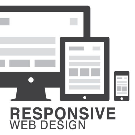
Responsive web design (often abbreviated to RWD) is an approach to web design in which a site is crafted to provide an optimal viewing experience—easy reading and navigation with a minimum of resizing, panning, and scrolling—across a wide range of devices (from desktop computer monitors to mobile phones) – Wikipedia

Responsive design is the methodology behind making a website respond to whatever platform you are viewing it on regardless of resolution and orientation. It may change how certain elements display but it will not remove elements or change the core functionality of their behaviours. Responsive design uses a fluid grid and it is usually possible entirely through HTML and CSS, without the need for DOM (Document Object Model) manipulation. – Matthew Freeman

According to Ethan Marcotte, The 3 Elements of Responsive Web Design are:

A flexible, grid-based layout – A layout based on proportions rather than absolutes; uses a flexible grid, which in turn ensures that a website can scale to a browser’s full width.

Flexible images and media – Layouts based on percentages resize gracefully according to the size of the browser window rendering them. However, it is problematic to ensure that the content within a site resizes.
Images and media should scale with the flexible grid; images that work in a flexible context, whether fluid themselves or perhaps controlled through overflow mechanisms. CSS addresses this problem with its max-width property

Media queries – Content based breakpoints; optimize the design for different viewing contexts and spot-fix bugs that occur at different resolution ranges. CSS3’s media queries directly address these usability problems by allowing browsers to serve different styles for different viewing contexts. CSS3 greatly expands support for media queries, adding the ability to target media features such as screen and device width and orientation.

These 3 elements of Responsive Web Design find their way into 3 different types of Responsive (RWD) Layouts:

The Basic Fluid Lay­out
Con­tent con­tin­u­ally flows or adjusts in a word-wrap fash­ion as screen width is increased or reduced. There are no “dis­tinct” dif­fer­ences in con­tent pre­sen­ta­tion. Fluid layouts are dynamic and user sensitive – adapting to the available real estate on the user interface and providing increased content accessibility.

The Adap­tive Lay­out
There are pre­de­fined sizes were dif­fer­ent lay­outs are trig­gered. These are called breakpoints. Typ­i­cally there are three or four break­points to accom­mo­date desk­top, tablet and mobile screen sizes.

The Respon­sive Lay­out
This is a hybrid of Basic Fluid Lay­out and Adap­tive Lay­out. There are pre­de­fined break points, how­ever in between these breakpoints con­tent will flow to expand or con­tract.

According to his article for the Adobe Blog, Carl Sandquist states that:

“Cur­rently, most RWD web sites use Respon­sive Lay­out since it offers a best-of-both-world expe­ri­ence. Con­tent snaps into the appro­pri­ate approx­i­mate posi­tion for a device type (e.g. Tablet) and then fine-tuned adjust­ments are made for the exact screen size on a par­tic­u­lar device.”

What is Adaptive Design (AWD)? Adaptive Layout?

“Adaptive design is the manipulation of layouts to best perform on certain screen resolutions inclusive of elemental removal or behaviour changing techniques. Adaptive design usually requires Javascript to efficiently manipulate the DOM. Javascript can be avoided if you plan on having duplicate on-page elements and then show or hide them based on screen sizes, this might be appropriate for smaller elements but not whole columns or navigation elements.” – Matthew Freeman

“This technique adapts what is displayed depending on the capabilities of the device being used, as well as the screen size. It centres on the context of the user, so even when the same content is used, it is adapted (with some or even all of the design elements changing), depending on whether the user is using a mouse and keyboard or touch screen. AWD also uses different layouts for tablets and mobiles with certain. ‘Responsive’ elements built in to reduce the number of different templates required. AWD can be taken to further extremes with content being completely repackaged and reworded, while images and video are either reworked or completely removed.” – Danny Bluestone

According to Aaron Gustafson, author of Adaptive Web Design, Crafting Rich Experiences with Progressive Enhancement:

“Progressive enhancement isn’t about browsers. It’s about crafting experiences that serve your users by giving them access to content without technological restrictions. Progressive enhancement doesn’t require that you provide the same experience in different browsers, nor does it preclude you from using the latest and greatest technologies; it simply asks that you honor your content (and your users) by applying technologies in an intelligent way, layer-upon-layer, to craft an amazing experience.

He encourages designers to: Think of the user, not the browser.”

Which one is better?

A better understanding of the differences between Responsive Web Design and Adaptive Web Design is a starting point to deciding which solution will work well for you, or your clients, if you are a WordPress professional. Knowing what solutions are available and having the ability to distinguish and implement whichever design approach best meets the specifications of the end user is an important element. Of course, nothing is carved in stone. Future designs may be a combination or a hybrid of both – employing the best features of each one. The goal is to ensure that the user experience at the point of searching and eventually finding your website is the best experience they get at that particular moment – fully hoping that it will be the first of many more visits and not their last.


5 Best Ecommerce Themes for October 2012

The holidays are almost here and what better way to spruce up your website than with some great eCommerce themes to improve the look and function of your e-store. Here’s a rundown of some of the best eCommerce themes to get you ready for holiday shoppers:

1. Sold! Responsive/E-Commerce Theme

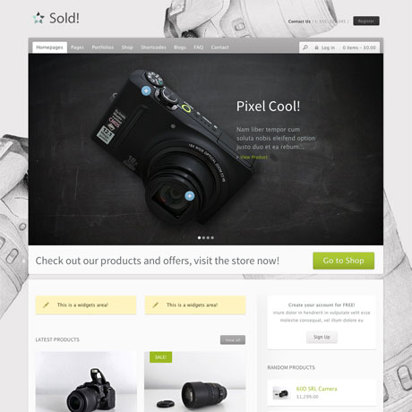
Sold! Premium WordPress Theme is an excellent mix of style and function. The clean, white space design does not distract and serves as the perfect backdrop to highlight choice merchandise. Sold has a beautiful slider where you can put your most interesting items on sale. You can even define points on the slide where you can add comments or even zoom images ala Flickr. This is perfect for highlighting detail on specific points of the product. Sold! uses two of the most powerful plugins – WooCommerce and Jigoshop – making it an effective eCommerce solution. Its multi-lingual capability, responsive features and easy customizability enables your store to service both local and global market.

Sold! Theme: $55 | Demo & Download

2. Mercor Responsive WooCommerce WordPress Theme

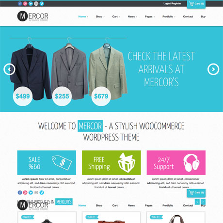
Another interesting theme worth mentioning is Mercor. Mercor Premium WordPress Theme gives you the look and feel of a department store or supermarket weekly catalogue. This responsive theme’s clean, fresh layout and white space styling creates an uncluttered look that’s easy on the eye even if there are numerous images and texts on the page. Mercor has a dynamic Nivo homepage slider to highlight store specials or to announce store events and sales. Mercor is fully responsive and uses WooCommerce to power e-commerce transactions. This powerful feature combination makes your site current, competitive and able to address the emerging mobile shoppers market.

Mercor Theme: $55 | Demo & Download

3. Intrigue Premium WordPress Theme

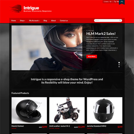
This latest eCommerce theme from CSSIgniter is bold and eye-catching. Intrigue Premium WordPress Theme is a responsive eCommerce theme that combines the power of WooCommerce and CSSIgniter’s straightforward theme design. This means that setting up a powerful eCommerce site need not be a complicated and tedious task to accomplish. With Intrigue, you can use a plethora of widgets to create the functionality you require. This theme comes out of the box in a hot red and black color scheme but you can also choose from the available 7 color schemes to create the look most appropriate to your market. Intrigue Premium WordPress Theme is not over the top and includes just the right amount of features and functionalities for whatever you need.

Intrigue Theme: $39 | Demo & Download

4. Mearishop – Clean Responsive E-Commerce Theme

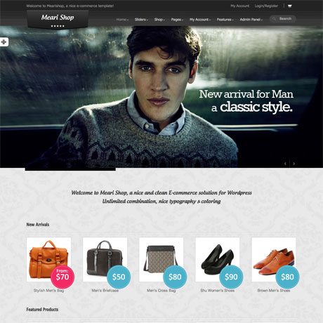
Mearishop Premium WordPress Theme is a great eCommerce solution that’s edgy and modern. The Lookbook-ish appeal makes it a perfect match for a fashion and accessories store. Customers can check out the portfolio or lookbook pages to determine the style that best suits them. Mearishop uses the powerful Hana panel combined with WooCommerce functionality to give you the power to control almost every aspect of the theme. With tons of options available, this features makes this responsive theme perfect for both WP noobs and experienced developers to use. Choose from unlimited color options, 7 backgrounds and 34 patterns to define your custom look. You can even upload your background image. With 7 sliders to choose from, Mearishop gives you the options you to reach your target market in style.

Mearishop Theme: $55 | Demo & Download

5. Xing Business/eCommerce WordPress Theme

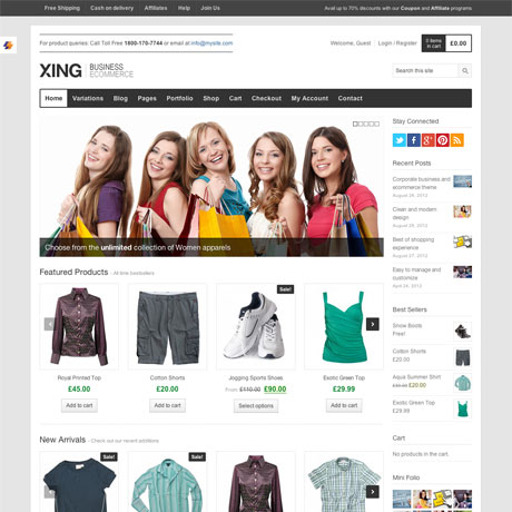
Xing Premium WordPress Theme is a modern and clean theme designed to meet the eCommerce needs of both small and large scale business alike. Xing is primarily an eCommerce theme but it is also flexible enough to be used for creative portfolios or for magazine/editorial blog type websites. Xing uses several jQuery powered features like the Flexslider and the jQuery Product Carousels(for WooCommerce recent/featured products). This highly customizable and responsive theme gives you tons of options to create the look you want. Xing is not wanting in anything – from shortcodes, to custom post formats, to custom widgets, to 8 portfolio layouts, to social sharing features and other features and functionalities to help you to create and customize your eCommerce site. Check out Xing today.

Xing Theme: $55 | Demo & Download

Keep your eyes peeled for more WordPress holiday roundups in the next few weeks!


Elegant Themes Shortcodes: Now Responsive!

With the advent of mobile platforms, WordPress themes have to adapt to the demands of this steadily growing user base. It can really be quite frustrating to read articles from any major newspaper’s website on iPhone or Android and get all the content mish mashed. Theme developers and web designers need to move more and more toward this emerging trend towards responsive themes.

It is a welcome development that Elegant Themes recently released its responsive shortcodes. While Elegant Themes has been churning out responsive themes for quite a while, the shortcodes were left out. It took 10 responsive themes before mobile friendly shortcodes were released. Great news, indeed!

So how do these new shortcodes, improve mobile browsing experience? Elegant Themes’ blog cites two examples of their improvement strategy. Tabs have always been an issue when websites typically viewed on a 960px wide screen to a 320px width. No matter what you do, having 10 tabs will alway come out cramped. Solution: Tabs turn into a slider when switching to mobile mode. It just makes sense to have sliders rather than have unreadable tab labels. Another example cited was the case of columns. As the content width gets narrower, text in columns become a bunch of flying letters. Solution: the new shortcodes convert columns into boxes when switching to mobile screens. Brilliant isn’t it? Regarding the new shortcodes, Elegant Themes has declared them to be fluid width giving them the capacity to shrink and expand according to screen size.

Web design and the emerging technology innovation and trends are accelerating even faster. More and more mobile users prefer to access the web through their devices and WordPress Themes providers need to step up their game. For loyal subscribers of Elegant Themes, these concrete steps towards updating and upgrading all Elegant Themes products is always welcome and appreciated.

Congratulations to Elegant Themes for taking WordPress theme development one step further and fully embracing the future of WordPress.

See Elegant Themes’ Responsive Shortcodes

Best Theme

  Best Theme (v1.1) A Beautiful, Responsive Theme for WordPress Sites Make sure to check out our official post on the Best Theme for updates on recent and future releases! Take some time to check out the Best Theme demo …