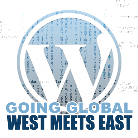
WordPress Design For A Global Market

Design is subjective. There are generally accepted design principles that govern the design community and serve as guides to evaluating “correct” design. However, not all of them are totally applicable to specific clients especially when Western taste buds meet Eastern culture. But when and where shall the ‘twain ever meet if beauty and design aesthetics are wrapped deeply in mores and culture?

This is the cross cultural challenge that web designers need to face in order to remain competitive in today’s global market place.

West, Meet East

Before the West was, the East was. Two of the world’s oldest civilizations, China and India, are also two of the fastest and most robust economies today. According to Census.gov, as of 2014, China and India ranked as the top two countries with the highest population in the world. China ranked first with 1.3B (population) with an approximate 42.3% Internet penetration, followed by India with 1.2B (population) with an approximate 81% Internet penetration. Approximately 1 billion internet users from these 2 (right to left, top-to-bottom reading) countries alone. And if theme developers do the math, even if at 1% of a billion internet users, that’s still a lot of WordPress themes right there. Too many to ignore.

Global Market Local User Design

We’ve talked about defining your target market and directing your business to reaching your specific demographic. Once you have that down pat, it’s probably time to think of expansion and consider widening your net a little further. To go a little more granular and target the local user.

With WordPress powering over 21% of the Internet and being one of the most user friendly and reliable CMS systems existing today, aside from the fact that it is free, more and more Internet users are looking to it as their platform of choice.

With that, the popularity of WordPress has crossed over into multi language markets despite having been around for only a decade and catering mainly to users of modern languages which are generally left to right in direction. Hence, the increase in demand for WordPress themes with RTL or WPML features or WP plugins that provide this functionality.

The diversity of WordPress users from all across the globe is becoming an important factor in developing themes that are relevant culturally and technically suited to these users local needs. As responsive once was a premium feature that has now become a standard feature in all WordPress themes, so shall the multi language and RTL feature become.

The Design Approach

The WordPress theme development marketplace has grown considerably with designers coming up with better and more user friendly designs that match the general needs of WordPress users. There is a huge pool of WordPress themes available for, generally, almost every type of website need out there. But there is still room to grow for more cross-cultural friendly options.

Below are some design elements that designers need to consider when creating themes that are responsive to culturally diverse user groups. (Notes culled from W3.org and Sitepoint.com)

  • Language
    – Languages don’t have a direction. Scripts have a writing direction, and so languages written in a particular script, will be written with the direction of that script. Languages can be written in more than one script.
  • Typography – fonts and characters
    – Typography can look “busier” to Western eyes than to Asian readers because many Asian scripts don’t have separate upper and lower cases. Some languages have scripts that are not alphabetic at all, but which express an idea rather than a sound. Occasionally, it’s necessary for an author to provide readers with pronunciation help for especially rare or awkward characters, usually with an alternative script in small writing above the ambiguous character.
  • Content presentation
  • Styling
  • Usability
  • Navigation
  • Mirror layout
  • Scripts (Left to Right, Right to Left, Top to Bottom)
    – Text direction is another thing that should not be confused with language. In some scripts, such as Arabic and Hebrew, displayed text is read predominantly from right to left, although within that flow, numbers and text from other scripts are displayed from left to right. Knowing the directionality of text, based on the script(s) to be used, is important to web designers and authors, because right-to-left text can be more complicated (for beginners) to work with and the organization and directionality of the page layout are affected. Therefore, knowing the writing direction can be relevant to estimating the work involved to create web pages in a new language.
  • Images and animations
  • Forms
    – Designing forms for an Asian market can have pitfalls for Western developers. For example, it’s common to require both given name and family name and give an error if both are not completed. Many Asian languages write names with family names first and given names afterwards while some have only one name. Also, do not limit the amount of characters in Address fields.
  • Mobile
  • Propriety
  • Color palettes
    – While choosing your colors for your design, keep in mind that certain colors have different connotations across cultures. For example, red is lucky for Chinese people. On the other hand, Thai people will be offended if you print their name in red — it’s the color that monks employ to write names on coffins, so to write someone’s name in red is to “wish them dead”.
  • Symbols and metaphors

For web designers, W3.org International’s tagline sums it up quite well: “Making the World Wide Web Worldwide.” Let’s!


Portfolio WordPress Themes for December 2013

Gear up for the year-end and display your holiday photos or your best creative work with these flexible and dynamic portfolio WordPress themes for you or your clients. Check these out:

Sonnet – One Page Parallax Multipurpose Portfolio

Sonnet Premium WordPress Theme is a clean and streamlined One page Parallax Responsive Business Template built with Bootstrap 3.0.2, HTM5 & CSS3. This flat, easy to customize theme with its well-placed content blocks boasts of professional coding as its core power. Also included are Visual Composer – the most popular & powerful drag and drop layout builder for WordPress, a powerful section editor, responsive grid portfolio plugin – Megafolio, Zilla Shortcode, a Pricing Table manager among others. This premium theme supports Automated Plugin management and even includes a demo content importer which will let you build the site with dummy content in a second.

Mocha Flat Bold WordPress Portfolio Theme

Mocha Premium WordPress Theme is a unique and bold portfolio WordPress that is aesthetically clean, flat, minimalist in design ideal for any design agency, creative professional, freelance designer, photographer, or anyone in the creative industry wanting to make a good impression on clients. It’s very flexible and is powered with Bootstrap framework. This premium WordPress theme has advanced theme options with unlimited styling options, unlimited colors, 500+ Google Fonts, a Visual Shortcode manager, and tons of other features to help you fully customize your website. This premium theme is WordPress 3.6 and 3.7 compliant.

Mercury Responsive Portfolio Photography Theme

Mercury Premium WordPress Theme is a clean, minimalist parallax style portfolio theme that can be used for any portfolio, photography or business website. Features include responsive design which adapts to mobile devices (iPhone, iPad) and can be deactivated with one click in your backend, it is retina ready for ultra-sharp high resolution graphics, sticky main menu navigation, off-canvas mobile navigation, drag & drop content builder, 20 gallery templates, 6 portfolio templates, filterable portfolios, instant AJAX search, Music support for gallery pages, Password Protected Gallery Support, Image Gallery Comments Support, Fullscreen Youtube and Vimeo video support, and a whole lot more.

Upward: Experimental Portfolio & Blog

Upward Premium WordPress Theme is a unique experimental responsive, retina-ready WordPress theme using pseudo-elements to create a distinct presentation style on original browsers (Firefox and Chrome) unlike any other theme. Usually, non-original browsers (like Safari for Windows) do not support anti-aliasing of pseudo-elements. Also, not all browsers support CSS3 animation completely, thus some part of animation isn’t available in IE8-9, Safari and Opera. Other than that, this premium theme includes important features like: light and dark skins, post/page options, powerful visual shortcodes, unlimited sidebars, unlimited fonts, and so much more.

Nervaq – Responsive One Page WordPress Theme

Nervaq Premium WordPress Theme is a fully responsive Ajax-powered, parallax one page portfolio template with a modern, clean and minimalistic design ideal for creative agencies, designers, freelance creatives, and those in the creative industry. This premium theme is highly optimized for both mobile and desktop platforms, it uses lazy-loading of images assets and compression of all required scripts. Other features include: Drag and drop gallery management, localization ready, and is built on a full OOP , modular, load-on-demand, WordPress framework.

Grido: Responsive and Multipurpose Grid Portfolio

Grido Premium WordPress Theme is a minimalistic theme ideal for creative professionals that love flat and clean design. Its stunning design and layout capabilities with excellent color (ten preset) and typographic choices will give your portfolio the attention that it deserves. This premium responsive theme is highly customizable using the dedicated control panel and is a highly flexible and widgetized theme, packed with WordPress features such as post-formats, page templates, custom widgets, shortcodes, including important features specifically designed for it. It is also Themelovin plugins compatible: Themelovin Dribbble, Themelovin Portfolio, Themelovin Shortcodes, Themelovin Team, Themelovin TwitterIt.

Dirty Saloon – A Rugged One Page WordPress Theme

Dirty Saloon Premium WordPress Theme is a Cowboy Western-inspired premium responsive Theme that will surely make you hold your horses. This unique, flexible, and freshly designed theme features innovative AJAX loading of Posts and Portfolio items which can be turned on and off on demand with one click in Page Builder. It features a premium Aqua Page Builder for easy creation of new pages for your site.The theme also comes with a Revolution Slider, a convenient Administration panel, and many more.


Creative WordPress Themes – November 2013

Are you working on a project and in need of a WordPress theme to match your client’s needs? Here are some of the latest creative and interesting WordPress themes to inspire you:

Attitude: Multimedia Portfolio for Media Artists

Attitude Premium WordPress Theme is a multimedia portfolio and blog theme specifically designed for media artists. This theme comes with 3 main media formats: audio – to share your creative sounds with the world, video – for producers, directors, and video designers to publish and share video, and gallery portfolio formats – for architects, interior & landscape designers, photographers and others who have few or many pictures for each project. Notable features are: fully compatible with high-resolution screens like a laptops with Retina-display, two color schemes – Light and Dark, custom slugs, portfolio migration from other themes, custom styles, motion typo, and demo XML to get started.

Swiss – Premium WordPress Theme

Swiss Premium WordPress Theme is an ultra minimal yet elegantly styled WordPress theme based on the Swiss design principles for layout, colors, and typography. Its European design flavor featuring big, bold typographic elements applies itself well to an agency, blog or portfolio website. This theme comes with 3 different homepage options, 2 blog styles, 3 filterable portfolio presentation options, a team members page, and many other features that will surely make your design company stand out. It also comes with a free Cr3ativ Shortcodes plugin you can use to easily add fully responsive elements such as google maps, alert boxes, columns, buttons (with or without icons) choose colors for buttons, pull quotes and so much more.

Pix – Responsive Multi-Purpose WordPress Theme

ePix Premium WordPress Theme is a feature-packed theme suitable to the demands of creative professionals like photographers, design agencies, creative freelancers, and the like. It is loaded with unique features like: the Fullscreen gallery, Stunning Galleries, advanced live Skin Editor, Visual Page Builder, Gallery Media Manager, Parallax, etc. It also includes other features such as: fully responsive, retina ready, advanced theme options, full WooCommerce design integration and WPML ready, font awesome integration, advanced typography options, Custom CSS field, SEO basics built-in, Wistia Video Hosting Integration, JW Player 6.x Integration with Audio / Video, extensive documentation and detailed screencast video tutorials and top-notch custom support.

Porcelain – Responsive Multi-Purpose Theme

Porcelain Premium WordPress Theme is a clean and dynamic, fully responsive, parallax WordPress theme suited for all types of website needs. It comes with some awesome features, such as custom headers and custom background sections and it is the perfect canvas for your creative ideas. The combination of responsive design and parallax animations creates a high impact and impressive home page that looks great on all kinds of devices. Features include: an extensive admin panel, packed with various options so you can easily modify stylings, colors, fonts, layouts, etc., a flexible AJAX gallery with jQuery animations and effects, the gallery also provides an AJAX pagination and category filter for a better items organisation, content slider, Nivo slider, masonry layout support, and so much more.

OneUp – One Page Parallax Retina WordPress Theme

OneUp Premium WordPress Theme is a fully responsive HTML5 Retina enabled One Page WordPress Theme suitable for any kind of creative or business use. Built upon the responsive Twitter Bootstrap framework, the theme is highly optimized for both mobile and desktop platforms. This premium theme utilizes lazy-loading of images and compression of all required scripts, to ensure a fast-loading and awesome looking website. Features include: advanced page builder, layered slide builder, drag ‘n drop galleries, custom thumbnail cropping, WPML compatible, 4 slider engines, and many other great features to create a high visual impact website.

Gothica – A one Page WordPress Theme in Goth Style

Gothica Premium Responsive WordPress Theme is a bold and striking one page theme with a modern gothic flair. This premium theme features innovative AJAX loading of Posts and Portfolio items (can be turned on or off on demand with one click in Page Builder), premium Aqua Page Builder, Revolution Slider, responsive design, unlimited homepage templates, CSS3 features and animations, 5 Post Templates (Standard, video, link, gallery, audio), Team Page, and so much more.

Tao: Retina & Responsive WordPress Portfolio Theme

Tao Premium WordPress theme is unique and incredibly easy to use WordPress portfolio theme that’s quick to setup and easy to customize. This premium handcrafted theme is perfect for showcasing your work with a creative twist. Check out the unique folding effect of the grid boxes. Other features include: fully retina & responsive, semantic and clean HTML5, coded with graceful degradation and SEO in mind, focus on user-experience, usability, and beautiful typography, WordPress 3.0+ ready (featured images, custom post types, custom menus), unbranded theme options, localisation support, widget enabled, diversified portfolio, etc.


Niche WordPress Themes November 2013

Searching for a WordPress theme that fits you or your client’s specific needs can often be satisfied by multi purpose WordPress themes. The seed design can often be tweaked and twiddled with to create the whatever the desired website outcome intended. However, if you find a theme that already matches the type of website you need then a lot of design time can be saved and spent on optimizing other features of the website. Here are some of the latest niche WordPress themes that you might find useful for your website needs.

Organic Market Friendly eCommerce WordPress Theme

Organic Market Premium WordPress Theme is a fun and fresh eCommerce theme ideal for online stores and shops. The delightful and eye-catching colorful design has been tailored to an organic food store, but is highly customizable and can be used for anything else. This simple and no nonsense theme features the basic website necessities but is also equipped with WooCommerce integration and includes support for all WooCommerce product management, widgets, and shortcodes so you can add all your products and set up your storefront. It also includes Royal Slider and Layer Slider Support and support for custom shortcodes for product sliders, featured product sections.

Campus Premium Multi Purpose WordPress Theme

Campus Premium Multipurpose WordPress Theme is one of the newest WordPress themes for education and business. Based on the new Super Skeleton 2 Framework with the leanest and yet the most highly functional features maximizing all that WordPress has to offer. Significant features include: a brand new streamlined and simple to use theme options panel with simple visual cues, nested inline documentation, with the option to preload built in or user uploaded (Skin Builder) skins, the entire Google Fonts library, Drag & Drop Layout Builder, rock solid, compliant SEO friendly code, and the new WordPress 3.6 Post Formats UI, a ThemeForest first.

Medico – Medical and Health WordPress Theme

Medico Premium WordPress Theme is a feature-packed medical and health styled theme that is both stylish and functional. It features several important elements such as: a working appointment form, responsive HTML5 and CSS3 design, foundation grid using predefined HTML classes, Magellan – a style agnostic plugin, Clearing – a plugin that makes it easy to create responsive lightboxes with any size image, Joyride – an extremely flexible plugin that gives users a tour of your site or app when they visit, Visual Shortcode Generator, Styles manager – 1 click style change for many major elements, Portfolio with 2/3/4 columns support, pagination support with non-animated filtering, drag&drop item sorting, and so many other great features to get create a one of a kind medical/health website.

Metric Music Band Responsive WordPress Theme

Metric Premium WordPress Theme is a retro modern theme for all who love music, such as music bands, musicians, DJs, producers, labels or organizers of events and festivals. This bold and dynamic theme features a great way to present all the necessary information relevant to those in the music business such as Events, Albums, Galleries and Videos and even a Blog. This responsive and fluid theme can be displayed on all devices from mobile phones to desktop computers (smartphones, tablets, laptops, desktops). The theme is also SEO optimized because of its highly semantic and well structured source code.

Agriculture – All in One WooCommerce WordPress Theme

Agriculture Premium WordPress Theme makes going organic look easy. This WooCommerce ready theme boasts of a simple to use custom user interface that can turn website management into a task even a child can handle. You can easily add products, arrange them into categories, schedule automatic sales periods, manage delivery and other options with ease. This premium theme is based on an extended WordPress admin panel, with many custom shortcodes and widgets that are so easy in use and customize that even WordPress beginners can handle. It includes: Layer Slider and Revolution Slider plugins, Woocommerce, Super Extended Shortcodes pack for easy content formatting and improved presentation, a powerful Form Builder Tool, customly developed by CMSMasters, lets you create an unlimited amount of forms of different types and complexity, from simple contact forms to complex questionnaires with numerous fields, radio-buttons, checkboxes and dropdowns, text areas, as well as set validation for these fields.

Booklet Personal Blogging Theme

Booklet Premium WordPress Theme is a fresh take on the way blog themes have always been done. The portfolio like homepage is fully responsive and images and layout will automatically fit the screen no matter which device you are using. Inspired by popular e-readers, Booklet is a sleek version of your online diary. Some of the best features into this personal WordPress theme include the ability to change the background color and font color from black to white, change the size of the font and even read in fullscreen mode. Overall, a great way to add that personal touch to stories you want to share to the digital world.

The Wedding Day Responsive Theme

The Wedding Day Premium WordPress Theme is an elegant and lovely responsive wedding theme couples are sure to fall in love with. It is suitable for users with zero programming skills as well as advanced developers. The theme is the perfect match for your wedding with predefined styles and features its very own VamTam drag & drop builder. This drag and drop tool will save you lots of time on building your pages or posts with the use of a simple interface with simple drag & drop actions. The VamTam drag & drop page builder is tightly integrated with tinymce editor and you can switch to visual or text editor at any time without losing any changes. Buyers will also receive a bonus print invitation template for free.

Atlas Directory and Listings Premium WordPress Theme

Atlas Directory & Listings WordPress Theme is a front-end online directory portal where you allow members to register, login, edit profile, submit and manage (delete/update) listings, change membership settings, and so much more from the front-end without having to log into the WordPress dashboard.
Set up an online directory portal of any type – companies, shops, restaurants, real estate, websites and so on. One of the core features of Atlas is its email notifications where every action taken on your website is notified to the site admin allowing you to have full control over what goes on in your website. This feature can be easily disabled through the theme options panel.


One Page WordPress Themes – October 2013

One Page WordPress themes are becoming quite popular lately. Not only do these ultra simplified and straightforward themes look brilliant but they are also faster loading. Some say they also produce higher conversion rates. Here are some of the latest One Page WordPress themes you need to check out:

GoBlack One Page Parallax WordPress Theme

GoBlack Premium WordPress Theme is a clean and modern single-page portfolio styled theme ideal for the promoting services of creatives, design agencies, or creative freelancers in a professional manner. This 100% fully responsive theme was built in HTML5 and CSS3 using Parallax javascript to create the animated parallax image effects that make it engaging and dynamic. GoBlack features include the revolution slider, unique portfolio scroll animation, smooth tabless design, fentancy black color schemes, and so much more.

Prisma One Page Responsive WordPress Theme

Prisma Premium WordPress Theme was developed with a goal to provide a quick solution to create an impressive modern website with an easily editable layout without sacrificing unique aesthetics. This bold, fully responsive one page theme built with Bootstrap 2.3.2 is easy to customize and includes features such as: filterable portfolio with integrated Fancybox, animated retina-ready splash menu, and also single page layout with stand-alone page setup option among others.

Flavor One Page Parallax WordPress Theme

Flavor Premium WordPress Theme is a warm and classic looking one page premium theme that will surely make your portfolio stand out. The generous space dedicated to presenting images (filterable) is readily accessible and gives visitors a very good idea of the quality of your work. Salient features of this theme include: modular homepage – layout sections + layout shortcodes, smooth tabless design, parallax effect, flexible grid system built with Bootstrap, among many.

Webmakers One Page WordPress Theme

Webmakers Premium WordPress Theme is a single page, clean and minimalist style WordPress theme recommended for creatives, freelancers and agencies. This theme comes with 5 pre-made theme skins, powerful theme options with ability to change typography, unlimited style settings for colors, fonts, and other design elements, a custom plugin based shortcode generator to build theme element easily, a built in ajax contact form, to name a few.

Cingle Responsive One Page WordPress Theme

Cingle Premium WordPress Theme is a clean, responsive multi purpose One Page WordPress theme ideal for a range of web uses. This premium theme will work well for business or corporate portfolios, creative agencies, design professionals, or even freelance professionals who want a more flexible theme to meet their various needs. Cingle features an ultra responsive design (enable/disable), sticky navigation, light and dark styles, parallax, Google Analytics tracking code, unlimited theme customization options, etc. to get your website to where you want it to be.

Simple Easy Parallax Retina WordPress Theme

Simple Premium WordPress Theme is an impressive, modern and yet very easy to use flat design WordPress theme with both single page and multiple page layout options. This fully responsive theme inspired by cool metro colors and built with Bootstrap includes features such as: mobile optimized parallax feature, animated contents, retina display optimization, touch optimized responsive layout, filterable expanding portfolio, and fully tested it on iPhone 5, iPad 4, S3 android and Windows Phone.

Visia Responsive One Page Retina WordPress Theme

Visia Premium WordPress Theme is a beautiful, minimalist, fully responsive retina ready single page WordPress theme that will surely impress your visitors. This premium theme includes a separate blog section and is suitable for any kind of creative or business use. Visia is highly optimized for both mobile and desktop platforms and uses a lazy-loading support for images, assets and compression of all required scripts for lightning fast loading time. It also features a built in custom thumbnail cropping tool to help you control images you need to highlight for your posts.

Omni One Page/Multi Page Parallax Flat WordPress Theme

Omni Premium WordPress Theme is a high quality, flat and full responsive WordPress theme for creative businesses or photographers. This Bootstrap built modern theme gives you 5 amazing header options to choose from (portfolio, revolution slider, video, parallax, layer slider).You can add unlimited pages and separators to each page and customize them according to your own preferences.You also have a choice between the One Page and the MultiPage version which can be easily switched in the Admin panel.


WordPress Plugins To Try This September 2013

Enhance your WordPress site with these useful plugins that will help beef up features and functions you already have:

Ajax Portfolio Grid for WordPress

Ajax Portfolio Grid plugin allows for smooth loading and reloading of pages because of its Ajax feature. Features include: flexible columns, Youtube and Vimeo support, Drag and drop support, and hardware accelerated touch swipe support among a few. This robust plugin is built around the MVC core and makes full use of HTML5, CSS3, PHP 5.2+, and jQuery 1.7 – latest technologies that allow it to render fast and lightweight results including effects that are responsive and adapt to most if not all handheld and mobile devices.

Paper Grid

Paper Grid is a lightweight and powerful content grid plugin for WordPress that allows you to showcase your team, your services and products, or any other type of content in a dynamic and interactive way. You can select images, icons, change colors and you can also easily share your team members or even content on your social networking sites. The Content Grid frontend css file is only 5 KB and the javascript file is only 2KB making it really lightweight which means your website’s loading performance will be fast.

Mobile.nav

Mobile.nav is an easy to install and easy to use mobile and responsive navigation menu plugin for WordPress that creates an awesome mobile menu for your website. It supports top level + nesting up to 3 sub levels (4 levels totally) but can expand to how many you need by copying few lines of css. This plugin uses the native WordPress built-in design language and easily integrates with the WordPress menu system and supports expanding menu tree. Mobile.nav works on iOS, Android and Windows Mobile.

Hashtag for WordPress

The Hashtag WordPress plugin uses the new auto-complete system in the WordPress editor which allows you to set up an integrated hashtag system for your website. You can easily add a hashtag (#word) in your posts based on # character and on other hashtags already existing on your site. This plugin filters all the sentences containing the hashtag and displays them with links and thumbnails to the related posts. The #hashtag word link and the #hashtag page can also be easily customized (font, border, radius, padding, margin, etc.) according to your preferences.

FormCraft WordPress Form Builder

Create your own stylized forms with FormCraft WordPress Form Builder plugin – an AJAX powered form interface that allows you to create responsive forms and add as many as 23 fields (conditional or not), add multi-columns, save form progress, generate form analytics, integrate MailChimp, Campaign Monitor and Aweber and send to auto responders, embed objects, maps and videos, upload multiple images (retina-optimized), add form validation, get all submissions in your inbox, and many other useful features.

Frontend Builder

Frontend Builder WordPress plugin allows you to design your web page using intuitive frontend and backend options and a drag & drop system that allows you to add all the content that you need regardless of the template that you are using. This plugin is an easy-to-use solution for all users regardless of their skill level whether as designers or developers. Developers will find this plugin useful because they can assign this plugin to their templates with their own shortcodes and enable their potential users to design their own web pages using their own template’s elements. Other features include: clone options, WordPress shortcodes, pre-made UI system, live preview, and tons of other options.


Creative WordPress Themes September 2013

The latest crop of new WordPress themes that are coming out are all inspiring and filled with features and functions all wrapped in pretty packages. Here are the latest WordPress themes to whet your creative juices:

Gridstack Responsive Agency Theme

GridStack Premium WordPress Theme is a unique and beautiful easy to use portfolio theme for agencies, artists, graphic designers, and freelancers. The theme’s extra wide and parallax-style media complemented by the clean and modern title rotator make it a perfect solution for showcasing photos, illustrations, videos and audio. It is responsive and automatically resizes to accommodate a variety of devices – computers, tablets and mobile phones.
It is also Ajax-enabled, allows you to display your brand logo on screen, and is SEO optimized, ensuring a consistent user experience while maintaining best practice SEO standards.

Big Gallery Photography/Portfolio WP Theme

BIG Gallery Premium WordPress Fullscreen Photography Portfolio Theme is an impressive way to showcase your photos on a grand scale made possible with the creative use of CSS3 and Javascript. Fullscreen WordPress themes are tricky especially when showcasing photographs that highlight the photographer’s composition intent. Some themes make photos look cut or stretched and lose their original intent. You have 4 full screen slideshows to choose from where you can fill the screen with the whole image, or automatically adjust images to prevent them from being cut. You have the option to change the slideshow type for every page and even play music or turn it off if you prefer.

Jarvis One Page Parallax WP Theme

Jarvis Premium WordPress Theme is a one page parallax WordPress theme for corporate, agency, nonprofit, freelancer or general business that includes features such as: MailChimp subscription support, 12 homepage variations, stunning parallax effect sections, Premium Revolution slider, background video support, ultra-responsive (including sliders), 6 navigation styles, advanced styling customization features with tons of customizable backgrounds for each section (unlimited colors, images, built-in patterns), ajax contact forms, Font Awesome icons, unlimited skins, awesome extensive theme documentation and help support, and other functions and features.

Craft Responsive and Retina-ready WP Theme

Craft Premium WordPress Theme is a clean and modern theme designed for creative agencies, design professionals, graphic designers, and freelancers dabbling into creative design. This retina-ready flat designed theme built with HTML5 and CSS3 includes many modern features such as graphically intuitive shortcodes, ultra high resolution graphics, advanced theme options panel, mobile ready sliders (FlexSlider 2), classic and masonry blog styles, paginated/ajax portfolio pages, and several page templates applicable to other business or web applications.

Storyline Board WP Theme

Discover Storyline Board Premium WordPress Theme – a different, creative, innovative and user friendly theme to present your portfolio, blog, online magazine, personal site or anything you may think of in a not so typical fashion. From innovative post styles (circle, square, image, text, sidebars,etc.) to unique design elements that will make your website truly stand out. This trendy and progressive product is a perfect vehicle to display your creative work/portfolio/photography gallery and amaze your visitors with an unusual new generation blog. This premium theme comes in three styles: colorful, glass, and facebook tabbed version.

Frame Photography WP Theme

Frame Premium WordPress Theme is a photographer’s virtual playground chock-full of features and options for portfolio and image gallery presentations. This premium theme HTML5 & CSS3 valid, responsive, retina-ready, comes in dark and light skin versions, has a powerful admin panel, includes a full screen, grid, and masonry style gallery/portfolio page, a working Ajax contact form, easy color management options, tons of options, and extended documentation to get your photography site up in no time.


WordPress Themes for Mobile and Tablet

Majority if not all of the recent WordPress theme releases have included responsive design as a staple feature. This ensures that these themes will display well on mobile and handheld devices. Below is a list of WordPress themes that have been created and designed primarily for mobile and handheld devices. These themes are meant to cater to a mobile audience but some of them can also function quite well even on desktop browsers.

Here’s a roundup of the latest WordPress themes for mobile and tablet:

Provocateur°

Provocateur° is a cool and interesting theme built using jQuery Mobile, HTML5 and CSS3, especially for mobile phones and particularly optimized for Apple devices. Main features include a portfolio, a blog, a customizable main page, custom menus and widgets, shortcodes (accordion, portfolio, contact form, tags, YouTube), and even a QR-code sharing option. This theme has a unique slide down menu, email and social networking sharing (twitter & facebook) options, and a changing flip animation.

Touch

Touch is a “lighter than air” WordPress theme that shows power can be packed in a light mobile theme. You get a straightforward blog, an optional static front page, a touch gesture-enabled gallery, a portfolio, a unique comment form along with a validation-enabled contact form, plus sliders, short codes etc. all in one neat, little package. This theme has been thoroughly tested on iOS, Android, Windows Phone, including desktop browsers.

Brave

Brave is an elegant and feature- rich dark theme created for mobile devices. This awesome theme has everything your desktop theme offers and can be used alongside your desktop site. it is ready for localization, can ‘install as web app’ on iOS, contains a beautifully unique menu, comes with comment/contact forms, has a touch/swipe enabled gallery, comes with multiple color schemes, and a variety of extremely customizable short codes to design the mobile website you need.

Resans

Resans is a highly advanced WordPress theme for creatives designed especially for tablets and mobile devices. On larger devices, Resans presents posts on a 4 column grid (Masonry style). As display sizes shrink, the number of columns reduce until a lone column is displayed mobile-style. Resans supports several features such as swipe gestures, responsive layout, 5 page afterload animations, animated loading of new pages, unlimited colors for fonts and backgrounds (header, footer, content, menu), and so much more. Resans can be used alongside with your desktop template and can be set up using Resans AP.

Hero

Hero is a super clean, feature packed WordPress theme built for websites with lot of mobile following. This theme has the power of a regular desktop theme adapted to the smaller devices. Hero gives you impressive blog and portfolio pages similar to a regular desktop version in a more compact form to encourage interaction from your mobile visitors. Theme features include: provisions for two different slider plugins, tons of shortcodes, 9 post formats (Aside, Quote, Image, Video, Audio, Gallery, Status, Link, Chat), translation ready, “install as web app” functionality, and so much more.

Spartan

Spartan is a fully featured WordPress theme for mobile devices created with the goal of being flexible enough to adapt to any and all types of WordPress sites and yet still function as a stand alone theme. One of the many cool features tucked into this theme is the menu that goes beyond just listing a number of links in predetermined styles. This feature allows you to build and color a unique navigation system of your choice. Other cool features include: the comment button that also serves as a visual indicator (grayed out when comments for a given post are disabled, or shaking itself ever so gently to remind the user to read and leave comments when comments are enabled), and also the amount of customization available via shortcodes.


Portfolio WordPress Themes 2013: Trends

Portfolio themes have always been highly influenced by the technical platforms the content is viewed on. Among the different theme categories, portfolios are probably the quickest to reflect new technological capabilities available. It is just fitting to consider what’s up around the corner at the end of 2012 as far as the Internet is concerned and how this will affect portfolio themes.

The main internet trend for 2013 and 2014 is the main streaming of mobile as an internet access device. It is strongly believed that smartphones and tablets will overtake desktops as the access device of choice. A lot of the conversions are expected to happen in developing countries where 3g is still the norm. A simple observation is to check what devices internet users use to upload content. More often than not it is through a handheld device, an iPhone, Android, or smartphone. To the user, it is all about convenience and accessibility. Designers and developers need to take note of this and need to consider creating themes that can handle images and multimedia content under these constraints.

The mobile effort should be done without sacrificing an emerging and equally important 4g LTE market. Designers should be cognizant of a significant growth of mobile and desktop users subscribing to internet connections much faster than a couple of years ago. Thus the access of devices to websites must be smart enough to be able to meet the seemingly opposite needs of these market segments. In a way, it is an expansion of responsive design into the backend of the website.

The emergence of new display technology such as Retina would be something to consider. Designers must be able to take multimedia content generated from any device and exploit the full capabilities of these next generation displays. Again, this should also be done in tandem with expected rapid growth in low capability areas.

Social media integration can not take a back burner as people are finding more and more ways to use this technology. Developers should take notice of the capabilities of Instagram or Pinterest and figure out how to incorporate such features into their themes. Their popularity is an indicator of sorts as to what people are viewing and how they are viewing it. It would be a pity to have a very beautiful portfolio website with very little traffic and only a handful of people enjoying it. Lastly, there is still much room to develop seamless integration with different resources available on the cloud – more exploration on how this can be utilized, maximized, and integrated into the ultimate WordPress portfolio theme.

We can’t wait to see what will emerge in 2013. Exciting times up ahead!