Check Out Our Favorite WordPress Themes for 2013

We play favorites. Surprise, surprise! Yes, we do. Especially if we know that what we find is really great and we want to share them with as many as we can. We’ve seen how many of you have benefited from our Best WordPress Themes for 2012 post and we hear you. Finding the best WordPress themes in the marketplace can sometimes be overwhelming, what with all the amazing graphics and all the features packed (sometimes bloated) into these themes. But not all these themes are created equal so we’d like to give you a push in the right direction with our comprehensive list of what to look for in WordPress themes.

We’ve updated our Best WordPress Themes for 2012 list and come up with an updated version – Best WordPress Themes for 2013. What’s great about our updated list is that not only have we’ve broken down these themes by categories making it easier for you to find what you need, the great news is that we will also be updating this post several times each month all year round. If you’ve been wanting a one-stop shop for the most updated themes in the marketplace, make sure to bookmark this page. We will be updating WordPress themes according to theme categories such as: Responsive, Portfolio, Magazine, Business, eCommerce, BuddyPress, Frameworks, HTML5, Real Estate, Free, and Premium. Yup, the list includes the best Free themes too. All these themes have made it into our list of favorites for good reason.

If you’ve been wanting to update your own website or you are searching for a great theme to use for your clients, head on out and check our post – Best WordPress Themes for 2013. You might find just what you are looking for. While you’re there leave us a comment on what else you want us to add to our list. We’d love to hear from you.


The Optimized WordPress Sidebar

According to the WordPress Code

The sidebar is a narrow vertical column often jam-packed with lots of information about a website. Found on most WordPress sites, the sidebar is usually placed on the right or left-hand side of the web page, though in some cases, a site will feature two sidebars, one on each side of the main content where your posts are found.

Historically, the main purpose of the sidebar has been to provide navigation assistance for the visitor – a function that commonly continues to the present day. These navigation aids are designed to help people move about your site and find the information you want them to see. The list of navigation items includes Categories, Pages, Archives, and even the most recent posts. Another navigational tool you’ll see in the sidebar is a search form to help people find what they are looking for on your site.

The first information in the standard WordPress installation is a list of Pages or Categories. Listing Pages helps the visitor find more information about your site, like About, Contact, Register, or Site Map. The information displayed in the sidebar is controlled by your Theme’s Template sidebar.php file.

Rethinking your Sidebar

Next to the menu navigation, the sidebar is your virtual signpost pointing the way to exactly where you want to direct your traffic. It acts like a target board of links where you deliberately shoot your traffic towards. That’s why you need to give careful thought to what goes into your sidebar. Every link should be strategic…optimized. Populating the sidebar with useless links that have no value to your users nor to your ranking is a waste of virtual real estate.

Left? Right? Nowhere in sight?

Tired of the left-right sidebar configuration/ Did you know that you can add sidebars to your theme other than the usual left-right configuration? You can actually put additional sidebar in a header, a footer, or any other area in your template. Additional sidebars let you place any WordPress Widget (such as Recent Posts, Pages, Links/Blogroll, Calendar, Tag Cloud, as well as any custom widgets) into new areas of your WordPress template. Check out this handy tutorial by Michael David to see how it’s done. Some content-rich sites have totally junked the sidebars or strategically relocated them as part of their branding. Whatever you decide to do with your sidebar, displayed or hidden, should be towards the goal of enhancing your user’s experience on your site while enhancing your site’s overall performance.


Responsive Web Design (RWD) vs Adaptive Web Design (AWD)

We’ve heard the terms Fluid, Adaptive, and Responsive used interchangeably when describing a theme’s ability to resize according to browser specs or device (mobile or not) size. Are they really different from one another or are they referring to the same characteristics found in themes described as such?

What is Responsive Web Design (RWD)? Responsive Layout?

Let’s take a closer look.

Responsive web design (often abbreviated to RWD) is an approach to web design in which a site is crafted to provide an optimal viewing experience—easy reading and navigation with a minimum of resizing, panning, and scrolling—across a wide range of devices (from desktop computer monitors to mobile phones) – Wikipedia

Responsive design is the methodology behind making a website respond to whatever platform you are viewing it on regardless of resolution and orientation. It may change how certain elements display but it will not remove elements or change the core functionality of their behaviours. Responsive design uses a fluid grid and it is usually possible entirely through HTML and CSS, without the need for DOM (Document Object Model) manipulation. – Matthew Freeman

According to Ethan Marcotte, The 3 Elements of Responsive Web Design are:

A flexible, grid-based layout – A layout based on proportions rather than absolutes; uses a flexible grid, which in turn ensures that a website can scale to a browser’s full width.

Flexible images and media – Layouts based on percentages resize gracefully according to the size of the browser window rendering them. However, it is problematic to ensure that the content within a site resizes.
Images and media should scale with the flexible grid; images that work in a flexible context, whether fluid themselves or perhaps controlled through overflow mechanisms. CSS addresses this problem with its max-width property

Media queries – Content based breakpoints; optimize the design for different viewing contexts and spot-fix bugs that occur at different resolution ranges. CSS3’s media queries directly address these usability problems by allowing browsers to serve different styles for different viewing contexts. CSS3 greatly expands support for media queries, adding the ability to target media features such as screen and device width and orientation.

These 3 elements of Responsive Web Design find their way into 3 different types of Responsive (RWD) Layouts:

The Basic Fluid Lay­out
Con­tent con­tin­u­ally flows or adjusts in a word-wrap fash­ion as screen width is increased or reduced. There are no “dis­tinct” dif­fer­ences in con­tent pre­sen­ta­tion. Fluid layouts are dynamic and user sensitive – adapting to the available real estate on the user interface and providing increased content accessibility.

The Adap­tive Lay­out
There are pre­de­fined sizes were dif­fer­ent lay­outs are trig­gered. These are called breakpoints. Typ­i­cally there are three or four break­points to accom­mo­date desk­top, tablet and mobile screen sizes.

The Respon­sive Lay­out
This is a hybrid of Basic Fluid Lay­out and Adap­tive Lay­out. There are pre­de­fined break points, how­ever in between these breakpoints con­tent will flow to expand or con­tract.

According to his article for the Adobe Blog, Carl Sandquist states that:

“Cur­rently, most RWD web sites use Respon­sive Lay­out since it offers a best-of-both-world expe­ri­ence. Con­tent snaps into the appro­pri­ate approx­i­mate posi­tion for a device type (e.g. Tablet) and then fine-tuned adjust­ments are made for the exact screen size on a par­tic­u­lar device.”

What is Adaptive Design (AWD)? Adaptive Layout?

“Adaptive design is the manipulation of layouts to best perform on certain screen resolutions inclusive of elemental removal or behaviour changing techniques. Adaptive design usually requires Javascript to efficiently manipulate the DOM. Javascript can be avoided if you plan on having duplicate on-page elements and then show or hide them based on screen sizes, this might be appropriate for smaller elements but not whole columns or navigation elements.” – Matthew Freeman

“This technique adapts what is displayed depending on the capabilities of the device being used, as well as the screen size. It centres on the context of the user, so even when the same content is used, it is adapted (with some or even all of the design elements changing), depending on whether the user is using a mouse and keyboard or touch screen. AWD also uses different layouts for tablets and mobiles with certain. ‘Responsive’ elements built in to reduce the number of different templates required. AWD can be taken to further extremes with content being completely repackaged and reworded, while images and video are either reworked or completely removed.” – Danny Bluestone

According to Aaron Gustafson, author of Adaptive Web Design, Crafting Rich Experiences with Progressive Enhancement:

“Progressive enhancement isn’t about browsers. It’s about crafting experiences that serve your users by giving them access to content without technological restrictions. Progressive enhancement doesn’t require that you provide the same experience in different browsers, nor does it preclude you from using the latest and greatest technologies; it simply asks that you honor your content (and your users) by applying technologies in an intelligent way, layer-upon-layer, to craft an amazing experience.

He encourages designers to: Think of the user, not the browser.”

Which one is better?

A better understanding of the differences between Responsive Web Design and Adaptive Web Design is a starting point to deciding which solution will work well for you, or your clients, if you are a WordPress professional. Knowing what solutions are available and having the ability to distinguish and implement whichever design approach best meets the specifications of the end user is an important element. Of course, nothing is carved in stone. Future designs may be a combination or a hybrid of both – employing the best features of each one. The goal is to ensure that the user experience at the point of searching and eventually finding your website is the best experience they get at that particular moment – fully hoping that it will be the first of many more visits and not their last.


StudioPress Review: The Good, Bad, & Ugly About StudioPress.com

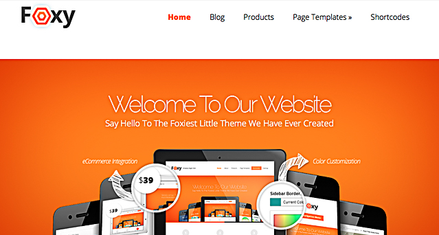
StudioPress, the brain-child of CoppyBlogger’s own Brian Gardner, is quickly becoming one of the most popular Theme Clubs, and we want to show you why (and how you can save over $600 by joining their all-access wordpress theme club).

If you are interested in learning more about Studio Press and the Genesis Framework, be sure to read this entire review. From theme by theme reviews to tips and trick to maximize your StudioPress Theme’s impact, we’re excited to take you behind the scenes at StudioPress.com.


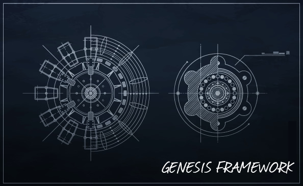
What Is A WordPress Framework?

Each and every wordpress theme in the StudioPress Club is running the Geneis Framework with version 1.6 currently in beta. Now for those not familiar with a framework, the best way to think of this is like a dashboard for your dashboard.

In a nutshell, frameworks allow for fast and quick development by creating a “framework” that people can use to quickly build in the features they desire.

To be certain, the true definition of framework is about as varied as the sites you visit trying to explain it, but if you take WordPress’ definition, they conclude, “A Theme framework is a Theme designed to be a flexible foundation for quicker WordPress development, usually serving as a robust Parent Theme for Child Themes. Some Theme frameworks can also make theme development more accessible, removing the need for programming or design knowledge with options pages.” Cool, right?

Well…kind of. The problem with frameworks is often the same problem with WordPress Themes. In theory, they are simple enough and serve a purpose. In reality, their usefulness is only as good as the coding that goes into them.


What Makes The Genesis Framework Different?

Automatic Updates – So much goes into creating your site, blog (or client’s site or blog). The last thing you want is for a new WordPress core update to completely crash the jumbled mash of code and plugins you’ve rigged together to call a site. Genesis helps take the guessing game out by using automatic updates so your code is always state of the art and fully optimized for search engines.

Turnkey Designs – When you purchase the full StudioPress membership, you get access to all of the dozens and dozens of Premium WordPress Themes ever created (both now and in the future) for a reasonable one-time price.

Unlimited – You can use the StudioPress WordPress Themes on an unlimited number of sites (no “developer” price to pay), you get access to unlimited support (for any questions or help), and you get unlimited updates for any and all code changes, future releases, new themes, all of it. When StudioPress says Unlimited, they mean it!

Security – StudioPress brought in one of WordPress’ leading developers to make sure each and every StudioPress Theme has the best security possible.

Easy Customization (Really) – It seems that every developer these days says that customizing there themes are easy. That is most certainly not the case. If you are looking for themes that are both HIGHLY customizable without getting into the code while still allowing you to build in extremely high-end and custom functions, StudioPress is not just a good choice, they are probably the best.


StudioPress Themes

While we could go on forever about even more reasons why StudioPress creates some of the absolute best WordPress Themes in 2011 (through features like: My Tweets, User Profiles, eNews/Updates and more), we now want to show you all the themes you’ll receive when you join StudioPress today.

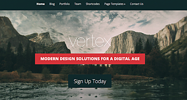
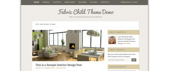
Fabric Theme: If you are looking for a modern and pastel colored theme then Fabric is the perfect fit for your personal or business site. Coming with all the functions you know from the StudioPress framework you can’t go wrong with this template.

Demo Fabric

divider

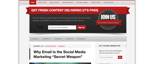
Generate Theme: This theme is targeted towards marketing people who would like to get their message across. Bright colors make this theme stand out of the crowd which gives you the option for easy call to action texts.

Demo Generate

divider

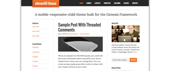
Eleven40 Theme: When looking at this theme you instantly notice the focus on content which makes this template perfect for all bloggers out there. Write and share your content with your audience anytime, anywhere!

Demo Eleven40

divider

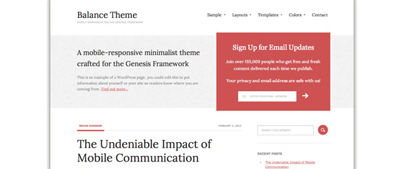
Balance Theme: Balance is a minimalistic theme which is the perfect solution for people who like to put the attention on their content rather than having fancy distracting graphic elements on their site.

Demo Balance

divider

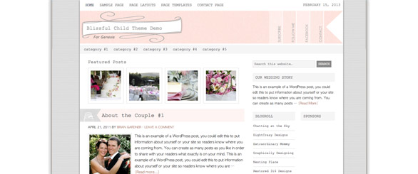
Blissfull Theme: Need a homepage for your wedding? No problem! Blissfull makes it easy to setup a dedicated site for your wedding or other celebrations.

Demo Blissfull

divider

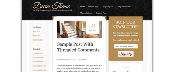
Decor Theme: This theme is fully responsive and looks samazing on your tablets or smartphone. If you are looking for an elegant solution for your website you can’t go wrong with this beauty.

Demo Decor

divider

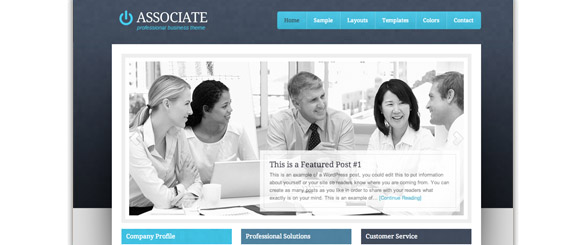
Associate Theme: This business orientated template is the perfect theme for your company. If you want to have a professional looking website which is easy to edit and add new content then WordPress and this oustanding design from StudioPress will satisfy you.

Demo Associate

divider

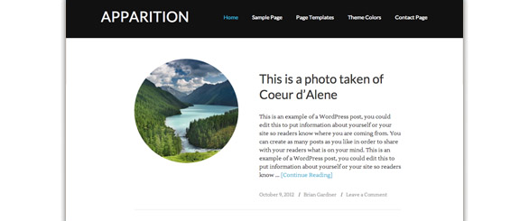
Apparition Theme: Is a very basic template which is perfect to showcase your recent pictures or stories that you want to share with friends or your followers. A simple front page layout gives the viewers all the information they need.

Demo Apparition

divider

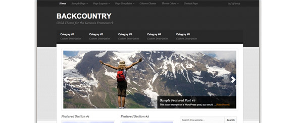
Backcountry Theme: Backcountry is a multi-purpose theme which you can use for any genre of site that you want. The dakr color scheme of Backcountry makes it perfect for nearly any website.

Demo Backcountry

divider

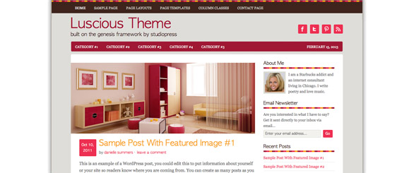
Luscious Theme: Colorful and bright that’s what makes this theme stand out. If you want to go against the minimalistic theme trend and want to shock your viewers with colors that make them never forget your site this template is perfect for you.

Demo Luscious

divider

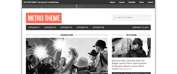
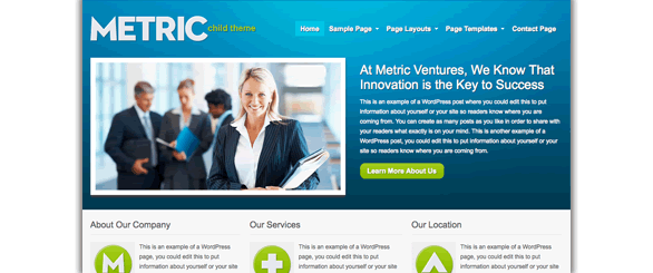
Metro Theme: Wether you use this theme for your magazine website or personal blog it always gives your visitors the impression of a professional and quality site. With minimalstic approach but still some contrast in the header this is one of the best StudioPress themes.

Demo Metro

divider

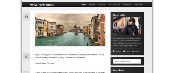
Mindstream Theme: Share your thoughts and stories with your audience. Simple, stylistish and modern. Enough said.

Demo Mindstream

divider

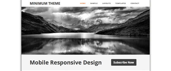
Minimum Theme: When you love white then you’ll love this theme. While some people might call this template boring others believe in simple is more. It is up to you if you like or hate this design but the trend is going towards minimalistic themes like this one.

Demo Minimum

divider

Modern Theme: Modern and easy to use. StudioPress created a clean and modern design which is useable on a broad variety of sites.

Demo Modern

divider

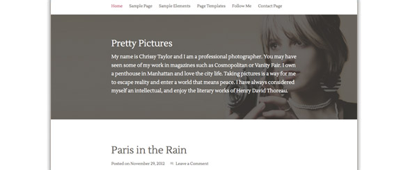
Pretty Pictures Theme: If you have pretty pictures that you want to showcase then Pretty Pictures is as the name states the perfect solution for you. Showcasing photos and videos within seconds make this theme even for beginners a good choice.

Demo Pretty Pictures

divider

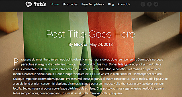
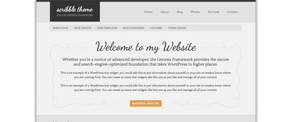
Scribble Theme: Scribble focuses on content and typography. People who rather write than post pictures will love this template. It is all about your content and what you want to share with the world.

Demo Scribble

divider

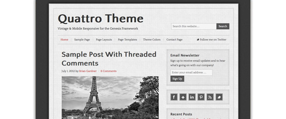
Quattro Theme: Quattro is a basic blog theme. Nothing special but has it to be always special? Sometimes something solid can be the perfect choice. If you share this opinion check out this template.

Demo Quattro

divider

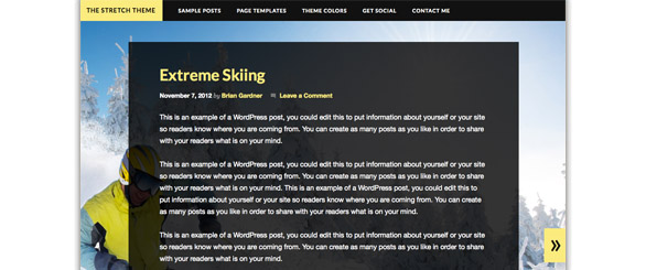
Stretch Theme: This theme is very creative and due the fact that you can set a full-width background it is very customizeable. Besides those options you have a wide range of page templates which will help you to publish your content faster.

Demo Stretch

divider

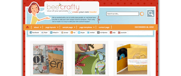
Bee Crafty Theme: Bee Crafty will display your wonders to the world. Snap in your own handmade header, stitch together a beautiful photo showcase home page, or draw up a unique and wonderful blog.

Demo Bee Crafty

divider

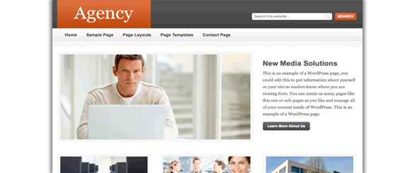
Agency Theme: When you’ve got lots of content and you need a professional way to show it off, Agency is the theme for you. Use it to showcase your company, services and what you can offer.

Demo Agency

divider

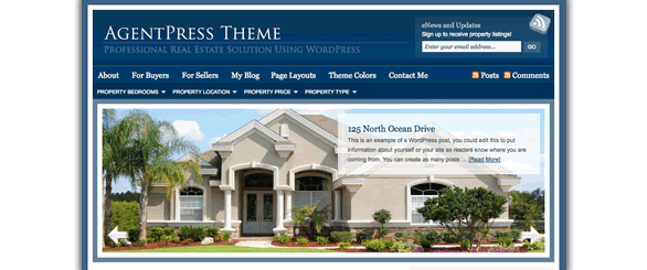
AgentPress Theme: The AgentPress theme is an ideal solution for real estate agents looking to market themselves and rise above competition. AgentPress includes multiple page templates that can be used to create a complete real estate website. From single property templates to a custom homepage, AgentPress is right for you.

Demo AgentPress

divider

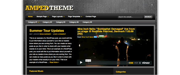
Amped Theme: You’re busy touring, writing, and signing autographs on everything put in front of you. You shouldn’t have to worry about the nuts and bolts of your website. Amped was built to spotlight your latest video, showcase your music and the show dates you need to promote… all at your fingertips and built on the rock-solid Genesis Framework for WordPress.

Demo Amped

divider

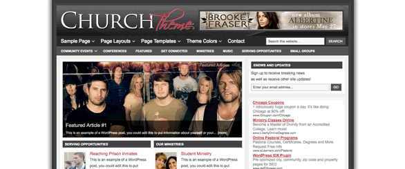
Church Theme: Got lots of magazine-style content and need a stylish frame? The Church theme is a great choice for sites that have a lot to say. Choose from StudioPress’ content-friendly soft color schemes and widgets that support everything from video to in-depth articles to great photography.

Demo Church

divider

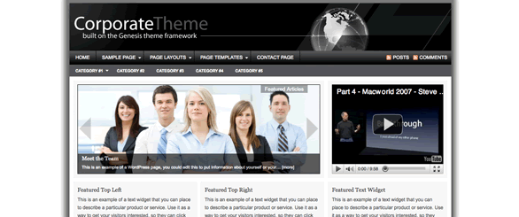
Corporate Theme: The Corporate WordPress theme for the Genesis Framework is a corporate-style theme that will provide a professional look for your business website. When you’ve got lots of content and you need a professional way to show it off, Corporate is the theme for you. Use it to showcase your company, services, and what you can offer.

Demo Corporate

divider

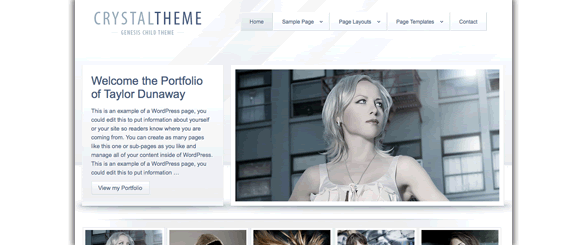
Crystal Theme: Got lots of portfolio-style content and need a stylish frame? Crystal’s a great choice for sites that want to showcase work. When you have a lot of content and you need a professional way to show it off, Crystal is the theme for you. Use it to showcase your company, services, and what you can offer.

Demo Crystal

divider

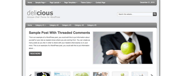
Delicious Theme: Easily create a dynamic portrait of your company or project for your customers. You’ll bring them inside, before they step in the door. Delicious effortlessly projects the exact image you desire, and allows you to focus on other content as well.

Demo Delicious

divider

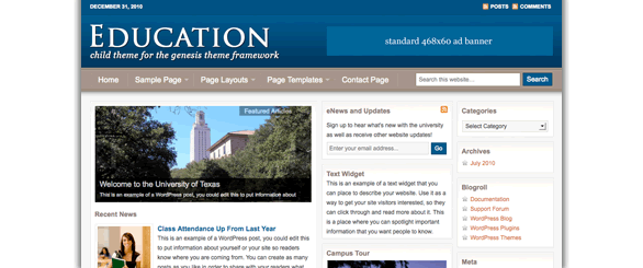
Education Theme: Your institution has a great deal of information to convey in a short period of time. Text, audio, video, curricula, and more. Help students, faculty and press find what they need fast, without the homework.

Demo Education

divider

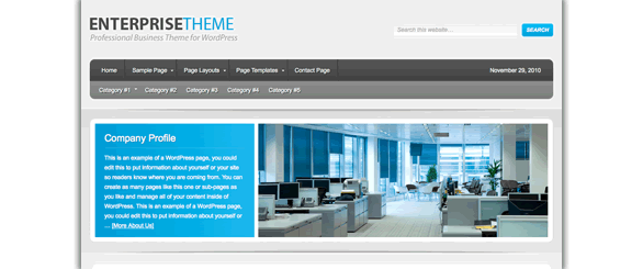
Enterprise Theme: The Enterprise child theme for the Genesis Framework is a corporate-style theme that will provide a professional look for your business website.

Demo Enterprise

divider

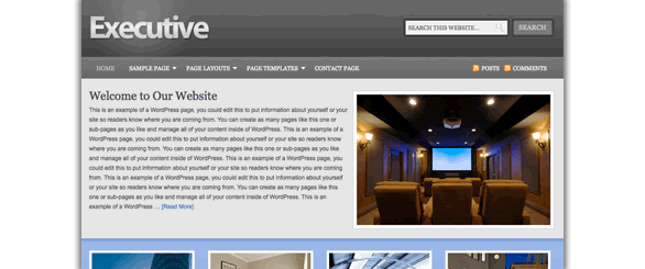
Executive Theme: Looking for a high-end corporate look? The Executive WordPress Theme is a corporate-style theme that will provide a professional look for your business’ internet address.

Demo Executive

divider

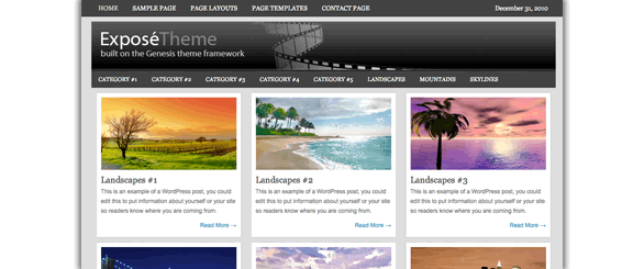
Expose Theme: When you come in from the field, you want to effortlessly create a stunning display of your photographic work. With a few clicks, Expose will give you the perfect WordPress Theme to exhibit your passion worldwide.

Demo Expose

divider

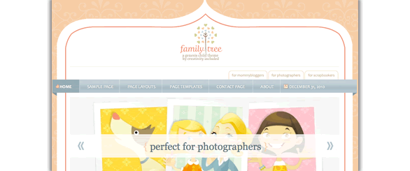
Family Tree Theme: Your full life never stops making priceless memories… where do you put all those stories? Family Tree is a safe and imaginative home for your family’s unforgettable moments.

Demo Family Tree

divider

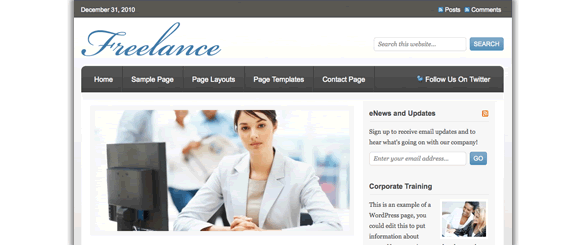
Freelance Theme: You’ve got enough to do with building and marketing your business. You shouldn’t have to worry about your website. Freelance places a strong, professional face on your business, so you can get back to work.

Demo Freelance

divider

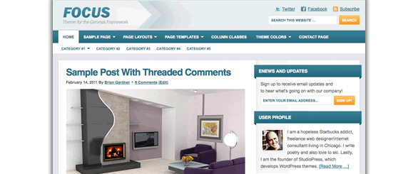
Focus Theme: We’re living in the Age of Distraction, with unlimited options pulling your readers in countless directions. It’s time to focus. The Focus Theme was built to bring your words, pictures and videos into sharp relief. It’s a clean and powerful theme with one critical objective: concentrating your priceless reader’s attention.

Demo Focus

divider

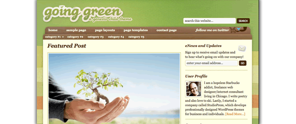
Going Green Theme: Maybe you want to save the earth. Maybe you want to save your neighborhood. Going Green is the clean and stable platform you can tell the world from. Make a difference with your website, and get the Going Green Theme.

Demo Going Green

divider

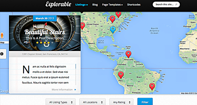
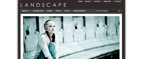
Landscape Theme: It’s a great big world out there, and you want to shoot it all. Shouldn’t your work have an exceptional home? The Landscape WordPress Theme is sophisticated and invisible enough to reveal the beauty in your pictures.

Demo Landscape

divider

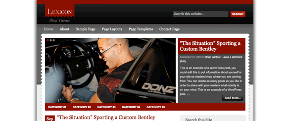
Lexicon Theme: You might be a journalist striking out on your own. Maybe you’re going to create the next big celeb blog. Whatever the story you want to cover, do it in style, cover it in Lexicon.

Demo Lexicon

divider

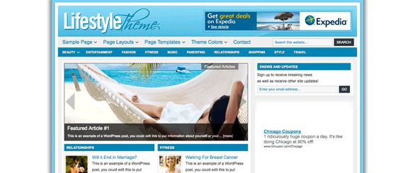
Lifestyle Theme: Got lots of magazine-style content and need a stylish frame? Lifestyle’s a great choice for sites that have a lot to say. Choose from five content-friendly soft color schemes and widgets that support everything from video to in-depth articles to great photography.

Demo Lifestyle

divider

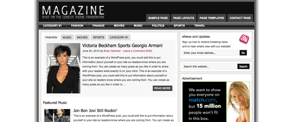
Magazine Theme: When you’ve got lots of content and you need a magazine-style format to show it off, Magazine is the theme for you. Magazine is sleek, up-to-date, and always cutting-edge… just like your content.

Demo Magazine

divider

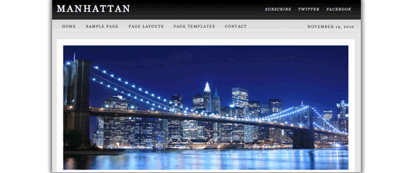
Manhattan Theme: When you’ve got lots of content and you need a professional way to show it off, Manhattan is the theme for you.

Demo Manhattan

divider

Metric Theme: Thankfully, the days of the starched, buttoned-down corporate website are over. You’ve got a way to build exactly what you need. Metric delivers a warm new media professionalism to your online customers.

Demo Metric

divider

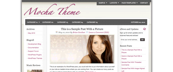
Mocha Theme: Mocha is the perfect theme for fashion, music, and style blogs… or anyone who craves stylish design. Mocha’s sophisticated design, upscale color scheme, and uncluttered layout always deliver a delicious experience for your audience.

Demo Mocha

divider

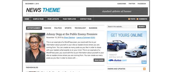
News Theme: Got lots of news-style content and need a stylish frame? The News theme is a great choice for sites that have a lot to say. Enjoy using the featured areas and custom widgets that support everything from video to in-depth articles to great photography.

Demo News

divider

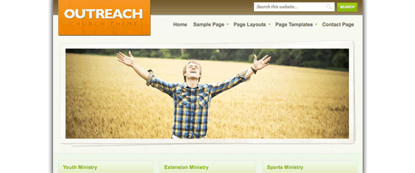
Outreach Theme: A church is one of the most information intensive organizations on earth. Don’t let your message get lost. Outreach gives you the framework you want, so you can give your people the message they need.

Demo Outreach

divider

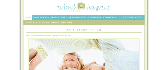
Pixel Happy Theme: Looking for a bright, modern-looking theme that showcases great images? Pixel Happy is the perfect choice. Pixel Happy’s sophisticated color scheme, generous white space, and slideshow and gallery functionality make the perfect framework for photography and other image-heavy sites.

Demo Pixel Happy

divider

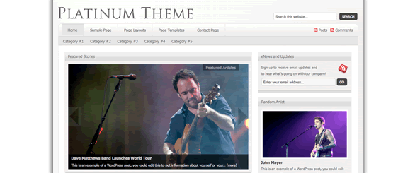
Platinum Theme: Have a great story to tell? An incredible show to put on and to let people know about it? How about showcasing your vocal skills? Let the modern Platinum theme take the back seat while you take the stage. It’s your time to shine.

Demo Platinum

divider

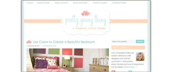
Pretty Young Thing Theme: There’s a fresh, vibrant generation out there, and you’re a part of it. Pretty Young Thing can capture the essence of your experience and reflect it back to a world that badly needs a dose of youthful exuberance!

Demo Pretty Young Thing

divider

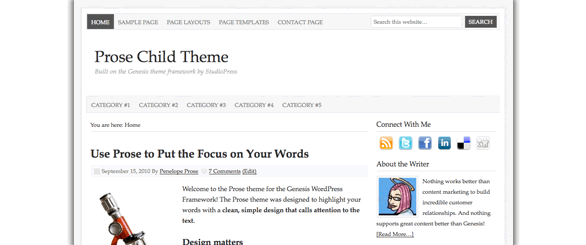
Prose Theme: Prose is an elegant theme with point-and-click design controls. With Prose, you can easily change things about the appearance of your site (like colors and fonts) without knowing anything about code. Maybe your readers prefer a larger font. You probably have certain colors you’ve chosen to reflect your individual brand. If you can point-and-click, you can customize Prose.

Demo Prose

divider

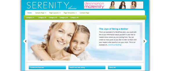
Serenity Theme: Got lots of magazine-style content and need a stylish frame? Serenity’s a great choice for sites that have a lot to say. Choose from an amazing selection of widgets that support everything from video to in-depth articles.

Demo Serenity

divider

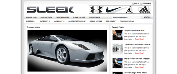
Sleek Theme: There was a time when the gadget-inclined were relegated to the basement. Those days are long gone and now you can show that. Get your geek on with Sleek, bring your brilliance to the world.

Demo Sleek

divider

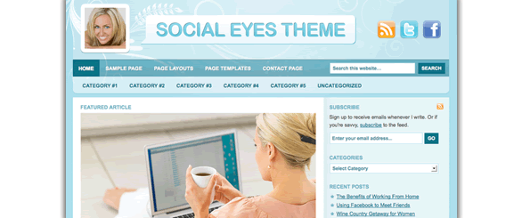
Social Eyes Theme: One of the great benefits of Social Media is the ability to meet people where they are. On Facebook? Over at Twitter? No problem. Social Eyes is an elegant and easy way to assemble a stunning home for all of your Social Media work, and to expand it with your own unique take on what’s going on.

Demo Social Eyes

divider

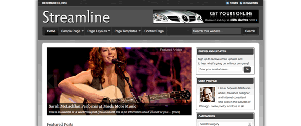
Streamline Theme: Your website shouldn’t get in the way of your stories. Here’s your chance to tell it like it is. Streamline throws light on your work, letting you get back to what’s important. Focus on the things that really matter.

Demo Streamline

divider

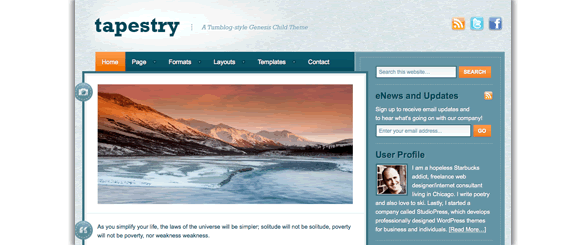
Tapestry Theme: You take pictures, you write stories and opinions, you make videos, you link to cool stuff all the time. Tapestry takes everything you make online, and makes perfect, beautiful sense of it.

Demo Tapestry

divider

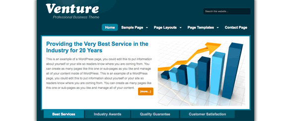
Venture Theme: You’re not playing a game. You’re in business, and you’ve got the numbers to prove it. Venture is as stylish and bold as you are, ready to show the world what you’re made of.

Demo Venture

divider

If you’ve been counting, that’s nearly 40 Premium WordPress Themes plus all the bonuses, support, and lifetime updates you simply won’t find elsewhere. Join StudioPress Today.


Nick Roach’s Elegant Themes Review

Elegant Themes - Updated Review for 2014

Updated: April 12, 2021 – 2021 is nearing the middle of the year, and now is a good time to update one of our most popular articles here on Blogging Experiment. For several years we have been singing the praises of Elegant Themes, and 2014 is shaping up to be no different. In a day and age where companies and websites come and go, Elegant Themes has not only stood the test of time, they have continued to innovate by creating massive value for their over 250,000 customers! In the following article, we’d like to give you a detailed overview of just why we call Elegant Themes the Best Deal in WordPress!

After all, having the right WordPress Theme is crucial to your websites’ success. It’s kind of like the study that showed how people looking to buy a home can make up their mind within 8 seconds of walking in the door whether they like it or not – by not giving your visitors the right first impression (your design) – you’re literally inviting them to hit the back button.

The Dilemma

As a blogger your focus should be on content. Blog design is important, but when you think about it, do people go to Craigslist because it looks pretty? Absolutely not. They use it because they’re the best in the field.

Since we’re not all Craigslists, we must merge the design and content aspects together in as seamless a manner as possible. You want to have a nice looking design, but you most likely are not strong in design itself (much less coding that pretty design). You want a unique, impressive look that conveys professionalism and passion about your craft, but you’re probably not an expert at usability (how “usuable” your site is to visitors). And finally, you want to do all this in the cheapest, most cost effictive way possible (nothing wrong with that).

Elegant Themes

Have you ever spent any length of time browsing around countless free wordpress theme sites only to be left feeling unsatisfied? Does it seem like most of the free themes are … well … free for a reason? Where are all the best wordpress themes? After going through these motions for a period of time, I decided to take a look at some premium wordpress themes to see if they were really that much better than the free ones. Shortly thereafter, I discovered Nick Roach’s Elegant Themes, and that changed everything for me.

I knew I could hire a web designer to create a nice looking website as I’ve done countless times in the past. But at $800 to $3500/pop, designers can be expensive. I was interested in finding a nice looking design that I could learn to tweak and modify myself to make it more personalized and customized to my liking.

As a website and blog developer, I am frequently developing new sites, and aside from the content itself, I want each design to be unique and professional. Enter ElegantThemes.

Elegant Themes Premium WordPress Theme Club

Forget $200 to $500 like many other premium theme clubs, for $69…YES, $69 – members get unlimited access and unlimited use to all of Nicks’ premium WordPress Themes. To date there are 80+ elegant WordPress Themes.

I’m going to get out of the way and let Nick’s design speak for itself. As you will see, these are top notch designs that would normally run you several thousand dollars a piece (I’ve researched hiring a good WordPress theme designer, and that is the going rate – typically the floor of their going rate).

Without further ado, here are some of the premium WordPress themes from Elegant Themes:


Nexus WordPress Theme

Blogex image_nexus

Nexus Features:

  • Magazine style
  • Responsive design
  • Unlimited color schemes
  • Secure and valid code
  • Complete localization
  • Browser compatibility
  • Perpetual updates
  • Unparalleled support
  • ADVANCED: ePanel theme options
  • ADVANCED: shortcode collection
  • ADVANCED: page templates

Example Site(s) using the Nexus Theme (Showcase):

More Information On Nexus From Elegant Themes:

Demo Nexus


Vertex WordPress Theme

Blogex image_vertex

Vertex Features:

  • Responsive design
  • Unlimited color schemes
  • Secure and valid code
  • Complete localization
  • Browser compatibility
  • Perpetual updates
  • Unparalleled support
  • ADVANCED: ePanel theme options
  • ADVANCED: shortcode collection
  • ADVANCED: page templates

Example Site(s) using the Vertex Theme (Showcase):

  • Email us if you are using the Vertex Theme, and we’ll list you here.

More Information On Vertex From Elegant Themes:

Demo Vertex


Fable WordPress Theme

Blogex image_fable

Fable Features:

  • Responsive design
  • Unlimited color schemes
  • Secure and valid code
  • Complete localization
  • Browser compatibility
  • Perpetual updates
  • Unparalleled support
  • ADVANCED: ePanel theme options
  • ADVANCED: shortcode collection
  • ADVANCED: page templates

Example Site(s) using the Fable Theme (Showcase):

  • Email us if you are using the Fable Theme, and we’ll list you here.

More Information On Fable From Elegant Themes:

Demo Fable


Foxy WordPress Theme

Blogex image_foxy

Foxy Features:

  • eCommerce
  • Responsive design
  • Unlimited color schemes
  • Secure and valid code
  • Complete localization
  • Browser compatibility
  • Perpetual updates
  • Unparalleled support
  • ADVANCED: ePanel theme options
  • ADVANCED: shortcode collection
  • ADVANCED: page templates

Example Site(s) using the Foxy Theme (Showcase):

  • Email us if you are using the Foxy Theme, and we’ll list you here.

More Information On Foxy From Elegant Themes:

Demo Foxy


Explorable WordPress Theme

Blogex image_explorable

Explorable Features:

  • Location based directory
  • Responsive design
  • Unlimited color schemes
  • Secure and valid code
  • Complete localization
  • Browser compatibility
  • Perpetual updates
  • Unparalleled support
  • ADVANCED: ePanel theme options
  • ADVANCED: shortcode collection
  • ADVANCED: page templates

Example Site(s) using the Explorable Theme (Showcase):

  • Email us if you are using the Explorable Theme, and we’ll list you here.

More Information On Explorable From Elegant Themes:

Demo Explorable


StyleShop WordPress Theme

Blogex image_styleshop

StyleShop Features:

  • eCommerce
  • Responsive design
  • Unlimited color schemes
  • Secure and valid code
  • Complete localization
  • Browser compatibility
  • Perpetual updates
  • Unparalleled support
  • ADVANCED: ePanel theme options
  • ADVANCED: shortcode collection
  • ADVANCED: page templates

Example Site(s) using the StyleShop Theme (Showcase):

  • Email us if you are using the StyleShop Theme, and we’ll list you here.

More Information On StyleShop From Elegant Themes:

Demo StyleShop


Fusion WordPress Theme

Fusion Theme from ElegantThemes.com

Fusion Features:

  • Responsive design
  • Unlimited color schemes
  • Secure and valid code
  • Complete localization
  • Browser compatibility
  • Perpetual updates
  • Unparalleled support
  • ADVANCED: ePanel theme options
  • ADVANCED: shortcode collection
  • ADVANCED: page templates

Example Site(s) using the Fusion Theme (Showcase):

  • Email us if you are using the Fusion Theme, and we’ll list you here.

More Information On Fusion From Elegant Themes:

(more…)