For decades web design has always been centered around the desktop. We’ve always created our themes with the assumption of a user sitting in front of a desktop with high speed internet connection and using the most powerful web browsers available. The advent of mobile platforms have forced us to rethink this paradigm and we have had remarkable progress in creating themes that work on both desktop and mobile platforms. A few years ago, it was predicted that mobile devices will overtake desktops as the dominant Internet access device. With this continued trend to towards mobile computing, are we really prepared to respond to this technology inflection point?
The necessity for asking this question comes with the realization that a lot of design practitioners still follow a graceful degradation doctrine of design. We develop a top of the line theme version designed for the most powerful infrastructure users may have and allow the theme’s functionalities to disable when weaker systems are encountered. We have done this effectively with the use of fluid grids, flexible images/elements and media queries. However, if iOS and Android devices become the new mainstream, shouldn’t our themes be designed primarily for these devices and allowed to progressively enhance when more generous systems are encountered?
The point we are putting forth is this: 2013 will likely be the year mobile devices take over. The challenge for us is to create our themes for this new environment. The next question: “Among mobile devices what should our base platform be?” Based on the latest mobile internet trend numbers, tablets, particularly the iPad, are now coming to the forefront. Smart phones are still on the early stages of growth with a lot of mobile subscribers anticipated to convert in the next couple of years. The growth of the mobile internet is driven by emerging markets led by China, India, Indonesia, Philippines and Nigeria. As such, upcoming themes should be optimized with iPad sized tablets in mind, comprehending how the site will load in light of 3G infrastructure still being mainstreamed in global markets. These designs should be light on cache on these memory limited devices. Features for high performance desktop systems should not in anyway be downloaded to mobile devices but should remain in the cloud to be activated only when the appropriate device is detected.
So what comes next? What do we look forward to beyond 2013? We still have about 5B mobile phone users anticipated to convert to smartphones. By then, our designs will have to be for the small screen. For now, our general trend is “miniaturization” of the desktop. Quite appropriate for a world that is becoming smaller and smaller everyday.

Business websites have always been put up for one purpose: to bring about more conversions/sales that will impact the company’s bottomline. The advent of the Internet has redefined the markets our companies and enterprises have operated in. Thomas Friedman has considered it one of the forces that “flattened” the world. What is amazing is that the Internet continues to evolve. Analysts have predicted that there will be a shift to mobile devices between 2013 to 2015, a forecast that is now turning into a reality. With this change in platform, businesses have to rethink how they do business on the web.
With a transition on the way businesses use the Internet, the question that needs to be asked is: “How do we develop business themes that will address this emerging trend towards mobility?” We need to consider how people use the mobile web. Business WordPress themes are no longer confined to corporate portfolios alone. More than ever, these themes should be designed to be multifunctional with eCommerce capabilities integrated in its core and these business WordPress themes must be flexible enough to adapt to the rapid changing face of the marketplace.
A good business WordPress theme built with this mobile trend in mind should focus on responding to these basic online activities that people do – people use the mobile web primarily to search, share, and shop. These are, in a nutshell, what people really do online – search for information, share what they find, and shop for stuff they need or want. WordPress themes for businesses should be designed in such a way as to enable people to Search, Share, and Shop without taxing memory, network, and computing resources especially if the user is using a mobile device. Product and price information should also be easy to share and be compared to competitors. Purchases should be safe, secure and robust over 3G infrastructure dominant in emerging markets of the developing world.
Aesthetically, the business theme should be responsive with the base design optimized for tablets which is now becoming the new mainstream. As a website owner, providing your clientele with the most pleasant online experience on your website will have a direct impact on your conversions. Addressing what they need in the simplest and fastest way possible will always yield good results.
Design trends and WordPress theme bells and whistles will come and go. These are all nice and fun to have but one day they are in, the next day they are out. Nice, flashy websites don’t make a business successful. It still boils down to good old-fashioned business practices like courtesy and excellent customer service, whether online or offline, that will win the day. These business ingredients transcend technological trends anytime.

Photokina 2012 just wrapped up recently and major camera manufacturers have just announced and released new camera models and camera products for all sorts of buyers. One of the major innovations to the professional digital camera line is the Wifi or GPRS feature that enables one to transmit and post images over a wireless network or the Internet – functioning in a way almost like a mobile phone.
The mobile market has also seen its own latest tech upgrades. The recent release of new and more powerful camera phone features and software updates for both iPhone and Android users boasts of more sophisticated camera features like panorama capabilities and multiple photo filters. The continued popularity of Instagram and Pinterest has flooded the Internet with images of food, places, and random stuff. Legitimate and professional photographers are also opting for lighter versions of their heavy gear allowing Lomography and iPhoneography to flourish.
Given the rate that this technology is gaining momentum and even its own following, we can anticipate that photographers who manage their own websites will want to incorporate quick and easy posting of their images straight from their cameras – no matter what type of camera or device they use – to the Internet.
In view of all that, what do we expect to see in 2013 as far as WordPress photography themes go? Here are some of the few things we think will become part or if not staple features in WordPress photography themes:
-
Eye-fi/Wifi/GPRS ready with Custom Image Resize Function – Mobile posting capabilities with built-in image resize function to resize large images to web friendly proportions.
-
Retina display ready – Crisper and clearer rendering of images without the added bulk or load time.
-
Social sharing function – Ability to post across multiple sites (Instagram or Pinterest integrated functions).
-
Infinite or vertical scrolling features (lite version) – Infinite scrolling is a great feature but sometimes it can cause frequent browser crashes. WordPress authors or developers can create a plugin that allows this feature while minimizing the bulk buildup that could result to slower loading sites.
-
Quick and easy bulk upload features (for mobiles) – Ability to manage multiple image uploads.
-
More eCommerce options – Some photographers prefer to use their website as an online gallery while others do that while also maintaining a store front. eCommerce should be a standard built in theme option which may be enabled or disabled if preferred.
As the world becomes increasingly mobile, WordPress theme users needs will continue to evolve. In line with that, theme authors and developers need to anticipate these developments and be two steps ahead of all these changes.

The holidays are almost here and what better way to spruce up your website than with some great eCommerce themes to improve the look and function of your e-store. Here’s a rundown of some of the best eCommerce themes to get you ready for holiday shoppers:

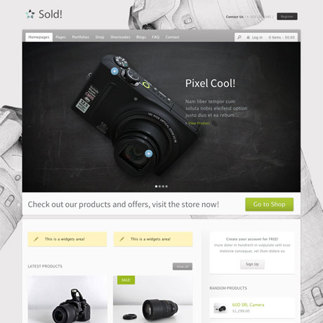
Sold! Premium WordPress Theme is an excellent mix of style and function. The clean, white space design does not distract and serves as the perfect backdrop to highlight choice merchandise. Sold has a beautiful slider where you can put your most interesting items on sale. You can even define points on the slide where you can add comments or even zoom images ala Flickr. This is perfect for highlighting detail on specific points of the product. Sold! uses two of the most powerful plugins – WooCommerce and Jigoshop – making it an effective eCommerce solution. Its multi-lingual capability, responsive features and easy customizability enables your store to service both local and global market.
Sold! Theme: $55 | Demo & Download

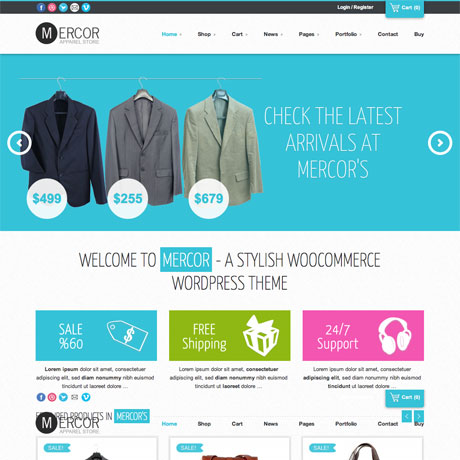
Another interesting theme worth mentioning is Mercor. Mercor Premium WordPress Theme gives you the look and feel of a department store or supermarket weekly catalogue. This responsive theme’s clean, fresh layout and white space styling creates an uncluttered look that’s easy on the eye even if there are numerous images and texts on the page. Mercor has a dynamic Nivo homepage slider to highlight store specials or to announce store events and sales. Mercor is fully responsive and uses WooCommerce to power e-commerce transactions. This powerful feature combination makes your site current, competitive and able to address the emerging mobile shoppers market.
Mercor Theme: $55 | Demo & Download

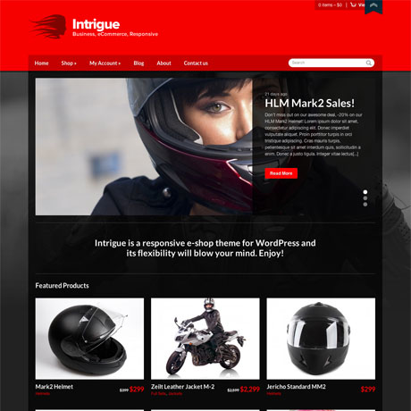
This latest eCommerce theme from CSSIgniter is bold and eye-catching. Intrigue Premium WordPress Theme is a responsive eCommerce theme that combines the power of WooCommerce and CSSIgniter’s straightforward theme design. This means that setting up a powerful eCommerce site need not be a complicated and tedious task to accomplish. With Intrigue, you can use a plethora of widgets to create the functionality you require. This theme comes out of the box in a hot red and black color scheme but you can also choose from the available 7 color schemes to create the look most appropriate to your market. Intrigue Premium WordPress Theme is not over the top and includes just the right amount of features and functionalities for whatever you need.
Intrigue Theme: $39 | Demo & Download

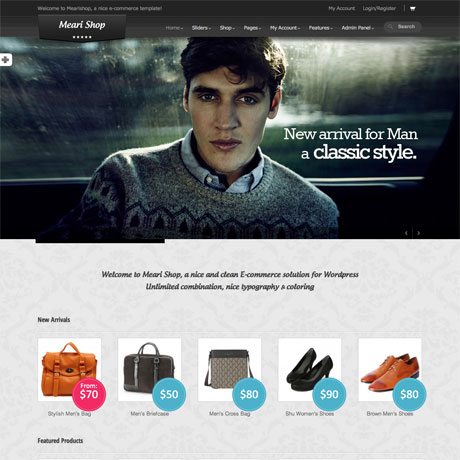
Mearishop Premium WordPress Theme is a great eCommerce solution that’s edgy and modern. The Lookbook-ish appeal makes it a perfect match for a fashion and accessories store. Customers can check out the portfolio or lookbook pages to determine the style that best suits them. Mearishop uses the powerful Hana panel combined with WooCommerce functionality to give you the power to control almost every aspect of the theme. With tons of options available, this features makes this responsive theme perfect for both WP noobs and experienced developers to use. Choose from unlimited color options, 7 backgrounds and 34 patterns to define your custom look. You can even upload your background image. With 7 sliders to choose from, Mearishop gives you the options you to reach your target market in style.
Mearishop Theme: $55 | Demo & Download

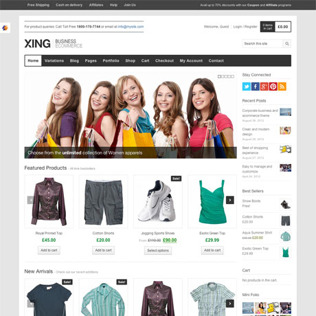
Xing Premium WordPress Theme is a modern and clean theme designed to meet the eCommerce needs of both small and large scale business alike. Xing is primarily an eCommerce theme but it is also flexible enough to be used for creative portfolios or for magazine/editorial blog type websites. Xing uses several jQuery powered features like the Flexslider and the jQuery Product Carousels(for WooCommerce recent/featured products). This highly customizable and responsive theme gives you tons of options to create the look you want. Xing is not wanting in anything – from shortcodes, to custom post formats, to custom widgets, to 8 portfolio layouts, to social sharing features and other features and functionalities to help you to create and customize your eCommerce site. Check out Xing today.
Xing Theme: $55 | Demo & Download
Keep your eyes peeled for more WordPress holiday roundups in the next few weeks!

With the advent of mobile platforms, WordPress themes have to adapt to the demands of this steadily growing user base. It can really be quite frustrating to read articles from any major newspaper’s website on iPhone or Android and get all the content mish mashed. Theme developers and web designers need to move more and more toward this emerging trend towards responsive themes.
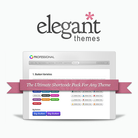
It is a welcome development that Elegant Themes recently released its responsive shortcodes. While Elegant Themes has been churning out responsive themes for quite a while, the shortcodes were left out. It took 10 responsive themes before mobile friendly shortcodes were released. Great news, indeed!
So how do these new shortcodes, improve mobile browsing experience? Elegant Themes’ blog cites two examples of their improvement strategy. Tabs have always been an issue when websites typically viewed on a 960px wide screen to a 320px width. No matter what you do, having 10 tabs will alway come out cramped. Solution: Tabs turn into a slider when switching to mobile mode. It just makes sense to have sliders rather than have unreadable tab labels. Another example cited was the case of columns. As the content width gets narrower, text in columns become a bunch of flying letters. Solution: the new shortcodes convert columns into boxes when switching to mobile screens. Brilliant isn’t it? Regarding the new shortcodes, Elegant Themes has declared them to be fluid width giving them the capacity to shrink and expand according to screen size.
Web design and the emerging technology innovation and trends are accelerating even faster. More and more mobile users prefer to access the web through their devices and WordPress Themes providers need to step up their game. For loyal subscribers of Elegant Themes, these concrete steps towards updating and upgrading all Elegant Themes products is always welcome and appreciated.
Congratulations to Elegant Themes for taking WordPress theme development one step further and fully embracing the future of WordPress.
See Elegant Themes’ Responsive Shortcodes

Have you ever stopped to consider what makes a theme the best WordPress theme of all time? Taking a look at some of the best themes of 2012 we have compiled, which one would be your choice? What qualities should a theme have in order for it to be ranked as the best WordPress theme ever? Here are a few attributes you can use to rate your theme choices:
- Flexible – A theme must have the ability to meet the needs of various users. You must be able to customize a theme for various applications. Ideally, the theme you use for your portfolio site, should work excellently on your wife’s personal blog site, your client’s e-commerce site, or any other website requirement you need. A multifunctional theme begets more users.
- Timeless – The best theme of all time should be ageless. It should demonstrate resilience in the midst of technology trends that come and go. The key to this is for code and other technical stuff under the hood to be easily upgradable and to be supported by a development team to keep it alive and updated. The theme’s aesthetic features should classic/timeless while being highly customizable to reflect emerging artistic theme movements or trends.
- Accessible – The theme has to be easily accessible to as many as possible. The pricing must be reasonable not only for 1st world countries but also in the emerging tech hubs of the developing world. Usage must be easy for persons of varied physical/mental abilities, age or educational background. How would the technically challenged or non-coders find using the theme? Is the theme available in many languages? Will the theme be accessible in varied devices of choice?
- Responsive – The theme has to should be responsive in every way. Mobile and handheld devices are changing the way we access information and creating websites that look good not only in traditional desktop computers but also on smartphones and tablets is the way of the future. If you want to create a website that responds to the needs of your clients, anywhere they are and everywhere they go – then being responsive is the way to go.
- Customer Support – The theme should have adequate support and provision for any WordPress updates. This is differentiates a good theme from a great theme. Customer support is paramount to any service oriented business and it will spell long-term success to anyone who puts that extra effort in.
There are many more attributes that can be added to this list. Feel free to share your thoughts and your choices. We’d really love to know which WordPress Theme you think is THE BEST WordPress Theme of ALL time.

Web design is not a stand alone activity. It is affected by several factors like technology trends, business trends, market trends, and consumer behaviour. It takes a studied effort in order to intelligently and accurately “predict” what the market wants in the future. No one can claim to make 100% accurate predictions but by taking stock of what goes on not just in the web design industry but in the related industries that affect it as well we can somehow make calculated “guesses” as to what trends may happen in the near future.
Here are some of our predictions on what’s currently hot and what will continue to be hot up to the early portion of 2013:
- Mobile Driven – WordPress themes will continue to be responsive, adaptive, fluid. Older but still popular themes will come out with mobile-friendly versions.
- HTML5 and CSS3 – Stricter adherence to W3C Valid code and significant decrease if not obsolescence of Flash.
- Simplified and uncluttered call to action buttons per page – Simple, minimal and uncluttered themes with lesser number of buttons to click.
- Big Typography – Big, bold and readable fonts.
- Single Web Page Design – Infinite scrolling (parallax style).
- Authentically Digital – Windows 8 style graphics (less shiny, more flat).
- Simplified front end customization – Backend customizations will move to the front making it easier to preview specific customization choices.
- Social Media Management – Integrating social media into the WordPress design template (Instagram, Pinterest, Dribble streams etc).
- Modular Template Layouts – More drag and drop options with less coding required for customization.
- Adaptive to new SEO trends – WordPress Themes will be adaptive to new SEO trends like Voice search, mobile search, humanized ranking, social media factors, etc.
If you a WordPress professional or developer, what emerging trends do you foresee in 2013? Share your thoughts. We want to know what you think.
Best Theme (v1.1) A Beautiful, Responsive Theme for WordPress Sites Make sure to check out our official post on the Best Theme for updates on recent and future releases! Take some time to check out the Best Theme demo …
