Fusion Theme from Elegant Themes Coming Soon

Elegant Themes recently announced their new and upcoming theme: Fusion – a theme designed to “fuse” professionalism and pizzazz to create that perfect solution for technology companies and blogs alike. If you run a tech blog or an app development company and you need a really cool looking theme that’s hip and modern then Fusion is probably the theme for you.

The general design of this theme is similar to Elegant’s recent themes, Nimble and Harmony, taking off from that single page design while adding the modern, graphic flavor to it. One of the many benefits of a “one page” design is that you get a quick and easy, concise at a glance look, quite handy for mobile devices, with options for details in sub pages.

Similar to Nimble and Harmony, Fusion has large sections clearly delineated from each other. Fusion has a section allocated for a logo, navigation menu and other corporate brand or social networking icons all prominently located above and seamlessly flows into a generously spaced section for a slider. This slider section can be used to showcase featured images or products, attention grabbing spiels, and other important announcements useful to your visitors. This can be followed by a section where static text boxes or placeholders can be used to feature select products or services. You also have an area to feature the latest blog post headlines that link to the full posts on the and there is also provision for sponsor links or ad banners. A widgetized footer area can also be setup to add more features and functionalities useful to the site.

So far we we’ve seen that Elegant Themes has been consistent as far as quality is concerned and so far, each product released remains true to its reputation for great design. This commitment can be experienced and has been experienced by so many customers in every Elegant Themes subscription. This latest theme offering is something to look forward to and no doubt it will be something that will surely be according to Elegant Themes’ strict standards.

Get 77 Premium Themes For $39

Harmony Theme from Elegant Themes is LIVE

On Nov 29, Elegant Themes officially released Harmony, a versatile premium WordPress theme designed for musicians and bands. Its key features are its custom audio player for sampling music tracks, event manager features and eCommerce functionality. Visitors can listen to the band’s music, purchase concert tickets via the band’s ticket vendor of choice and purchase music/merchandise through the theme’s WooCommerce powered e-store pages. It’s a one-stop website both musicians and fans will surely enjoy.

Harmony is a well designed, well developed theme considering this is Elegant’s first step into music themes. A lot of expectation and inputs have been given by users since the theme’s announcement on Nov. 7 and these suggestions have been carefully woven into the theme as best possible. The theme continues to deliver that signature Elegant Themes look and upholds its reputation for simple yet sophisticated design that distinguishes it, specifically Harmony’s aesthetics, from other music themes in the market. In addition, its excellent event management capabilities make it convenient for fans to patronize the band’s latest gigs and concerts as seamless and as effortless as scrolling through the pages.

Harmony includes an integrated MP3 audio player which gives fans and potential fans the opportunity to listen to audio samples of upcoming or already released music tracks. The theme is also equipped to display music videos and concert previews as an effective marketing tool to attract the attention of this media savvy generation of fans. This theme is also responsive and will work well on handheld and mobile devices – a staple of every ear plugged music fan out there. This means that fans can enjoy their favorite band’s music anytime, anywhere – which is definitely music to any musician’s ears.

Features:

  • Responsive Design
  • Theme Options
  • Shortcodes
  • Page Templates
  • Perpetual Updates
  • Secure and Valid Code
  • Browser Compatibility
  • Complete Localization
  • Unlimited Colors
  • Unparalleled Support

Harmony Premium WordPress Theme includes top-notch tech support provided by Elegant themes’ support staff to help you setup your site and get it running in no time.

Get 77 Premium Themes for $39

Let’s Write Some WordPress Poetry

If you have been following this basic WordPress journey, you would have learned some very basic info about WordPress, HTML, CSS, PHP, tags, html templates, css stylesheets, and a whole lot more. It’s about time to put that basic info to the test and write something “poetic” or at least attempt to. The key word here being “attempt”.

Our attempt is to write something very simple and easy. We will assume that you already have your own domain name and that you have WordPress installed and running on your site. If you’ve never coded a WordPress theme before or your brain freezes at the sight of all the gobbledygook and unintelligible mishmash of hyphens, brackets, parentheses, asterisks, colons and semicolons, and so much more, this might help you. For the experts out there, pardon the language, because this might turn out to be too barbaric for your code sensibilities. Sounds scary already.

We now know that HTML and PHP are two distinct “web” languages and that WordPress is written using PHP. WordPress Themes are basically plain HTML templates, with WordPress specific PHP tags integrated into specific areas where needed.

Just like the old snail mail letter where you have the date, the heading, the greeting or salutation, the body of the letter, the closing, and the signature, the basic components of a typical WordPress theme consists of:

  • the Header
  • the Menu (navigation)
  • the Sidebars
  • the Content Column and
  • the Footer

And just like the traditional snail mail letter where you need to write on real paper, you will need a text editor to write your code. Those are the basics.

In a previous article, we wrote that one of the fastest ways to learn a language is through immersion. We will attempt to apply this immersion technique in this exercise and hopefully we can learn to understand, then “speak” and “write” WordPress code as we go along. In this little experiment, we shall choose a theme, (Twenty Eleven, in this case), analyze it, try to dissect it and break it down, and then ry to create our own version, super simplified of course, based on our understanding of how it works. We will be working backwards instead of coding from scratch.

Let’s take a look at what Twenty Eleven’s Main Index Template (index.php) contains and let’s dissect. (The code below is taken from an existing website. Some of the tags have been color coded only for the purpose of this discussion).

Note that the items highlighted in red refer to the basic components of a WordPress Theme. If we strip it down to these basics, eliminate the rest of the code (strings, integers, and variables) and leave just the basic, we can actually begin to write simple code that looks like this:

(The Header)
<?php get_header(); ?>

(The Menu)
<?php if ( have_posts() ) : ?>
<?php twentyeleven_content_nav( 'nav-above' ); ?>

(The Content)
<?php /* Start the Loop */ ?>
<?php while ( have_posts() ) : the_post(); ?>
<?php get_template_part( 'content', get_post_format() ); ?>

(The Sidebar)
<?php get_sidebar(); ?>

(The Footer)
<?php get_footer(); ?>

Of course we might be breaking a few syntax rules here and there but we’ve managed to write some sort of broken WordPress poetry. Haiku-like perhaps but nevertheless, it IS code. Till next!


BuddyPress WordPress Themes 2013: Trends

BuddyPress has come a long way since its conceptualization in 2008. What is BuddyPress anyway?

According to WPMU.org:

BuddyPress is a suite of plugins for WordPress that transforms into a fully functional social network platform.
When installed on WordPress Multisite it provides features that lets your members socially interact with each other within a multi-blogging platform environment. It provides all the features that allow you to build a community on your network. BuddyPress enables you to build passionate users around a specific niche.”

Buddypress.org puts it quite succinctly:

“BuddyPress is Social Networking, the WordPress way.”

The concept of turning a WordPress site into a social network is indeed radical and has not been lacking in challenges. What is amazing is that BuddyPress users of today find a plugin that fully integrates into ordinary WordPress as opposed to the few who were tinkering with WPMU a couple of years back. With its latest version, 1.6, BuddyPress is an easy to use plugin with good content management capability. You can enjoy the benefit of user generated content with the ability to moderate and control spam posts using existing infrastructure on WordPress. BuddyPress also gives you the functionality you expect from any social networking site. You can add and remove friends, create groups and much more.

With all that BuddyPress is offering now what more is store for this great plugin? The battle cry of the developers is theme integration. More and more people would like to turn their existing sites into social networking sites without discarding their existing theme capabilities. Come to think of it, if you have a great ecommerce theme, why would you want discard your eCommerce capabilities for social networking. The challenge for theme developers is to create or redesign themes that integrate the capabilities of buddypress. Social networking, in tandem with mobile devices, has made our world smaller, closer, and within reach. It is undeniable.On the other hand, BuddyPress developers also have to do their share to make the plugin more seamless. While the task doesn’t seem easy there is indeed a host of talented, highly motivated people working to reach the summit from both sides. We are looking forward with much eagerness to their success!


Portfolio WordPress Themes 2013: Trends

Portfolio themes have always been highly influenced by the technical platforms the content is viewed on. Among the different theme categories, portfolios are probably the quickest to reflect new technological capabilities available. It is just fitting to consider what’s up around the corner at the end of 2012 as far as the Internet is concerned and how this will affect portfolio themes.

The main internet trend for 2013 and 2014 is the main streaming of mobile as an internet access device. It is strongly believed that smartphones and tablets will overtake desktops as the access device of choice. A lot of the conversions are expected to happen in developing countries where 3g is still the norm. A simple observation is to check what devices internet users use to upload content. More often than not it is through a handheld device, an iPhone, Android, or smartphone. To the user, it is all about convenience and accessibility. Designers and developers need to take note of this and need to consider creating themes that can handle images and multimedia content under these constraints.

The mobile effort should be done without sacrificing an emerging and equally important 4g LTE market. Designers should be cognizant of a significant growth of mobile and desktop users subscribing to internet connections much faster than a couple of years ago. Thus the access of devices to websites must be smart enough to be able to meet the seemingly opposite needs of these market segments. In a way, it is an expansion of responsive design into the backend of the website.

The emergence of new display technology such as Retina would be something to consider. Designers must be able to take multimedia content generated from any device and exploit the full capabilities of these next generation displays. Again, this should also be done in tandem with expected rapid growth in low capability areas.

Social media integration can not take a back burner as people are finding more and more ways to use this technology. Developers should take notice of the capabilities of Instagram or Pinterest and figure out how to incorporate such features into their themes. Their popularity is an indicator of sorts as to what people are viewing and how they are viewing it. It would be a pity to have a very beautiful portfolio website with very little traffic and only a handful of people enjoying it. Lastly, there is still much room to develop seamless integration with different resources available on the cloud – more exploration on how this can be utilized, maximized, and integrated into the ultimate WordPress portfolio theme.

We can’t wait to see what will emerge in 2013. Exciting times up ahead!


On Becoming a WordPress Professional

How does one become a certified WordPress professional indeed? Earning your stripes as a WordPress professional does not come from a course you enroll in and study for X number of years in your regular university. Neither do you get a degree or a diploma for the numerous WordPress conferences, seminars or webinars you attend. In truth, becoming a WordPress professional is not age bound, race bound, location bound, language bound or educational background bound. One key ingredient is the willingness to learn, make mistakes, and learn all over again.

Many current WordPress professionals and practitioners did not start out as such. Perhaps some have come out from the corporate world and taken a radical sabbatical from their daily grind while others probably started out in their dorm room or garage. Maybe others began tinkering with WordPress while they were in their teens while some are going through a second wind in their careers. The Internet has this built-in democratic leveling quality where anyone can make it regardless. Since the year is about to end, maybe some of you are considering a quiet change or transition into something else – a new career path of sorts. You don’t necessarily have to be a developer or a designer to be a WordPress professional. Here are a few options for you to think of if you are considering a shift into the exciting world of WordPress:

Developer

Web development is the back-end of the website, the programming and interactions on the pages. A web developer focuses on how a site works and how the customers get things done on it. Good web developers know how to program CGI and scripts like PHP. They understand about how web forms work and can keep a site running effectively.A good web developer will have excellent programming skills and be able to use a range of programming tools. He or she will be able to provide solutions to give a website the functions required. Web developers will use a range of programming tools such as ASP, Javascript, XML and SQL. The focus is more on the backend and the functionality of the site.

Designer (Themes)

Web design determines the look and feel of a website. It covers the layout, navigation and colors of a website. Web design is more concerned with aesthetics and user experience than functions. A web designer will make a website easy to use and fit for purpose. A good web designer will have graphic design skills and a good understanding of marketing. He or she will know how to grab the attention of visitors and encourage them to explore a website. A web designer is concerned with how a site looks and how the customers interact with it. Good web designers know how to put together the principles of design to create a site that looks great. They also understand about usability and how to create a site that customers want to navigate around in.

Developer (Plugins and Widgets)

Plug-ins and widgets are a great way to enhance the functionality of your site by adding in extra features. These can be placed anywhere inside your template by function hooks. You can start creating and eventually selling stand-alone plugins that add value to existing or new themes.

Support Professional

One of the most common deficiencies in the WordPress themes marketplace is the lack of or absence of theme support. You can start a career by being part of a support team that is responsible for providing after-sales support to customers who have purchased specific themes.

Consultant/Marketing

Providing consultancy services, networking, and hooking up clients with designers and developers is another option to becoming a WordPress Professional. Many times, a lot of great designers do poorly sales-wise because of a lack of marketing skills. You can offer your services to acts as a marketing consultant to WordPress designers and developers who have little or no time to do the marketing themselves.

Blogger/ Theme Description Writer

With the explosion of WordPress themes in the marketplace, there is very little difference between one theme to the next and a lot of them look like clones. You can offer your services as a writer to create a marketing hook for designers and developers who would rather write code than a marketing spiel.

Documentation Writer

Providing appropriate and useful detailed documentation that is easy to understand even by WordPress beginners is another option. Transcribing the installation and setting up process in easy to follow steps adds value to the theme and a well written piece will mean less resources spent on support.

WordPress Trainor

If you have acquired a certain level of proficiency in WordPress and you are confident enough about what you know, you can also try going into teaching and training.

These are just a few ideas to think of as you consider starting or shifting to a career as a WordPress professional.


40 Future City Art Illustrations for Inspiration

My physics teacher used to say – “Change is constant in nature. If change is not taking place then something is wrong.” We started from a Big Bang, life somehow evolved on earth, we learnt how to burn fire, we learnt the power of a wheel, we learned how to make machines, Franklin discovered electricity, Faraday discovered how to produce it in power houses, Bill Gates developed Windows and here we are in the twenty first century. But what if we try to go a little further? What if we try to envision the future? This is an interesting topic and the numerous popular science fiction movies and novels bear witness to this fact.

Stephen Hawking said on a Discovery Channel program that it may be possible to build a time machine with which we can go into the future but not back in history. Such a time machine has not yet been made and is only a subject of fiction. Science is too strict and limited by the laws of nature while art, in this respect, is limitless as it is free to imagine and inculcate anything and everything in its domain. Below I present you with 40 art illustrations which our artists have carefully crafted by imagining what the future of our world might look.

(more…)


Responsive Web Design (RWD) vs Adaptive Web Design (AWD)

We’ve heard the terms Fluid, Adaptive, and Responsive used interchangeably when describing a theme’s ability to resize according to browser specs or device (mobile or not) size. Are they really different from one another or are they referring to the same characteristics found in themes described as such?

What is Responsive Web Design (RWD)? Responsive Layout?

Let’s take a closer look.

Responsive web design (often abbreviated to RWD) is an approach to web design in which a site is crafted to provide an optimal viewing experience—easy reading and navigation with a minimum of resizing, panning, and scrolling—across a wide range of devices (from desktop computer monitors to mobile phones) – Wikipedia

Responsive design is the methodology behind making a website respond to whatever platform you are viewing it on regardless of resolution and orientation. It may change how certain elements display but it will not remove elements or change the core functionality of their behaviours. Responsive design uses a fluid grid and it is usually possible entirely through HTML and CSS, without the need for DOM (Document Object Model) manipulation. – Matthew Freeman

According to Ethan Marcotte, The 3 Elements of Responsive Web Design are:

A flexible, grid-based layout – A layout based on proportions rather than absolutes; uses a flexible grid, which in turn ensures that a website can scale to a browser’s full width.

Flexible images and media – Layouts based on percentages resize gracefully according to the size of the browser window rendering them. However, it is problematic to ensure that the content within a site resizes.
Images and media should scale with the flexible grid; images that work in a flexible context, whether fluid themselves or perhaps controlled through overflow mechanisms. CSS addresses this problem with its max-width property

Media queries – Content based breakpoints; optimize the design for different viewing contexts and spot-fix bugs that occur at different resolution ranges. CSS3’s media queries directly address these usability problems by allowing browsers to serve different styles for different viewing contexts. CSS3 greatly expands support for media queries, adding the ability to target media features such as screen and device width and orientation.

These 3 elements of Responsive Web Design find their way into 3 different types of Responsive (RWD) Layouts:

The Basic Fluid Lay­out
Con­tent con­tin­u­ally flows or adjusts in a word-wrap fash­ion as screen width is increased or reduced. There are no “dis­tinct” dif­fer­ences in con­tent pre­sen­ta­tion. Fluid layouts are dynamic and user sensitive – adapting to the available real estate on the user interface and providing increased content accessibility.

The Adap­tive Lay­out
There are pre­de­fined sizes were dif­fer­ent lay­outs are trig­gered. These are called breakpoints. Typ­i­cally there are three or four break­points to accom­mo­date desk­top, tablet and mobile screen sizes.

The Respon­sive Lay­out
This is a hybrid of Basic Fluid Lay­out and Adap­tive Lay­out. There are pre­de­fined break points, how­ever in between these breakpoints con­tent will flow to expand or con­tract.

According to his article for the Adobe Blog, Carl Sandquist states that:

“Cur­rently, most RWD web sites use Respon­sive Lay­out since it offers a best-of-both-world expe­ri­ence. Con­tent snaps into the appro­pri­ate approx­i­mate posi­tion for a device type (e.g. Tablet) and then fine-tuned adjust­ments are made for the exact screen size on a par­tic­u­lar device.”

What is Adaptive Design (AWD)? Adaptive Layout?

“Adaptive design is the manipulation of layouts to best perform on certain screen resolutions inclusive of elemental removal or behaviour changing techniques. Adaptive design usually requires Javascript to efficiently manipulate the DOM. Javascript can be avoided if you plan on having duplicate on-page elements and then show or hide them based on screen sizes, this might be appropriate for smaller elements but not whole columns or navigation elements.” – Matthew Freeman

“This technique adapts what is displayed depending on the capabilities of the device being used, as well as the screen size. It centres on the context of the user, so even when the same content is used, it is adapted (with some or even all of the design elements changing), depending on whether the user is using a mouse and keyboard or touch screen. AWD also uses different layouts for tablets and mobiles with certain. ‘Responsive’ elements built in to reduce the number of different templates required. AWD can be taken to further extremes with content being completely repackaged and reworded, while images and video are either reworked or completely removed.” – Danny Bluestone

According to Aaron Gustafson, author of Adaptive Web Design, Crafting Rich Experiences with Progressive Enhancement:

“Progressive enhancement isn’t about browsers. It’s about crafting experiences that serve your users by giving them access to content without technological restrictions. Progressive enhancement doesn’t require that you provide the same experience in different browsers, nor does it preclude you from using the latest and greatest technologies; it simply asks that you honor your content (and your users) by applying technologies in an intelligent way, layer-upon-layer, to craft an amazing experience.

He encourages designers to: Think of the user, not the browser.”

Which one is better?

A better understanding of the differences between Responsive Web Design and Adaptive Web Design is a starting point to deciding which solution will work well for you, or your clients, if you are a WordPress professional. Knowing what solutions are available and having the ability to distinguish and implement whichever design approach best meets the specifications of the end user is an important element. Of course, nothing is carved in stone. Future designs may be a combination or a hybrid of both – employing the best features of each one. The goal is to ensure that the user experience at the point of searching and eventually finding your website is the best experience they get at that particular moment – fully hoping that it will be the first of many more visits and not their last.


Woop Woop WordPress CSS Style

Last week, we learned a little bit about basic HTML (Hypertext Markup Language), how it started, how it works and how to read and write HTML “crudely”.

To recap, here’s what we did:

1. First, we took this block of text (Hypertext):

ACT I. PROLOGUE.Two households, both alike in dignity In fair Verona, where we lay our scene,From ancient grudge break to new mutiny,Where civil blood makes civil hands unclean.From forth the fatal loins of these two foes A pair of star-cross’d lovers take their life; Whose misadventured piteous overthrows Do with their death bury their parents’ strife. The fearful passage of their death-mark’d love, And the continuance of their parents’ rage, Which, but their children’s end, nought could remove, Is now the two hours’ traffic of our stage; The which if you with patient ears attend, What here shall miss, our toil shall strive to mend. SCENE I. Verona. A public place.

2. Marked it up (Markup) like this:

<p>ACT I.<p>

<p>PROLOGUE.<p>

<p>Two households, both alike in dignity In fair Verona, where we lay our scene, From ancient grudge break to new mutiny, Where civil blood makes civil hands unclean.<p>

<p>From forth the fatal loins of these two foes A pair of star-cross’d lovers take their life; Whose misadventured piteous overthrows Do with their death bury their parents’ strife.<p>

<p>The fearful passage of their death-mark’d love, And the continuance of their parents’ rage, Which, but their children’s end, nought could remove, Is now the two hours’ traffic of our stage; The which if you with patient ears attend, What here shall miss, our toil shall strive to mend.<p>

<p>SCENE I.<p>

<p>Verona. A public place.<p>

3. To make it appear like this when published online:

ACT I.

PROLOGUE.

Two households, both alike in dignity In fair Verona, where we lay our scene, From ancient grudge break to new mutiny, Where civil blood makes civil hands unclean.

In a nutshell, we took some plain block of text we wanted to publish online, marked it up using some simple tags to create a more readable, web friendly version that browsers like IE, Firefox, Safari, etc. will recognize. The tags we used: <p> </p> <h1> <h2> were just hypothetical sample tags, not necessarily real html tags, just to demonstrate how HTML works.

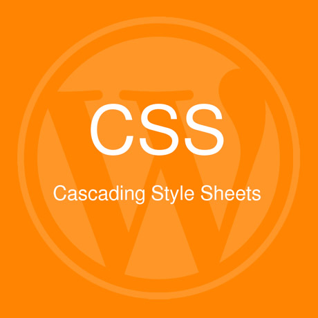
Believe it or not, there was a time when the web was really that simple. Plain, boring, unadorned text. That was before – until a new markup language was created – devoted to styling the look of a web page. The new markup language was called Cascading Style Sheets (CSS).

Going back to our definition of CSS:

CSS, or Cascading Style Sheets, is a W3C open standards programming language for specifying how a web page is presented. It allows web site designers to create formatting and layout for a web site independently of its content.

A bit of CSS history:

“According to the W3C, the CSS specification was drawn up in response to “pressure from authors for richer visual control.” The demand for better control of web pages was certainly there, but browsers in the late 1990s just weren’t up to the job. They implemented CSS very poorly or not at all. As a result, only the very brave or foolhardy adopted CSS in the early stages. Nevertheless, the W3C continued work on the specification and brought out a new version, CSS2, in 1998. This retained all the features of CSS1 and added some new ones.”

CSS gives you the power to set styling rules in one place. When you want to make changes to your web site, you make changes in that one place, and your whole web site changes automatically to reflect those new styles.

Why are they called “cascading” style sheets?

The cascade in CSS refers to the way that rules are added together and applied cumulatively. Think of the cascade in the literal sense of a waterfall or a river. As a river flows from the mountains to the sea, it starts off as a tiny trickle, but as more water is added through tributaries, it becomes bigger and more powerful. Yet the water in that original trickle is still part of the whole.

CSS works in a similar way. You can create a style rule that trickles down through the whole page. For example, it’s common to set the background and text colors in a rule for the body of the page. But lower down, new rules can be added that affect the font or size of the text without changing the color. And just like a river can break into a delta as it reaches the sea, you can break the CSS cascade into different strands, so that a sidebar looks different from the main content or footer of the page.

(source: Getting Started with CSS – David Powers)

With CSS, you can design your web page using different design elements, choose different fonts and font styles, add color, images and every design bling you can think of to jazz up your page. All this is done on a separate stylesheet that is linked to your main HTML code which means you can change the design elements anytime without recoding over and over. Simply put, CSS dresses up your drab and boring HTML and adds some “woop woop woop” to it – CSS style.

More next week.