Nimble Theme by Elegant Themes

Nimble Premium WordPress Theme is a well balanced theme in a lot of aspects. The theme’s demo displays a combination of colors that is pleasing and attractive to the eyes. Its styling is bold but still effectively leaves makes clever use of white space giving the eyes a place to rest strategically. The overall design is balanced and looks beautiful on large monitors as well as on smartphone displays. It is indeed aptly called “Nimble” as it is flexible enough to adapt to various types of websites.

Nimble’s homepage is deliberately section giving it that clearly defined look. Each section has its own color scheme, effectively transitioning users from one section to the next as they scroll through the page. The top section contains a beautiful, full width slider for showcasing attention grabbing works and taglines. Clicking on a slide takes you to a page that contains details of the featured work or post. This section transitions into another section which can be used to give a bird’s eye view introduction about important information such as the company, mission, vision, product/service summaries or other types of information. This is further enhanced by call to action buttons at the bottom of the boxes that take you to pages where you find more exhaustive descriptions. There is also a section that can be used for special quotes, taglines or announcements. The next sections can be configured to contain recent news and updates, recent blog posts, recent portfolio additions, and even a price table to complete the whole layout. All these customizations can be easily handled via the ePanel Theme Options feature included in all Elegant Themes WordPress themes.

Nimble’s responsive design is quick and impressive. Images and content quickly resize to the width of your browser or the screen size of your handheld device. This means that your visitors can expect a pleasant browsing experience all the time.

More Features:

  • Responsive design
  • ePanel Theme Options
  • Large collection of shortcodes
  • Premade Page Templates
  • Perpetual Updates
  • Secure and Valid Code
  • Browser Compatibility
  • Complete Localization
  • Five Unique Colors
  • Unparalleled Support

Nimble Premium WordPress Theme includes top-notch tech support provided by Elegant themes’ support staff to help you setup your site and get it running in no time.

Nimble Theme: $39 | Demo & Download

Nimble Theme: Coming Soon from Elegant Themes

Elegant Themes recently gave a sneak peak of their upcoming Nimble Theme. Nimble is a business theme described to be simple, flexible, and balanced. It will be interesting to see how Nick Roach pulls this one off – balancing bold and colorful design without going over the top. Nimble will also be responsive and will definitely be generously packed with features and functionality, as is characteristic of each and every Elegant Theme.

A quick look at the theme’s snapshot shows that this theme has a carousel style slider prominently placed on the homepage. Elegant themes has stated that this is to give business websites a platform to present a call to action. The slider can be enabled or disabled if so desired. The slider is followed by 3 sections and a footer. The first section is a place to put product and service summaries which lead to pages that describe business offerings in detail. The second section is for news and update summaries to give your visitors a good idea of how things are going in the business. The third section is a place to put projects that can be linked to portfolio or gallery pages.

The theme has been well received by most of those who left comments. There have be a handful who feel that Elegant Themes should veer away from themes that spend a significant chunk of the homepage on sliders or big images. Elegant Themes has responded that this design approach has been what business clients have been looking for and leads to greater conversion rates for the clients.

According to Nick Roach:

Most corporate sites do indeed need to convey a message, and it is important for that message to be big, bold and in front of the users right when he/she lands on the page. Giving a clear call to action with a single image, large header and a button is what I have found converts the best and results in the lowest bounce rates. It works because it is easy to understand. In almost every occasion, simplicity is what wins out over clutter. Having too much “stuff” in view when you land on the page can confuse the user. It’s better to lead them on a clear path.

Coming from someone who has been doing this for so many years, and who by now, knows and understands this market pretty well, it’s safe to assume that this new theme, considering all other factors, has been well-thought out and designed.

For now, we all just have to be content with twiddling our thumbs and waiting for Nimble to be fully released and then make our conclusions thereafter.

Check Out the Nimble Theme

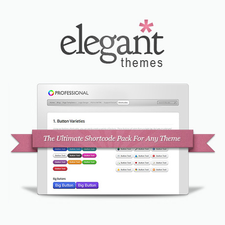
Elegant Themes Shortcodes: Now Responsive!

With the advent of mobile platforms, WordPress themes have to adapt to the demands of this steadily growing user base. It can really be quite frustrating to read articles from any major newspaper’s website on iPhone or Android and get all the content mish mashed. Theme developers and web designers need to move more and more toward this emerging trend towards responsive themes.

It is a welcome development that Elegant Themes recently released its responsive shortcodes. While Elegant Themes has been churning out responsive themes for quite a while, the shortcodes were left out. It took 10 responsive themes before mobile friendly shortcodes were released. Great news, indeed!

So how do these new shortcodes, improve mobile browsing experience? Elegant Themes’ blog cites two examples of their improvement strategy. Tabs have always been an issue when websites typically viewed on a 960px wide screen to a 320px width. No matter what you do, having 10 tabs will alway come out cramped. Solution: Tabs turn into a slider when switching to mobile mode. It just makes sense to have sliders rather than have unreadable tab labels. Another example cited was the case of columns. As the content width gets narrower, text in columns become a bunch of flying letters. Solution: the new shortcodes convert columns into boxes when switching to mobile screens. Brilliant isn’t it? Regarding the new shortcodes, Elegant Themes has declared them to be fluid width giving them the capacity to shrink and expand according to screen size.

Web design and the emerging technology innovation and trends are accelerating even faster. More and more mobile users prefer to access the web through their devices and WordPress Themes providers need to step up their game. For loyal subscribers of Elegant Themes, these concrete steps towards updating and upgrading all Elegant Themes products is always welcome and appreciated.

Congratulations to Elegant Themes for taking WordPress theme development one step further and fully embracing the future of WordPress.

See Elegant Themes’ Responsive Shortcodes

When Is The Best Time To Sell WordPress Themes?

Like any other product, the demand for WordPress themes does have seasonality. In our observation, theme sales do well from January to March then slows down from April to May. Summer months are usually slow while sales pick up in the fall with a dip around Christmas time.

Seasonality in any product or service is determined mainly by socio-cultural factors in the marketplace. In most markets around the world, economic activity is dependent on holidays or the absence or presence of school. There is also the aspect of climate, where people tend to stay indoors more during the cold months.

In the case of theme sales, it can be said that this phenomenon is mainly driven by the level of activity a person has during a season. Great sales during the first quarter of the year may be attributed to more free time for buyers to stay online as the kids are still in school and most folks prefer to stay indoors during winter. This means people have more time to tinker with their websites during this time and spotting opportunities for improvement or change could mean upgrading to a newer WordPress theme or buying and installing a new plugin. The spring slowdown correlates to the physical activities associated with this season: spring cleaning, gardening, putting away winter stuff, etc. Sometimes the lure of the outdoors is greater than staying inside the house, what with the weather becoming more pleasant and warmer. When summer kicks in and as the kids are out of school, that’s when all the vacations, trips and out of town activities happen. People tend to relax a bit more and work on websites take a back burner during this time. As kids go back to school in the fall, sales gradually picks up as people find more time to focus on work before the next big holidays, like Thanksgiving and Christmas, roll in. Spending patterns during Thanksgiving and Christmas usually turn towards gifts, gadgets, and other stuff to buy online unless WordPress authors take their cue from the season and create enticing special prices for WordPress theme packages or bundles.

Knowing these patterns, how do you align development and marketing activities for your themes? It would be wise to have your development activities lie heavily during the spring and summer months. That way, your resources do not have to compete with the demands of development and marketing at the same time. The best time to strengthen core technology, respond to emerging design trends, is during these lean months. As fall comes, resources can be shifted to marketing and after sales support as sales starts picking up. This is the right time to introduce new products and manage customer satisfaction as they adapt to your new themes.

Recognizing these consumer patterns may help you plan your annual business cycle as you make those critical decisions to save time, effort and money in your WordPress business.