How To Improve Performance On Your WordPress Site
Great content is at the mercy of site speed. No matter how wonderful your content is, taking more than 4 seconds to load can mean significant loss of traffic and loss of potential income for your website. Why? People hate slow websites. The slower it takes for your page to load, the faster people leave it. Patience is not a virtue when it comes to the internet. That is why site speed is important.

Google is obsessed with site speed and has incorporated it as one of the signals for determining search rankings. In a previous article on determining a website’s quality score , we learned that user experience is now a major element and part of the equation in determining and improving your site’s ranking. A fast site creates satisfied users, improves user experience, and improves overall site quality and performance.

If your website is taking longer to load than necessary, it’s time to take stock and audit the elements causing the delay. Here’s a checklist of some of the things you need to consider as you work on improving your site’s performance:

  • Use a CDN (Content Delivery Network) to load heavy scripts and images and to lighten the load on your server.
  • Optimize caching – Browser caching stores cached versions of static resources. This speeds up page speed tremendously and reduces server lag.
  • Remove/Reduce/Compress large images, videos, and other content. Resize and optimize images for web use. Specify image dimensions and use the right image format.
  • Minify JavaScript and remove unused CSS files. Reduce HTTP loading requests for CSS style sheets, scripts, images, and HTML
  • Remove/Reduce/Deactivate unnecessary or unused widgets or plugins. Plugins and widgets are bandwidth thieves. Try deactivating all of your plugins to test your speed. Activate a widget or a plugin one at a time to see which one is the speed culprit.
  • Check the loading time of your ads or affiliate codes to see how they affect page speed.
  • Check your WordPress theme for compatibility issues with your WordPress version or your browsers.
  • Choose a good web host or switch to a better one with a proven uptime track record if necessary.

Here are some of the tools you can use to help you analyze your site’s performance:

Page Speed

Page Speed evaluates performance from the client point of view, typically measured as the page load time. This is the lapsed time between the moment a user requests a new page and the moment the page is fully rendered by the browser.

Yahoo! YSlow

Firefox/Firebug Add-on that analyzes web pages and suggests ways to improve their performance, based on a set of rules for high performance web pages.

Google Analytics Plugin by Yoast

Google Analytics for WordPress plugin allows you to track your blog easily and with lots of metadata: views per author & category, automatic tracking of outbound clicks and page views.

Pingdom Website Speed Test

Pingdom offers cost-effective and reliable server, network and website monitoring. They use a global network of servers to monitor customers’ sites 24/7, all year long. The service includes statistics for uptime and response time, and can send out alerts via SMS, email, and more.

W3 Total Cache

W3 Total Cache is designed to improve user experience and page speed of your site by increasing server performance, reducing the download times and providing transparent content delivery network (CDN) integration.

In conclusion, as far as website essentials go, the adage “less is more” is best. Sticking to only what’s necessary and throwing away what is not needed will help your website float to the top. The faster your website loads, the better your site performs and the experience your users have will be more pleasant, favorable, and hopefully more memorable, making them want to come back for more.


Free Designer Resources for your WordPress Theme: Icon Sets

Sometimes all it takes to add the finishing touch to a drab design is choosing the right design element. There are numerous resources available online but sometimes it gets too overwhelming to search for them. We’ve found a few design resources that you might be able to incorporate into your WordPress theme design:

Free Outline Icons from Vandelay

these minimalist, outline style icons designed by Grandiz for Vandelay Designs will go well with Swiss-style, white spaced WordPress themes.

Free Brands Icons from Smashing Magazine

Smashing Magazine is giving away Simple Icons by Dan Leech. This set contains 100 white icons that have transparent backgrounds and can be used for popular websites, apps and organisations.

Free WordPress Post Type Icons from Fribly

Add some style to your custom posts with these sticker type icons. Icons are transparent and in png format. They include: status, link, quote, video, audio, image, gallery and aside. May be used for both personal and commercial projects.

Social Media Icons from Harkable

These sharp and sleek social media icons will add polish to any WordPress theme. Add that extra wow to your website using these icons. (PSD and PNG format)

Clean and Colorful Social Media Icons for 2013 from Mascot Agency

These simple yet vibrantly colored icons have that Windows 8 graphic quality about them. More icons are included in the actual download.

Icons are a great way to add a signature look to your website when done the right way. Enjoy these free resources to add that signature look to your site.


17 Awesome Adobe air apps for designers

One fine day I was trying to fill in an important official form online on my Mozilla Firefox’s browser. After spending about half an hour I reached the last few questions of the form. One question there asked me to click a checkbox to answer but I could see no checkbox on the screen. After wasting a lot of time reading the instructions and every possible detail over and over again I asked for advice from my friends. One person told me that I should try to refill the form on Internet Explorer. I tried it and now the checkbox appeared and I successfully completed and submitted the form online.

The problem just described occurred because the form was designed to work especially for Internet Explorer. You see, designing an application for all systems is tedious as one has to tweak the runtime code again and again to make it compatible to work with different systems. Here is where Adobe AIR jumps in. If an internet application is designed using Adobe AIR then it will automatically work for all systems and browsers.

Technically speaking:

“Adobe AIR is a cross-operating system runtime that lets developers combine HTML, JavaScript, Adobe Flash and Flex technologies, and Action Script to deploy rich Internet applications (RIAs) on a broad range of devices including desktop computers, netbooks, tablets, smartphones, and TVs. AIR allows developers to use familiar tools such as Adobe Dreamweaver®, Flash Builder®, Flash Catalyst®, Flash Professional, or any text editor to build their applications and easily deliver a single application installer that works across operating systems.” – Adobe’s website.

Adobe AIR has a wide array of apps that can help designers design better applications. Below I have selected 17 of them.

(more…)


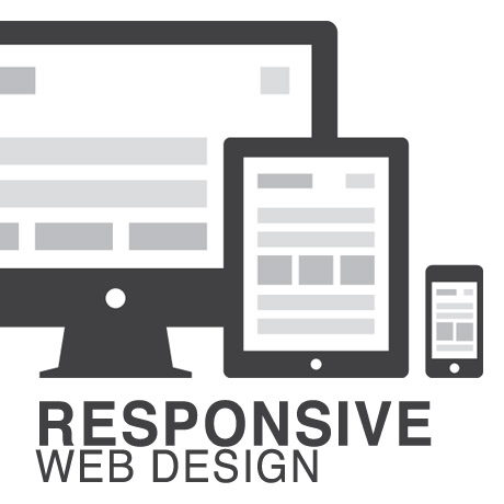
Responsive Web Design (RWD) vs Adaptive Web Design (AWD)

We’ve heard the terms Fluid, Adaptive, and Responsive used interchangeably when describing a theme’s ability to resize according to browser specs or device (mobile or not) size. Are they really different from one another or are they referring to the same characteristics found in themes described as such?

What is Responsive Web Design (RWD)? Responsive Layout?

Let’s take a closer look.

Responsive web design (often abbreviated to RWD) is an approach to web design in which a site is crafted to provide an optimal viewing experience—easy reading and navigation with a minimum of resizing, panning, and scrolling—across a wide range of devices (from desktop computer monitors to mobile phones) – Wikipedia

Responsive design is the methodology behind making a website respond to whatever platform you are viewing it on regardless of resolution and orientation. It may change how certain elements display but it will not remove elements or change the core functionality of their behaviours. Responsive design uses a fluid grid and it is usually possible entirely through HTML and CSS, without the need for DOM (Document Object Model) manipulation. – Matthew Freeman

According to Ethan Marcotte, The 3 Elements of Responsive Web Design are:

A flexible, grid-based layout – A layout based on proportions rather than absolutes; uses a flexible grid, which in turn ensures that a website can scale to a browser’s full width.

Flexible images and media – Layouts based on percentages resize gracefully according to the size of the browser window rendering them. However, it is problematic to ensure that the content within a site resizes.
Images and media should scale with the flexible grid; images that work in a flexible context, whether fluid themselves or perhaps controlled through overflow mechanisms. CSS addresses this problem with its max-width property

Media queries – Content based breakpoints; optimize the design for different viewing contexts and spot-fix bugs that occur at different resolution ranges. CSS3’s media queries directly address these usability problems by allowing browsers to serve different styles for different viewing contexts. CSS3 greatly expands support for media queries, adding the ability to target media features such as screen and device width and orientation.

These 3 elements of Responsive Web Design find their way into 3 different types of Responsive (RWD) Layouts:

The Basic Fluid Lay­out
Con­tent con­tin­u­ally flows or adjusts in a word-wrap fash­ion as screen width is increased or reduced. There are no “dis­tinct” dif­fer­ences in con­tent pre­sen­ta­tion. Fluid layouts are dynamic and user sensitive – adapting to the available real estate on the user interface and providing increased content accessibility.

The Adap­tive Lay­out
There are pre­de­fined sizes were dif­fer­ent lay­outs are trig­gered. These are called breakpoints. Typ­i­cally there are three or four break­points to accom­mo­date desk­top, tablet and mobile screen sizes.

The Respon­sive Lay­out
This is a hybrid of Basic Fluid Lay­out and Adap­tive Lay­out. There are pre­de­fined break points, how­ever in between these breakpoints con­tent will flow to expand or con­tract.

According to his article for the Adobe Blog, Carl Sandquist states that:

“Cur­rently, most RWD web sites use Respon­sive Lay­out since it offers a best-of-both-world expe­ri­ence. Con­tent snaps into the appro­pri­ate approx­i­mate posi­tion for a device type (e.g. Tablet) and then fine-tuned adjust­ments are made for the exact screen size on a par­tic­u­lar device.”

What is Adaptive Design (AWD)? Adaptive Layout?

“Adaptive design is the manipulation of layouts to best perform on certain screen resolutions inclusive of elemental removal or behaviour changing techniques. Adaptive design usually requires Javascript to efficiently manipulate the DOM. Javascript can be avoided if you plan on having duplicate on-page elements and then show or hide them based on screen sizes, this might be appropriate for smaller elements but not whole columns or navigation elements.” – Matthew Freeman

“This technique adapts what is displayed depending on the capabilities of the device being used, as well as the screen size. It centres on the context of the user, so even when the same content is used, it is adapted (with some or even all of the design elements changing), depending on whether the user is using a mouse and keyboard or touch screen. AWD also uses different layouts for tablets and mobiles with certain. ‘Responsive’ elements built in to reduce the number of different templates required. AWD can be taken to further extremes with content being completely repackaged and reworded, while images and video are either reworked or completely removed.” – Danny Bluestone

According to Aaron Gustafson, author of Adaptive Web Design, Crafting Rich Experiences with Progressive Enhancement:

“Progressive enhancement isn’t about browsers. It’s about crafting experiences that serve your users by giving them access to content without technological restrictions. Progressive enhancement doesn’t require that you provide the same experience in different browsers, nor does it preclude you from using the latest and greatest technologies; it simply asks that you honor your content (and your users) by applying technologies in an intelligent way, layer-upon-layer, to craft an amazing experience.

He encourages designers to: Think of the user, not the browser.”

Which one is better?

A better understanding of the differences between Responsive Web Design and Adaptive Web Design is a starting point to deciding which solution will work well for you, or your clients, if you are a WordPress professional. Knowing what solutions are available and having the ability to distinguish and implement whichever design approach best meets the specifications of the end user is an important element. Of course, nothing is carved in stone. Future designs may be a combination or a hybrid of both – employing the best features of each one. The goal is to ensure that the user experience at the point of searching and eventually finding your website is the best experience they get at that particular moment – fully hoping that it will be the first of many more visits and not their last.


Searchable, Crawlable, Optimized Content – The SEO Fix You Are Looking For?

Website owners are constantly looking for that one SEO formula or template that will assure them of that coveted top spot on the search engine pages. Many webmasters have retracted from their black hat ways and are cleaning up their acts – deleting link building campaigns, url redirects, keyword stuffing, etc. – and are turning to more Google-friendly methods to avoid being penalized. One of the many SEO strategies that people are investing in is CONTENT – good, relevant, easily crawlable content. But is it THE magic SEO formula that people are looking for?

Imagine ordering a decadent looking 3-tier specialty cake baked by Cake Boss Buddy Valastro himself – intricately designed and made with absolutely the finest ingredients. It’s got everything in it to definitely make it a conversation piece among the guests. But, what if someone forgets to display this wonderfully made cake and it stays in the kitchen where no one gets to see it except the kitchen staff. No doubt it’s a wonderful and probably the best tasting cake your guests will ever taste but unless they see it, admire it, slice it, taste it – they will never know what they are missing. Same thing goes with your wonderful, relevant, crawlable, well-written content. Out of sight, out of mind.

But hey, you can have your cake and probably eat it too if you take a wholistic approach to SEO. Yes, by all means, go ahead and build relevant, optimized, searchable great content. But don’t stop there. Make sure that you get it out there and give your audience a taste of it. Get people engaged enough to share it, link to it, and make them want to come back for more. Use and maximize social media. Add that tested and reliable SEO plugin. Market your brand. Plan your public relations campaign. Grow your audience. Junk those outdated SEO concepts. Analyze and study your statistics. Realize that it’s not a one-time event but it’s something that needs to be maintained constantly. SEO is not a one-template fits all type of thing. It is anything and everything that contributes to your website’s visibility and helps you land on that top page in the SERPS.

For more on this topic, check out this helpful article on Moz.com.


WordPress-Friendly Ghost Themes

Ghost started out as a Kickstarter project by John Nolan with the goal of creating

… a blogging platform with all the open source benefits of WordPress, but simpler in every way, and just focused on publishing. Ghost is unique in its philosophy of focusing entirely on publishing. Everything about the administrative system is designed around making writing simple and pleasurable. Everything about the theme system has been created to facilitate personal blog, magazine, and news themes.

The biggest difference between Ghost and other platforms from a technological point of view is that it’s built entirely in JavaScript. A modern technology stack means that Ghost can push the boundaries of what’s possible with the web. You can install and run a blog on a 16MB USB stick, a Raspberry Pi, or a high powered Virtual Private Server.

Although this new ecosystem is fairly new compared to WordPress and may not appeal to everyone’s liking, there have been several beautiful and interesting themes that have been released with a WordPress version counterpart. Here are a few of these Ghost-inspired WordPress themes that you can check out.

CASPER

Casper WP theme, is essentially a port of the gorgeous default theme from the Ghost blogging platform built using Underscores as a base. It is a clean, minimalist, and lightweight theme that’s designed to highlight content without the unnecessary frills. Author, Lacy Morrow, gives a short demonstration of the theme’s features with a blog post that was written in Markdown (the language used by Ghost)and uses the Jetpack Markdown plugin for parsing. Other WordPress features are also integrated into the theme.

RAIN

RAIN is one of the best selling Ghost themes on ThemeForest and also has a responsive WordPress theme counterpart. This minimalist WordPress “Ghost” theme has a background that is 100% dynamic where you can imply upload your own photo and it also includes audio files in the package free of charge. This theme is designed primarily for writers.

ASTRO

Astro is a content focused responsive theme, originally a Ghost designed theme, built for the WordPress platform. Designed from the bottom up to be high performance, user friendly, and accessible on all devices. Astro adapts to the users viewport, so it looks great on smartphones, tablets, TVs, and even the latest 4K monitors. Astro includes two different post styles. The standard style is designed for update posts and short articles. The featured style includes full title images, suited towards larger articles, tutorials and other documentation.


Top Themes Featured on Theme Forest

Every week, Themeforest features promising WordPress themes that are worth noticing. Here are some of the latest themes that have been featured on Themeforest you need to see. Check these out.

Forgiven – A Powerful WordPress Theme for Churches

Forgiven Premium WordPress Theme is a powerful parallax enabled church theme that includes major features such as: Visual Composer plugin, Slider Revolution, Envira Gallery, the unique and exclusive Blur Slider, support for Church Theme Content, WooCommerce support, Page customizer, Gravity Forms and Contact Form 7 support, Sermon functionality, The Events Calendar and the Events Calendar Pro plugin integration and support, and so much more.

FlatAds – Classified AdsWordPress Theme

FlatAds Classified Ads WordPress Theme is a super flexible and fully responsive Premium Directory/Listing WordPress themebuilt with HTML5 and CSS3. FlatAds is compatible with WooCommerce 2.1, bbPress, and MailChimp for WP plugin. Other key features include custom fields for categories and subcategories, interactive Google maps Geolocation support, integrated PayPal payments support, and WPML (multilingual) support.

Faculty – Responsive Academic WordPress Theme

Faculty Responsive Academic WordPress Theme is a magazine or personal blog styled page that can be used to build personal or professional websites specifically for academic people. This simple and yet well structured responsive theme is especially designed as an online cv of professors and PHD students. Key features include publications management, option to present research, teaching and blog pages, and provision for downloadable CVs for interested visitors.

KLEO – Next level Premium WordPress Theme

KLEO – Next level Premium WordPress Theme is an extremely flexible, fully customizable BuddyPress and bbPress compatible WordPress multipurpose theme to help you create a community, a corporate portfolio, or a membership website. This membership ready theme allows you to create membership levels and restrict content based on member access quite easily. key features include: WPML and Translation Ready, WooCommerce Ready, Google Maps integration, Contact Form 7 compatible, among others.

Time Travel – Timeline WordPress Theme

Time Travel – Timeline WordPress Theme is an ultra modern next generation premium theme developed with cutting edge technology and design. The built-in voice control makes it both revolutionary and at the same time super intuitive to use. You can set up your own language to be used in the voice commands control, so it is as easy as possible for your visitors. The design of the site is a 3D time travel path, ideal for displaying chronology data, posts flow by date, history info or just any type of timeline content in a modern and futuristic way.

It is ideal as a blog, a portfolio site, a corporate site aiming to display the history of company or brand, an artist’s portfolio to display albums / films / books in a chronological way, an agency website to showreel projects and team by date, etc.

Hooray – Premium WordPress Blog Theme

Hooray Premium WordPress Blog Theme is one of the most colorful and user friendly personal blog themes. Key features include: easy to use powerful Admin Panel, full Arabic RTL support, social counter integration, translation and multi language ready, page templates, review and rating system, unlimited colors and sidebars, and so much more.

Moustachey: A Blog theme with extra gusto

Moustachey Premium WordPress Theme is a fun, quirky WordPress blog theme playing on the moustache design. Key features include: Author support, social share enabled, typekit web fonts integration, adobe edge web fonts integration, Google analytics support, Google API v3 integration, configurable donate/message block at the top of the page, localization support, and so much more.


Best WordPress Themes 2021

UPDATED April 12, 2021: 2021 is sure to be another great year for WordPress Theme development. Like the millions and millions of people using WordPress, we eagerly await the Themes and Plugins to be released this year, and you can …


What Features Do Most Commercial WordPress Themes Have in Common?

WordPress users enjoy many benefits not necessarily available in other content management systems. The plethora of high quality WordPress themes that users can choose from is more than enough to dress up any website. Whatever type of website you plan to put up, most likely, there is a WordPress theme for it. Here are some of the most common features present in some of the most popular WordPress themes in the market today.

A Great Slider

An effective theme must help create a steady following for your site. It must be able to captivate casual visitors and convert theme into followers that eventually become clients and customers. A slideshow is a great tool that can deliver quick, dramatic visual impact combining the use of images with taglines, spiels, or memes to hook visitor interest. This billboard-like effect gives casual visitors something to spark their curiosity and encourage them to examine and explore your site further. The short attention span this generation has, a slider is an indispensable feature for any website. Popular plugins like Slider Revolution, Layer Slider, Nivo Slider, and Flexslider make the job a whole lot easier.

Parallax and Animation

Once you’ve gotten the attention of visitors, the challenge shifts towards keeping their interest. Perhaps you’ve attended lectures were you came in with excitement about what you could learn only to be disappointed by a boring, uncharismatic instructor whose droning voice put you to sleep. This is analogous to going through great content in boring or even hard to read content. This actually narrows your followers to those who are actually already sold to your content. If your goal is to convert more people to your product or service, the presentation of your content has to facilitate easy reading and assimilation of information. Corporate presentations are often more effective when stats are represented as animated charts and bullets. These actually help executives focus on the items that need to be considered. Having animated bullets and content sections also give focus on items you want your visitors to remember.

Flexible Layout with Drag and Drop Capability

Presenting your content is important in developing your following. While animation helps your audience focus on key points of your content, a sound content structure is still required for visitors to make sense of your site as a whole. Being able to piece together key points into a cohesive body of knowledge will drive home a stronger message to your visitors that will keep them coming for more. To do this, your content has to be organized in such a way that visitors go through important sections in a natural, stress free manner. The natural flow of content will vary according to your audience. Recognizing this, themes that have been designed and devised to respond to the needs of various audiences will bring a higher conversion in terms of subscribers and followers. A lot of themes now include drag and drop page builder features allowing you to assemble your own pages from scratch. Some themes come with ready made layouts for almost any type of site which can be tweaked to meet specific audience needs. Most, if not all, of these themes have powerful options panels and shortcode generators for maximum customization flexibility.

Mobile Friendly

Mobile is a platform that cannot be ignored. Mobile gadgets are part of today’s lifestyle because of the convenience it provides its users. As such, theme designers and developers are forced to confront the peculiarities one encounters when using a mobile device. A theme has to be responsive. This means it has to be able to adjust to give the best possible display regardless of what device you use to browse your site. Theme pages need to have the capability to reorder and resize according to tablet and smartphone displays without sacrificing the beauty of the theme on desktop. In addition to this, special navigation menus for mobile devices must be able to facilitate the interface differences on these devices from desktop. Usually, the Bootstrap framework is a theme author’s go to option to ensure optimal performance on mobile platforms.

Good SEO

No matter how great your site is in terms of content or aesthetics, it must be found by your target audience. Great themes are coded in such away that is friendly to search engines to help land your site on the first few pages of search results. This is accomplished in a number of ways: meta and links, XML sitemaps, RSS Optimization, and Breadcrumb among others. There are numerous options to ensure your site is covered by good SEO measures. Clean code, SEO optimized images and videos, and installing reliable and tested SEO plugins like SEO by Yoast, etc. are some of the many SEO practices you can integrate on your site.