WordPress Theme Support – The Awful or Awesome Truth
So you’ve finally uploaded your shiny new premium WordPress theme but it looks nothing like the theme you loved so much in the demo and now you’re wondering if you just wasted your money on a lemon. You fiddle and you tweak but the errors just keep piling up. Not all premium WordPress themes include free support so it can be a bit perplexing especially if you are setting up a website for a client. Frustrating, is a mild word. Where do you go and what do you do?

Here are some of things to look for, support-wise, before, during, and after purchasing a premium WordPress theme. Some theme providers have all of them while some don’t so use your own discretion and judgment before you make your final decision and click that “Confirm purchase” button.

Documentation (Theme or Plugin guides – online or offline)

Check if the theme includes extensive and detailed documentation and a troubleshooting guide if available. Find out whether installation and setup guides are available online and offline as access to these guides serve as your reference documents as you setup your WordPress theme.

XML file or demo content

Most of the time we get attracted to a particular theme because of the demo. The demo gives us an idea on what is possible for our own individual projects. Unfortunately, recreating the same demo can be challenging if the elements used in the demo are not included. Some authors do not include the demo file but there is a growing trend among a lot of authors where they include the XML file or demo content as a bonus.

Photoshop files (layered)

Trying to recreate the WordPress theme in the demo can be much easier if the author includes all the allowable files used. Photoshop files make it easier for you to duplicate or customize the theme’s design elements without having to start from scratch.

Detailed tutorials (video or text)

Text based tutorials are great but video tutorials are best because the author can demonstrate and guide you on exactly what to do when setting up or modifying your WordPress theme. Video tutorials save you a lot of time, and, mistakes are reduced because of misinterpretation. Simply pause and play when you need to go back to a certain instruction.

Screenshots

In the absence of video tutorials, screenshots are also great because they serve as visual guides to help you install and get your WordPress theme up and running. Visuals are always effective as it gives you a clear picture of what you are supposed to do. You can always go back and refer to these screenshots if you get lost along the way.

Basic support services for installation, setup, guidance, bug fixing and general support for basic WordPress issues and concerns

For non-WordPress savvy users, authors and developers provide basic WordPress theme setup and installation. The extent of this service varies from author to author although generally this service includes simple adjustments and tweaks that do not fall under their customization services.

Support or Community Forum

WordPress authors and developers who have been around long enough in the business are most likely to have a dedicated support forum or community support group to help each other out. Access is generally limited to members or customers who have purchased themes sold by these authors. Make sure to register in these forums and be active in the community to learn hacks, tips and tricks that don’t normally come with the documentation and tutorials.

Help desk, live chat, or available hours for technical support

Some WordPress authors or theme providers might even have the legroom to provide a dedicated support system which includes a help desk or ticket based support system, live chat, and dedicated technical support crew. Be sure to note the time or hours support is available as some of these teams live in different time zones.

Update and Upgrade Support

WordPress updates its software from time to time and problems arise when the WordPress theme you purchased is no longer compatible with these updates. Same thing goes with plugins and other elements like short codes, etc. Make sure that your WordPress theme author or developer has provision for updates and upgrades that will affect the theme and if there are any additional charges related to it.

Author/Developer Contact info

Find out and store the author or developer’s contact information online and offline. Request for an email address, a business phone number, or any other means to get in touch with the author if he does not have a dedicated support forum. Leaving comments on the WordPress theme’s product preview page does not guarantee your concerns will be attended to in real time.

Finding the perfect WordPress theme that matches your dream website is more than just appearances. Make sure you know what you are getting when you pay for that pretty theme you’ve been eyeing. It pays to know what’s in the fine print…or what’s not in it.


WordPress Themes Should Be More Expensive: HERE’S WHY

If this post has caught your eye, you are probably a current WordPress user, author, developer, designer, or if not, perhaps a potential one. The subject of pricing is a tricky topic that some prefer to ignore or avoid – the proverbial elephant in the room. Why, because this is a hot topic indeed.

How should WordPress Themes be priced anyway?

For the purpose of this article, let’s start off by saying that a WordPress theme is a downloadable digital product as compared to an actual physical product that can be shipped. When you purchase a WordPress theme you do not receive any physical items at all but instead, you are given permission or license to download an electronic/ digital product (the theme), via email or a provided link, and use it according to the author/developer’s specific TOU (Terms of Use).

Traditionally, the actual cost of producing/manufacturing tangible products can be arrived at by adding the cost of materials used and the labor paid to produce these products to arrive at the total cost of goods. Others may add on overhead costs but strictly speaking it’s simply materials +labor. For services rendered, actual cost can be arrived at based on a rate applied to the number of man hours spent (time) on a project or the professional fee charged by the person (expert) rendering the service.

However,

Digital products require an approach to pricing that differs from that used for physical products. Most digital products have common characteristics which includes:

  • high fixed cost to produce the first unit, but low marginal costs to produce subsequent units
  • quality is difficult to judge without actually experiencing the product

The most common pricing method that can be used for digital products is to use a licensing approach.
(source: Digital Economy: Impacts, Influences, and Challenges by Harbhajan S. Kehal, Varinder P. Singh)

The Digital Products Cost Equation

The cost structure of digital products = high fixed costs that are sunk, and tending towards zero marginal costs.

Fixed costs refer to the costs associated with a product, that are fixed over a number of units. Thus regardless of the number of units produced and sold, the fixed costs remain the same. With digital products, much of the fixed costs are actually sunk costs, and therefore non-recoverable costs. A large portion of the costs associated with digital products are fixed, and sunk, and not variable costs, which are more typical of traditional manufactured goods.

Sunk costs refer to costs that are non-recoverable fixed costs. Digital products usually have significant sunk costs (when compared to other fixed costs) in the form of research & development and intellectual property (copyright, patents etc.) for the product. If the product is not successful in the marketplace, the costs associated with the the product development (intellectual property, labor) cannot be recovered. Thus when making pricing decisions about the product in the future, one should not factor in the sunk costs. If a product’s cost structure is made up of sunk costs (no other fixed costs) and zero marginal costs then any price above zero will contribute to the company’s bottom line. Other fixed costs, that are not sunk (rent, depreciation on equipment etc.) should be factored in when making pricing decisions in the future, since these are ongoing costs to the company. The company will continue to have to pay these costs in the future, this is not the case for sunk costs.

Marginal costs are the costs associated with creating an additional unit of product. This is similar to variable costs, which are the costs that increase directly with the increase in production (unlike fixed costs). Digital products typically have very low marginal costs, when compared with traditional goods (materials, labor etc.) and if the product is distributed via a web site, then the marginal costs can be zero. The consumer is bearing the distribution costs, and there are no packaging costs. This is why companies are able to market their products for free on their web sites, in order to try to entice further purchases at a later time (in the hopes of creating lock-in perhaps).
(source: http://www.udel.edu/alex/dictionary.html#d)

What costs go into the creation of a WordPress theme anyway?

How many of you enjoy BTS (Behind the scenes) footages of upcoming movies? BTS clips give you a sneak peek of how these movies were filmed and the production process these films have gone through. Similarly, if we could do a BTS video of how a WordPress theme is created, can you imagine the amount of work that goes into creating a theme? Can you identify which activities fall under fixed costs, sunk costs, or marginal costs? Can you tell how many working hours have gone into its creation? Can you measure the education, experience, competence and expertise of the author/developer?

When you purchase a WordPress theme from a reputable WordPress author/developer you typically get a long list of features like the one below. But, have you ever associated any cost to these features?

1. Theme Features and Functionalities

  • Fancy Sliders
    • Simple jQuery Slider
    • Slider Pro ($25)
    • jQuery Carousel Evolution ($10)
    • TouchCarousel ($21)
    • LayerSlider (Parallax Slider) ($15)
    • Paradigm Slider ($15)
    • Slider Evolution ($18)
    • Nivo Slider WordPress Plugin ($19)
    • Pinwheel Slider ($9)
    • Responsive Ken Burns Slider WordPress Plugin ($18)
  • Plugins/plugin compatibility ($4-$50)
    • eCommerce/shopping cart plugins
    • Audio/Video/Images/Slideshows/Widgets/Portfolio
    • SEO, Social Media
  • Multiple page templates (more than basic Blog and Archives templates)
  • Graphic Design Elements
    • Icons
    • Fonts
    • Stock Photos
    • Multimedia
  • Mobile device compatibility and display features
  • Styling Short codes (buttons, columns, tables, boxes, dropdowns, drop caps, etc.)
  • Custom admin panel and customization features

2. Admin/Marketing/Support Costs

  • Business license/ applicable taxes (cost = based on your geo location)
  • Developer’s fees
  • Hosting costs
  • Theme preview designs
  • Copywriting
  • Analytics – Marketplace sharing
  • Support staff, Forum maintenance, Live chat support
  • Documentation, PSD/XML/Demo content files
  • Video tutorials, screencasts and video hosting costs
  • Setup, installation of WordPress, theme, plugins (time spent)

3. Labor: Professional fees and software (personal or outsourced)

  • Man hours to create and develop theme
    • (design and coding)
    • design concept | creative process (R&D, selection and decision making: colors, fonts, graphics, icons
    • testing, browser compatibility
  • Software: Photoshop, Dreamweaver, Illustrator, etc – ($1500 up)
  • Training, Seminars, Education

Did you know that creating custom themes for clients range from around $1500 up to $50000 depending on the project. Looking at the list above, and seeing everything that goes into creating a theme, would you say that WordPress themes are underpriced? overpriced? or fair enough?

Let’s ask the next question. What’s important to you? How much do you value your business? your brand? yourself?

The answers to these questions will more or less determine how much you are willing to pay anything actually – whether it’s paying for your website, for your family needs, or even for your own personal growth.

How important are these WordPress designer’s traits to you?

  • Competence – work portfolio
    Web development requires many skills: Proficiency in Photoshop and design skills, CSS and HTML skills, copywriting and SEO skills, programming skills, with subsets of skills across a vast array of programming languages.
    If you’re comparing costs between developers, make sure it’s apples to apples – you should know what you’re getting in terms of feature set and functionality. Then take into consideration the experience and portfolio of the individual or company you’re looking at hiring, the attention you can expect to receive and the general rapport between you and a potential developer. Even if the cost is perfect and everything else seems right on paper, you may want to think twice about hiring someone if you don’t feel that somewhat ethereal sense of connection and comfort.
  • Experience – good working knowledge, coding skills
    A less experienced person may charge less because he doesn’t have the full-blown skill of a seasoned professional. It’s always a risk when you’re working with freelancers who build websites “on the side”, self-taught “learn web design in 21 days” types and people who are just starting out in the industry.
  • Number of years in practice
    Experienced developers can charge you more because they bring the weight of their expertise to bear on your project. An experienced developer may be able to do your site in half the time and charge twice as much, but remember you’re dealing with value and not cost.

Sometimes you have to make your decision, not based on cost, but based on value – which company do you want to work with? Which one has the most experience, the best portfolio, the most responsive people? A higher cost should not disqualify a company if that’s the one you’re confident can get the job done.

Pricing is not a magic, secret recipe. It’s just the cost of doing business, plus the value of expertise, plus the time needed to complete a project in a particular set of circumstances with a particular set of requirements. (reference: Websearchsocial.com)

At $39 you can already get 80 premium WordPress themes, no sweat. It’s about the same price, more or less, of a plugin or a slider, isn’t it? Do you agree that these themes should be worth a whole lot more than that?

Tell us what you think. We’d love to hear your thoughts.


Secure Your Interwebs With Sucuri

Malware infestations, blacklistings, Google warnings, malicious software, infected domain, suspicious activity, phishing – not exactly the landing page you want to welcome your visitors with, right? But if you have experienced the dreaded Google warning splash page (just like the dreaded blue screen), it is a cause for concern.

Hackings and other website attacks are becoming more prevalent nowadays. Not that they weren’t before but these malicious activities never went away either. They’ve just become a little bit more sophisticated than before. Government websites, large hosting websites and the more popular and well-known websites seem to be a favorite target but the truth is – no website is immune from these attacks. It is projected that the total number of websites in 2013 will reach 1 Billion and 2 Billion in 2015. (source: toni.org) That’s a lot of www candidates right there. Of course, you can reason away that your website is totally insignificant compared to the 999 million other websites that can be targeted by a malicious attack. On the other hand, yours might just be THE one. Hopefully not.

The impact of a website attack can be devastating especially if it is an eCommerce or a highly monetized site. Not only do you lose a lot in terms of time, lost data, missed sales opportunities and potential business income due to messed up systems and lost traffic, these attacks also affect your site’s credibility and reliability which are the most important currencies any business can have online. Once the public becomes aware of the attack, caution sets in and transactions become paralyzed. The possibility of being blocked or blacklisted becomes a total nightmare. The website owner is now faced with an unnecessary battle of perceptions that could have been prevented in the first place. How can this battle be prevented and how can you, the website owner, protect your peace of mind from potential attacks?

Sucuri Security is a company that offers a security service that detects unauthorized changes to network (cloud) assets, including web sites, DNS, Whois records, SSL certificates and others. It is also heavily used as an early warning system to detect Malware, Spam and other security issues on web sites and DNS hijacking. Sucuri shot into the limelight when GoDaddy hosted sites were attacked and exploited. They were the company that conducted the cleanup operations for them. Sucuri is not a malware protection software to be installed on your site. The company provides a monitoring service to protect your website from any malware, threats of intrusion, infections, and the like. This extra layer of protection is an assurance for both you and your clients or customers that any information exchanged on your website will not be compromised.

You can get a free analysis for your website from Sucuri. Just visit their website and have your website checked anytime. They also have a free plugin that can be downloaded from the WordPress plugins page. This plugin is free but works best in tandem with their security service packages. To learn more about these service packages, check out their website to see which one matches your requirements. The investment you make today to secure your website can save you so much headache in the future.

Visit Sucuri.net to get your free analysis. Download the free plugin from WordPress.

Get Sucuri Now!

25 Basic Adobe Lightroom Tutorials for Learners

The phrase “photo editing” has become synonymous with “Adobe Photoshop”. Photoshop is the industry leader when it comes to editing images. But one drawback of Photoshop is that a designer needs a good amount of coaching before he can use Photoshop properly. A coaching center near my house promises to teach Photoshop in 2 months to the layman. Not everybody will be willing to invest two months to learn a photo editing software, especially when one does not intend to choose photo designing as a career.

Understanding this problem, Adobe has designed another software named Adobe Lightroom to help even the general public to easily edit images. To quote Adobe’s website – “Lightroom includes all the tools you need for most digital photography tasks in one intuitive solution. Lightroom helps photographers work faster and more efficiently with one image, a set of images, or a large image library.”

When I stated that Lightroom can be used for the general public I don’t mean that one can begin using it merely after installing it. Obviously you need to have some guidance to use the software properly. Therefore, in this blog post, I have collected a list of 25 excellent tutorials on how to use Lightroom properly and get desired results.

(more…)


Responsive Web Design (RWD) vs Adaptive Web Design (AWD)

We’ve heard the terms Fluid, Adaptive, and Responsive used interchangeably when describing a theme’s ability to resize according to browser specs or device (mobile or not) size. Are they really different from one another or are they referring to the same characteristics found in themes described as such?

What is Responsive Web Design (RWD)? Responsive Layout?

Let’s take a closer look.

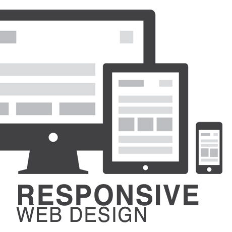
Responsive web design (often abbreviated to RWD) is an approach to web design in which a site is crafted to provide an optimal viewing experience—easy reading and navigation with a minimum of resizing, panning, and scrolling—across a wide range of devices (from desktop computer monitors to mobile phones) – Wikipedia

Responsive design is the methodology behind making a website respond to whatever platform you are viewing it on regardless of resolution and orientation. It may change how certain elements display but it will not remove elements or change the core functionality of their behaviours. Responsive design uses a fluid grid and it is usually possible entirely through HTML and CSS, without the need for DOM (Document Object Model) manipulation. – Matthew Freeman

According to Ethan Marcotte, The 3 Elements of Responsive Web Design are:

A flexible, grid-based layout – A layout based on proportions rather than absolutes; uses a flexible grid, which in turn ensures that a website can scale to a browser’s full width.

Flexible images and media – Layouts based on percentages resize gracefully according to the size of the browser window rendering them. However, it is problematic to ensure that the content within a site resizes.
Images and media should scale with the flexible grid; images that work in a flexible context, whether fluid themselves or perhaps controlled through overflow mechanisms. CSS addresses this problem with its max-width property

Media queries – Content based breakpoints; optimize the design for different viewing contexts and spot-fix bugs that occur at different resolution ranges. CSS3’s media queries directly address these usability problems by allowing browsers to serve different styles for different viewing contexts. CSS3 greatly expands support for media queries, adding the ability to target media features such as screen and device width and orientation.

These 3 elements of Responsive Web Design find their way into 3 different types of Responsive (RWD) Layouts:

The Basic Fluid Lay­out
Con­tent con­tin­u­ally flows or adjusts in a word-wrap fash­ion as screen width is increased or reduced. There are no “dis­tinct” dif­fer­ences in con­tent pre­sen­ta­tion. Fluid layouts are dynamic and user sensitive – adapting to the available real estate on the user interface and providing increased content accessibility.

The Adap­tive Lay­out
There are pre­de­fined sizes were dif­fer­ent lay­outs are trig­gered. These are called breakpoints. Typ­i­cally there are three or four break­points to accom­mo­date desk­top, tablet and mobile screen sizes.

The Respon­sive Lay­out
This is a hybrid of Basic Fluid Lay­out and Adap­tive Lay­out. There are pre­de­fined break points, how­ever in between these breakpoints con­tent will flow to expand or con­tract.

According to his article for the Adobe Blog, Carl Sandquist states that:

“Cur­rently, most RWD web sites use Respon­sive Lay­out since it offers a best-of-both-world expe­ri­ence. Con­tent snaps into the appro­pri­ate approx­i­mate posi­tion for a device type (e.g. Tablet) and then fine-tuned adjust­ments are made for the exact screen size on a par­tic­u­lar device.”

What is Adaptive Design (AWD)? Adaptive Layout?

“Adaptive design is the manipulation of layouts to best perform on certain screen resolutions inclusive of elemental removal or behaviour changing techniques. Adaptive design usually requires Javascript to efficiently manipulate the DOM. Javascript can be avoided if you plan on having duplicate on-page elements and then show or hide them based on screen sizes, this might be appropriate for smaller elements but not whole columns or navigation elements.” – Matthew Freeman

“This technique adapts what is displayed depending on the capabilities of the device being used, as well as the screen size. It centres on the context of the user, so even when the same content is used, it is adapted (with some or even all of the design elements changing), depending on whether the user is using a mouse and keyboard or touch screen. AWD also uses different layouts for tablets and mobiles with certain. ‘Responsive’ elements built in to reduce the number of different templates required. AWD can be taken to further extremes with content being completely repackaged and reworded, while images and video are either reworked or completely removed.” – Danny Bluestone

According to Aaron Gustafson, author of Adaptive Web Design, Crafting Rich Experiences with Progressive Enhancement:

“Progressive enhancement isn’t about browsers. It’s about crafting experiences that serve your users by giving them access to content without technological restrictions. Progressive enhancement doesn’t require that you provide the same experience in different browsers, nor does it preclude you from using the latest and greatest technologies; it simply asks that you honor your content (and your users) by applying technologies in an intelligent way, layer-upon-layer, to craft an amazing experience.

He encourages designers to: Think of the user, not the browser.”

Which one is better?

A better understanding of the differences between Responsive Web Design and Adaptive Web Design is a starting point to deciding which solution will work well for you, or your clients, if you are a WordPress professional. Knowing what solutions are available and having the ability to distinguish and implement whichever design approach best meets the specifications of the end user is an important element. Of course, nothing is carved in stone. Future designs may be a combination or a hybrid of both – employing the best features of each one. The goal is to ensure that the user experience at the point of searching and eventually finding your website is the best experience they get at that particular moment – fully hoping that it will be the first of many more visits and not their last.


10 Inspirational Typography Plugins for WordPress

Believe it or not – typography or the way you present your text and media on your website – plays a crucial role in building your brand name. Did you know? There are books comprising thousands of pages that teach you how to use a consistent typographical style on your publications. Such as well as “Style Guides” like The Chicago Manual of Style, The MLA Style Manual, Hart’s Rules or The Oxford Guide to Style, etc. Different organizations use different style guides and apply them on their publications in order to achieve consistency throughout the text. If a person who has been reading The Guardian for several months will be asked to identify the paper amongst a collection of many other papers such that the name of the publication is hidden from view, he will have little or no difficulty in identifying it. This is because The Guardian, just like all other standard newspapers, use a specific set of fonts, a specific indentation, a specific line gap, etc. in its publications. Such things help create an authority and reinforce the brand name.

It is not necessary that you follow the standard guides for your publication. If you want you can create your own set of style rules or mix some of your own personal tastes with any standard style manual. Whatever you decide, to help you in your endeavor I present you with 10 inspirational typography plug-ins for WordPress. Some are free while some others cost a nominal amount.

(more…)


Woop Woop WordPress CSS Style

Last week, we learned a little bit about basic HTML (Hypertext Markup Language), how it started, how it works and how to read and write HTML “crudely”.

To recap, here’s what we did:

1. First, we took this block of text (Hypertext):

ACT I. PROLOGUE.Two households, both alike in dignity In fair Verona, where we lay our scene,From ancient grudge break to new mutiny,Where civil blood makes civil hands unclean.From forth the fatal loins of these two foes A pair of star-cross’d lovers take their life; Whose misadventured piteous overthrows Do with their death bury their parents’ strife. The fearful passage of their death-mark’d love, And the continuance of their parents’ rage, Which, but their children’s end, nought could remove, Is now the two hours’ traffic of our stage; The which if you with patient ears attend, What here shall miss, our toil shall strive to mend. SCENE I. Verona. A public place.

2. Marked it up (Markup) like this:

<p>ACT I.<p>

<p>PROLOGUE.<p>

<p>Two households, both alike in dignity In fair Verona, where we lay our scene, From ancient grudge break to new mutiny, Where civil blood makes civil hands unclean.<p>

<p>From forth the fatal loins of these two foes A pair of star-cross’d lovers take their life; Whose misadventured piteous overthrows Do with their death bury their parents’ strife.<p>

<p>The fearful passage of their death-mark’d love, And the continuance of their parents’ rage, Which, but their children’s end, nought could remove, Is now the two hours’ traffic of our stage; The which if you with patient ears attend, What here shall miss, our toil shall strive to mend.<p>

<p>SCENE I.<p>

<p>Verona. A public place.<p>

3. To make it appear like this when published online:

ACT I.

PROLOGUE.

Two households, both alike in dignity In fair Verona, where we lay our scene, From ancient grudge break to new mutiny, Where civil blood makes civil hands unclean.

In a nutshell, we took some plain block of text we wanted to publish online, marked it up using some simple tags to create a more readable, web friendly version that browsers like IE, Firefox, Safari, etc. will recognize. The tags we used: <p> </p> <h1> <h2> were just hypothetical sample tags, not necessarily real html tags, just to demonstrate how HTML works.

Believe it or not, there was a time when the web was really that simple. Plain, boring, unadorned text. That was before – until a new markup language was created – devoted to styling the look of a web page. The new markup language was called Cascading Style Sheets (CSS).

Going back to our definition of CSS:

CSS, or Cascading Style Sheets, is a W3C open standards programming language for specifying how a web page is presented. It allows web site designers to create formatting and layout for a web site independently of its content.

A bit of CSS history:

“According to the W3C, the CSS specification was drawn up in response to “pressure from authors for richer visual control.” The demand for better control of web pages was certainly there, but browsers in the late 1990s just weren’t up to the job. They implemented CSS very poorly or not at all. As a result, only the very brave or foolhardy adopted CSS in the early stages. Nevertheless, the W3C continued work on the specification and brought out a new version, CSS2, in 1998. This retained all the features of CSS1 and added some new ones.”

CSS gives you the power to set styling rules in one place. When you want to make changes to your web site, you make changes in that one place, and your whole web site changes automatically to reflect those new styles.

Why are they called “cascading” style sheets?

The cascade in CSS refers to the way that rules are added together and applied cumulatively. Think of the cascade in the literal sense of a waterfall or a river. As a river flows from the mountains to the sea, it starts off as a tiny trickle, but as more water is added through tributaries, it becomes bigger and more powerful. Yet the water in that original trickle is still part of the whole.

CSS works in a similar way. You can create a style rule that trickles down through the whole page. For example, it’s common to set the background and text colors in a rule for the body of the page. But lower down, new rules can be added that affect the font or size of the text without changing the color. And just like a river can break into a delta as it reaches the sea, you can break the CSS cascade into different strands, so that a sidebar looks different from the main content or footer of the page.

(source: Getting Started with CSS – David Powers)

With CSS, you can design your web page using different design elements, choose different fonts and font styles, add color, images and every design bling you can think of to jazz up your page. All this is done on a separate stylesheet that is linked to your main HTML code which means you can change the design elements anytime without recoding over and over. Simply put, CSS dresses up your drab and boring HTML and adds some “woop woop woop” to it – CSS style.

More next week.


Best Shopping Cart Plugins for WordPress in 2013

Online shopping has been steadily growing in the last few years. As more and more people engage in business transactions on the web, it is fitting for WordPress sites to be ready for this flurry of eCommerce activity. Here are some of what we consider the best eCommerce plugins for the upcoming year.

Cart66

The Cart66 WordPress ecommerce plugin makes selling easier than ever before. With Cart66 you can sell electronics, digital downloads, videos, music, web hosting, legal services, collect membership fees, and more. Online selling need not be so complicated. This plugin makes selling anything as simple and as easy as can be. Cart66 integrates major merchant tools such as Amazon S3, for delivering digital products, and popular payment gateways such as Paypal’s payment system for collecting payments from sales. There is also a Lite Version which can be downloaded for free from the WordPress repository.

Jigoshop

This eCommerce plugin is the basis for the popular WooCommerce solution. While the two plugins have diverged development wise, Jigoshop maintains the clean, well written code philosophy both plugins have. Jigoshop provides you with the features necessary to set up an eCommerce website in no time with the option to create a multitude of product types and apply detailed attributes customers can easily refine your catalog, ensuring they find what they’re looking for in just a couple of clicks. It is one of the fastest growing plugins and has an emerging ecosystem of extensions that go with it.

WooCommerce

WooCommerce is a free, open source eCommerce plugin that is easy to install, use and extend. This very popular plugin is built for flexibility. It has great built in functionalities such as reporting, tax and shipping capabilities, products and inventory, supports numerous payment gateways, and so much more. The basic functionality can also be beefed up with available extension upgrades to match your business requirements. WooCommerce is an eCommerce tool kit that you can tailor to your specific needs.

MarketPress

MarketPress is an easy to use and powerful ecommerce / shopping cart plugin available for WordPress. This plugin was developed from the ground up to make it simple to set up a stylish online shop, MarketPress has all the features you need, including: Multiple payment gateways (PayPal, Authorize.net, Google checkout, 2checkout, Moneybookers, eWay, Cubepoints and more), fully internationalized by the WPML crew, and includes provision for shipping, coupons, Google Analytics Ecommerce tracking, sale pricing, unlimited product variations. Not only that, it’s also free.

WP Marketplace

The WP Marketplace plugin is a full-featured WordPress Shopping Cart/e-commerce system that is extremely easy to install and even easier to maintain. It has everything you need to build a complete online shop – from front-end management to shipping to payment gateways to analytics to social marketing and SEO features. WP Marketplace is an eCommerce tool that can turn your website into a money making machine.


Magazine WordPress Themes 2013: Trends

One of the usual challenges of online newspapers or magazines is streamlining content in a more readable and user friendly format. Because of the verbose or content-heavy nature of these sites, careful thought needs to be made in creating a theme layout that employs clever typography skills and information management techniques to create content that is readable and easy on the eye. Visual cues need to deliberately designed and strategically placed to draw attention to the most important sections of the site despite being bombarded by tons of images and information all at the same time. Because we are living in the digital age, careful thought and consideration also needs to be given to the never ending technological race to release the latest device or gadget where these websites will be accessed.

In light of all that, we think that Magazine WordPress Themes will continue to see improvements and changes in the following areas:

Easy to Implement, Clean, and Streamlined Design with an Emphasis on Readability

A well organized layout eliminates clutter and confusion and creates a pleasant navigational experience for visitors. This creates the impression that the people behind the publication are professionals and consequently adds credibility to the magazine’s reputation. Carefully chosen fonts and font sizes also add to the overall readability of the site and will hopefully encourage casual readers to become loyal subscribers.

Drag and Drop Features

Every publication is different. Each one has specific requirements based on their own reader base. Some formats may work for a certain season but become dated in the next. Magazine WordPress themes should be flexible enough to handle different layout configurations without much ado. One viable solution is to integrate a Drag and Drop feature to give website owners flexibility to reconfigure their websites and switch design elements around easily.

Single Page Templates

One of the benefits and yet at the same time one of the disadvantages of a magazine styled theme is that more content is featured on the front page. The homepage is filled with images and content to gain maximum exposure and accessibility. Perhaps more and more Magazine WordPress Themes will be designed with alternative options to use infinite scrolling single page templates to ensure that all posts will be given equal amount of exposure. This also eliminates the need for more clicks from visitors.

Responsive Layouts

The mobile web revolution has forever changed the way people access the internet. Online publications hosted on WordPress should be responsive or have that option available to them. Devices and gadgets are constantly evolving therefore Magazine WordPress themes need to be in step or be able to adapt to these technological changes quickly.

Search Engine Optimized, Affiliate, and Ad Ready

The lifeblood of print publications is in advertising. The same holds true for online publications. As these websites increase in size and readership, more and more resources are required to maintain it like hosting space, multiple authors and contributors, maintenance costs, etc. Magazine WordPress Themes authors need to design with these considerations in mind and give WP theme users backend options to monetize the site. Provision for and management of ad blocks or affiliate links should be standard built-in features already.

Rating and Review System

People love to voice their opinions and having this feature built into a Magazine WordPress theme encourages interactivity. This helps increase site traffic and later on adds credibility and authority which is translates into higher ranking sites as well.

Translation Ready

The Internet is an international marketplace represented by people from all around the world. Magazine WordPress themes need to be translation ready to take advantage of the untapped global target market.

The digital revolution has already eaten up a great chunk of the print generation but there is still room for growth. Although there are some printed materials that digital can never replace, those that can, will definitely benefit from this paperless trend we are seeing.