On Becoming a WordPress Professional

How does one become a certified WordPress professional indeed? Earning your stripes as a WordPress professional does not come from a course you enroll in and study for X number of years in your regular university. Neither do you get a degree or a diploma for the numerous WordPress conferences, seminars or webinars you attend. In truth, becoming a WordPress professional is not age bound, race bound, location bound, language bound or educational background bound. One key ingredient is the willingness to learn, make mistakes, and learn all over again.

Many current WordPress professionals and practitioners did not start out as such. Perhaps some have come out from the corporate world and taken a radical sabbatical from their daily grind while others probably started out in their dorm room or garage. Maybe others began tinkering with WordPress while they were in their teens while some are going through a second wind in their careers. The Internet has this built-in democratic leveling quality where anyone can make it regardless. Since the year is about to end, maybe some of you are considering a quiet change or transition into something else – a new career path of sorts. You don’t necessarily have to be a developer or a designer to be a WordPress professional. Here are a few options for you to think of if you are considering a shift into the exciting world of WordPress:

Developer

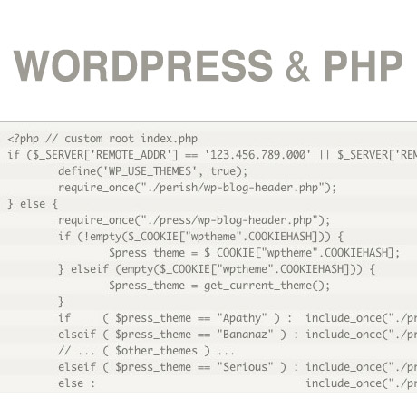
Web development is the back-end of the website, the programming and interactions on the pages. A web developer focuses on how a site works and how the customers get things done on it. Good web developers know how to program CGI and scripts like PHP. They understand about how web forms work and can keep a site running effectively.A good web developer will have excellent programming skills and be able to use a range of programming tools. He or she will be able to provide solutions to give a website the functions required. Web developers will use a range of programming tools such as ASP, Javascript, XML and SQL. The focus is more on the backend and the functionality of the site.

Designer (Themes)

Web design determines the look and feel of a website. It covers the layout, navigation and colors of a website. Web design is more concerned with aesthetics and user experience than functions. A web designer will make a website easy to use and fit for purpose. A good web designer will have graphic design skills and a good understanding of marketing. He or she will know how to grab the attention of visitors and encourage them to explore a website. A web designer is concerned with how a site looks and how the customers interact with it. Good web designers know how to put together the principles of design to create a site that looks great. They also understand about usability and how to create a site that customers want to navigate around in.

Developer (Plugins and Widgets)

Plug-ins and widgets are a great way to enhance the functionality of your site by adding in extra features. These can be placed anywhere inside your template by function hooks. You can start creating and eventually selling stand-alone plugins that add value to existing or new themes.

Support Professional

One of the most common deficiencies in the WordPress themes marketplace is the lack of or absence of theme support. You can start a career by being part of a support team that is responsible for providing after-sales support to customers who have purchased specific themes.

Consultant/Marketing

Providing consultancy services, networking, and hooking up clients with designers and developers is another option to becoming a WordPress Professional. Many times, a lot of great designers do poorly sales-wise because of a lack of marketing skills. You can offer your services to acts as a marketing consultant to WordPress designers and developers who have little or no time to do the marketing themselves.

Blogger/ Theme Description Writer

With the explosion of WordPress themes in the marketplace, there is very little difference between one theme to the next and a lot of them look like clones. You can offer your services as a writer to create a marketing hook for designers and developers who would rather write code than a marketing spiel.

Documentation Writer

Providing appropriate and useful detailed documentation that is easy to understand even by WordPress beginners is another option. Transcribing the installation and setting up process in easy to follow steps adds value to the theme and a well written piece will mean less resources spent on support.

WordPress Trainor

If you have acquired a certain level of proficiency in WordPress and you are confident enough about what you know, you can also try going into teaching and training.

These are just a few ideas to think of as you consider starting or shifting to a career as a WordPress professional.


Harmony Theme: Coming Soon from Elegant Themes

It’s the age of the boy band, the rocker chicks, and the indie alternative rock group and fans have been stalking their favorite bands social network sites. But what if these bands had their very own websites to give them and their fans an online address where they can all converge and have fun?

Elegant Themes is coming up with its version of the music/band/artist WordPress theme and it looks quite exciting. We wonder how Nick Roach is going to combine elegance and swag all at the same time. No doubt, it will be something good.

Sneak peeks can be seen on the Elegant Theme’s blog page. A few features that’s been talked about are:

    The theme is compatible with the standard soundcloud plugin, and that you can add your soundcloud social media Icon in the header
  • Highly visual, clean and responsive experience
  • Includes an eStore / eCommerce compatible
  • Alternate color schemes
  • Major features: showcase songs, sell swag, cultivate fants, notify them of upcoming shows
  • Define your own background image for each location

Check out the Elegant Themes blog or even our blog regularly for the latest updates on the release of this new theme from Elegant Themes, Harmony theme.

Get 77 Premium Themes for $39

Popular WordPress Plugins from CodeCanyon

Plugins are becoming more and more a necessity in putting up a website. These little programs significantly augment the capabilities of themes to produce more robust and highly functional awesome websites. Here are some plugins you may find very useful for your site:

UberMenu WordPress Mega Menu Plugin

Are you tired of ordinary menus that come with your purchased themes? No worries. Ubermenu is a plugin designed to enhance existing plugin capabilities of any theme. This plugin turns your theme’s menu into flyouts or mega menus. Defining the hierarchy of menu items is as easy as dragging and dropping your options. Flyouts are easily created by ordering and indenting menu options. Mega menus can be created easily starting with a tick in the mega menu options. The rest of the steps are relatively simple. This powerful plugin is fully responsive, ensuring your menus are optimized and will look great on mobile devices.

LayerSlider WP – The WordPress Parallax Slider

If you want to do away with flat boring slideshows, Layerslider is a must-have plugin for you. With Layerslider, you can display slides made up of your images layered together for a more stunning 3d look. It’s not surprising that your slides will look like an elegant pop-up book page. Animation of each slide component may be configured and controlled to create dramatic transitions. This plugin is also responsive and SEO friendly.

Slider PRO – WordPress Premium Slider Plugin

Creative professionals constantly seek unique and interesting ways to display their creative works before an audience. These professional artists tend to be more meticulous and demanding of portfolio themes that will be used to display their portfolio on their websites. Slider PRO is an amazing plugin that gives web designers a myriad of slider options like transitions, effects, skins and so much more. This plugin can really turn ordinary sites into powerful portfolio websites for creative professionals.

JackBox – Responsive Lightbox – WordPress Plugin

Here’s another plugin for creative professionals. JackBox – Responsive Lightbox – WordPress Plugin is a neat plugin that allows you to create that lightbox effect even on mobile devices and smartphones. Portfolio or image and video rich sites can take advantage of this plugin to keep their desktop presentations consistent even in mobile format.

Foobar WordPress Notification Bars

This special plugin allows you to create notification bars on your site. You can flash reminders to visitors with a notification bar at the top of the web page to highlight important announcements or information. This can also be used as a source for additional monetization opportunities particularly for websites with themes that don’t have any space for ad widgets. FooBars also allows you to display your social media buttons so visitors can contact you in the social web.

Check out these plugins and give your website that extra edge from the rest. Visit Codecanyon for more WordPress plugins.


10 Useful WordPress Add-ons for Firefox

Almost in all our blog posts we need to add external links, images, etc. to enhance the quality of our posts. The traditional method to do that is to first write the complete article and then search for the relevant data on the Internet and, when found, insert it in the blog post. But you can save a lot of time by using the Zemanta WordPress add-on. If Zemanta is installed and you are writing an article in WordPress then the add-on displays relevant articles, links and images that match with your text and you can choose which ones to insert right from the WordPress dashboard. Zemanta will also display the attribution details of the image. Obviously this is a great help in your blogging journey.

This is just one example on how add-ons can help you in blogging. If you want more of these fantastic add-ons then you have come to the right place. In this article I present you  10 useful WordPress add-ons for Firefox.

The add-ons collected below have different purposes. For example Deepest Sender, can be used to post to your WordPress website even when you are on a different page. This can be of a great help when,  you are reading an article on the Internet and you think you can build upon the idea presented there in a better way. All you have to do is to hit Ctrl+ and you will be in your WordPress dashboard and can start typing.

So scroll down and find which one suits you best.

(more…)


WordPress and PHP


In the last few weeks, we’ve learned some basic concepts on HTML5 and CSS. A simple analogy we can use as to how they work can be likened to writing a traditional letter sent via snail mail. HTML5 is like marking and dividing the content of the letter into sections like: the date, the greeting, the body, the closing, and the signature. CSS is what is used adds pizzazz to the is the way the letter is written: stylized handwriting, choice paper, and images and illustrations to enhance it. The result is a beautiful handwritten masterpiece ready to be sent and read by the reader. This week, we add on to our WordPress building blocks and learn how PHP comes into the picture.

To review, here’s how we defined PHP:

PHP (initially Personal Home Page tools)

PHP is a recursive acronym for PHP: Hypertext Preprocessor. It is a popular server-side scripting language designed specifically for integration with HTML, and is used (often in conjunction with MySQL) in Content Management Systems and other web applications. It is available on many platforms, including Windows, Unix/Linux and Mac OS X, and is open source software.

Adam Brown shared this simple and easy to understand explanation to tie it all up together:

When you view a webpage, the server (i.e. the site you are viewing) sends a bunch of HTML to your computer. Your browser (Firefox, Safari, Internet Explorer, whatever) then turns this HTML source into the pretty stuff you see in your browser. With pure HTML, every visitor to a website will see the same thing, no matter what.

For example,

if we make an HTML page with this content:

<p>Today is December 1st, 2007<p>

…everyone who visits the site will see this:

Today is December 1st, 2007

…even if it is not December 1st, 2007.

What if you want to modify that so it always shows the current date? That’s where PHP comes in. PHP is processed by your server (i.e. by the site you are visiting). The server evaluates any PHP in the page before sending anything to your browser. So if we write this in the web page:

<p>Today is <?php echo date(‘F jS, Y’); ?></p>

Then the server will change that PHP expression into the current date, then send that as HTML to your browser, which then does its part.

Remember: The server processes PHP, but the browser processes HTML.

PHP does not get sent to the browser, only the HTML that the PHP produces.

People sometimes wonder why their theme’s index.php file looks nothing like the HTML source they see in their browser. Well, now you know why.

(source: PHP 101- Adam R. Brown. Check out his website for more easy to follow tutorials.)

Why is it important to understand PHP? Because WordPress is written using PHP and requires it for operation.

Till next!


Responsive Web Design (RWD) vs Adaptive Web Design (AWD)

We’ve heard the terms Fluid, Adaptive, and Responsive used interchangeably when describing a theme’s ability to resize according to browser specs or device (mobile or not) size. Are they really different from one another or are they referring to the same characteristics found in themes described as such?

What is Responsive Web Design (RWD)? Responsive Layout?

Let’s take a closer look.

Responsive web design (often abbreviated to RWD) is an approach to web design in which a site is crafted to provide an optimal viewing experience—easy reading and navigation with a minimum of resizing, panning, and scrolling—across a wide range of devices (from desktop computer monitors to mobile phones) – Wikipedia

Responsive design is the methodology behind making a website respond to whatever platform you are viewing it on regardless of resolution and orientation. It may change how certain elements display but it will not remove elements or change the core functionality of their behaviours. Responsive design uses a fluid grid and it is usually possible entirely through HTML and CSS, without the need for DOM (Document Object Model) manipulation. – Matthew Freeman

According to Ethan Marcotte, The 3 Elements of Responsive Web Design are:

A flexible, grid-based layout – A layout based on proportions rather than absolutes; uses a flexible grid, which in turn ensures that a website can scale to a browser’s full width.

Flexible images and media – Layouts based on percentages resize gracefully according to the size of the browser window rendering them. However, it is problematic to ensure that the content within a site resizes.
Images and media should scale with the flexible grid; images that work in a flexible context, whether fluid themselves or perhaps controlled through overflow mechanisms. CSS addresses this problem with its max-width property

Media queries – Content based breakpoints; optimize the design for different viewing contexts and spot-fix bugs that occur at different resolution ranges. CSS3’s media queries directly address these usability problems by allowing browsers to serve different styles for different viewing contexts. CSS3 greatly expands support for media queries, adding the ability to target media features such as screen and device width and orientation.

These 3 elements of Responsive Web Design find their way into 3 different types of Responsive (RWD) Layouts:

The Basic Fluid Lay­out
Con­tent con­tin­u­ally flows or adjusts in a word-wrap fash­ion as screen width is increased or reduced. There are no “dis­tinct” dif­fer­ences in con­tent pre­sen­ta­tion. Fluid layouts are dynamic and user sensitive – adapting to the available real estate on the user interface and providing increased content accessibility.

The Adap­tive Lay­out
There are pre­de­fined sizes were dif­fer­ent lay­outs are trig­gered. These are called breakpoints. Typ­i­cally there are three or four break­points to accom­mo­date desk­top, tablet and mobile screen sizes.

The Respon­sive Lay­out
This is a hybrid of Basic Fluid Lay­out and Adap­tive Lay­out. There are pre­de­fined break points, how­ever in between these breakpoints con­tent will flow to expand or con­tract.

According to his article for the Adobe Blog, Carl Sandquist states that:

“Cur­rently, most RWD web sites use Respon­sive Lay­out since it offers a best-of-both-world expe­ri­ence. Con­tent snaps into the appro­pri­ate approx­i­mate posi­tion for a device type (e.g. Tablet) and then fine-tuned adjust­ments are made for the exact screen size on a par­tic­u­lar device.”

What is Adaptive Design (AWD)? Adaptive Layout?

“Adaptive design is the manipulation of layouts to best perform on certain screen resolutions inclusive of elemental removal or behaviour changing techniques. Adaptive design usually requires Javascript to efficiently manipulate the DOM. Javascript can be avoided if you plan on having duplicate on-page elements and then show or hide them based on screen sizes, this might be appropriate for smaller elements but not whole columns or navigation elements.” – Matthew Freeman

“This technique adapts what is displayed depending on the capabilities of the device being used, as well as the screen size. It centres on the context of the user, so even when the same content is used, it is adapted (with some or even all of the design elements changing), depending on whether the user is using a mouse and keyboard or touch screen. AWD also uses different layouts for tablets and mobiles with certain. ‘Responsive’ elements built in to reduce the number of different templates required. AWD can be taken to further extremes with content being completely repackaged and reworded, while images and video are either reworked or completely removed.” – Danny Bluestone

According to Aaron Gustafson, author of Adaptive Web Design, Crafting Rich Experiences with Progressive Enhancement:

“Progressive enhancement isn’t about browsers. It’s about crafting experiences that serve your users by giving them access to content without technological restrictions. Progressive enhancement doesn’t require that you provide the same experience in different browsers, nor does it preclude you from using the latest and greatest technologies; it simply asks that you honor your content (and your users) by applying technologies in an intelligent way, layer-upon-layer, to craft an amazing experience.

He encourages designers to: Think of the user, not the browser.”

Which one is better?

A better understanding of the differences between Responsive Web Design and Adaptive Web Design is a starting point to deciding which solution will work well for you, or your clients, if you are a WordPress professional. Knowing what solutions are available and having the ability to distinguish and implement whichever design approach best meets the specifications of the end user is an important element. Of course, nothing is carved in stone. Future designs may be a combination or a hybrid of both – employing the best features of each one. The goal is to ensure that the user experience at the point of searching and eventually finding your website is the best experience they get at that particular moment – fully hoping that it will be the first of many more visits and not their last.


10 Inspirational Typography Plugins for WordPress

Believe it or not – typography or the way you present your text and media on your website – plays a crucial role in building your brand name. Did you know? There are books comprising thousands of pages that teach you how to use a consistent typographical style on your publications. Such as well as “Style Guides” like The Chicago Manual of Style, The MLA Style Manual, Hart’s Rules or The Oxford Guide to Style, etc. Different organizations use different style guides and apply them on their publications in order to achieve consistency throughout the text. If a person who has been reading The Guardian for several months will be asked to identify the paper amongst a collection of many other papers such that the name of the publication is hidden from view, he will have little or no difficulty in identifying it. This is because The Guardian, just like all other standard newspapers, use a specific set of fonts, a specific indentation, a specific line gap, etc. in its publications. Such things help create an authority and reinforce the brand name.

It is not necessary that you follow the standard guides for your publication. If you want you can create your own set of style rules or mix some of your own personal tastes with any standard style manual. Whatever you decide, to help you in your endeavor I present you with 10 inspirational typography plug-ins for WordPress. Some are free while some others cost a nominal amount.

(more…)


Rules of Engagement – Writing to Engage your Audience

Content is the lifeblood of the information age and attracting the audience you want is only a result of the content you provide. The proof of the pudding is in the eating. The popularity of your blog is highly dependent on the quality of “pudding” you provide.

Below is a list of articles that may be helpful to those who want their content to be more engaging:

8 Great Blog Writing Ideas for Engaging Content (Amanda diSilvestro)

This article outlines ways to engage the audience based on the premise that people comment in order to disagree. This writing style should involve a good understanding of the audience and a deliberate introduction of controversy into the post. The post usually ends with a question and begins with a question.

5 writing tips for engaging your blog audience (Laryssa Wirstiuk)

To engage your audience, your post has to be written such that narrations are as concrete and specific as possible. This appeals to an audience that has itching ears for a beautiful story. In addition, writing has to be in conversational-dialog fashion, as opposed to a monologue or lecture. It incorporates the use of thought provoking quotes, good transitions and appropriate multimedia.

How to write engaging blogs people want to read – (Beanstalk, Inc.)

People go to the internet primarily to seek information, to find meaning or engage in a dialogue rather than to be lectured upon. A good blogger must be aware of this and must address his/her audience directly. Writing must be active and made up of shorter sentences to sustain reader interest. The general objective is to help out a “neighbor” seeking information rather than to write a self-absorbed literary soliloquy.

How to write great blog content @Problogger

Sometimes all you need to start is a finger to point you in the right direction. This is a great resource shares different resources on how to: get started writing, explore different writing techniques, establish your own writing workflow, find and sustain your motivation, and make your blog stand out by following basic content creation principles.


Woop Woop WordPress CSS Style

Last week, we learned a little bit about basic HTML (Hypertext Markup Language), how it started, how it works and how to read and write HTML “crudely”.

To recap, here’s what we did:

1. First, we took this block of text (Hypertext):

ACT I. PROLOGUE.Two households, both alike in dignity In fair Verona, where we lay our scene,From ancient grudge break to new mutiny,Where civil blood makes civil hands unclean.From forth the fatal loins of these two foes A pair of star-cross’d lovers take their life; Whose misadventured piteous overthrows Do with their death bury their parents’ strife. The fearful passage of their death-mark’d love, And the continuance of their parents’ rage, Which, but their children’s end, nought could remove, Is now the two hours’ traffic of our stage; The which if you with patient ears attend, What here shall miss, our toil shall strive to mend. SCENE I. Verona. A public place.

2. Marked it up (Markup) like this:

<p>ACT I.<p>

<p>PROLOGUE.<p>

<p>Two households, both alike in dignity In fair Verona, where we lay our scene, From ancient grudge break to new mutiny, Where civil blood makes civil hands unclean.<p>

<p>From forth the fatal loins of these two foes A pair of star-cross’d lovers take their life; Whose misadventured piteous overthrows Do with their death bury their parents’ strife.<p>

<p>The fearful passage of their death-mark’d love, And the continuance of their parents’ rage, Which, but their children’s end, nought could remove, Is now the two hours’ traffic of our stage; The which if you with patient ears attend, What here shall miss, our toil shall strive to mend.<p>

<p>SCENE I.<p>

<p>Verona. A public place.<p>

3. To make it appear like this when published online:

ACT I.

PROLOGUE.

Two households, both alike in dignity In fair Verona, where we lay our scene, From ancient grudge break to new mutiny, Where civil blood makes civil hands unclean.

In a nutshell, we took some plain block of text we wanted to publish online, marked it up using some simple tags to create a more readable, web friendly version that browsers like IE, Firefox, Safari, etc. will recognize. The tags we used: <p> </p> <h1> <h2> were just hypothetical sample tags, not necessarily real html tags, just to demonstrate how HTML works.

Believe it or not, there was a time when the web was really that simple. Plain, boring, unadorned text. That was before – until a new markup language was created – devoted to styling the look of a web page. The new markup language was called Cascading Style Sheets (CSS).

Going back to our definition of CSS:

CSS, or Cascading Style Sheets, is a W3C open standards programming language for specifying how a web page is presented. It allows web site designers to create formatting and layout for a web site independently of its content.

A bit of CSS history:

“According to the W3C, the CSS specification was drawn up in response to “pressure from authors for richer visual control.” The demand for better control of web pages was certainly there, but browsers in the late 1990s just weren’t up to the job. They implemented CSS very poorly or not at all. As a result, only the very brave or foolhardy adopted CSS in the early stages. Nevertheless, the W3C continued work on the specification and brought out a new version, CSS2, in 1998. This retained all the features of CSS1 and added some new ones.”

CSS gives you the power to set styling rules in one place. When you want to make changes to your web site, you make changes in that one place, and your whole web site changes automatically to reflect those new styles.

Why are they called “cascading” style sheets?

The cascade in CSS refers to the way that rules are added together and applied cumulatively. Think of the cascade in the literal sense of a waterfall or a river. As a river flows from the mountains to the sea, it starts off as a tiny trickle, but as more water is added through tributaries, it becomes bigger and more powerful. Yet the water in that original trickle is still part of the whole.

CSS works in a similar way. You can create a style rule that trickles down through the whole page. For example, it’s common to set the background and text colors in a rule for the body of the page. But lower down, new rules can be added that affect the font or size of the text without changing the color. And just like a river can break into a delta as it reaches the sea, you can break the CSS cascade into different strands, so that a sidebar looks different from the main content or footer of the page.

(source: Getting Started with CSS – David Powers)

With CSS, you can design your web page using different design elements, choose different fonts and font styles, add color, images and every design bling you can think of to jazz up your page. All this is done on a separate stylesheet that is linked to your main HTML code which means you can change the design elements anytime without recoding over and over. Simply put, CSS dresses up your drab and boring HTML and adds some “woop woop woop” to it – CSS style.

More next week.