10 Useful WordPress Add-ons for Firefox

Almost in all our blog posts we need to add external links, images, etc. to enhance the quality of our posts. The traditional method to do that is to first write the complete article and then search for the relevant data on the Internet and, when found, insert it in the blog post. But you can save a lot of time by using the Zemanta WordPress add-on. If Zemanta is installed and you are writing an article in WordPress then the add-on displays relevant articles, links and images that match with your text and you can choose which ones to insert right from the WordPress dashboard. Zemanta will also display the attribution details of the image. Obviously this is a great help in your blogging journey.

This is just one example on how add-ons can help you in blogging. If you want more of these fantastic add-ons then you have come to the right place. In this article I present you  10 useful WordPress add-ons for Firefox.

The add-ons collected below have different purposes. For example Deepest Sender, can be used to post to your WordPress website even when you are on a different page. This can be of a great help when,  you are reading an article on the Internet and you think you can build upon the idea presented there in a better way. All you have to do is to hit Ctrl+ and you will be in your WordPress dashboard and can start typing.

So scroll down and find which one suits you best.

(more…)


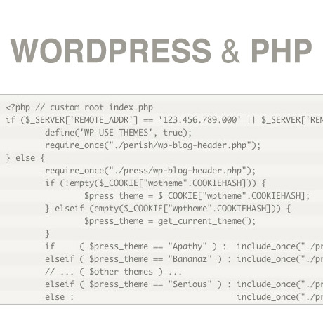
WordPress and PHP


In the last few weeks, we’ve learned some basic concepts on HTML5 and CSS. A simple analogy we can use as to how they work can be likened to writing a traditional letter sent via snail mail. HTML5 is like marking and dividing the content of the letter into sections like: the date, the greeting, the body, the closing, and the signature. CSS is what is used adds pizzazz to the is the way the letter is written: stylized handwriting, choice paper, and images and illustrations to enhance it. The result is a beautiful handwritten masterpiece ready to be sent and read by the reader. This week, we add on to our WordPress building blocks and learn how PHP comes into the picture.

To review, here’s how we defined PHP:

PHP (initially Personal Home Page tools)

PHP is a recursive acronym for PHP: Hypertext Preprocessor. It is a popular server-side scripting language designed specifically for integration with HTML, and is used (often in conjunction with MySQL) in Content Management Systems and other web applications. It is available on many platforms, including Windows, Unix/Linux and Mac OS X, and is open source software.

Adam Brown shared this simple and easy to understand explanation to tie it all up together:

When you view a webpage, the server (i.e. the site you are viewing) sends a bunch of HTML to your computer. Your browser (Firefox, Safari, Internet Explorer, whatever) then turns this HTML source into the pretty stuff you see in your browser. With pure HTML, every visitor to a website will see the same thing, no matter what.

For example,

if we make an HTML page with this content:

<p>Today is December 1st, 2007<p>

…everyone who visits the site will see this:

Today is December 1st, 2007

…even if it is not December 1st, 2007.

What if you want to modify that so it always shows the current date? That’s where PHP comes in. PHP is processed by your server (i.e. by the site you are visiting). The server evaluates any PHP in the page before sending anything to your browser. So if we write this in the web page:

<p>Today is <?php echo date(‘F jS, Y’); ?></p>

Then the server will change that PHP expression into the current date, then send that as HTML to your browser, which then does its part.

Remember: The server processes PHP, but the browser processes HTML.

PHP does not get sent to the browser, only the HTML that the PHP produces.

People sometimes wonder why their theme’s index.php file looks nothing like the HTML source they see in their browser. Well, now you know why.

(source: PHP 101- Adam R. Brown. Check out his website for more easy to follow tutorials.)

Why is it important to understand PHP? Because WordPress is written using PHP and requires it for operation.

Till next!


Responsive Web Design (RWD) vs Adaptive Web Design (AWD)

We’ve heard the terms Fluid, Adaptive, and Responsive used interchangeably when describing a theme’s ability to resize according to browser specs or device (mobile or not) size. Are they really different from one another or are they referring to the same characteristics found in themes described as such?

What is Responsive Web Design (RWD)? Responsive Layout?

Let’s take a closer look.

Responsive web design (often abbreviated to RWD) is an approach to web design in which a site is crafted to provide an optimal viewing experience—easy reading and navigation with a minimum of resizing, panning, and scrolling—across a wide range of devices (from desktop computer monitors to mobile phones) – Wikipedia

Responsive design is the methodology behind making a website respond to whatever platform you are viewing it on regardless of resolution and orientation. It may change how certain elements display but it will not remove elements or change the core functionality of their behaviours. Responsive design uses a fluid grid and it is usually possible entirely through HTML and CSS, without the need for DOM (Document Object Model) manipulation. – Matthew Freeman

According to Ethan Marcotte, The 3 Elements of Responsive Web Design are:

A flexible, grid-based layout – A layout based on proportions rather than absolutes; uses a flexible grid, which in turn ensures that a website can scale to a browser’s full width.

Flexible images and media – Layouts based on percentages resize gracefully according to the size of the browser window rendering them. However, it is problematic to ensure that the content within a site resizes.
Images and media should scale with the flexible grid; images that work in a flexible context, whether fluid themselves or perhaps controlled through overflow mechanisms. CSS addresses this problem with its max-width property

Media queries – Content based breakpoints; optimize the design for different viewing contexts and spot-fix bugs that occur at different resolution ranges. CSS3’s media queries directly address these usability problems by allowing browsers to serve different styles for different viewing contexts. CSS3 greatly expands support for media queries, adding the ability to target media features such as screen and device width and orientation.

These 3 elements of Responsive Web Design find their way into 3 different types of Responsive (RWD) Layouts:

The Basic Fluid Lay­out
Con­tent con­tin­u­ally flows or adjusts in a word-wrap fash­ion as screen width is increased or reduced. There are no “dis­tinct” dif­fer­ences in con­tent pre­sen­ta­tion. Fluid layouts are dynamic and user sensitive – adapting to the available real estate on the user interface and providing increased content accessibility.

The Adap­tive Lay­out
There are pre­de­fined sizes were dif­fer­ent lay­outs are trig­gered. These are called breakpoints. Typ­i­cally there are three or four break­points to accom­mo­date desk­top, tablet and mobile screen sizes.

The Respon­sive Lay­out
This is a hybrid of Basic Fluid Lay­out and Adap­tive Lay­out. There are pre­de­fined break points, how­ever in between these breakpoints con­tent will flow to expand or con­tract.

According to his article for the Adobe Blog, Carl Sandquist states that:

“Cur­rently, most RWD web sites use Respon­sive Lay­out since it offers a best-of-both-world expe­ri­ence. Con­tent snaps into the appro­pri­ate approx­i­mate posi­tion for a device type (e.g. Tablet) and then fine-tuned adjust­ments are made for the exact screen size on a par­tic­u­lar device.”

What is Adaptive Design (AWD)? Adaptive Layout?

“Adaptive design is the manipulation of layouts to best perform on certain screen resolutions inclusive of elemental removal or behaviour changing techniques. Adaptive design usually requires Javascript to efficiently manipulate the DOM. Javascript can be avoided if you plan on having duplicate on-page elements and then show or hide them based on screen sizes, this might be appropriate for smaller elements but not whole columns or navigation elements.” – Matthew Freeman

“This technique adapts what is displayed depending on the capabilities of the device being used, as well as the screen size. It centres on the context of the user, so even when the same content is used, it is adapted (with some or even all of the design elements changing), depending on whether the user is using a mouse and keyboard or touch screen. AWD also uses different layouts for tablets and mobiles with certain. ‘Responsive’ elements built in to reduce the number of different templates required. AWD can be taken to further extremes with content being completely repackaged and reworded, while images and video are either reworked or completely removed.” – Danny Bluestone

According to Aaron Gustafson, author of Adaptive Web Design, Crafting Rich Experiences with Progressive Enhancement:

“Progressive enhancement isn’t about browsers. It’s about crafting experiences that serve your users by giving them access to content without technological restrictions. Progressive enhancement doesn’t require that you provide the same experience in different browsers, nor does it preclude you from using the latest and greatest technologies; it simply asks that you honor your content (and your users) by applying technologies in an intelligent way, layer-upon-layer, to craft an amazing experience.

He encourages designers to: Think of the user, not the browser.”

Which one is better?

A better understanding of the differences between Responsive Web Design and Adaptive Web Design is a starting point to deciding which solution will work well for you, or your clients, if you are a WordPress professional. Knowing what solutions are available and having the ability to distinguish and implement whichever design approach best meets the specifications of the end user is an important element. Of course, nothing is carved in stone. Future designs may be a combination or a hybrid of both – employing the best features of each one. The goal is to ensure that the user experience at the point of searching and eventually finding your website is the best experience they get at that particular moment – fully hoping that it will be the first of many more visits and not their last.


10 Inspirational Typography Plugins for WordPress

Believe it or not – typography or the way you present your text and media on your website – plays a crucial role in building your brand name. Did you know? There are books comprising thousands of pages that teach you how to use a consistent typographical style on your publications. Such as well as “Style Guides” like The Chicago Manual of Style, The MLA Style Manual, Hart’s Rules or The Oxford Guide to Style, etc. Different organizations use different style guides and apply them on their publications in order to achieve consistency throughout the text. If a person who has been reading The Guardian for several months will be asked to identify the paper amongst a collection of many other papers such that the name of the publication is hidden from view, he will have little or no difficulty in identifying it. This is because The Guardian, just like all other standard newspapers, use a specific set of fonts, a specific indentation, a specific line gap, etc. in its publications. Such things help create an authority and reinforce the brand name.

It is not necessary that you follow the standard guides for your publication. If you want you can create your own set of style rules or mix some of your own personal tastes with any standard style manual. Whatever you decide, to help you in your endeavor I present you with 10 inspirational typography plug-ins for WordPress. Some are free while some others cost a nominal amount.

(more…)


Rules of Engagement – Writing to Engage your Audience

Content is the lifeblood of the information age and attracting the audience you want is only a result of the content you provide. The proof of the pudding is in the eating. The popularity of your blog is highly dependent on the quality of “pudding” you provide.

Below is a list of articles that may be helpful to those who want their content to be more engaging:

8 Great Blog Writing Ideas for Engaging Content (Amanda diSilvestro)

This article outlines ways to engage the audience based on the premise that people comment in order to disagree. This writing style should involve a good understanding of the audience and a deliberate introduction of controversy into the post. The post usually ends with a question and begins with a question.

5 writing tips for engaging your blog audience (Laryssa Wirstiuk)

To engage your audience, your post has to be written such that narrations are as concrete and specific as possible. This appeals to an audience that has itching ears for a beautiful story. In addition, writing has to be in conversational-dialog fashion, as opposed to a monologue or lecture. It incorporates the use of thought provoking quotes, good transitions and appropriate multimedia.

How to write engaging blogs people want to read – (Beanstalk, Inc.)

People go to the internet primarily to seek information, to find meaning or engage in a dialogue rather than to be lectured upon. A good blogger must be aware of this and must address his/her audience directly. Writing must be active and made up of shorter sentences to sustain reader interest. The general objective is to help out a “neighbor” seeking information rather than to write a self-absorbed literary soliloquy.

How to write great blog content @Problogger

Sometimes all you need to start is a finger to point you in the right direction. This is a great resource shares different resources on how to: get started writing, explore different writing techniques, establish your own writing workflow, find and sustain your motivation, and make your blog stand out by following basic content creation principles.


Woop Woop WordPress CSS Style

Last week, we learned a little bit about basic HTML (Hypertext Markup Language), how it started, how it works and how to read and write HTML “crudely”.

To recap, here’s what we did:

1. First, we took this block of text (Hypertext):

ACT I. PROLOGUE.Two households, both alike in dignity In fair Verona, where we lay our scene,From ancient grudge break to new mutiny,Where civil blood makes civil hands unclean.From forth the fatal loins of these two foes A pair of star-cross’d lovers take their life; Whose misadventured piteous overthrows Do with their death bury their parents’ strife. The fearful passage of their death-mark’d love, And the continuance of their parents’ rage, Which, but their children’s end, nought could remove, Is now the two hours’ traffic of our stage; The which if you with patient ears attend, What here shall miss, our toil shall strive to mend. SCENE I. Verona. A public place.

2. Marked it up (Markup) like this:

<p>ACT I.<p>

<p>PROLOGUE.<p>

<p>Two households, both alike in dignity In fair Verona, where we lay our scene, From ancient grudge break to new mutiny, Where civil blood makes civil hands unclean.<p>

<p>From forth the fatal loins of these two foes A pair of star-cross’d lovers take their life; Whose misadventured piteous overthrows Do with their death bury their parents’ strife.<p>

<p>The fearful passage of their death-mark’d love, And the continuance of their parents’ rage, Which, but their children’s end, nought could remove, Is now the two hours’ traffic of our stage; The which if you with patient ears attend, What here shall miss, our toil shall strive to mend.<p>

<p>SCENE I.<p>

<p>Verona. A public place.<p>

3. To make it appear like this when published online:

ACT I.

PROLOGUE.

Two households, both alike in dignity In fair Verona, where we lay our scene, From ancient grudge break to new mutiny, Where civil blood makes civil hands unclean.

In a nutshell, we took some plain block of text we wanted to publish online, marked it up using some simple tags to create a more readable, web friendly version that browsers like IE, Firefox, Safari, etc. will recognize. The tags we used: <p> </p> <h1> <h2> were just hypothetical sample tags, not necessarily real html tags, just to demonstrate how HTML works.

Believe it or not, there was a time when the web was really that simple. Plain, boring, unadorned text. That was before – until a new markup language was created – devoted to styling the look of a web page. The new markup language was called Cascading Style Sheets (CSS).

Going back to our definition of CSS:

CSS, or Cascading Style Sheets, is a W3C open standards programming language for specifying how a web page is presented. It allows web site designers to create formatting and layout for a web site independently of its content.

A bit of CSS history:

“According to the W3C, the CSS specification was drawn up in response to “pressure from authors for richer visual control.” The demand for better control of web pages was certainly there, but browsers in the late 1990s just weren’t up to the job. They implemented CSS very poorly or not at all. As a result, only the very brave or foolhardy adopted CSS in the early stages. Nevertheless, the W3C continued work on the specification and brought out a new version, CSS2, in 1998. This retained all the features of CSS1 and added some new ones.”

CSS gives you the power to set styling rules in one place. When you want to make changes to your web site, you make changes in that one place, and your whole web site changes automatically to reflect those new styles.

Why are they called “cascading” style sheets?

The cascade in CSS refers to the way that rules are added together and applied cumulatively. Think of the cascade in the literal sense of a waterfall or a river. As a river flows from the mountains to the sea, it starts off as a tiny trickle, but as more water is added through tributaries, it becomes bigger and more powerful. Yet the water in that original trickle is still part of the whole.

CSS works in a similar way. You can create a style rule that trickles down through the whole page. For example, it’s common to set the background and text colors in a rule for the body of the page. But lower down, new rules can be added that affect the font or size of the text without changing the color. And just like a river can break into a delta as it reaches the sea, you can break the CSS cascade into different strands, so that a sidebar looks different from the main content or footer of the page.

(source: Getting Started with CSS – David Powers)

With CSS, you can design your web page using different design elements, choose different fonts and font styles, add color, images and every design bling you can think of to jazz up your page. All this is done on a separate stylesheet that is linked to your main HTML code which means you can change the design elements anytime without recoding over and over. Simply put, CSS dresses up your drab and boring HTML and adds some “woop woop woop” to it – CSS style.

More next week.


30 Inspirational Non-Profit WordPress Themes 2013

Amongst all the civilized life of shopping malls and movie lexes we must not forget that there are parts in this world whose inhabitants don’t get even the basic necessities of life like food and water. Innocents get killed everyday in calamities like bomb blasts, earthquakes, tsunamis, etc. Children are out of schools as their parents cannot pay for their education. People die even from minor curable diseases merely because they didn’t have the money to see a doctor. The situation is far more serious than what I can describe in a few sentences. The statement that I wish to make is that we should care about others and should donate generously to non-profit organizations that are trying to help those in need.

Perhaps the following collection of 30 WordPress themes, designed especially for the non-profits may make a small contribution in making the world a better place.

Of course different niches have different site design requirements. A social networking site should look and behave in a completely different way than what a gaming site should look like. Special care and attention was devoted to the following templates so that they craft out into a good and clean look, which is what is required for non-profit organizations.

Some of the templates below are without charge but due to certain restrictions we can’t just giveaway everything absolutely free, although we would have loved to. Hence we have charged a nominal amount in the remaining templates. Scroll down and take a look.

(more…)


Black Friday & Cyber Monday WordPress Deals 2012

WordPress: Black Friday & Cyber Monday deals 2012

We like to keep our pulse on the latest and greatest in the world of WordPress, and we wanted to bring you a list of some of the biggest and best WordPress deals for Black Friday and Cyber Monday 2012.

Bluehost: You can join Bluehost hosting at the bargain basement price of $3.95/month starting Friday November 23, 2012 – Monday November 26, 2012. Get the Bluehost Promo here.

HostGator: Get 50% off your hosting order on Black Friday and Cyber Monday. This includes shared, VPS, and even dedicated accounts. Get domains for $1.95 (this is the lowest price HostGator has ever had on domains). Get the HostGator Promo here.

Themify: Starting now until November 26th, 2012, you can use the coupon code BLACKFRIDAY to get 40% off on all of our Themify WordPress Themes including the Club membership! This is a great opportunity to join their developer club at a fantastic price. You can get all 33 themes (Photoshop mockup files included) for just $53.40 (normally $89). That is $1.62 per theme! If you are an existing member, this is a good time to buy more themes or upgrade to the Club membership. Get the Themify Promo here.

ManageWP: Subscribe to a premium subscription and you’ll receive a 30% life-time discount for any ManageWP package or configuration, which will remain active for as long as you remain a customer, even if you upgrade or downgrade in the future! Get the ManageWP Promo here.

Theme Junkie: This year, Theme Junkie is offering a promo code that allows you to get 40% off with the promo code BLACK. This brings the lifetime membership to $119.40, the 1-year membership to $41.40, the 6-month membership to $29.40, and the single purchase (which lets you get 3 Themes for the price of 1) to $23.40. Get the Theme Junkie Promo here.

Obox-Design: Obox has put together two bundles for the Black Friday/Cyber Monday promotion this year. The Classic Bundle gives you 4 overhauled classic Themes + 1 Plugin for just $25. The Super Premium Bundle gives you 6 amazing Premium Themes + 2 Plugins for $50 (an incredible savings of $610). Get the Obox Design Promo here.

Solostream: Get 20% off your Solostream purchase with promo code: 5084BE. The promotion is valid through Monday November 26, 2012. Get the Solostream Promo here.


Best Shopping Cart Plugins for WordPress in 2013

Online shopping has been steadily growing in the last few years. As more and more people engage in business transactions on the web, it is fitting for WordPress sites to be ready for this flurry of eCommerce activity. Here are some of what we consider the best eCommerce plugins for the upcoming year.

Cart66

The Cart66 WordPress ecommerce plugin makes selling easier than ever before. With Cart66 you can sell electronics, digital downloads, videos, music, web hosting, legal services, collect membership fees, and more. Online selling need not be so complicated. This plugin makes selling anything as simple and as easy as can be. Cart66 integrates major merchant tools such as Amazon S3, for delivering digital products, and popular payment gateways such as Paypal’s payment system for collecting payments from sales. There is also a Lite Version which can be downloaded for free from the WordPress repository.

Jigoshop

This eCommerce plugin is the basis for the popular WooCommerce solution. While the two plugins have diverged development wise, Jigoshop maintains the clean, well written code philosophy both plugins have. Jigoshop provides you with the features necessary to set up an eCommerce website in no time with the option to create a multitude of product types and apply detailed attributes customers can easily refine your catalog, ensuring they find what they’re looking for in just a couple of clicks. It is one of the fastest growing plugins and has an emerging ecosystem of extensions that go with it.

WooCommerce

WooCommerce is a free, open source eCommerce plugin that is easy to install, use and extend. This very popular plugin is built for flexibility. It has great built in functionalities such as reporting, tax and shipping capabilities, products and inventory, supports numerous payment gateways, and so much more. The basic functionality can also be beefed up with available extension upgrades to match your business requirements. WooCommerce is an eCommerce tool kit that you can tailor to your specific needs.

MarketPress

MarketPress is an easy to use and powerful ecommerce / shopping cart plugin available for WordPress. This plugin was developed from the ground up to make it simple to set up a stylish online shop, MarketPress has all the features you need, including: Multiple payment gateways (PayPal, Authorize.net, Google checkout, 2checkout, Moneybookers, eWay, Cubepoints and more), fully internationalized by the WPML crew, and includes provision for shipping, coupons, Google Analytics Ecommerce tracking, sale pricing, unlimited product variations. Not only that, it’s also free.

WP Marketplace

The WP Marketplace plugin is a full-featured WordPress Shopping Cart/e-commerce system that is extremely easy to install and even easier to maintain. It has everything you need to build a complete online shop – from front-end management to shipping to payment gateways to analytics to social marketing and SEO features. WP Marketplace is an eCommerce tool that can turn your website into a money making machine.