MultiMedia WordPress Themes August 2013
Today’s multimedia audience has been bombarded with multi sensory stimuli that engage and entertain like never before. Competing in such an environment is pretty challenging and demands a lot of creativity especially when it comes to web design. Here are some innovative WordPress themes that offer you more than your usual WordPress fare:

Fuji Full Screen WordPress Theme

Fuji Premium WordPress Theme is an innovative theme with design aesthetics that are far from your typical WordPress theme design. Its modern and clean design is visually refreshing in every aspect. All the best trends in web development have been implemented in this theme: No pages reload (Html5 pushstate), Retina ready, Responsive Layout, Audio Player and Css3 animations are just some of the features of this theme. It also includes features such as: 9 different page types (Home, Standard Page, Column Page, Full Page, Half Page, Collection, Gallery, Video and Blog), Unlimited Galleries, Unlimited Collections (Portfolio) and Unlimited Audio Tracks, and so much more to fit any type of web application you need.

Acid Unique Horizontal Blog and Portfolio Theme

Why scroll downwards when you can scroll or swipe sideways? Acid Premium WordPress Theme combines the best design features you adore in Metro and One-Page and brings it all together into this one theme. Choose from Colorful Hipster, Serious Black, and Retro Grandma to create the website you need in the style that you want. This theme includes the following key features: unique portfolio layout, unlimited color options, mini parallax, unlimited scroll, One-Page horizontal layout with the option to choose and use the Metro Style blog and portfolio or a combination of both.

Anthe WordPress Theme

If creativity is your passion then up the ante and create a website that reflects just that with Anthe Premium WordPress Theme – a reliable, fast and responsive WordPress theme designed to promote small design agencies or big creative minds. This fresh and creative premium theme gives you four page styles and two page layout options. It’s a 2 in 1 theme – multi-page & single-page solution – all in one package. You can combine your WP pages to create incredible single pages with only a few clicks.

WildHorn Full Screen WordPress Theme

Wildhorn Premium WordPress theme is a full screen theme designed to put your multimedia content (images, videos, and audio) in the spotlight. Equipped with the bests trends in web development such as: No pages reload (Html5 pushstate), Retina ready, Responsive Layout, Audio Player and Css3 animations. This theme also comes with an embedded music player (can be turned on or off) to add that something extra to the whole web experience.

Wave WordPress Theme for Artists

If you are an artist looking for a theme to house your art on the web check out Wave Premium WordPress theme – a responsive WordPress theme made for artists that can also be used as a portfolio cum blog by anyone needs a theme to showcase images and galleries and a blog as well. It is designed on a 1180px grid with 16 columns which can be quite flexible for showcasing art in different sizes or dimensions. This premium theme is also WooCommerce ready which opens up opportunities for artists to sell their artwork online right on the spot.


30 Creative Business WordPress Themes

For a successful business an outstanding site plays a major role, Today a lot of creative professionals have realized this and use Word Press as the engine for building an online site. The ease of use of WordPress, the high number of portfolio styled themes and plugins available for building a professional portfolio web site makes the decision easy.  (more…)


Email Deliverability Tips from Richard Lindner

Email marketers are faced with both challenges and opportunities not open to your traditional direct mail or real life salespeople. Opportunities to penetrate a wider audience via email at a fraction of the cost of snail mail marketing or sales rep expenses make it a powerful marketing tool. One of the many challenges, however, is the effectivity of these email campaigns which are dependent on whether the email gets delivered, read, trashed or sent straight to the spam box.

Email marketing is directly marketing a commercial message to a group of people using email. In its broadest sense, every email sent to a potential or current customer could be considered email marketing. It usually involves using email to send ads, request business, or solicit sales or donations, and is meant to build loyalty, trust, or brand awareness. Email marketing can be done to either cold lists or current customer database. (source: Wikipedia)

Email is not dead. It’s still very much alive and is still one of the most effective means of communications around. Hackers and spammers still think so that’s why they go through all the trouble of phishing, spamming, keylogging, etc. It’s been going on for years and they are still at it. It’s also why legitimate email marketers have to be strategic and creative in finding ways to reach their target market successfully.

Below are some useful insights shared by Richard Lindner during the Traffic and Conversion Summit 2013 held early this year.

  • Email is changing and evolving in 2013. Gmail priority inbox automatically filters subscriber’s emails. Marketers must stand out in the inbox and provide relevancy and value for their email subscribers. (- Margaret Farmakis)
  • Sanebox, otherinbox, boomerang and other inbox services – services that filter out “spam” and make sure that only the most important emails rise to the top and get rea. The rest are automatically filtered out
  • 36% of all emails are now read on a mobile device. Are your emails mobile ready?
  • What you’re NOT doing is giving you a bad reputation. Better reputation = more emails get delivered.

Factors that determine email reputation and how to improve on it:

  • Email service provider – ESPs are evaluated as senders based on the reputation of the Internet Protocol (IP) Addresses and domains of their clients. Senders on a shared IP are lumped together from a reputation standpoint. The reputation of the IP you’re using is determined by the email practices of everyone who uses it. Examples of popular ESPs are Aweber, iContact, Infusionsoft, etc.
  • Sending infrastructure
  • I.P. reputation
  • Domain Authority – the domain you’re emailing from. Having a blacklisted can lead to inability to deliver emails as well as lost Google index ratings
  • Mailing patterns – Volume and Frequency. How many and how often emails do you send can affect responses to your emails.
  • 3rd Party Reputation – Affiliates could hurt your reputation if they spam your affiliate link. Control this by not putting affiliate program on authority domain.
  • Engagement – Are your emails opened? read? replied to? starred? forwarded?

How can you improve your email reputation?

Check your “score” at Senderscore.org. Sender Score is a report used by ISPs to measure the credibility of an email sender on a 1 to 100 scale. Work on your credibility.

  • monitor your score
  • track complaints
  • identify the root cause of complaints
  • monitor your IP address and sending address for blacklistings
  • authenticate your emails
  • set expectations with new subscribers – frequency, volume, and subject of emails

WordPress Themes: Flat vs Skeuomorphism

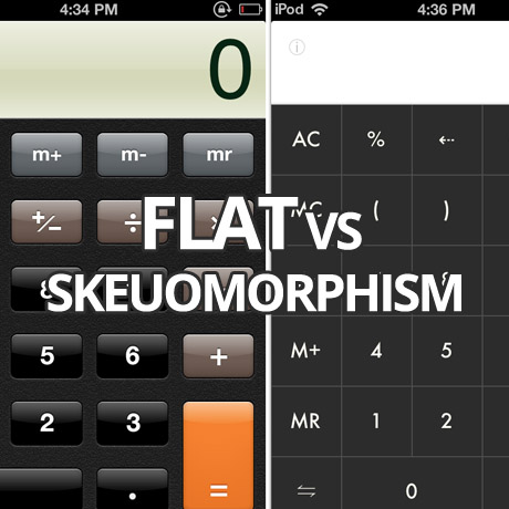
First it was responsive, and then it was retina-ready, and now it’s all about flat design. – mainstream design trends that have been embraced and integrated into a lot of current WordPress theme designs. Not exactly a bad thing especially if you are being sensitive to the demands of the target market you are servicing. Flat design (as seen in Windows 8) is the current design flavor as opposed to the more traditional skeuomorphic designs (as seen in pre-iOS 7 graphics). It is not exactly a “new” design style but it has received a lot of attention lately especially because of Apple’s recent decision to go “flat” in the latest iteration of iOS. Let’s dive a little deeper.

Skeuomorphism Defined

Skeuomorph, , or skeuomorphism – n. (Pronunciation: /?skyo?o??môr?fiz?m/)
Skeuomorphism refers to a design principle in which design cues are taken from the physical world. This term is most frequently applied to user interfaces (UIs), where much of the design has traditionally aimed to recall the real world – such as the use of folder and files images for computer filing systems, or a letter symbol for email – probably to make computers feel more familiar to users. However, this approach is increasingly being criticized for its lack of ingenuity and its failure to pioneer designs that truly harness a computer’s superior capabilities, rather than forcing it to merely mimic the behavior of a physical object.

The term skeuomorphism is derived from the Greek words “skeuos,” which means vessel or tool, and “morphe,” which means “shape.”
(source: Techopedia.com)

Flat Design Defined

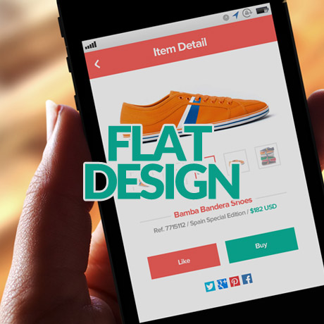
Flat design is a minimalistic design approach that emphasizes usability. It features clean, open space, crisp edges, bright colours and two-dimensional/flat illustrations. In flat design, ornamental elements are viewed as unnecessary clutter. If an aspect serves no functional purpose, it’s a distraction from user experience. This is the reason for the minimalistic nature of flat design. (source: creativebloq.com)

Flat design is a technique that uses simple effects – or lack thereof – to create a design scheme that does not include three-dimensional attributes. Effects such as drop shadows, bevels, embossing and gradients are not used in flat design projects.
Some call the look of flat design simple, although it can be quite complex. The look itself is simple, direct and user-friendly, making it an increasingly popular option for mobile user interfaces as well as trendy web design. (source: designmodo.com)

The Debate – Old Ornate vs. The New Cool

Many designers argue for or against either one of these design styles. It is an ongoing debate in design circles and the discussion has sometimes been heated and enlightening at the same time. Aside from the obvious difference in looks, visual designers have taken to flat design in response to technology. Not only is it quicker to design but also the smaller file sizes of these design elements allow for faster loading and a more efficient UI experience. As the web becomes more mature and more distinct in its visual language, the use of these flat design elements will become more instinctive and less dependent on graphics that imitate real life.

WordPress and Flat Design

WordPress designers have already been incorporating flat design into many of the WordPress themes that are coming out. Minimalist, clean, simple graphic elements are common in several of the newer theme releases. Excessive shadows, real world things, 3D effects, gradients are a few of the effects that have been greatly reduced and have given way to cleaner, simpler, colorful, light and modern elements.

Which one is better?

Some people like log cabins while others prefer IKEA-styled homes. We can’t say one is better than the other because it is a matter of personal preference. As far as designing WordPress themes for a specific market goes, one market will prefer the minimalist look while another will be wowed by a 3D, parallax powered, visually stimulating theme. Some are even drawn to crowded design. The choice belongs to the consumer. And the consumer will buy whatever matches his or her preferences and meets his or her goals and objectives. What may seem beautiful to one client can look disgusting and awful to another.

WordPress professionals who create WordPress themes and sell them in the marketplace are subject to the whims of of the consumer. No one can really predict which theme will be a smashing hit once it is released. However, delivering a product to the market that is consistent with one’s design sensibilities and high standards of quality will always find its target market match somewhere along the way.

Share your thoughts. We’d love to hear from you.


Flat Design WordPress Themes You Can Flaunt

Design trends come & go. Some rise to the top like a shooting star and stay there with the rest of the stars while others burst like comets and fade into the night sky. One so called design “trend” that has actually been around for the longest time has been getting much attention only recently. In fact, even Apple has finally embraced it and has incorporated it in their latest iteration of the iOs. Say hello to the flat design. And it has found its way in many of the newest WordPress themes being released. Here are some examples of WordPress themes that have gone “flat”. Check these out.

Nova Flat & Clean Responsive Theme

If you are looking for a WordPress theme that can be used for multipurpose applications and for diverse types of websites, check out Nova Premium WordPress Theme, a clean, flat design multipurpose premium theme that will surely amaze you. It’s got a sample content importer, 14 homepage options, 9 premium sliders, unlimited header options, a page builder, fluid layout, a skin manager, and a short code editor just to name a few. The flat graphics are integrated nicely and they add to the overall professional look of the theme.

Showy Bold and Flat Portfolio

Impress your clients with this ultra minimalist, boldly simple, flat design WordPress portfolio theme, Showy. Design agencies, creative professionals, and freelance artists will love the simple, uncluttered look of this premium theme that will surely put their creative work in the spotlight. Less is more, indeed. And if it’s a portfolio showcase you want, you have everything you actually really need in this excellent theme.

Flat Responsive Portfolio Theme

If your’re looking for a fresh new way to present your portfolio in step with the latest flat design trend, Flat Premium WordPress Theme is worth a peek. The horizontal scrolling action gives visitors the feeling that they are going through a glossy high end design magazine. You get a choice of 2 homepage options, flat design interactive social media buttons, AJAX pagination for quicker load time, collapsible side menu, tons of other features, plus it is retina ready (great for images) with an optional retina logo upload field feature.

Revusion Flat Corporate Theme

Revusion Premium WordPress Theme is a flat responsive, modern and very professional looking corporate theme packed with features for today’s modern business. Revusion integrates Pixeden flat icons into its design as inspired by the current flat design UI trend. This premium theme gives you several different layout options via its page templates. You can choose to add a testimonial page, a team page, a services page, an FAQ page, a gallery page, aside from the usual blog, portfolio, and contact pages to ensure you can pick exactly what you want to add to your site. This retina display ready theme also comes with the Slider Revolution Responsive WordPress Plugin.

Sistina Flat Multipurpose Shop Theme

Sistina Premium WordPress Theme is a clean and modern WooCommerce theme, designed with a fresh flat style and with a great responsive and retina-ready design. The cool flat graphic elements, modern typography, and streamlined layout give this theme that modern flair that will appeal to today’s modern shopper. This WordPress theme includes several premium features like the Wishlist and the Compare Products features, the Product Enquiry form (for catalog use sans the shopping cart), the Ajax layered filter, and also a Popup plugin to show offers and news.


Building an Online Following through Publishing – NYTimes Best-Selling Author Tucker Max

You either love him or hate him – a common reaction when you hear the name Tucker Max. But there’s more to this foul-mouthed #1 New York Times Bestselling author of I Hope They Sell Beer in Hell than meets the eye. Tucker Max was one of the guest speakers in the Traffic and Conversion Summit 2013 held early this year and he shared some practical and valuable insight as to how he became a successful author despite the odds against him. Here are some of the nuggets he shared during the event:

Publishing a book is just a “Trojan horse” to establish your reputation and do bigger stuff. Published authors have a lot of more perceived prestige and respect vs. marketers.

Book is the best way to become an authority of your field. Use books to build media and brands

Ryan’s model for launching a new brand: Find a thought leader, publish a hardback book, use as a self-liquid offer, use that to build a brand and media

At the very least, publish a Kindle book

Tucker’s Tips:

On Getting Opt ins from books:

  • In the first 10% of book, Amazon shows a “look inside” feature, include a link to your opt-in page. It’s even clickable on Amazon. Ex. “For readers only, get the bonus chapter/audio version over here.”

On Publishing Model

  • Competing goals of publishing a book: NYTimes best-seller, make a lot of money, spreading your message. If you’re not in Barnes and Nobles, it’s hard to become NYTimes Bestseller. Making money – selling stuff off the backend. If you’ve been self-published, it’s hard to get a big 6 publisher to pick you up later on. Easier to get mainstream media if you’ve been published with big 6 publisher.

On Manipulating Mainstream Media

  • Tucker bought sponsored tweets from big celebrities. You only have to pay if celeb accepts. He got Kardashians, Snookie to tweet about his book.

On Dealing with Competitors

  • Don’t compete with them and try to be entertaining. Be a different category completely and known as the “serious guy”

According to him,

“As marketers, we’re often seen in a bad light. Society views us scammers. It doesn’t matter how much money you’re making, you’re always going to be associated with scams, frauds and a lot of other slimey stuff.

But if you’re a published author, then everything changes. Suddenly, everyone respects you. Because you wrote a book. You almost have the same social status and prestige as movie stars and musicians now.The coolest part is, you don’t need to seek a publisher. You can self-publish on Kindle nowadays.

Also, keep in mind, you don’t want to publish books to make money (because chances are most people won’t make much, no matter how many little kindle eBooks they pump out). The real purpose is to use your book as to establish your authority and expertise in your niche.

Don’t go out and look for attention. Just focus on creating the best thing you can create. Worry about what you’re creating 80% and the marketing/selling 20%.

Tucker Max generated a huge following on his website prior to publishing his first and highly successful bestselling book. He has published several books since then. He had an epiphany that started after his first book was published and has announced that we was leaving behind the lifestyle that made him famous. He has turned into a health buff and he is also a mixed martial arts practitioner.


30 Different Content Slider Plug-ins for WordPress

When looking at websites, slideshows and carousels are the best way to present images and this is usually achieved using jQuery. To have jQuery slider galleries or other image presentation on your web page you have to code or download a jQuery slider plug-in and integrate it. Those sliders give effective looks and are very attractive to users.

Here you can see 30 Different content slider plug-in for WordPress. Hope these plug-ins help you…Enjoy!!!

(more…)


Nexus WordPress Theme from Elegant Themes

Stories are an important part of our identity as humans and as a society. More often than not, we go through magazines and newspapers looking for stories to inspire us, inform us and the like. It is easier for us to appreciate a situation if we read the experiences of people involved and see pictures as opposed to a detached report with just facts and figures. This gives the user a more concrete appreciation of what really transpired. Websites must be able to present content as stories that engage users to interact more. There must be a good balance between text and media content to achieve this. At the same time, the website design needs have the flexibility to be able to arrange content in such a way as to effectively create a synergy between text and media content.

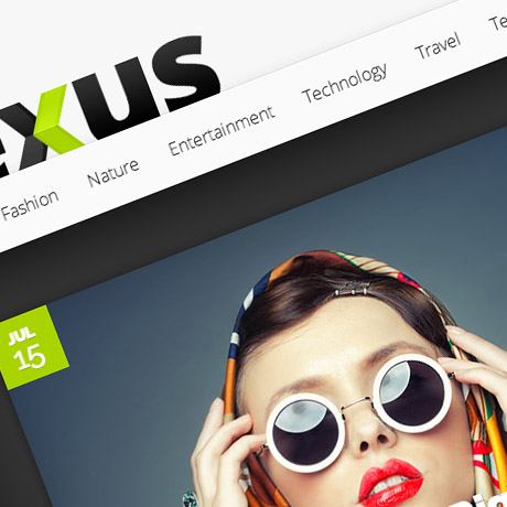
Nexus Premium WordPress Theme is a theme created to give you the power to organize content and maximize your capability to tell your stories in an engaging manner. The theme’s homepage builder allows you to set-up content modules and arrange and organize them in such a way as to create an effective narration of your content. The theme’s overall design approach using a strict grid together with a typographical hierarchy and a clean layout gives your elements the ample space to breathe. This gives your visitors a pleasant and enjoyable experience browsing through readable, accessible content.

This premium theme is quite easy to customize according to personal specs and preferences using the theme’s ePanel. There are also tons of shortcodes and widgets available to expand the the look and function of your site. Nexus is built on HTML5 and CSS3 for fast, efficient loading of your website. The theme is also responsive allowing your site to look good on both mobile and desktop devices.

Features:

  • Perpetual Updates
  • Secure and Valid Code
  • Browser Compatibility
  • Complete Localization
  • Advertisement Areas
  • Homepage Builder
  • Unlimited Colors
  • Custom Widgets

Nexus Premium WordPress Theme includes perpetual updates, unparalleled support, and access more than 80+ high quality WordPress themes included in every Elegant Themes membership.

Get 85 WordPress Themes For $39!

Content Auditing – Is Your Content Up To Par?

“High quality content”, “Content is king.” – we often hear these phrases and although we know that content matters a lot, especially to Google, how many of us pay particular attention to what we post online? If you’ve been publishing large volumes of content on your website for how many years, have you ever taken the time to assess the quality of the content you have published? Have you ever conducted a content inventory, or better yet, a content audit on everything that appears on your website? Do you think managing your content will impact your traffic and conversion efforts or is its effect purely cosmetic?

A content inventory is the process and the result of cataloging the entire contents of a website. An allied practice—a content audit—is the process of evaluating that content.(source: Wikipedia)

WHY: Reasons for Conducting Content Audit

There are many reasons why you should consider conducting a content audit on your website especially for legacy content. You could use the collected data to evaluate specific functions and features of your website and its contents and optimize it to its fullest potential. Here are some reasons for conducting a content audit on your website(s):

  • Review your site’s architecture, structure, and navigational systems to make it more efficient and user friendly
  • Redesign, reconstruct, or renovate your website to make it more current or more responsive to the demographics of your current users. Consider the mobile market.
  • Migrate content to-from another site(s), from static pages to content management system (CMS)
  • Manage content quality, the amount of content, relevance, its layout presentation and design
  • Identify orphaned pages, content bloat, redundant pages that do not meet Google’s algorithm standards
  • Gather and analyze statistics as to user behaviour and interactivity on your website
  • Determine and identify popular and unpopular pages that get the most or the least visits – recognize effective content
  • Identify keywords and maximize organic search terms that drive traffic to your website

“Content audits are critical to understanding and evaluating the performance of your content against business goals, user needs, editorial standards, and performance factors such as search engine optimization and content use or web analytics. They bring value to your website project and on-going maintenance tasks by allowing you to carefully catalog and analyze your content structures, patterns, and consistency. Content audits tailored to your organization’?s content goals will reveal the highest quantity of specific opportunities for content improvement”.(source: content-insight.com)

HOW: Content Audit Strategy

Conducting a full-blown Content Audit especially on content heavy websites should be strategic and well-planned because it can be tedious and overwhelming. Strategy is key. Tactics can be modified and adapted. Some companies even choose to “throw out content” and start fresh. You can choose to conduct your content audit according to your needs and specifications in several ways:

  • Full Content Audit – Complete and comprehensive list of every content including all pages and all assets (downloadable or attached files etc.)
  • Partial Content Audit – Top hierarchy and subcategories or subset list
  • Content Sampling – Examine representative samples of content

WHO: Content Auditors:

  • Website designers and managers
  • Information architects and taxonomists
  • Content managers and developers
  • Content strategists and marketers
  • SEO managers

WHAT: Important Content Audit Items

  • Identify and document content volume and types
  • Identify and document the current content structure
  • Assess whether the content is being used
  • Document inconsistent content presentation

TO DO: Simple Content Audit Action Plan Sample

Conduct a Content Inventory

Create a content inventory spreadsheet and catalog. It may or may not include the following items based on your specs or based on the order of the most significant parts of your website:

  • ID, numbering or index
  • Page Title
  • Page Name
  • Page Type (homepage, navigation, ecommerce, blog, etc.)
  • URL
  • Level in the site (hierarchy)
  • Content type (multimedia, image, video, doc, pdf, HTML)
  • Owner/maintainer/author (content rights)
  • Comments
  • Character count or content size
  • Topics, tags, category, keywords, meta data
  • Date created
  • Last updated
  • Related files
  • Broken links (linking practices)
  • Duplicate content
  • Short Description or Notes
  • Alt tags on multimedia (images, video, audio, etc.)
  • PageViews
  • Unique Visitors
  • Bounce Rate
  • Page Authority

Track your content on the Internet, social networking sites, and contributions posted on other websites

Monitor the quality of your content as pertaining to topic, tone, consistency or compliance with your branding or marketing strategies

Assess and evaluate your content: keep, fix, improve, update, redirect, archive, remove, delete or trash

Use content analysis tools to get the job done if necessary (Excel, Content Analysis Tool, etc.)

Make an offline copy

If the job is too daunting, hire a Content Auditing Services Firm or a Content Audit Professional

The initial stages of the whole process can be time consuming and overwhelming but once you have a system in place that’s current and updated, you will be able to glean insight from all the information you’ve gathered and steer your website towards a richer, exceptional, more substantial, Google algorithm friendly content that will keep visitors coming back for more.