WordPress Themes: Flat vs Skeuomorphism

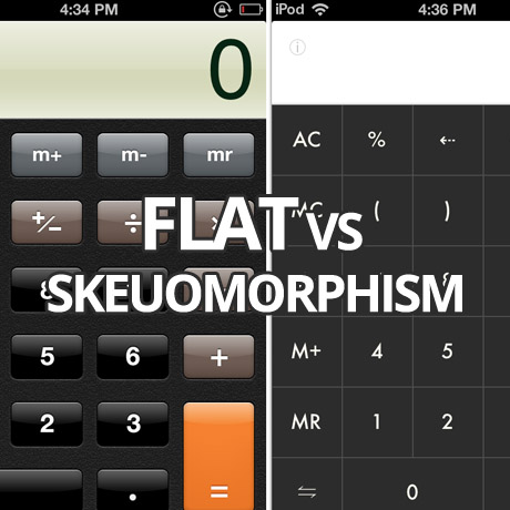
First it was responsive, and then it was retina-ready, and now it’s all about flat design. – mainstream design trends that have been embraced and integrated into a lot of current WordPress theme designs. Not exactly a bad thing especially if you are being sensitive to the demands of the target market you are servicing. Flat design (as seen in Windows 8) is the current design flavor as opposed to the more traditional skeuomorphic designs (as seen in pre-iOS 7 graphics). It is not exactly a “new” design style but it has received a lot of attention lately especially because of Apple’s recent decision to go “flat” in the latest iteration of iOS. Let’s dive a little deeper.
Skeuomorphism Defined
Skeuomorph, , or skeuomorphism – n. (Pronunciation: /?skyo?o??môr?fiz?m/)
Skeuomorphism refers to a design principle in which design cues are taken from the physical world. This term is most frequently applied to user interfaces (UIs), where much of the design has traditionally aimed to recall the real world – such as the use of folder and files images for computer filing systems, or a letter symbol for email – probably to make computers feel more familiar to users. However, this approach is increasingly being criticized for its lack of ingenuity and its failure to pioneer designs that truly harness a computer’s superior capabilities, rather than forcing it to merely mimic the behavior of a physical object.The term skeuomorphism is derived from the Greek words “skeuos,” which means vessel or tool, and “morphe,” which means “shape.”
(source: Techopedia.com)
Flat Design Defined
Flat design is a minimalistic design approach that emphasizes usability. It features clean, open space, crisp edges, bright colours and two-dimensional/flat illustrations. In flat design, ornamental elements are viewed as unnecessary clutter. If an aspect serves no functional purpose, it’s a distraction from user experience. This is the reason for the minimalistic nature of flat design. (source: creativebloq.com)
Flat design is a technique that uses simple effects – or lack thereof – to create a design scheme that does not include three-dimensional attributes. Effects such as drop shadows, bevels, embossing and gradients are not used in flat design projects.
Some call the look of flat design simple, although it can be quite complex. The look itself is simple, direct and user-friendly, making it an increasingly popular option for mobile user interfaces as well as trendy web design. (source: designmodo.com)
The Debate – Old Ornate vs. The New Cool
Many designers argue for or against either one of these design styles. It is an ongoing debate in design circles and the discussion has sometimes been heated and enlightening at the same time. Aside from the obvious difference in looks, visual designers have taken to flat design in response to technology. Not only is it quicker to design but also the smaller file sizes of these design elements allow for faster loading and a more efficient UI experience. As the web becomes more mature and more distinct in its visual language, the use of these flat design elements will become more instinctive and less dependent on graphics that imitate real life.
WordPress and Flat Design
WordPress designers have already been incorporating flat design into many of the WordPress themes that are coming out. Minimalist, clean, simple graphic elements are common in several of the newer theme releases. Excessive shadows, real world things, 3D effects, gradients are a few of the effects that have been greatly reduced and have given way to cleaner, simpler, colorful, light and modern elements.
Which one is better?
Some people like log cabins while others prefer IKEA-styled homes. We can’t say one is better than the other because it is a matter of personal preference. As far as designing WordPress themes for a specific market goes, one market will prefer the minimalist look while another will be wowed by a 3D, parallax powered, visually stimulating theme. Some are even drawn to crowded design. The choice belongs to the consumer. And the consumer will buy whatever matches his or her preferences and meets his or her goals and objectives. What may seem beautiful to one client can look disgusting and awful to another.
WordPress professionals who create WordPress themes and sell them in the marketplace are subject to the whims of of the consumer. No one can really predict which theme will be a smashing hit once it is released. However, delivering a product to the market that is consistent with one’s design sensibilities and high standards of quality will always find its target market match somewhere along the way.
Share your thoughts. We’d love to hear from you.
Note: Many of the articles on this site include affiliate links that may earn us a commission if you decide to buy the recommended product.


Interesting point. This is an old ongoing debate: Which is better Flat Design or Skeuomorphism? Until now, looks like more people, both designers and users prefer Flat Design over Skeuomorphism