
M-Commerce – The Mobile Market, Web Design and Conversion
The unstoppable invasion of mobile computing and how it has woven itself into our daily routines is undeniable. A life without the Internet, free WiFi, and our handheld devices is almost unimaginable and web designers have heard and heeded this lifestyle change, hence, the birth of responsive, fluid, and liquid design trends. Mashable has even named 2013 “The Year of Responsive Design”. However, we are still in the early stages of understanding this mobile demographic to yet see tangible and consistent conversion results from the marriage of Mobile Commerce (M-Commerce) and Web Design for handheld and mobile devices. Responsive design does not necessarily equate to actual conversion, whether in sales, subscriptions, or networking.
According to a report by Litmus.com,
“More email is read Mobile than on a desktop email client or via webmail. Stats say 36% of email is now opened on a mobile device, with 33% for desktop and 31% for webmail.” – Litmus –”Has your audience gone Mobile” (June 2012)
As of September 2012:
We’ve seen some major changes in mobile email opens in the past year and a half. As of September 2012, 38% of all opens were on a mobile device, compared to only 17% eighteen months ago—that’s a 123% increase in mobile opens!
Diving deeper into specific mobile operating systems, the majority of these opens are being made on iOS (iPhone and iPad – 80.34%) and Android (18. 93%) devices:
The next question is, Does Mobile Traffic Convert into Leads?
Not necessarily so. There are several factors that lead to actual traffic conversion and there is no hard and fast rule on it but website owners can make educated guesses based on actual data and stat results gathered from their own website traffic trends.
Three ways to reach your target mobile traffic:
Run a native mobile app
- Needs to be downloaded by the user
- Restricted amount of content and functionality
A mobile website or M-Dot (a dedicated scaled down mobile version of the main website)
- Advantage – faster loading time and optimization
- Disadvantage – two bodies of content to manage
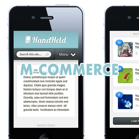
Responsive web design
- Uses responsive, fluid, liquid layouts, media queries, and flexible images to adapt to various devices and resolutions
- More future friendly
- One body of content to manage
- Consistent brand experience
- Social media friendly
Among all three, responsive web design appears to be the most feasible way of reaching your target market. But is responsive web design enough to address the problem of conversion?
Here are some strategies to consider to maximize your web design and marketing optimization efforts to improve your conversion rates on your website:
Create a mobile optimized landing page
- Make sure that your landing page is displayed properly on all screen sizes (portrait and landscape)
- The need for speed – achieve fast loading time (5 seconds or less) by using optimized media content (images, video, and audio) and scripts.
- User friendly – Prospects don’t have to type anything just click a button. If possible, must be clickable by the thumb.
- Content must be simple, readable and easily navigable. Call to action buttons must be prominently but strategically located.
Create a mobile optimized order form
- Redirect users from the landing page to your mobile optimized order form.
- Form fields should be easy to read and fill out on any mobile device. Longer forms lead to boredom and lower conversion rates.
- Remove all sidebar content so the form fits perfectly on the viewable window of the mobile device
Create several versions of your landing pages and order forms and test which ones convert the most. Improving User Experience and establishing a User Friendly Interface all contribute to an enjoyable browsing experience for your mobile visitors which will eventually boost your conversion results.
Note: Many of the articles on this site include affiliate links that may earn us a commission if you decide to buy the recommended product.